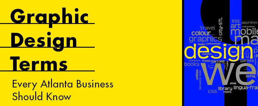
Often times you might hear your graphic designer Here are some terms you may hear me using from time to time and the meanings of each. By no means is this an exhaustive list just a small sample of terms you might want to consider adding to your vocabulary.
Baseline
A base line is an imaginary line where type sits that acts as a point of rest for the copy. This will help to make sure the lines of type are easily read across all the paragraphs of your website or document.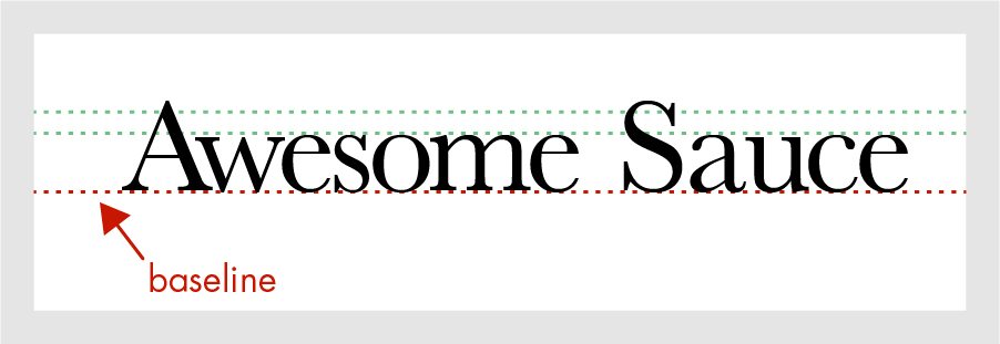
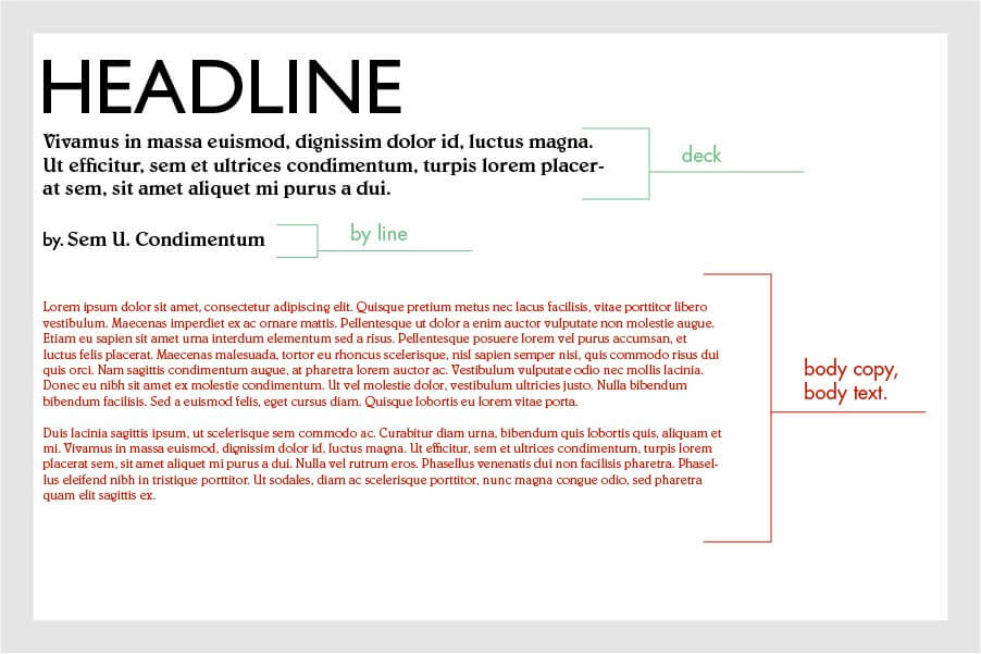
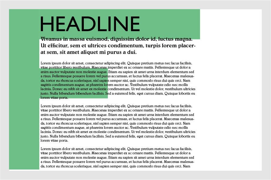
Body Copy, Body Text, and occasionally Body or just Text
This is the group of sentences that make up the paragraphs, as you may already know, but this term is how it’s commonly used especially among Advertisers and Copy writers. This is the bulk of the information as opposed to the Headline, Sub Headline, By Line, or Deck. With the development of mobile devices, it is difficult to pin down and exact point size for the copy in digital form. However, it seems that having it Between 10 points and 12 points is about the norm.
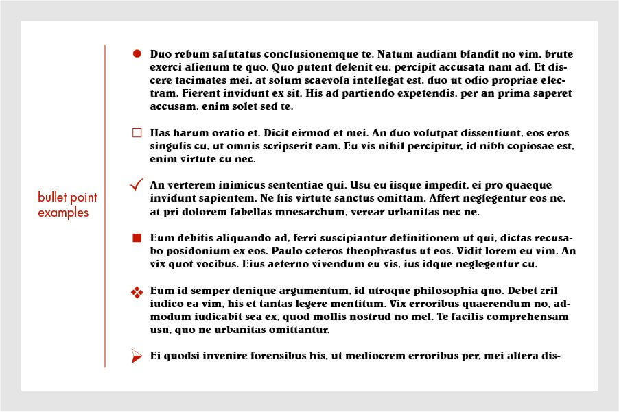
Bullet
A bullet or bullet point is a shape that is used to introduce a new point most often used in lists. You can use a multitude of list indicators that come in numbers or even shapes to make your pages thematic and give it the feeling of your own personal touch.
Dingbat
Created by Herman Zapf in 1978 these ornamental characters are a part of a typeface made up of a series of signs and symbols for ease of use if you want to add in a specific and unique character type into your Body Copy. This is great when you really needed something quick and clear to help symbolize a specific message or make a specific statement.
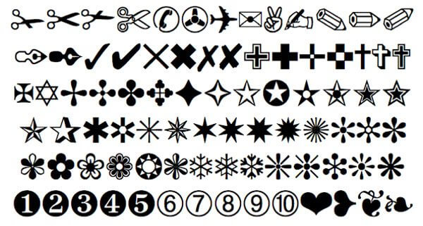
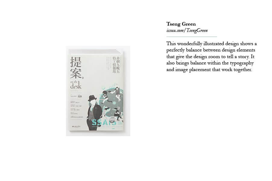
Image Attribution: www.lynda.com
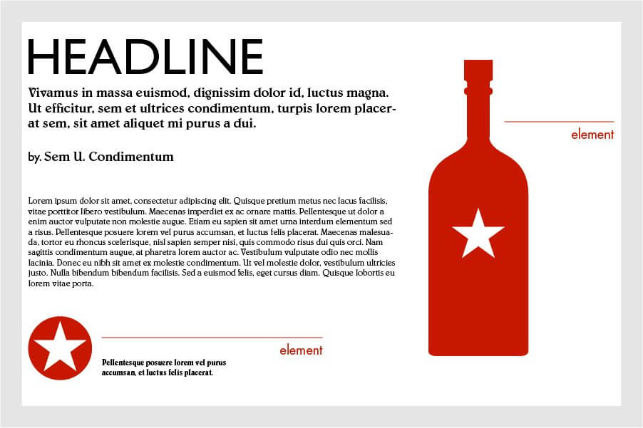
Element
An element refers to an object on the canvas or page these are usually what is visible on the screen if you are using a device or a printed page. These can consist of Lines, Shapes, Texture, Color, Image, Body Copy, Paragraphs, or – in rare cases Code, usually used for instructional purposes.
Extended Text
Like the Body Copy (above) the Extended Text will usually have longer paragraphs supporting the point it’s aiming to make like an article or novel.
Eye Flow
When people look at the content on a page, they see things in a specific order, particularly they see objects that are arranged on a page in a pattern. This is usually guided by certain cues known as hierarchy on a page, because of the most important starting points or breaks in new topics within an article. Headlines are the most common way to organize topics on a given subject however, when we read written information our eyes naturally read information from the top left then across horizontally to the right and then our eyes will scroll down. In graphic design this is known as an F-Pattern, because the eyes create the lines of an “F” when traced.
When we look at images our eyes follow a Z pattern starting on the Top left and ending on the Bottom right?
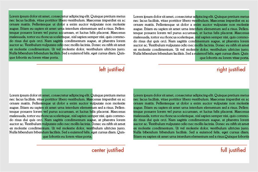
Justified Type
Paragraphs have different alignment types that that work together with the copy on the page. Justified type is when the right and left ends of the paragraphs both have straight lines instead of lines that are ragged.
White Space
This is space on a page that is not been taken up by content and has left an area untouched by anything else on the surface plane. Have you ever seen a website that seems to have content almost everywhere on the site? More commonly these are made up of advertisements on web pages, and when you do see these you get a feeling that the content is hard to absorb or worse unreadable all together. That is because the clutter is taking up the white space and your eye does not know where to go visually. Usually new artists who are learning the principles of graphic design and who have not grasped the concept of allowing the elements to “breathe” make this mistake the most. As you grow you will appreciate the flow of content as you get better in arranging the content on a page, not only will this be more aesthetically pleasing but much more professional as well.
Well that wraps it up. I hope this was helpful and that you learned some valuable ideas that will help you in your web design or graphic design projects. There is a multitude of concepts and web design principles to explore and we’ll cover more in another post.