The overall throwback classic tone that Burger King logo and packaging design is taking from the hip of the Flame Bold typeface, yep that’s the font, to its to use off white tones bring in an obvious 70s retro feel. I will admit that I originally had mixed feelings in the direction of the new branding initially, openly admitted in my tweet. But I’ve grown to like it.
It makes it obvious it’s penetrating a clear distinction between every other Fast-food restaurant in the market right now, by getting back to the basics, especially when things get complicated. Not in its market, but in the heartbeat of its culture. 20 years in the making, it could no longer pretend to be something it wasn’t in its visual identity.
Start fresh, start over; at the core the logo and packaging stating “This Is Who We Are.” It’s this positioning that communicates the overall impression and feeling that I get from Burger King’s amazingly authentic rebrand.

Flush tomatoes, crisp lettuce, the sweet taste of onions and crunchy pickles atop a 4oz all-beef flame-broiled patty. Food that brings people together; conversations online to conversations in the living room.
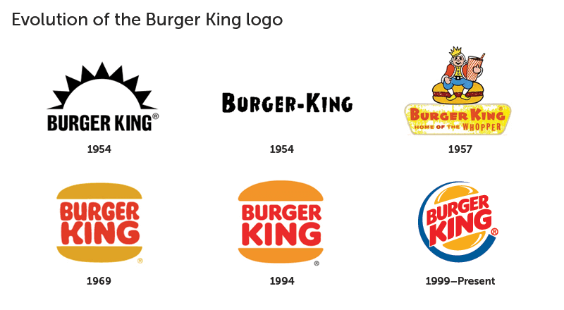
The old logo seems to try too hard. The name is bursting from the seams almost as if it were shouting at you, fighting for your attention, too desperate. And the over-exaggerated energy with strokes even included on the “buns” doesn’t make it as believable, it seems to tap into the shiny object syndrome of our youth.
An Evolution, Not a Revolution
Out with the old and in with the new. BK has taken two steps back to make the step forward even better. I don’t know how this is going to play out, but I look forward to seeing, hearing, tasting, and smelling the experiences of the stories BK’s brand’s evolution in the logo and new packaging design will tell.
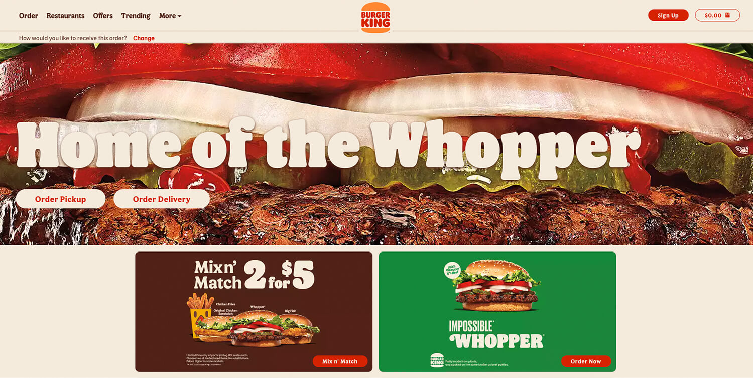
The earth tones throughout the solid color of the red, pecan brown, off white, green, and carrot orange. Keeps it much more approachable and tied to the freshness of their ingredients. All the shapes have taken a somewhat much-defined approach: the roundness in the buttons on Burger Kings website’s experiences to the bevels of the user interface design.
Even the logo has taken major approaches in simplifying its elements once again making it slightly taller in the “buns” now have distinct roles for their shapes.
The logo monogram has gotten a lot of praise from Burger King in the design community when it’s letterforms B.K. Create a double entendre using the letters “B” for the overall form and then the letter “K” as internal ingredients.
No longer is there a multifaceted approach to the packaging design in the wrappers’ design anymore either. They’ve also to focus on either the flexible typography or communicative illustrations, but never both at once.
Also, they also have a cast of illustrated characters that they’ve introduced, which could very well play significant roles in the story that we could experience in the future? Having such a simple framework that’s culturally agreed-upon to exist within an era just might be what Burger King needed to hear from fans.
So now Burger King has the flexibility to campaign with those brand identity elements. And culture bombs under either single campaigns or guerrilla tactics to various platforms (Facebook, Instagram, TikTok, etc.). This time, at least from this beginning, it looks to me as though they have positioned themselves to explore, learn, share, and be part of its culture’s many journeys for the long haul.