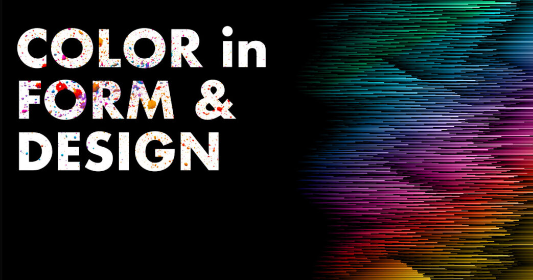
Have you ever wondered how color works in the form of design? Seeing colors in a flat surface is different compared to using them in your actual designs. How color contrast with other visual and pictorial elements on the page creates a dynamic interaction. In this article we will talk about and look at a few examples of how colors look when applied under various circumstances.
How colors interact with a design has an individualistic relationship compared to looking at them on a flat surface. The tints, tones, and shades seem to interact and dance around to communicate what the designer intends on in their messaging.
You have varying degrees of hierarchy that lets you know the relationship and sometimes priority in relationship to other surrounding elements. Cooler colors like blue, green, or purple will naturally take a back seat compared to colors that advance like red, yellow, or orange.
Once you arrange colors in your design compositions, you’ll notice how the relationship changes or how adjustments are because of the way colors arrange on the page. Even when using two complementary colors it can still have a dramatic effect in the wider range because of the shear factor a contrasting effect.
A designer must also think about how the content is communicating and how to structure that content using the principles while organizing visual elements. Even within color, deliberate practice and consideration must cooperate with all touch points that represent the brand. For the integrity of the brand or to market the product in alignment with a thematic experience.
Making Color Selections
As you’re choosing colors, they set the tone by narrating the feeling that people will get from experiencing your chosen designs. The overall selection of these colors remain as a pallet and combining temperature, value, and saturation that work together under careful consideration.
Selecting a pallet involves choosing the right color combinations that reflect the overall tone of the message in its delivery. As stated before, this should be paramount and optimal whether the feeling is warm, comfortable familiarity, or something cool and rigid.
Overall colors that are being selected must work together according to their relationship to one another across the spectrum.
By relying on and leveraging existing color combinations, those systems will give you the greatest range of diversity in contrasting power in your designs that can show points of interest or moment of rest within a composition.
If you’d like to know more on color theory you can find more info in this article Color Theory: 5 Form Design Best Practices You Can Use Today
You need not go crazy here, in fact the most reliable form of color design combinations are going to benefit you, for assets such as logos, asking yourself which one’s stand the test of time? What two colors reflect best on the values of the company and align with industry expectations.
Clarity is going to be your best friend, as the audience is part of an experience. Let content and color set a pattern of what to expect. As your audience understands this pattern, they will become more reliant on it to help them navigate the architecture and find the points of interest it draws them into most.
Keep Experimenting
Yet there are no hard-and-fast rules, you may choose the rules out the window. Otherwise, choosing to garner an intuitive approach in mixing and matching colors that you feel represents the message putting an artistic flair over conventional norms.
Or you may choose two different color systems that have intentional use based on their individual circumstances and what the content needs to communicate on behalf of the messaging.
There are plenty of ways to experiment and play with color that are both fun, innovative, and expressive all in one. Now you’re empowered with ideas to use color in content that adds tremendous value within your brand or design projects.
Although this article is much more philosophical, in some ways, let it be a source to remind you and keeping things simple as a most efficient form of communicating.