What major brand have you ever seen without a solid logo? The answer is none. Every major brand has a logo. The logo is an important component of how your customers experience your brand. Therefore, it would make sense you would want your logo to accurately represent your business.
But what steps do you need to take in order to make that happen? In this article, you’ll learn everything you need to know about making your logo from start to finish for your business or a design problem you’re trying to solve for a client.
You’ll learn how to ask the right questions for the brief, selecting type, picking the right color palette, going through the design process, and even tips on what makes a great logo, so grab a pen, continue reading, and let’s get started in the process.
You might be curious about the specific steps that you need to take. Here’s an outline of the steps you can follow:

1.) Understand the problem you are trying to solve
When you design a logo has one specific goal in mind—communicating the values and attributes of a business in a simple, memorable mark. So, a logo is a representative of your brand, it’s not the actual brand and it won’t sell the product for you. It’s something that people connect with overtime after experiencing your product or service.
So, you’d want to make sure you understand the problem you’re trying to solve first before jumping in headstrong into finding solutions.
By first understanding, the problem that the logo trying to solve for your business and getting a clear picture, the people who engage with the logo will have a better idea of the initial messaging that you’re trying to get across. The customers who interact with your brand will also get a better idea of what your business is about and if you will be the right fit for their needs.
Because understanding the needs of the actual business such an up part of the logo design process, make sure you ask the right questions. By surfacing insights, you might uncover attributes or unique elements about the organization.
Plus, you gain insight into all the touchpoints need when presenting the logo from the business cards, signage, nametags, wayfinding, user interfaces, website, packaging, and social media channels. So, ask the right questions, listen, and take notes.
Here are some questions to help get you started:
- What’s wrong with the logo you have?
- What do you like about your current logo?
- What is the name of your company?
- What is the nature of the business and what do you do?
- What will you use the logo for?
- Where would the logo be seen?
- What are your long-term goals for the brand?
- What is unique?
- Who’s your target audience?
A professional business logo design will not only be adaptable, but it will uniquely communicate the essence of the culture. And by asking the right questions, it will make your brand stand out from any competition in the market.
“Design is thinking made visual”Saul Bass

2.) Branding & Creative Brief
What is a brand?
The brand is the culmination of experiences that customers and consumers have with your company. The term “brand” originally came from the mark that cattle ranchers put on their livestock. But we now use the term brand, at least in the business space, as the makeup of a multitude of expressive touchpoints.
Branding isn’t about just the tangible elements among an organization, it’s about the company’s values, the way they communicate products in advertisements, and the reputation of the company. The dominant idea of branding is to build awareness, and not just for the company but also for your customers.
Personal branding is how someone ends up building a reputation among multiple networks. Now is the time that’s more important than ever to building a brand. Even though this article is about designing a logo for your business, there still some important brand terms that you should keep on hand.
- Avatar: An icon made for the brand can animate, express, or have free rein with other elements in its messaging.
- Brand Identity: An expression of a brand, trademark, communications, visual, and name.
- Branded House: A company in which the dominant brand name is the company name, such as Mercedes-Benz; also called a homogeneous brand or a monolithic brand; the opposite of a house of brands.
- Icon: A visual brand symbol used to separate its self from the competition.
- Logo: A logotype or trademark used as an identifier for the brand.
- Logotype: A wordmark, typeface, or hand lettering that used to express a name brand.
- Trade Dress: The visual appearance is characteristic of the brand including but not limited to typefaces colors, shape packaging, and additional elements that consistently become the public-facing elements of the brand.
- Trademark: A phrase, name, or symbol that shows a particular product and differentiates itself from other products in its category. Usually belonging to a specific company was a form of intellectual property owned by the brand.
- Symbol: A mark or trademark used to represent a brand.
The first to get to the heart of your brand’s personality and understand exactly what it is. The logo will help you do that, but you must get an obvious idea of what your brand in its entirety will find what’s important.
Paint an impressive picture of what your brand begins with by assessing the values that best represent the brand, well-informed design choices to help bring everything together. If you want to find out more about what a brand is, you can find out in this podcast episode What Is A Brand?
Here are some questions that you can ask to help identify some attributes that will help create your logo:
- Why did you start this business?
- What are some values that this company holds and expresses?
- What do you do better than anyone else?
- What makes your company stand out beyond competitors?
- If your customer described the company in three words, would they be?
- What are some products that your logo will be on?
3.) Research & Inspiration
Before you do preliminary sketches, all or looking for any inspiration or doing a brainstorming, you first need to conduct some research about the business, the industry, and competitors.
By conducting research, you can get a better idea of the target market and what they’re valuing. You also gain more info about the products or services the business offers and what other brands may have already penetrated the market on various platforms.

When you’re done doing the initial research, there are a few things you should know by the time you’re done:
Answers to questions, like:
- What’s the production process like for this product or service?
- What’s the background or history of the product?
- What’s unique about the ingredients of this product
- What’s memorable about the service quality?
You can always ask the client more questions about things you discover to gain a little more insight that may give you more ideas on how to implement solutions. It’s by paying attention to those details that can help your ideas stand out among other brands.
Looking at the competition
While examining the competition you want to be aware of the other brand identities are in the marketplace, so that what you design can stand out and’s help set your design apart from the competition. You don’t want to be another me to design a solution; you want to have an identity that unique to the brand.
An excellent way to start is by looking at the direct competitors. Anyone in the same market that offers the same product or service as your client. For example, Apple and Microsoft are direct competitors in the technology department because they both create software for the same target audience.
Then there are indirect competitors. These are the other brands or companies that offer similar products or services in the same segment as your business. Microsoft and Dell are indirect competitors because even though they’re both technology companies, they’ll focus more on the hardware while Microsoft is primarily a software company that could also run on a Dell computer.
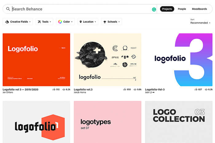 Websites like Behance offer a gallery of references where you can find inspiration or build a community.
Look at how the competition is positioned more than their brand or logo. Consider how they use typography, color palettes, photography choices, and anyway that they use their branding on unique products relevant to the industry. If you can, take a screenshot of it and save it as inspiration in a folder or something to keep in mind to model later on.
Because of the size and scope of some industries, don’t worry if you don’t cover every single competitor out there. If you’re looking at a local business, then using Google will do just fine because then you’ll know the immediate competition or global leader that your brand is up against.
Places to find logo ideas
The internet gives us a significant advantage in finding other ideas and models of inspiration, but we’re not doing it to copy but mainly to find out what’s trending. It at least gives you a preview of how other companies in the same industry have solved the logo design problem.
Keep in mind that what you find on these other sites may find their way into your thumbnails indirectly. This by definition will happen because of the intricate way our minds work, especially for images that impress themselves on our subconscious.
This all kinds of tools you can use to find ideas including resources such as books, magazines, logo design databases, and websites that will show you what solutions are already available so you can either document or weed out what to avoid. Here are six places to find logo design inspiration online:
Instagram:
- Logo Archive (@logoarchive): A collection of amazing black and white logomarks broken up into stories and curation for ease of consumption.
- Logo Books (@logobooks_): Features books around logo design, brand design, from editors and publishers. This also includes an online store.
- Learn Logo Design (@learnlogodesign): Logo design sketches and sometimes grid components to help you see the geometry of logo design.
- Logoseum (@logoseum): An archive for global logos from around the world. Some in a single color, some in full color from past and present.
- Logo Place (@logoplace): A modern collection of stylized logos, logotypes, illustrations, and icons.
Websites:
- Brands of the World (brandsoftheworld.com): Contains logos from around the world with access to download available vector files.
- Brand New (underconsideration.com/brandnew): The hottest new brands on the market, including logo redesigns.
- Behance (behance.com): A massive database of designers and agency owners. Assorted categories of brand identity designs, logo designs, and graphic design portfolios.
- LogoPond (logopond.com): A modern gallery of logo collections and submissions for both personal or business logo designs.
- Dribbble (dribbble.com): Logo designs, UI/UX, packaging, graphic design, icons. Here you’ll find a great modern collection.
- Logo Lounge (logolounge.com): You can see fresh logo designs for business, trends, and news. The makers of the logo lounge books also have a membership plan where you can get involved in their annual call for entries that’s free for members.
Looking beyond the screen
When you look into logo designs or any of the sites be sure to keep them organized in a file folder that you go back for future reference. It’ll just be handy as you are conceptualizing and coming up with ideas during the design process.
You can also get outside and use your smartphone to take pictures of things you see in your area that might not be available or online. You need not be exclusive about where the image comes from just as long as it helps to stimulate directions to go in. I’ve used napkins, natural objects, grocery stores, labels, just about anything that looks interesting.
Using design ideas like words, images, pictures, sounds, products, or objects—anything that would help you get to a place in thinking larger about this project. If you doing this digitally also collect them into a mood board that helps you bring ideas together.
Understand your findings
So you’ve collected samples and ideas from the world around you, you want to take the time to focus on any common themes that are showing up so your design doesn’t become a look-alike or worse yet another cliché. But you can still glean shared ideas that are happening among your competitors and it will help you understand industry trends that may be helpful. It also gives you the bonus of avoiding things the client may insist on in the design direction just because they see a similar solution somewhere else.
Often, you’ll notice design elements that are repeating including the imagery, cultural icons, typefaces, or colors. In those instances, you want to avoid things that will appear like the competitor to prevent confusing your target audience. But keep in mind these things may what your audience is accustomed to seeing.

4.) Brainstorm Ideas
Starting your ideas with brainstorming will help to jumpstart concepts to get these ideas across. Begin with a pencil and several sheets of blank paper, you can jot down several ideas, notice thumbnail sketches. Or if you prefer to start with words, or you can start with a Mind Map. We’ll cover both here.
Mind mapping
This technique is great for getting ideas out of your head and connect the relationships between information. Most mind maps are the same they have a word or picture on the center that has expanding lines that connect images words color symbols in a radiant and alive way.
- Place the central idea in the middle and associated themes radiate from the central image.
- The branches contain keywords or key images drawn or written on the line.
- Relating topics that aren’t as important also expand out as twigs from the branches similar to a node.
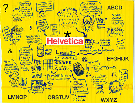
This brilliant mindmap by Austin Kleon illustrates the important aspects of typography.
“Don’t worry about people stealing your ideas, worry about the day they stop.”Jeffrey Zeldman
Sketch Ideas
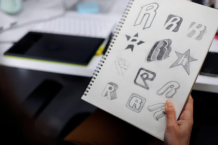
When having ideas, I want to get that idea down as quickly as possible not wasting any time and there is no particular way that I go about sketching ideas as a come to me, they get written immediately. Keep a pen and pad handy because everywhere that you go superb ideas to strike at any moment.
After doing a few iterations or ideations you can also use grid graph paper as it helps to keep a sense of order, proportion, and balance without always having to draw grid lines. It helps your lines remain consistent so you can make angles in curves that are accurate because you’re using a template to work with. Don’t get bogged down in too much in the sketch’s perfection, these are just rough thumbnails you can easily jot to get the idea down.
If you want to go further and refine the sketch, for example, an illustrative purpose and by all means keep going until you find the idea that you’re looking for or the ideas clear enough that thinking goes to the next step scanning it into a digital form. Keep in mind there is no one way of doing sketches. Plenty of designers have original ways of approaching their own conceptual phase so do what’s best and what works for you.
Get Feedback
If time allows, find a community group on Facebook or Instagram to get experienced feedback on your ideas. I would even find people who are the target audience for the market you’re trying to reach and asking the people in that group how they resonate with the idea.
Of course, you want to make this clear to the admin of a Facebook group to let him know you want to test if an idea is sound. Design is subjective so going to the right audience rather than a group of designers may give you feedback to the people who the brand may directly impact.
While collecting feedback from a group of people get a general idea of how it resonates with an audience and whether it will work for that industry. Ask is the logo seems familiar to maybe another business or how they interpret the logo and how it makes them feel?
You also may want to view at your local from fresh angles to make sure there aren’t any hidden meanings or images that you didn’t intend. Flip them, turn them upside down, reverse the colors.
Remember to scale the concept of original sizes if you can to see if they will work or not. Always take this as feedback and not as the gospel truth, trust your gut along with the feedback to make the best call.
5.) Types of Logos
Now that you’re finished doing sketches and you feel you have an idea or several ideas, it’s time to pinpoint a direction to go among the concepts you have. There are multiple things to take into consideration for your logos like typography, shapes, colors, geometry, symbols, and alignment.
By breaking things up into chunks it’ll help you fine-tune the logo into a memorable mark and make a solution sequentially, which will keep you from being overwhelmed trying to do everything at the same time.
Before picking the thumbnail that may seem a good direction to go in, you want to make sure that the overall direction will be the best way to go and at least initially. It is no perfect type of logo for every industry, even though there are trends. So, use your best judgment and pick what will be best for the brand you’re working with.
Classic Brand Mark
Falling into logo trends can seem easy and exciting. But over time they will look stuck or even dated. By going with the tried and true, a simple and timeless logo will last through the ages.
This approach will speak to your audience and much more likely for them to take you seriously because you’re not using any fancy typographic tricks or ambiguous color schemes. A classic position communicates that you’re serious and have a sense of integrity.
Vintage
At Little five points in Atlanta, Georgia is where you can find the hipster scene and come along with its vintage design that complements the stores including the culture. Vintage designs immediately hit you with a feeling of life’s past. A vintage logo will tell you the history of the business and how it’s rooted in the audience it serves. Black colors with worn textured feelings, brown burlap bags showing signs of age, and Victorian or woodcut typography are stars of the stage that looks like blocks pulled fresh off a screen print.
Modern
A minimalistic approach is a style commonly used by modern-day brands to show that sense of sophistication through simplicity. These often use very geometric shapes, often have a lot of white space or abstract symbols that would cause you to dive deeper into the culture of the brand to understand its true meaning. A modern logo will communicate that your brand is with the times and it takes into consideration elements of timelessness.
Whimsical
These fun brands give the impression of being childlike and approachable. They are colorful, bubbly, imaginative, or have fun sensory fonts. Playful in all his aesthetics sometimes paired with a whimsical typeface and storytelling using an illustration design approach, these logo designs will give you fun flexibility to explore further interactions through personality.
Hand Lettering
The handmade concept has an authentic style all on its own. It says “humans make this for humans.” When using hand made lettering and pairing it with a serif or sanserif typeface helps to create a cohesive balance. If you’re going to use a supported visual element, then making sure the texture of the image is similar to the texture of the script. When you pair a hand lettering the hand-drawn illustration reinforces the messaging of the brand. If you going to combine it with a visual element that looks whimsical, it could make the design look humanistic yet delicate.
Monograms
Having a single letter logo is something bigger brands often use, especially in a corporate setting for business appearance. A lot of corporate businesses go with just using initials because the name might either be too difficult to remember or they need to fit the logo in a tight space. Monograms are great for cleverly expressing its name, but it will take plenty of marketing dollars to reinforce the product or service of the company.
Logotypes
Logotypes are a comprehensive way of using the name of the business expressing it in type as an image by the minute shapes of the letterforms. Think of companies like Coca-Cola, Google, or Disney, to name a few where typography is the center of focus. If you think it is the best way to go because of the unique name of your business you might find unique ways to express it in a way that resonates with the values of your company.
Pictorial mark
Typically, when people talk about a logo they are referring to a symbol also known as a pictorial mark. Because these marks are so iconic and their elements are so easy for people to remember is what all businesses are trying to achieve their logo. The range in which you can create a pictorial mark won’t limit you to one style or another. You can pick something that’s trending in the market and leverage that to have your unique style but be careful not to go too far. Overall you want to create something that truly represents your brand and choosing the elements that best reflect its history, culture, industry, or values.
Abstract logomark
“Zig when other people zag” as brand specialist Marty Neumeier put it, can cause you to stand out among the mundane and boring commonly overused safe design concepts. Put your mark in a position for interpretation in something fresh and innovative. If you pick something that abstract will put your logo in the league all of its own. Companies like Nickelodeon explore with their abstract mark in a playful execution with all the subsidiaries underneath the brand. If you want to know how abstract shapes influence how people perceive messages, search into how shapes influence people’s perceptions would be an excellent start.
Mascots
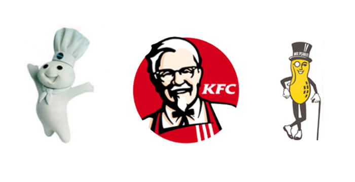
Mascots are a brilliant way to invite excitement into your brand’s personality. The flexibility and character (pun intended) that they allow give your brand a range of personality in a fun and playful cartoon characters for your brand or business. Mostly used for sports teams or children cereal, or even a more serious approach like Geico gecko, you could see the possibilities become endless.
Emblem
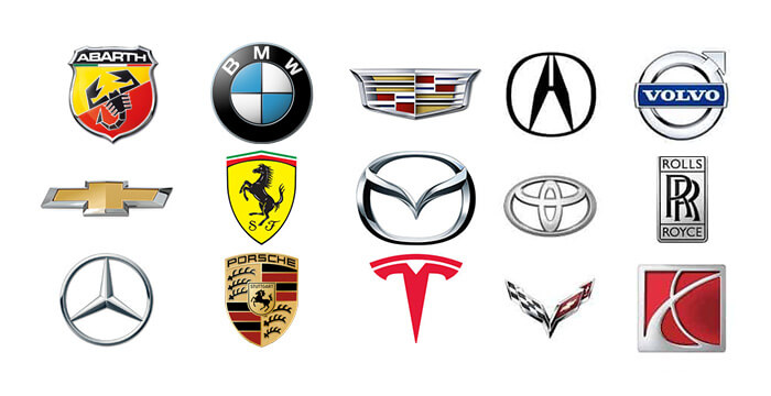
An emblem mark or crest will often combine both a pictorial image and the type that surrounds or envelopes by particular shape. These also come in badges, shields, or icons. Often there are certain levels of heraldry that play in a range of history involving history with these types of designs.
Using Combinations
A combination mark is using both typographic elements with a visual mark that is usually together with the symbol integrating itself with the word. This allows the symbol to stand on its own without the type, thus making a mark that could stand all on its own.
6.) Graphic symbolism
From the dawn of time, graphic symbols are the earliest forms of communication we’ve used. Old cave drawings and using those forms as a visual sign makes it easy for immediate interpretation of what’s being said.
This visual language allows us to deliver information about a culture or history at a glance that has become a permanent part of our civilization. This visual form of treatment also translates to design in business.
People will interpret your business by the recognition of what you consistently say in your messaging and by who you are through your values and broadcast.
By understanding your brand, audience, values, and services it is easier to make choices among the composition, typography, shapes, and colors. So having an effective creative brief and asking the right questions will be paramount to making the right decisions.
If you imagine a green checkmark, you immediately relate that to having permission or accessibility, on the contrary, looking at a red X would immediately give you the impression of restriction. And no matter what language it’s in, its intended understanding is clear.
So when you choose the right symbol for the business, you can quickly deliver what that brand is about if that’s the primary aim.
Consumers will relate your logo and your brand to the experience that they have an association after multiple slight impressions or a single engaging one. But don’t confuse communication with experience, your logo is not your brand, it’s the representative of the brand experience.
Show the ideas you want to have about your company by using the right symbol, whether it be concrete or abstract.
Symbol Meanings
Symbols have integrated themselves into everyday parts of our lives. They’re on-street signs, aisle directories of grocery stores, food packaging labels, and many other products.
Do you need ideas on what symbols to use for your business? Below is a list of the most common symbols and what they mean in the U.S.:
Heart — This represents love, health, compassion, healing, romance, enthusiasm, vitality.
Dove — Peace, love, and calm.
Tree — Growth, nature, stability, good health, nature-oriented, and eternal life.
Owl — Wisdom, intelligence, learning, education, inside.
Dragon — Power, wisdom, strength, and mysticism.
Butterfly — Rebirth, beauty, and transformation.
Arrows — Direction, moving-forward, force, speed, progress, and decisiveness
Circle — Encompassing, nurturing, completeness, wholeness, continuation, fun, infinity, cycles, self-actualization.
Square — Stability, security, directness, tradition, order, structure
Triangle — Balance, stability, transformative, women’s health, illumination, focus, balance, innovation, harmony.
People — Humanity, teamwork, empathy, collaboration.
Plant — Growth, change, positivity, nature, and value.
Light bulb — Brainstorming, creativity, ideas, intelligence.
Clouds — Weather, climate, cloud technology.
Water — Purity, life, cleanliness, creation, health, cleansing.
Sun — Energy, power, life, glory, newness, warmth, power, endurance, stamina.
Moon — Time, enlightenment, peacefulness, feminine eternity, time.
Fire — Anger, passion, destruction, rebirth, energy, speed, brightness, passion.
Transferring to the Screen
After you sketch the key ideas and then gone back to further refine them, you may want to go back and add the details that you need depending on the level of detail for the logo design. If you’re skilled in illustrating then take the time to make something that’s appropriate for the project at hand, only you can determine it to be enough.
If you’re comfortable using a graphic tablet or even your mouse you can go back and further refine your sketches using whatever program you’re comfortable with before transferring it into a vector file. I typically use pen and paper so I don’t get too detailed unless I’m using that final sketch as per the framework for the logo.
I always use the initial linework before going into the computer to get all the details down, while other designers will just use software to draw like Adobe Photoshop or illustrator. You don’t have to worry about coloring the men just yet or using any shading methods. What’s important is that you the linework down—so just focus on the form.
You want to make sure that your sketch is going to be as close as you can get it to how you want the final form to look before scanning in. A good resolution to scan your images would be between 250 to 300 dpi. And then you can save it in a file structuring folder as a JPEG or file.
If your sketches have been done using grid paper, you might not want those imported with the sketch. You can make an adjustment to Levels in Photoshop to remove those unwanted artifact lines.
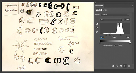
Using the levels panel in Adobe Photoshop. You can adjust the contrast in your sketches for better contrast and remove underlying paper gridlines.
You’ll always want to use a vector program such as Adobe Illustrator, Affinity Designer, or any alternative free logo design resources. I personally use Adobe Illustrator because of the ecosystem of the entire creative suite and it’s been the industry standard for years now.
7.) Working with shapes and forms
Every logo you see is either directly or indirectly centered around a shape. And you’d be wise to take into consideration what shape your logo for your business will take. Shapes have associations that come with them on a subconscious level. There are primarily three shapes that can be reduced down into categories—symbolic, organic, and geometric.
Geometric
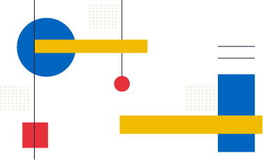
Geometric shapes are in their purest form made simple, typically made for different types of cultures. Because of the consistency that’s been used over time as a visual language, most cultures will use this time and time again.
Because of the impact, these images have you wanting to make sure you use them appropriately. The meaning that the symbols have given you leverage to communicate with clarity.
Explore in black and white
Start to work through logos in black and white will help you keep focused on the form of the design and not get bogged down in unnecessary details at this stage. You’ll also build a collection in different variations while noticing issues a lot easier. There are other aesthetic design decisions you can make later in the process that you won’t be distracted by at this stage.
It’s here where you want to explore the proportions and weights of the rendering and make any alterations to the style. Now is where you want to have fun and experiment. If you want to add any elements to be much easier to do it now than it will be down the road when you’ve added things like type and color.
Organic Shapes
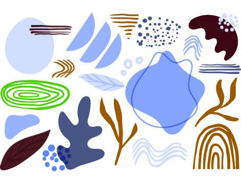
The impressive thing about using our organic shape is that is completely up for interpretation. There are an infinite amount of organic shapes that can be used, particularly outlines, so you have a whole world to explore. The only challenge here then it’s picking an organic shape that the audience will recognize like a maple leaf, for example, may need to be altered in a way so it’s clear to understand.
Other organic shapes may include trees, rocks, ripples, grass, leaves, waves, and many others. Nature can classify pretty much anything that nature has available, including insects.
If you plan on using organic shapes as your logo design for your business, there are some things to consider:
- Their shapes in nature that have a natural soothing effect like the flow of water, the wind against blades of grass, or the rustle of leaves in the fall. It uses many of these earthy sensations within the holistic community and alternative medicine.
- Shapes with sharp angles immediately give the feeling of danger or impulse but people to view them alternatively smoother curves may make people feel more at ease and comfortable.
How lines affect us
Using curved lines creates a more dynamic approach and gives a sense of motion or energy. The flexibleness craft lines show their ability to adapt and respond.
So, if you want to betray adaptability or reactivity, the gracefulness of curved lines would make a great fit. Using a soft curve will have a calming effect not just in the logo design but in any associated brand elements. Curved lines also express energy and aliveness.
Horizontal, vertical, and diagonal lines
Where you use your lines in your design do impact the perception and associations that are made with your brand.
Horizontal lines express stability and calm. They create a natural base and look to support other surrounding elements in an area of safety. They can also communicate the width of an object, but they also can be visually mute because they don’t contain as much energy compared to the other types of lines.
Vertical lines seem to rise into the sky as if being launched. The line guiding upward and in a religious context to heaven with the visual interest of ascension. As mentioned earlier, having thicker lines half stability so when paired with verticality can make your logo more trusting and not as fragile.
Diagonal lines, although they have the flexibility to pair with vertical or horizontal lines, they’re also the most unstable in their expression. The angle of the line plays the part of how much energy is associated with the elements. So the higher the endpoint of a line to the base diagonal, the more energy it’s perceived to have.
Diagonal lines with a lower angle we’ll seem much more calm casual and using less energy. When paired with other visual elements you can create a sense of dynamic energy without taking attention from a logomark or logotype when used.
Smooth, jagged, and irregular lines
Jagged lines are constantly changing direction it can appear jarring to look at creating points of tension. The irregular movements can mean danger, frustration, drama, or confusion. Because they change direction so quickly, the dynamic approach can also be interpreted and playful as a mosaic.
Irregular lines have a more natural hand-drawn approach to them. They appear natural and not forced in the thickness of them can vary depending on where the interests lie under the visual form. Particularly within a serif typeface that has the characteristics. Depending on how the lines are drawn, they can deliver entirely different messages they’re also very expressive in the individuality of the lines it’s completely up to the hands that make it.
In your logo design be sure to select a style whether it be smooth, rigid, or jagged that best fits the needs of the client brand that best portrays that message and visual language.
Using the golden ratio
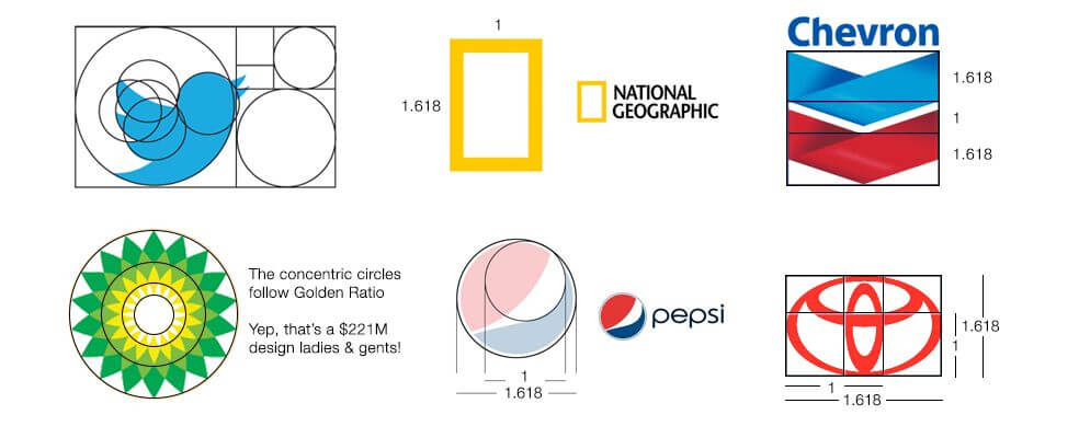
Using the golden ratio is a mathematical equation known as the Fibonacci Sequence where the numbers duplicate in sequence from the previous set ie. 0, 1, 1, 2, 3, 5, 8, 13, 21, 34, 55, 89, 144, 233, 377, 610, 987…. You can use this method in your designs to help you make design decisions that balance out the aesthetics of your design. It boils down to understanding the difference between the shapes in its alignment and seeing those relationships. The more you practice as a designer the more you’ll be able to see the world differently.
But don’t get caught up in using this as a hard and fast rule, it’s more of a guideline to leverage. So how can you use the golden ratio in your designs? Use parts of the golden ratio to smooth out or create pre-measured portions that are naturally pleasing to the eye.
Make sure not to use more than one golden ratio in your design and also focus on a single section of the golden ratio to used to create balance on specific elements of your logo. To get a grasp on the golden ratios to look at major design firms such as Pentagram to get a handle of how they’ve used it.
 If you need a tool to help you to use the golden ratio, I’ve created a free vector template that you can download to use in your next design.
8.) Typography
The first typeface you choose may not be the best one initially and that’s okay. You want to explore as many typefaces as possible to get an overall sense of outlooks and options to present to the client.
There are a few reasons you would want to choose the right typeface:
- The range of the typeface and its corresponding font family.
- The look of a logo mark in the overall style.
- You’re making logotype and that will be the primary visual representation.
- The brand message and the way the type needs to communicate through its details.
Choosing the right style
While selecting the right typeface, remember to keep in mind the style that’s most relatable to the audience you’re targeting. From bold to italics or lightweight or extended, you want to have a range of fonts to work with.
But let’s say you choose a primary font choice, always think of a secondary typeface that will support the primary one. You want to make sure it is distinctive enough for legibility yet similar enough to complement any primary type used. And last but not least, making sure the type style is going to be in alignment with the market expectations to position a layer of trust.
Take a glance at the market you are involved in to see if any distinct characteristics pair well with your font library. Remember that typography isn’t just about legibility it also has characters in it that act like a personality, so find what’s unique about the mark and leverage that in your selection. Is it square? Round? Oblique? Triangular? Or is it more oval? These are just some cues to get your brain looking for the details.
Classes of Typefaces
To pick a complementing typeface can be a chore for some, so simplify the process I’ve outlined a few major categories of type to get you started.
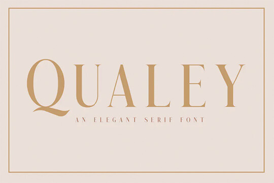
Serif typeface
A serif typeface looks stable and stands the test of time. They’re identifiable by the little marks at the end of the characters known as “serifs.” This category of type choice has more of an elegant and refined approach. These are especially great when printed in the contrast between thick and thin strokes gives it a range of utility.
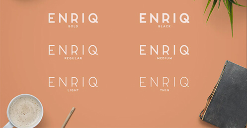
Sans serif typeface
This typeface, meaning “without Serifs,” is much more popular within the modern scene and also tended to feel clean. Unlike serif typefaces, these are very simple and straightforward and work well with added effects when used sparingly. To go with a more modern or seem to be “up with the times”, this would be the direction to go in without looking dated.
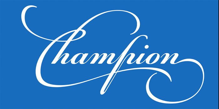
Script typeface
Script fonts are reflective of hand-drawn lettering that use connect letterforms called swashes often look like it’s made by hand or by the stroke of a pen. I often use these during the holiday season, particularly Christmas or for formal events such as weddings. These can also be great for businesses that want to have that touch of posh.
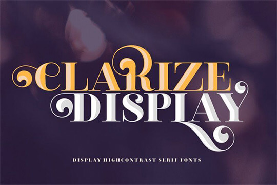
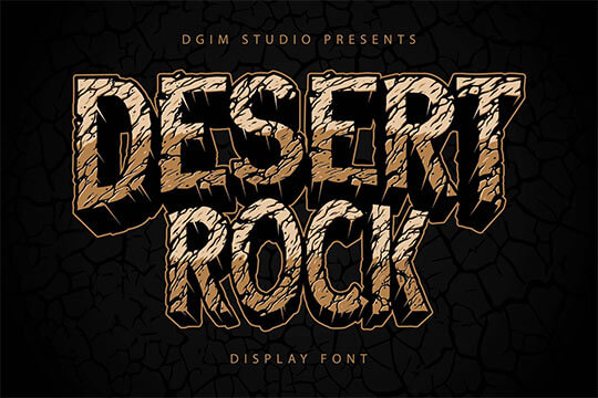
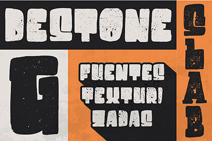
Display font
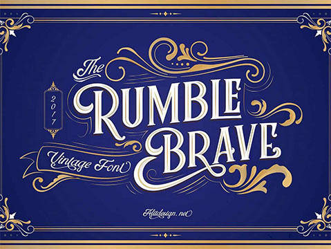
Display fonts are those that you use the tip of the Trinity and hip more often they’re not going to be the core asset of legibility. These are fonts that are more often downloaded for free from the internet and are used as an image, pattern, or visual design element.
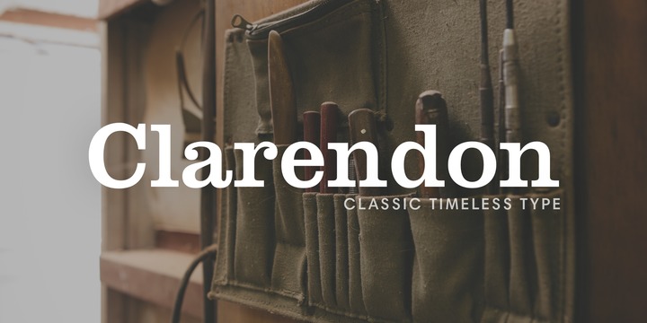
Slab Serif, Egyptian
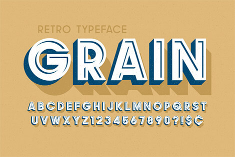
The slab serif is similar to a serif typeface the only distinction is that the little notches at the end of the character are much thicker in weight and usually made up of 90° angles. This is often reminiscent of woodcut type and can give your logo a Western or industrial interpretation.
Typography is going to be one of your cornerstone approaches when making a logo so don’t just rely on the image or shape. Use type to your advantage to show your skill and critical thinking to communicate the essence of a business through the logo design. Not only is relying solely on a pictorial mark less direct but its more expensive because of the brand recognition that marketing dollars are going to need to push behind it over a sustained period of time.
“Typography is two-dimensional architecture, based on experience and imagination, and guided by rules and readability.”Hermann Zapf
Typeface Pairing
Keep in mind that you want to choose two typefaces maximum and make sure they complement each other fairly well. Also, okay to use a single typeface, but as I said earlier, make sure you have enough fonts (options within that typeface) to choose from.
A good way to have contrast your type with a single typeface is to skip weights. For example, if you’re using regular you can go down to light; or if you using a thin weight, you can jump up two sizes too bold. You can also skip point sizes from let’s say 12 pt. to 14 pt. etc.
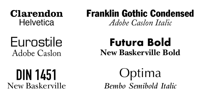
The pairing of these typefaces is chosen based on the contrast of form. They are distinctive enough to be noticeable but similar enough to have harmony in their form.
9.) Color
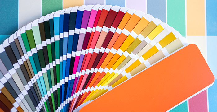
Colors have a whole range of associated meanings. And there’s a whole psychology behind the use of colors and how they affect our purchasing decisions. Marketers have gotten it down to a science and they use this to help influence our purchasing decisions for the products that we buy. If you want to learn more about the color theory, you could check out the blog post the psychology of color in marketing and branding, or if you want to listen there an audio podcast version as well.
Here’s an abridged version of the breakdowns of colors and their meanings:
![]() Red
Red
Red is a highly used color in branding that stokes emotions. It increases the appetite and typically has a symbolization of passion, love, and intensity.
![]() Yellow
Yellow
With Yellow this color it’s best to stimulate mental processes it represents optimism, youthfulness, and clarity. It is a color that’s marketed often to infants believing that it stimulates their awareness.
![]() Blue
Blue
Businesses that use blue seem to be calmer and more peaceful. And it’s often used in financial areas of banking particularly a nave or deep blue. Lighter shades of blue are seen as more youthful to boys so that’s something to keep in mind when you’re using a lighter tone of the color blue. If you want your logo to see more reliable than using blue would be the way to go, it’s also the most trusted color in a business setting.
![]() Orange
Orange
In marketing orange signifies creativity or it can influence impulse buyers. Orange also has a level of excitement to it associated with something new such as the rising sun.
![]() Green
Green
Green is often associated with wealth and money but also has a symbol of being eco-friendly typically associated with greenery in nature. Green also has a very relaxed eco-friendly often used on health fueled packaging designs.
![]() Purple
Purple
This color is one that’s highly regarded in being a color of royal descent. The brands that use this will be perceived as being regal more so than any other association.
![]() Black
Black
Black is typically bold it’s powerful it’s classic and has been of much more of an elegant and extremely luxury element with confidence and a bit of sophistication. But on the other spectrum can symbolize death or formality.
![]() White
White
White is also an achromatic color that denotes cleanliness and maturity, it is a color of clarity and freshness. White is also a color seen as a luxury for companies like Rolls-Royce in the brand that it projects.
Color Combinations
You have the option of sticking with one color, two colors, or a multicolor logo, but be careful that the colors you choose are harmonious because it will cheapen the brand’s experience if there is no balance. Keep in mind the color that you choose to be reflective of the brand values and aim to connect it with those associations.
The notes that you collected in the creative brief about the color choices that the client likes or the client disliked (you did get that information didn’t you) is what you want to keep as a reference. You also want to keep in mind the competition and make sure that you’re not using the same colors as a competitor that’s dominant in that space.
Use the color wheel will simplify the process to make it easier to choose the compliments but will go over them just in case. An important note, make sure to test your logo on a black background in white and on a white background and black to make sure that no fine lines get lost as you scale down the logo.
Complementary
Complementary colors position themselves directly across which other on the color wheel. There’s often a personal preference on the number of colors that should be used in the logo, especially when it involved printing the design out.
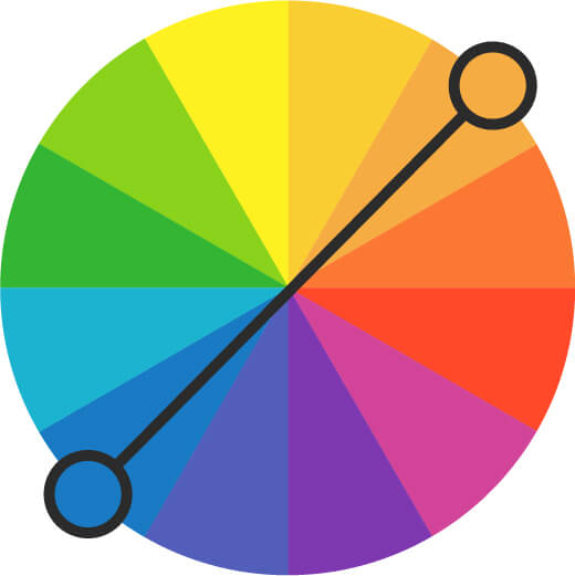
However, you’ll still want to keep in mind that the more color that you use your design, the more expensive the print is going to get. The colors that are directly opposed to each other, the color will have the highest level of contrast. Therefore, creating a sense of harmonious relationships and reflect the best qualities of each other.
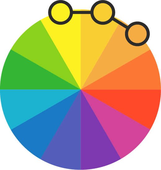
Analogous color
Colors that are directly next to each other are known as an analogous color scheme. The harmony of this color palette because they are adjacent to one another slightly reduces the contrast.
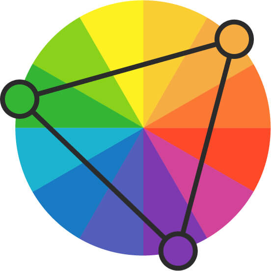
Triadic color
A triadic color scheme uses colors from three distinct points in a triangular shape on the color wheel. When it comes to using this color system in your business, your logo will have an added effect of being dynamic.
Resources for Selecting Color
Select the right color for your logo design is a strategy all in-itself. So help the process you can use outside tools and resources to make the process easier. Here are a few recommendations that could use in your process:
- Adobe Color (https://color.adobe.com/explore) Allows you to create your custom palette or use pre-created ones for your designs.
- Coolors (https://coolors.co/) A color palette generator that creates options based on a randomized but calibrated system for balance. You can also upload photos to match.
- Color Hunt (https://colorhunt.co/) A library of colors with trending, popular, and random options.
- Design Seeds (https://www.design-seeds.com/) Color combinations that are paired with images for a full range of creative ideas.
Pick the colors that you want to reflect the image you want your brand to reflect is much more important than the colors you choose. The target audience wants to feel as though the brand’s messaging is congruent with the associations they want to align with.
10.) Putting it all together
Make the gestalt, or overall collective communication of the design takes practice overtime to get a fingertip understanding of what changes or mood the design of your logo is communicating. Allow yourself to relax and patiently consider the underlying intention of your logo will help you understand the minor things that may need to be changed.
Composition
From the layout, iconography, shapes, typography, colors, give you all the building blocks you need to compose a great logo. Keep in mind that how you organized these elements and how you use them will have a great impact on the perception customers will have on the business you’re designing for.
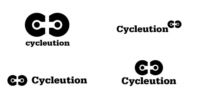 There are some things you want to take it to account for when creating a memorable logomark:
- Using scale what signifies areas of importance, what we should focus on within the logo. So be mindful of what emphasis you are putting on your elements.
- When you’re putting elements together in your composition, grouping items together means that we relate them like a tribe.
- If you separate items by having spaced out more, this is much more of a friendly approach so if that’s the message you intend on sending then this may be valuable.
- Plenty of white space around your design gives a calming effect by using the negative space to communicate cleanliness and sophistication.
- The more symmetrical your elements, the more your logo will seem much more orderly.
If you want to know more about using space in your designs, read the article Separating Space.
Single out the right solution
So, you’ve spent time valuing logos looking at typography, selecting the right colors, making sure its hierarchy communicates the right way, and now you have to select the right logos to show the client.
What are some qualities of a great logo?
A great logo is simple, ubiquitous, and timeless, and it also properly conveys the brand message. A great logo is consistent, and its form appropriately communicates hints of the brand identity. A great logo will read well in small sizes as an app icon or can be reinterpreted as a website favicon.
A great logo:
- Is timeless
- Is adaptable at small sizes
- Is distinctive and unique
- It’s easy to remember
- Appropriately reflects the values of the brand
Out of all the logos that you’ve made and options are available, how do you know which ones to show? Below are some questions that will help guide you and selecting the right one(s).
- Does it align with your target audience?
- Can you immediately tell me what it is?
- Will your ideal customers immediately know what your business does?
- Is it simple and easy to remember?
- Can a 5-year-old explain it to you? Can an 80-year-old explain it to you?
- Will you have to redesign it in a couple of years?
- Is it flexible enough to apply two different applications without losing communication?
- Does it stand out from the competition?
“A great logo is not about what one likes or dislikes. It’s not about you. It’s about what works. And what we want to determine is: What problem is our client trying to solve.”Sagi Haviv, Chermayeff & Geismar & Haviv
You want to make sure you manage what’s being communicated in your logo according to the market. So if you’re selling candy you going to need a fun and playful logo that can be printed on plastic wrappers and box packaging compared to a bottle of whiskey that may have an intricate label, or video game startup company that sends notifications to a smartphone.
Remembering to examine all the potential applications that the logo will inhabit, may give you indications of the best choice to make for the business. A common pitfall to avoid is selecting a logo based on what you like instead of choosing the needs of the audience and the values of the business or product solution.
What are some things you should avoid in a logo?
Keep in mind there are some things that you should completely avoid when designing a logo. These are a few things learned over the years of what to avoid:
- Stay away from trends. Trends are catchy and easily recognizable because they’re everywhere, but a trend also means you don’t want to make a logo you look outdated a year from now.
- K.I.S.S. Keep it simple & stupid. Don’t go overboard when designing your logo and having a bunch of unnecessary elements because you have a bunch of things you wanted to say.
- “Think outside the box?” First, you must understand the “box” before you think outside it. Don’t be generic in your approach, therefore, understanding the market, the competition, the problem the client is really trying to solve, especially if you’re running a local business, is a vital step in the early stages. I cannot stress this enough!
11.) Presenting the logo
Select the right mockups
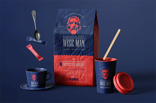
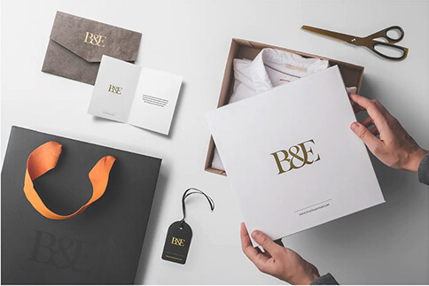
Mock-ups are a powerful tool when helping to sell your ideas. They help to communicate your ideas in the ways that would be presented in the real world making them easier to relate to. But make sure you select the right templates when using mock-ups.
Here’s a guide to help you make the right choices for the right purposes.
Presentation mock-ups:
- It’s better to use straight shot photography for your mock-ups.
- Have the information on a business card, for example, head-on instead of at an angle.
- Looking at an iPhone icon close up.
- Contextualize images is how the customer of the client will probably see them or interact with them.
If you looking for places to find mock-ups, there are plenty of resources online.
Here are the ones I most recommend:
- Envato Elements (https://elements.envato.com/) A collection of images, stock video, typography, templates, animated design elements, and WordPress themes for one low monthly price.
- Yellow Images (https://yellowimages.com/) Professional 3D mockups and templates with the option to have a design created from their subscriber program.
- Free Pick (https://www.freepik.com/) Affordable stock photograph, mockups, Photoshop documents, and icons. There are plenty of options to choose from that are free with attribution.
- Adobe Stock (https://stock.adobe.com/) Adobe is currently the design standard when it comes to industry creative tools. They also have a stock library that you can access from some applications directly.
- Live Surface (https://www.livesurface.com/) This Adobe Illustrator plugin allows you to do mockups without ever needing to leave the platform. No more relying on hopping back into Photoshop.
Present like a pro
Designs don’t sell themselves, so just because you created something great doesn’t mean it’s going to be able to speak on its behalf. Sell your idea to the client it’s just like using any other skill but it doesn’t have to be daunting.
Thinking if you just showed the design to the client that doesn’t instantly get it, you make the risk of a design by committee happening. You want to take control of the presentation, tactfully of course, and clearly show how what you’ve thought through and how these decisions will help the business achieve its goals.
Present in-person/video call
I found that presenting ideas in person always gives me the best Leverage because I can address issues upfront and immediately. Use tools like Skype, Google Hangouts, Facebook, or Zoom.
The key idea to remember is people remember things in threes. Also, the order in which you share ideas matters by telling the right story in the right sequence. Let’s say you’re presenting three ideas to the client— which seems to be the most common approach among logo designers and in advertising. People tend to remember the first idea rather simply, followed by the last idea, then the second idea; anything coming after that sequence will follow in a natural order.
So, when you’re presenting your ideas the best concept first, the second-best at the very end, then the third-best idea in the middle. This structure will give you the best leverage, the sharing of the strongest idea, and getting it accepted.
I typically present three ideas but the more ideas you show higher the chance that wind up turning into I designed by committee, also known as the Deathbed of your design. If you’ve created a smaller amount of sketches, anywhere between 25 or 30, in the brainstorming phase, it might even be better just to show two solutions instead of three.
“Don’t bunt. Aim out of the ballpark. Aim for the company of immortals.”David Ogilvy
Visually tell a story
People love a good story its documentation about how something or someone concluded. Gives you insight and you get to see it unfold in the magic behind the production. You can apply the same approach that directors do in movies to your logo presentation.
Don’t just show the client the final logo and then going to clever explanations to validate your choices — did he see the design in the Keynote. Go to the core of the idea, talk about the process, the research you did in the market, the understanding of the current brand positioning, the gap between where they are and where they want to be. This is the process of telling the story about the Brand, and the deliberate choices that are being made to fulfill the brand promise.
Label your choices
Does the scenario sound familiar? So, you’ve done a presentation. The client likes what they have seen, and they want to rest on it for a while before they decide. But oftentimes they come back with Ill-informed annotated changes or requests.
So you find yourself back at the computer again second-guessing about why you took on this project, to begin with. Taking their feedback with a spoon full of sugar you spend more time making changes, but then after a round of revisions, you find your self once again presenting with more resistance from the client. What gives?
A good way to reduce the chances of that happening is to make sure you create labels on the decisions you’ve made. That way when the client goes back over the presentation it’ll be easier for them to remember what you said with reasons you’ve already explained.
Dealing with client feedback
Sometimes even the best delivery of a solution gets pushed back from the client. You can keep trying further explorations of Concepts, are conduct additional research to back up your reasoning. But if you sincerely believe that you have done your due diligence, don’t fall into the trap of thinking delivering more ideas is the solution.
Except that some clients just won’t be happy no matter what you do — this is where having how many revisions in the agreement that they signed in writing comes in handy.
Be sure to ask the client questions and getting feedback. Design is subjective after all and the client may not understand the reason behind your choices based on design theory alone, making it simple may help you seal the deal.
Revisions
Client change requests are a normal occurrence during the design process but it also isn’t something that the client can do on a whim just because they hired you and think your time is dispensable. Take the reins and lead the client with solid advice but also listen because some of their insight may make the design approach better. In some cases, you may even want to create variations of a single idea to implement the designs suggested by the client so you can show that you have a working relationship, even if it’s just to explain how it doesn’t light up with the original intention of the campaign.
If there’s a standard you’re trying to get across to the client find examples of bigger or well-known brands in a collection to give credit that your decisions are based on evidence of what works. You may even want to do a side-by-side comparison showing the client’s design choice in an alternative direction that will have a better chance of success.
Alternatively, you can explore final revisions in the design after the client’s approval to see if you can make improvements on your own to an already accepted direction. Just make sure you keep the client in the loop there’s nothing worse than making changes to the design without keeping the client informed. That will make you seem unprofessional and potentially damage the trust you’ve spent time and labor building.
If a client falls head over heels with the initial design, congratulations! You now have the opportunity to see if any additional improvements or demonstrations of applications can be made. Remember that the aim is to make the client and the business look as great as possible.

Finally, always be professional
No matter how the scales may tip you must always professionally hold yourself in high esteem. You’re a designer, you aim to fix a business problem. You’re helping someone achieve a business goal, that’s what separates an artist from a designer.
Always keep the client’s goals at the forefront of every design decision and take responsibility for those decisions. Be honest, maintain clear communication, and be confident in your abilities.
Constantly evolve and grow developing your skills you’re not going to have it all figured out, you’ll never be done improving. Learn from others and strengthen good logo design process integration, testing, and refinement. The level of your process is a reflection of your commitment to professionalism and its consistency will grow as part of your reputation. So, go forth, take what you can from these ideas, and use your talents to add value to others.
You’ve got this!

