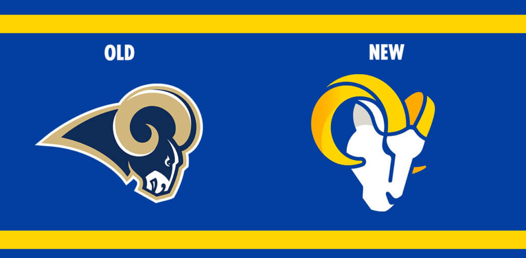
Los Angeles, likewise noted as “the city of Angels,” rolled out its new logo for the LA Rams on Monday. The creative process over the past four years was long overdue ever since the organization name moved from St. Louis to Los Angeles.
In a news release when the team’s perspective included in it, they answered: “the new look affirms the team’s commitment to respecting the past while respecting the future.”
The Logomark
A new logo lockup has two separate designs both emphasizing the iconic Ramshorn on the designs–a monogram that features the initials LA with the ram’s horn interlocking the two letters and a more geometric redesign of the Ram’s head iconic throughout the NFL.


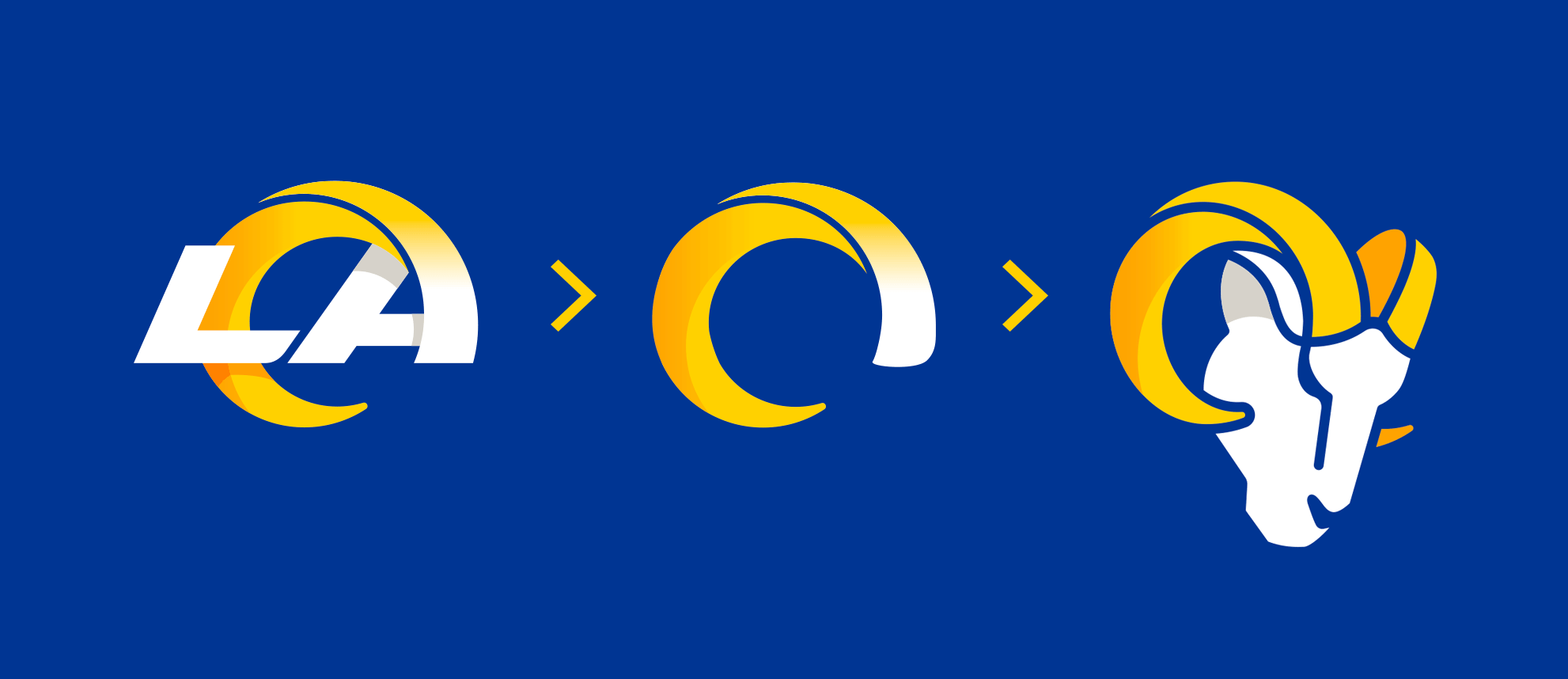
Similarly, a simple horn wraps itself around split into two parts unifying the initials L and A signifying its tie to the beloved city the gradient that follows suit to show the shift from the old into the new, rooted in the foundation heading in a new direction with the organization.
Its geometry leverages the Fibonacci sequence in construct, making it consistent with nature’s mathematical sequence in the horn’s curvature.

An accompanying wordmark a stack into three rows in the copy shows variety just like the changing heights of the city in its focus.

New Logo Colors
For new colors they’ve chosen to use are Rams Royal blue and Sol yellow.
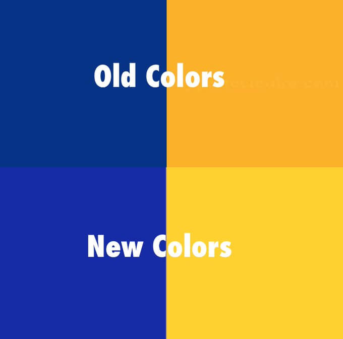
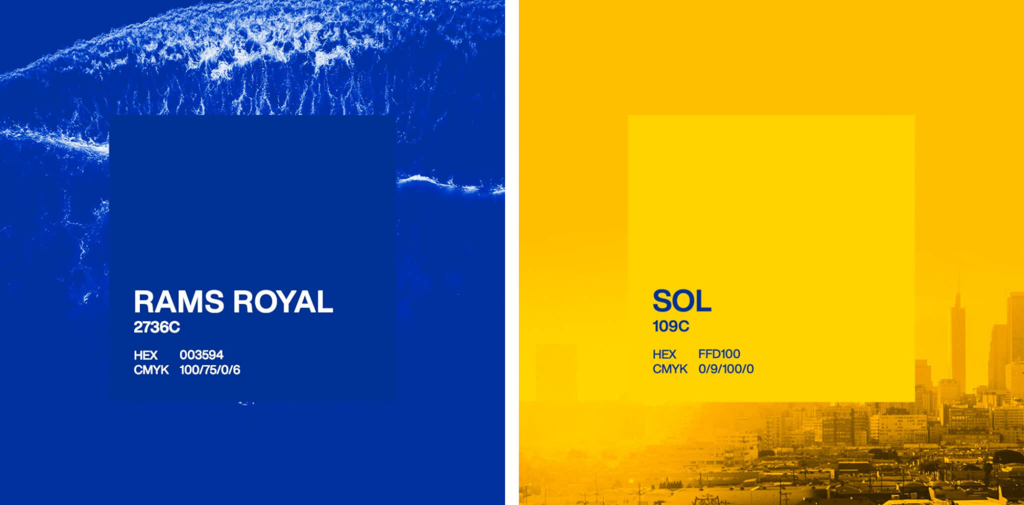
Contrary to prior versions of the original royal blue and gold from the past. New colors hues are also referred to as “Rams Royal” and “Sol.”
They named Rams Royal after the color that’s been persistent throughout the company’s presence, preserving the legacy and the celebration of the history of the team. Yellow is now a signature color “Sol” is the team’s fresh paints the sunshine of Southern California and illustrates this the essence or “soul” of the team.
The original Navy blue that is no-longer a part of the pallet, along with the gold and white that he used back in 2000 when the Rams was still a part of St. Louis.
What The Fans Think
Someone leaked the logo design a few weeks ago that turned out to be a custom-made hat was for the NFL draft. With the current state of how the Internet treats unverified leaks, it didn’t hold favor with the fans. Below are some photos of the thoughts:
They had planned an initial release date to showcase the logo on Saturday, reflecting the astrological sign of Aries, which leverages the symbol of the Ram.
But fans have taken it into their own hands to make their own variations of the logo, and some of them are quite impressive.
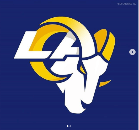
IG @nfl_meemez
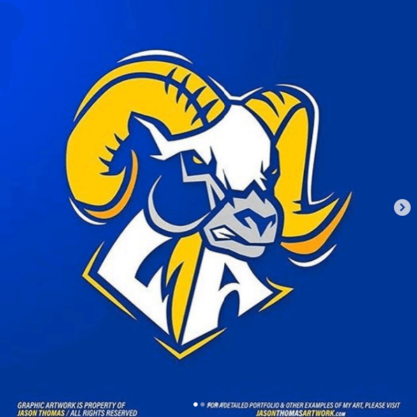
IG @foxdeportes
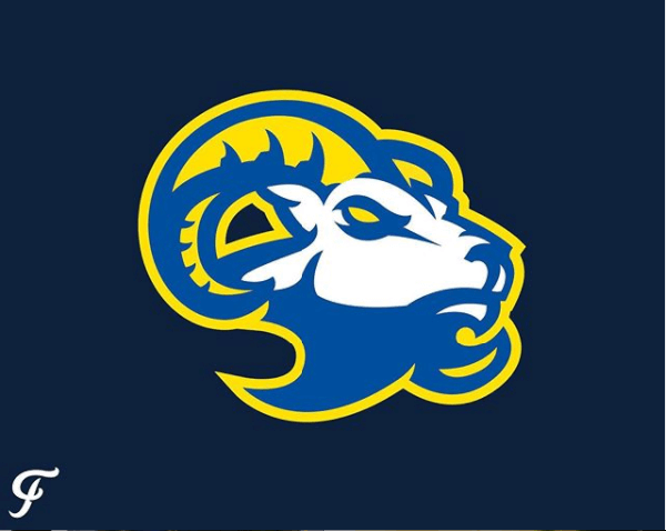
IG @foosersports
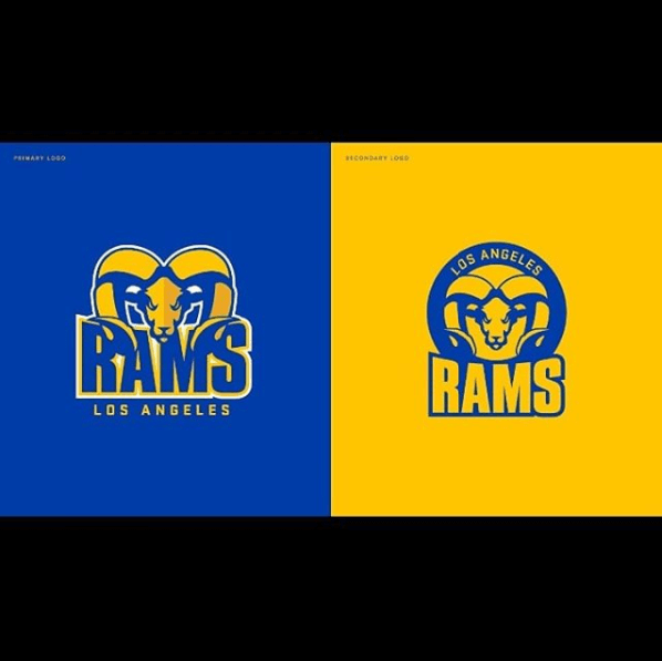
IG @kinglorenzob
What’s next with the logo rollout?
Next, we’ll finally see what display of the team’s memorabilia will be in uniforms and helmets which no set date is fixed.
Several alterations of the team’s uniform saw many changes since the 1950s, including blue and gold uniforms.
Traditionally los angeles rams wore most of the logo design in past uniforms of yellow pants and curling Ram’s horns on the helmet and sleeves. While the white jersey had Ram shaped horns in the famous royal blue color. But it’s no-longer decorated with numerals and the name of the player as accent jerseys cloaked in yellow sleeves.
Final Verdict
Overall, I like the new design is okay. I’m not a fan of sports so the only thing I’m going by is the aesthetic of the design. I still think the overuse of geometry was forced and not natural in this instance. The good? I’m excited about the new colors as they seem to contrast much more harmoniously with the prior version.
What do you think of the new design?
Leave your comments below.

