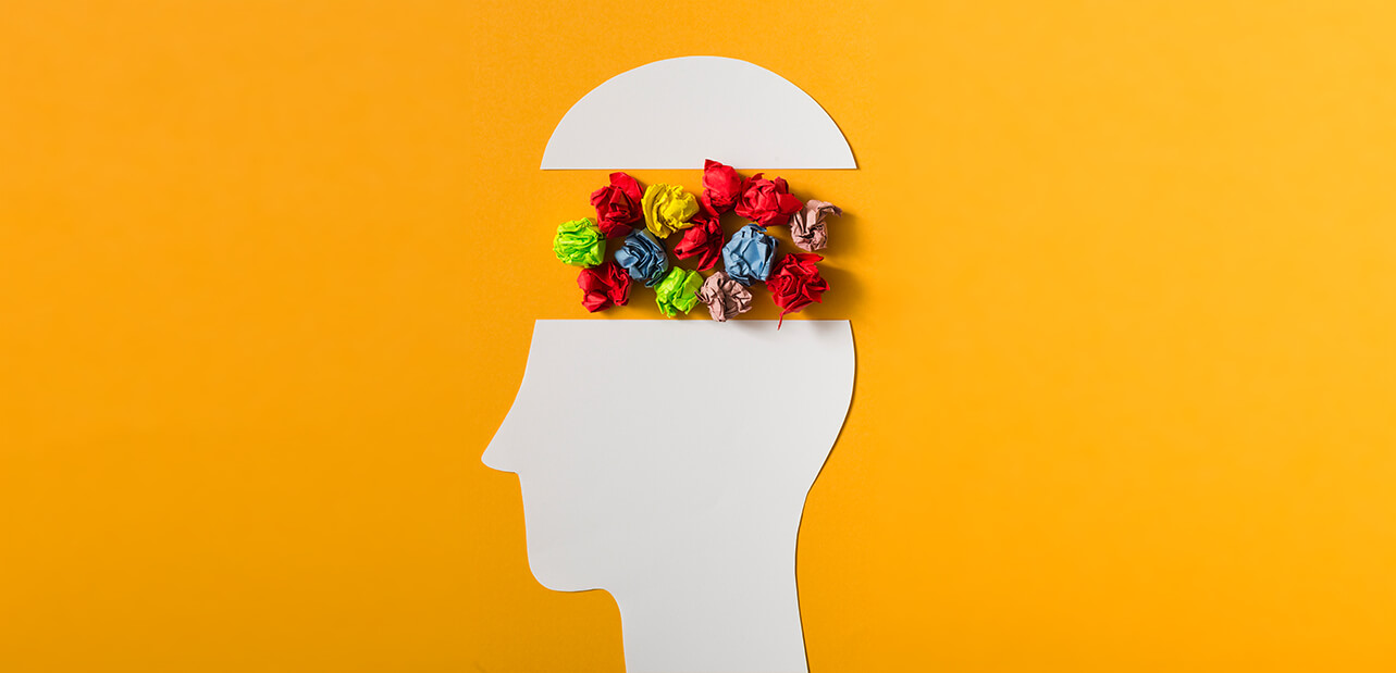
In The Psychology of Color in Marketing and Branding I will talk about the influence of color in our environment and the products we interact with, and all of the things that impact us daily.
When branding your organization, it’s key the appearance of your brand looks to be the ideal company, product, or service that the people you’re trying to reach are in alignment.
As much as 85% of shoppers place the use of color as their primary driver to buy a product or service as reported by KISSmetrics.
Other color sources such as Pantone have a color of the year prediction in the market, and they can determine the opinions of others.
You are constantly being bombarded and subconsciously by messages from all different brands.
But did you know the colors used in a brand marketing campaign’s visual design message have a subliminal effect on our unconscious?
And it completely talks to us in a specific code like way.
We react to these messages in a manner that makes us or helps influence us to make the purchasing decisions whether it be for food or fashion or hygiene.
In this post, we will talk about exactly how do these colors affect us and how to use them in your branding when you are building your brand identity or doing marketing for your business.
So let’s get started.
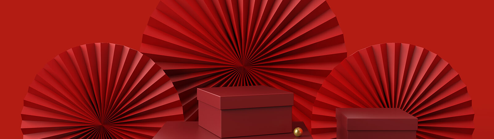 Red
Red
Red is a highly used color in branding because it influences intense emotions. It increases the appetite and typically has a symbolization of passion and love and the intensity.
Red also is a color of intense emotions and pulls these emotions out of people so of all the companies that use red or company such as Exxon, CNN, Coca-Cola, Version, Kellogg’s, and Nintendo.
Red often symbolizes, love, warmth, and passion.
The color of red lipstick, for example, that’s often used in the fashion and makeup industry, especially in attracting the opposite sex. The theory behind this is we humans as mammals relate this to the look of ripe fruit.
It’s the belief that the lips fill with blood, typically when there’s passion involved or when there’s a sincere desire of attraction. The lips then become more vibrant as they are being filled with blood. So, the association of attraction & desire becomes apparent.
That’s something that activates highly in the human brain and translates to marketing choices in the products we associate with these features because it’s so powerful.
Red is also a color that often most used during the holidays of Christmas and Valentine’s Day. This is one of the three primary colors in the spectrum, so that’s another reason what color gets used so often.
 Yellow
The Psychology of Color in Marketing and Branding Yellow is best used to stimulate mental processes.
Yellow represents optimism, youthfulness, and clarity. It is a color that’s marketed often to infants, believing that it stimulates
their awareness.
Even number two pencils have a yellowish-orange tend to them, the color yellow is very striking and powerful, especially when combined with black.
Aside from yellow being used in association with baby products, yellow is a color also used in alignment with many company value systems.
It influences positive, optimistic, and energetic attitudes by design.
Companies such as Best Buy and McDonald’s allow you to see those golden glowing signs.
Even from the highway at a distance, and that’s just how influential the color yellow can be.
When being used within an actual advertising campaign, it’s effective at being used to grab the attention of window shoppers passing by.
So, publicly facing business can use this tactic or if you want to get their attention, you can tactfully use yellow.
Yellow will have the power of presence beyond the overused choices of other brands.
If you’re looking to boost the communication, learning, and education yellow often has the impression of learning and growth in elementary institutions.
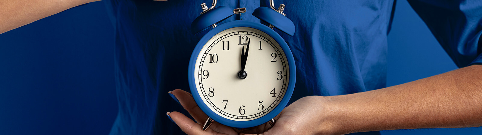 Blue
Blue
We usually associate the color blue with water. It turns out it’s the most preferred color by men and women. People are also 15% more likely to stay in your shop if it’s painted blue. Based on a study by the Journal of Business Research.
This means if you use blue paint inside of your shop, people are less likely to go through rushed because of the soothing and relaxed associations we have with this color.
Other brands that use blue in their messaging more often will be Walmart, Oreo, Hewlett Packard, Bank of America, and Dell. Even social media companies such as Twitter and Facebook use these as logo mark colors to create a sense of security and trust within their brands.
Colors that use blue seem to be calmer and more peaceful. And it’s often used in financial areas of banking a lot if you’re using a lighter tone of the color blue.
By shifting the color scheme the tent, tones, and shades will evoke different ideas or communication messages used within the brand altogether.
This is one way of leveraging a single-color choice into multiple advantages by slightly changing the color.
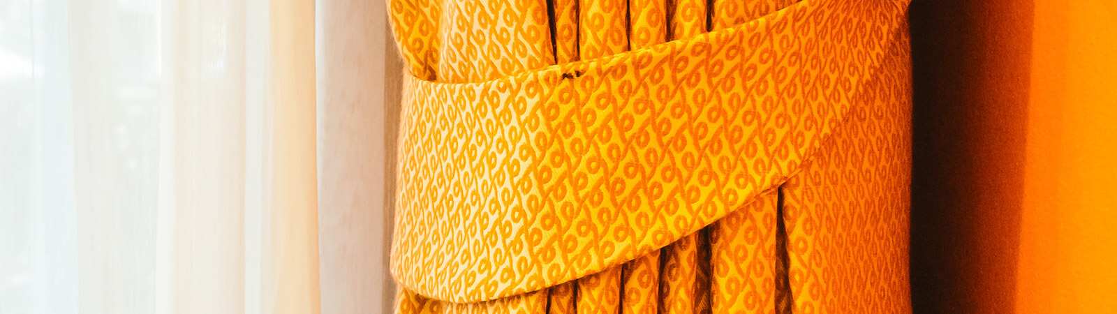 Orange
In marketing orange signifies creativity or it can influence impulse buyers in The Psychology of Color in Marketing and Branding.
I’m not entirely sure why that would influence them, but it is a color that’s proven to work and is then used to influence an impulse buy.
Within companies and shown to customers, it’s proven to also viewed as being cheerful, confident, and it can also be a powerful call-to-action in digital media.
Orange also usually assumed in marketing as fun or full of vitality. The perception of orange in branding gives the buyer the idea they are getting more in return than what they are paying for.
Some companies commonly branding with orange are Nickelodeon, Amazon, The Home Depot, and Harley-Davidson.
Firefox uses orange in its logo as a flame that circles a blue globe. Brands are using orange with additional colors in their scheme to make things more exciting and develop intoxicating engagement.
 Green
Green
Green associates with wealth and money used a lot with wealth or money, but also has a symbol of being eco-friendly.
If you want your company to appear and have the feeling of being evergreen, consider adapting this with yellow or having a forest green color as your primary.
Many organic food brands use green such as Green Giant because it makes it recognizable within the industry of health and wellness.
Now you know green will be the primary color of choice if you’re going for a clean, crisp environmental feel.
Green it also shows resources and capital and it’s also used in marketing creating awareness of prosperity making people feel abundant or, worse, envy.
Green has a very natural and nurturing nature type of emotion evoked within it and that in the 15th-century green was the preferred color by many.
Even among military ranks, green is used to make soldiers camouflage under certain conditions.
A deeper darker greens brands that ask you to use greens or John Deere, Whole Foods, Monster Energy Drink, BP, Starbucks, Tropicana, and Android Operating Systems.
Those are just a few, just a name that uses green because it’s half the sense of balance and harmony, health, and growth.
Even freshness like when you imagine a fresh fruit or something that’s growing it is green and very earthy and having those earth tones.
Negative associations to green range from sickness, boredom, or cheapness.
 Purple
This color is one that’s highly regarded in being a color of royal descent. We will perceive the brands that use this as being regal more so than any other association.
If you want to create a more contemplative mood, this color does the trick. Often influencing contemplation and causing your audience to become much more introspective.
Purple is one of the least liked colors in America but it’s one of the most common color used by luxury brand items.
Some brands and uses purple are FedEx, Sci-Fi, Yahoo, Taco Bell, and Hallmark.
Corporations like Monster and Hallmark leverage purple within their brand to create an ambiguous tone of not being too warm but not too cool or overbearing to their audience.
Purple has somewhat of a subtle strength that’s also used in many beauty products related to skincare.
Either way, you use it, history shows that the elite will gravitate towards this through the intention of tints and shades. Using varying shades (grey) of purple triggers, the feminine essence, while tints (black) make for a serious voice.
 Black “Color” in Branding
It’s often referred that black or white are real colors. They’re not colors, these are what art calls achromatic colors.
Black is the fullness of color or taking in all light. It’s the embodiment of all light and color around it.
Because it’s an achromatic color black can play multiple roles to create a variance with every other color in your brand communication.
Black is typically bold, powerful, classic, and has an elegant, exclusive, or luxury feel. Which also contributes to its sophistication.
That, unlike any of the other colors in its mystery about it, is well-suited to like Batman later dressed in all black or someone like Neo from the Matrix series.
The Psychology of Color in Marketing and Branding, if you want to be a brand who has the perception of being reserved in your communication intentions globally, this might be the color for you.
But be careful in using it on the walls of your storefront. It most definitely will seem sterile or institutionalized within your brick-and-mortar location.
However, within the cosmetic industry, it plays to the benefit of package designs for lipstick and brushes works well.
Brands that use black as their primary foundation are Chanel, Blackberry, Microsoft, Nike, and Adidas.
If you use too much black, at least in America, it can give off feelings of mourning or sinister feelings especially when paired with red.
 White “Color” in Branding
White is also an achromatic color that denotes cleanliness and maturity it is a color of clarity and freshness.
You’ll spark creativity if you use a blank canvas to create on and also represent having a sense of being at the fresh start of a new beginning.
Use clear area on a page or layout to create what’s called “white-space” in design and branding. It’s the tactical way of leveraging the emptiness to let other elements breathe and be the center of focus.
A shade of white can also interchange with silver instead that most automotive manufactures use in their logo mark.
If you’re wanting to highlight a change of price in your products, then using white and red will do the trick. The contrast between the two colors is so extreme that they are certain to catch the eyes of people scrolling on a webpage or passing by one of your advertisements.
Many webpages are using white to make their sites look clean and giving themselves leverage to add accents of another color as a way of optimizing the user interface design.
Tactfully using white can make your branding look modern and sleek when paired with black as a contrasting alternative.
Conclusion
Now you know how The Psychology of Color in Marketing and Branding affects also how they work when it comes to branding and marketing your business.
You know how to choose them for the message you want to get across in your marketing with the intent to steal the attention away from your customers.
And you’ll be more aware of how other businesses are using colors to communicate their hidden meaning all around you more than the average customer.
That is what we have for the psychology of color, or is there something you’ve learned? Is there anything that you found useful?
Let me know in the comments.
Share this Post