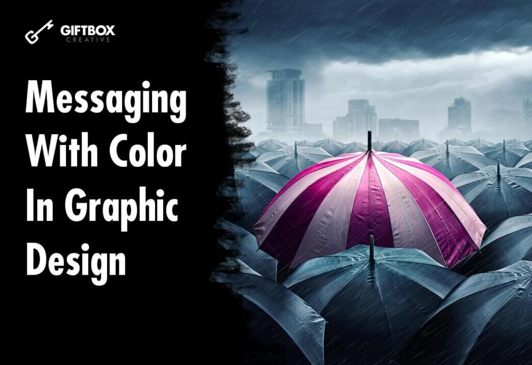
How color affects messaging and the way the designer sees the world, and even how the audience receives the information from an emotional standpoint is the great superpower of branding. Your color choices, particularly the primary colors, will be the tool that will elicit certain emotions depending on the value of that color that’s chosen. Using it influences the sense of mood pressed into the viewer’s mind because of the pre-associated color.
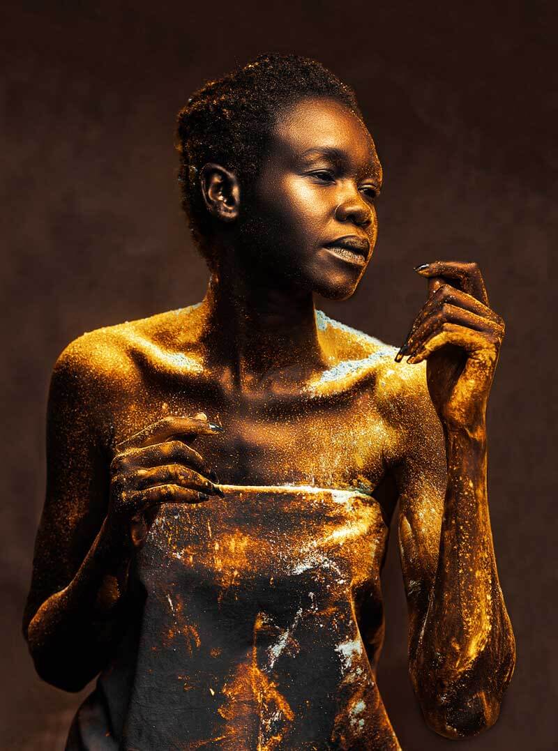
The warm gold and brown complement themselves with one being the more dominant color that being gold. Even the way the light catches the gold dust in some cases creates a high value of saturation.
“Since I Saw You Last” by Kabutha Kago
Greens can signify an eco-friendly brand when used in logo design or can have somewhat of a sickly feeling when used as a shade in an image. Blues may show associations to business or structure while red evokes hunger when used in food hospitality. all these colors have prescribed usages, but it’s okay to break the rules and experiment because of placing the product or potential competitive landscape to see what makes sense in alignment with the content.
Also, the use of temperature in a design will set the overall tone of the messaging in any image. Using green shades with grey and blacks gives the tone of seriousness and cold drama while contrasts with yellows, oranges, or reds produce a lighter, more uplifting feeling even when applying these colors for you and other design elements such as a solid color backdrop or gradient in typography, having the right contrast or knowing what visual hierarchy and patterns of usage are appropriate for that color.
Even when using type with color, the most commonly used are both black and white. Coloring within the typography depends on the brand while understanding how its surrounding elements support what might take away attention from that color.
We often associate the financial space with the color blue because of its approachable and calm presence. We naturally associate green with money because of this occurrence report in the US.
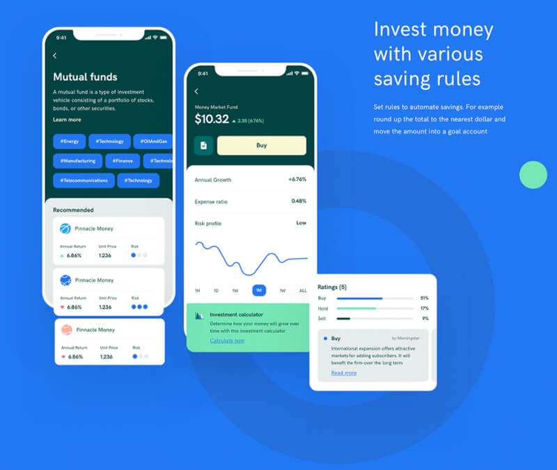
“Fujiko UI Kit Goal Saving Finance UI UX” by Grace-Saraswati
Traditions in Color Messaging
There are similar usages for certain colors within specific industries. It seems to be familiar and worked efficiently in that space this makes a consistent usage and universal or local understanding.
The uses of color for each industry become a safe way to use a color that has been pre-qualified. For example, American political colors primarily use blue, white, and red, while a child-friendly color brand will often gravitate toward Orange because of its energetic and approachable warmth. You can find out more about the psychology of color in this article.
The more familiar a culture is with color within that tribe, the more likely they are to trust it because it’s been pre-approved. So, a metalhead wearing a tie-dye shirt, white leggings, and rainbow glasses would look out-of-place during a rock concert.
For an industry such as food, red seems to be the most popular and most common choice. It also has subconscious effects that bring about hunger.
“Pizza Pizza Logo” – Khalil Alnono
Using a scale of one color and having it more dominant through saturation, its presence will intensify even more even while making it less prominent in scale.
If you take an achromatic color such as black or white and put a small portion of another hue to the palate, the intensity of that color grows towards the opposite of its natural hue. Darker tones will become lighter and lighter tones may become darker.
Still, leveraging colors according to their default associations will save you time and a lot of frustration, so rather than trying to be original, you can use the tried-and-true methods and still get your intended message across. Here’s a handy guild to Selecting Colors Fast.
Greens can signify an eco-friendly brand when used in logo design or can have somewhat of a sickly feeling when used as a shade in an image. Blues may show associations to business messaging or structure while the color red evokes hunger when used in food hospitality. All of these colors have prescribed usages, but it’s okay to break the rules in an experiment because of where you might be placing the product or studying a potential competitive landscape to see what makes sense in alignment with your strategy.