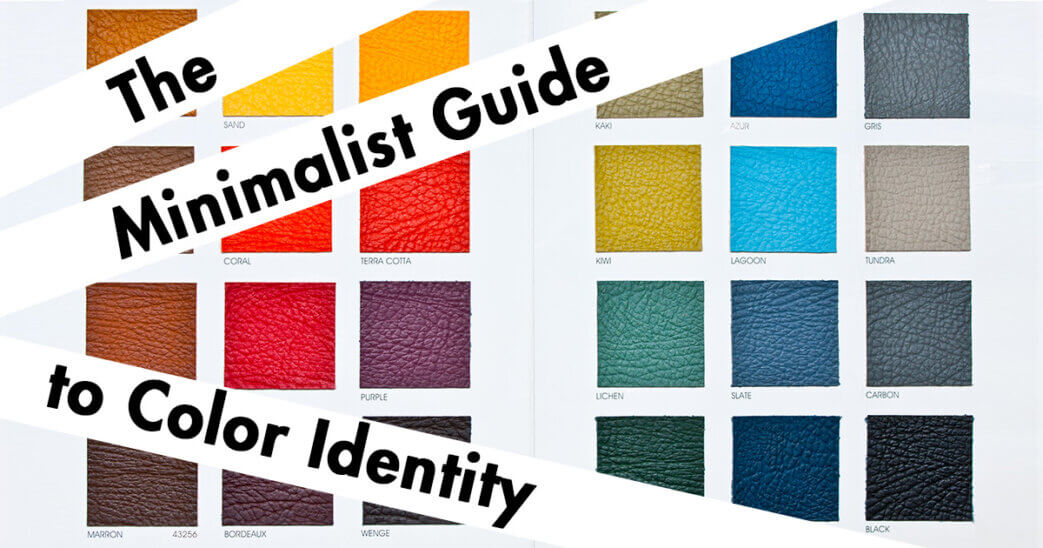
Color identity presents it’s self as somewhat of a paradox; they make themselves relevant under the situation they’re being used. Even when paired with other colors, they will make themselves appear different based on the relationship of those colors.
Color has a significant impact on the way that we interpret the world. There are very few if any other elements that communicate so profoundly that the countries rely heavily on them for their culture. The subjectivity in which color holds meaning has its cultural connotations, but the way the light reflected from color and interpreted is universal.
The skill of tactfully using color takes just as much patience and care as any other element. It’s not something to be second-guessed s something that can be thrown together by a pallet if you want to be masterfully intentional. So, if you’re going to leverage, it’s at a tool to communicate, you must first understand the principles of color identity and how they can be leveraged.
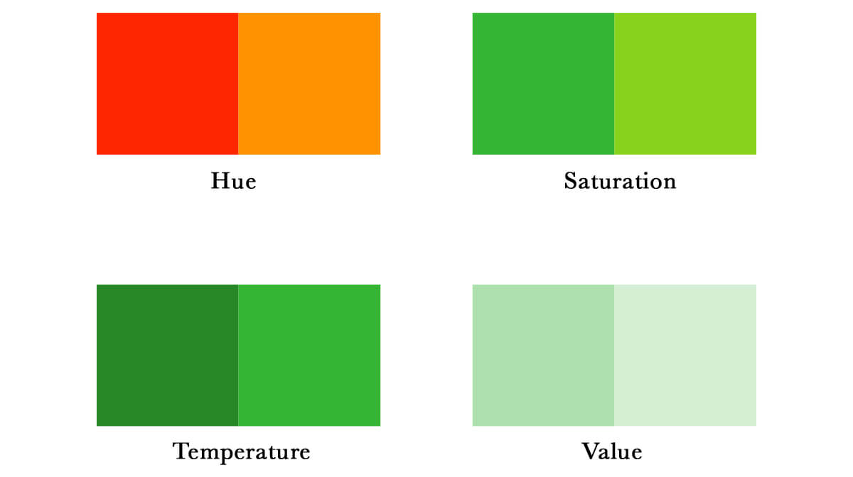
Although there are numerous amounts of color names and properties that help describe these wavelengths, there are four distinct characteristics that are most important.
Hue: the optical appearance of color identified by the wavelength, or presented color, we’ve noticeably given a named attribution.
Saturation: the intensity of color and its brightness in contrast to desaturated into grey.
Value: the level of Darkness color may have or how light it may appear.
Temperature: a relative perception of how warm color is or how cool it may be.
Hue
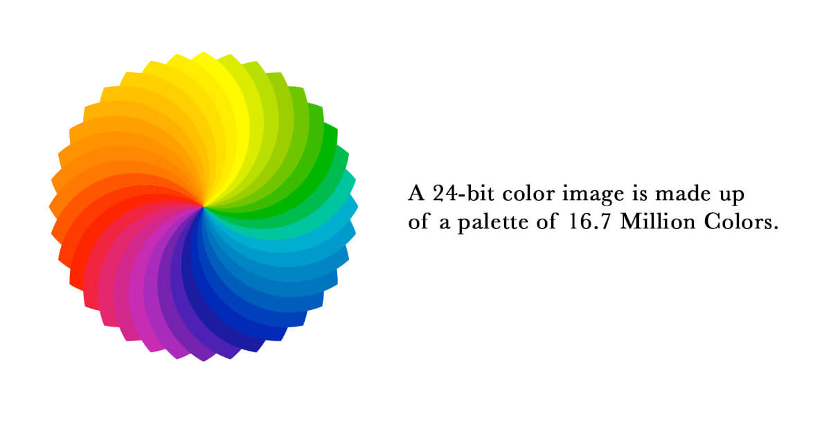
A Hue is what we call the primary color and how it identifies with the spectrum. We referred to hues as violet, fuchsia, orange, green, purple, and many others. The different ranges these Hues present themselves are on a prism of light that reflects in our eyes from the surface of the object they reflect.
As we place our gaze on an object’s surface we describe it in terms of color based on what is most apparent or dominant. Therefore we say the object is a particular color when, in fact, it’s further from the truth. What we’re seeing is a single prism of color being reflected off of the surface of the object, while every other color in a lens is absorbing, and this is how we see it’s Hue.
But if you were to place the same color adjacent to one in comparison, then that color would appear very different, it is in that instance that we can distinguish the true identity of that color. This is what makes an entire library of colors possible, and names deviate from the primary red yellow and blue. In essence, colors began to adopt different attributes. They began to change the overall Hue of that color even by the slightest margin.
The same effect not only works with Hues but was also the surface texture of other objects such as an automobile. The light that bounces off the surface of an object also reflects that color, even if it bounces off multiple services that are close to one another until it’s reflected off into an open area.
via: “Color images in telepathology: How many colors do we need?”
Colors made up of two systems; there’s the additive color system, and it is a subtractive color system. The additive color system is all the colors the three primary ones that combine to create White; this is the RGB for red green and blue color spectrum. Or a digital color system that you’re probably reading on your monitor tablet or mobile phone.
The subtractive color identity system is made of CMYK or Cyan, Magenta, Yellow, and Black. This is a subtractive color system only used for printed purposes on physical objects you interact within the real world.
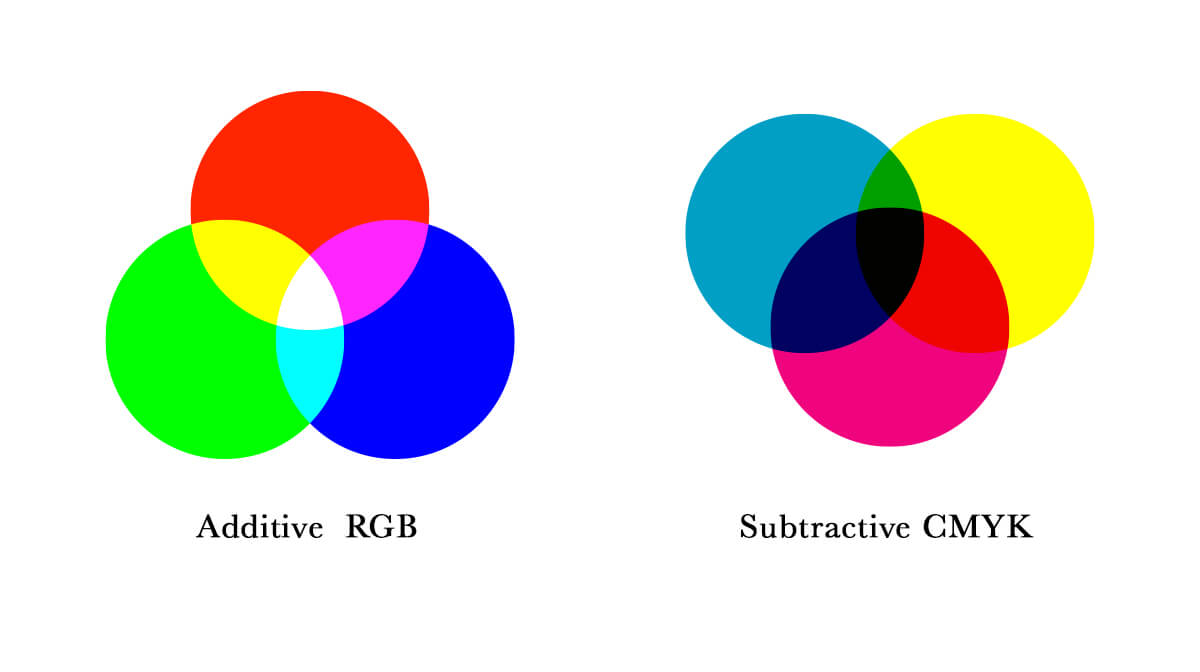
Looking at two primary colors, both create a blend that creates an entirely new hue, as we also call a secondary color. For example, the colors violet it is made up of red and blue, orange making up of red and yellow, and green is a combination of yellow and blue.
Taking an additional step gives you tertiary color hues, such as yellow-green, orange-yellow, red-orange, blue-violet, blue-green, and violet-red. Tertiary colors are even more distilled version are the secondary colors in the primary colors that dominate them.
Saturation
Color saturation indicates the level of energy and how intense it is compared to the other colors around it. As the color becomes more desaturated, it begins to lose its intensity going into a grayscale.
We’re all the Hues send it to become shades of grey or solid black or pure white. It’s easier to determine the saturation of a color in relevance to other colors around it as they are together; this is what will indicate the level that tone the saturation imposes.

By nature, colors have an intensity about them without any adjustments once so ever, such as yellow. This color will naturally stand out among others because of the intense wavelength of that Hue.
The contrast on the color wheel will stand out the most notably with complementary colors. Still, the corresponding Hue will naturally bring out a contrast in saturation and, even in some cases, make one color more intense than another.
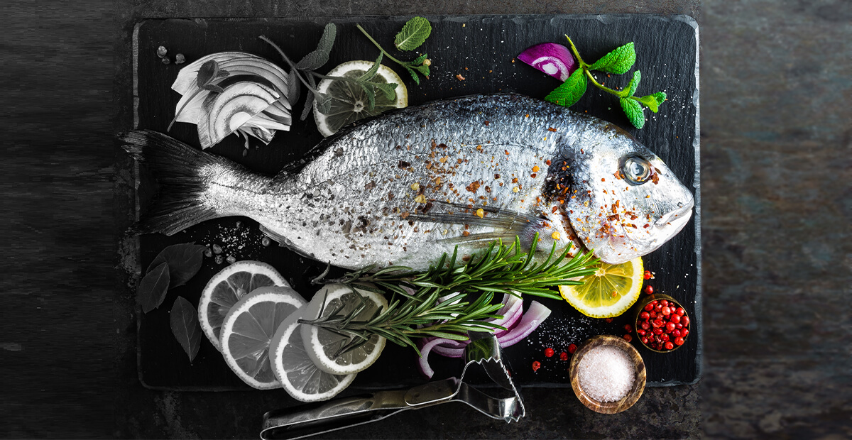
The saturation is this fish photo gradually gradients from desaturated (left) to saturated (right).
Using a scale of one color and having it more dominant through saturation, its presence will intensify even more even while making it less prominent in scale.
If you take an achromatic color such as black or white and put a small portion of another hue to the palate, the intensity of that color grows towards the opposite of its natural hue. Darker tones will become lighter and lighter tones may become darker.
Value
The value of a color identity is determined by how dark or light it appears to be. Color like red is inherently lighter compared to the color brown, which seems to be darker. But this is all in proportion to the colors around it that will help to identify its intensity.
But if you compare the color red to yellow, the red will often be seen as the darker color. Or if you take the color blue, which usually a receding color, and you haven’t next orange, the orange will appear much brighter and its intensity.
If you already have a bright intense color, and you attempt to make that color lighter you may end up desaturating it against the white background simply because of its relative closeness of intensity. Conversely, if you have a highly saturated hue and you darken, it will become less intense.
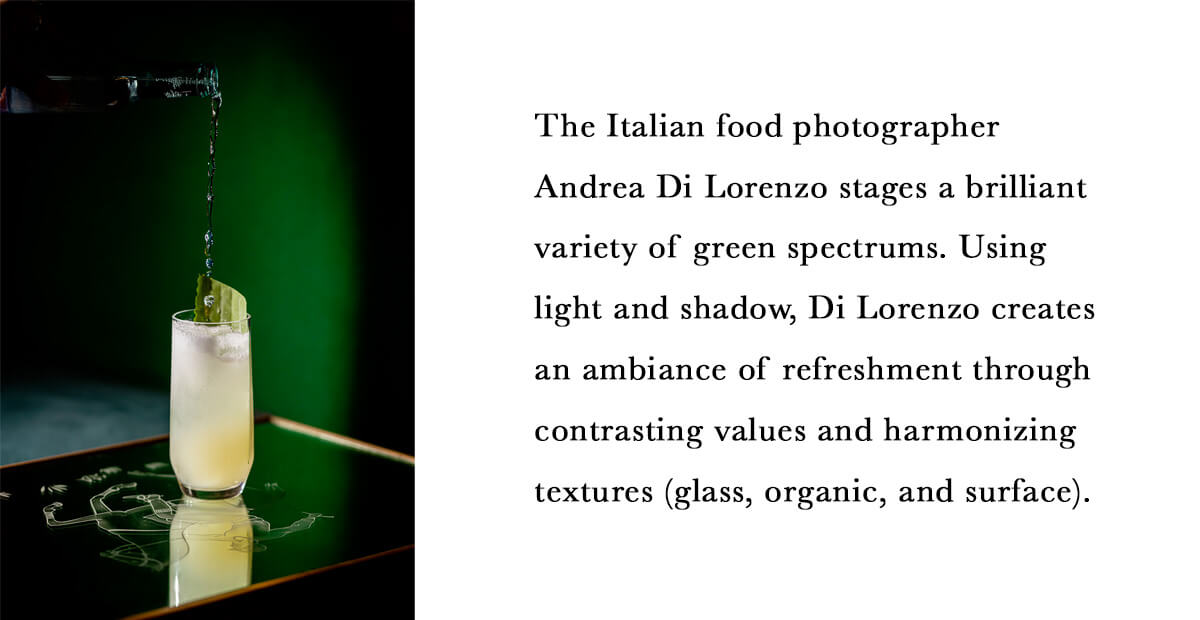
Photograph By: Andrea Di Lorenzo
Take any color and place it on top of a darker color, the contrast between those two colors will make the lighter one advance even more. Making the mistake of having to hues that are relatively similar in value, it can make it difficult to see where one-color ends and another begins because of the way the intersection of colors seems to vibrate.
This makes it extremely difficult to see the border between the two. Still, if there is a very different in value or intensity, it becomes easier to distinguish those edges.
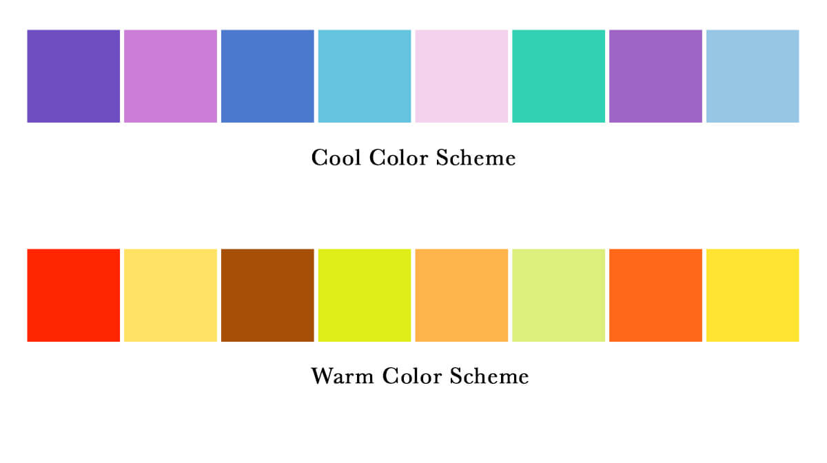
Temperature
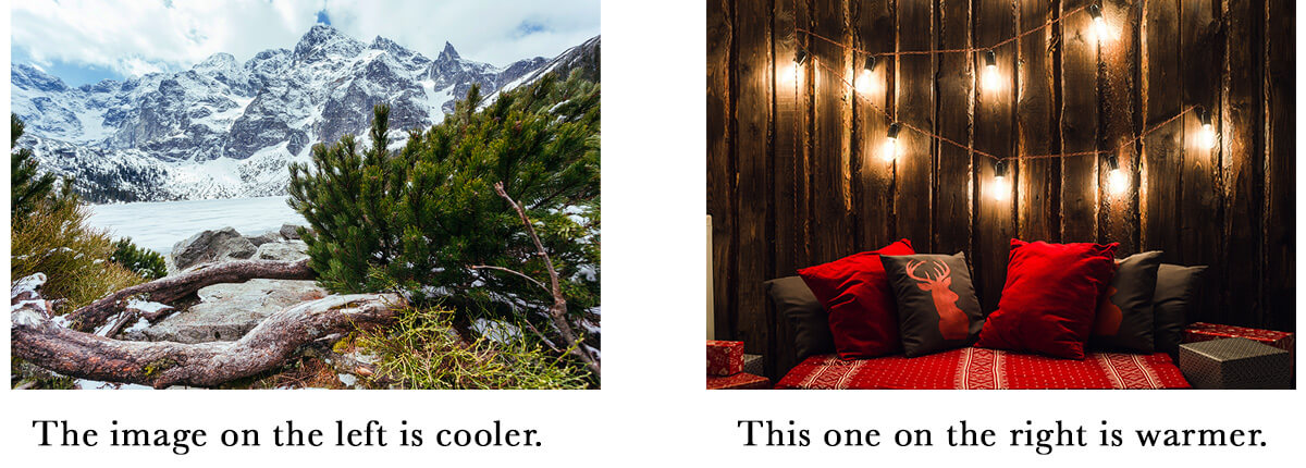
Color temperature is related to the association we make based on how we’ve interacted with that color in the past. Colors said to be warmer such as red or orange, can be related to things like sitting by the fire or in the warm sun.
Cool colors such as blue or white remind us of objects tour experiences that are related to coldness like the winter snow or polar ice caps. Those seem familiar or at least come to mind when seeing an object because of the associations in personal memories attached to those experiences belay to colors that we hold with us overtime.
As colors are associated with one another and paired, there will be different results in a fix on how temperature plays a part in the color scheme. If you have the color cyan, for example, and you play sit next to Navy, which is a much darker blue, dim the cyan color may become much warmer because of its proximity to a darker color.
As you approach using different color temperatures, the range at which these colors become noticeable is best displayed by leveraging opposite extremes.
Making more subtle changes within the same hue is also another way to leverage temperature in a way that will be much more noticeable and easier to control compared to the adjacent that isn’t related at all. The wavelengths are similar enough when you use variations of the same color temperature to get wide range adoption with just a slight shift in its warmth.
How do you plan to make use of leveraging a color identity by application of its elements? Knowing these principles of color will be useful throughout working with virtually any kind of logo or graphic design in marketing. If you are looking for tools for selecting color I’ve compiled a list.