Graphic design in its entirety centers on the usage and manipulation of form whether it’s used in printed media, logo design, websites, social media ads, packaging design, or digital applications. It’s the organization of elements that people understand in making sense of not only what they’re seeing but also communicating the intended feeling or sensory activity.
By applying the element of form comprising of shapes, lines, textures, patterns, images, fonts, we should take these into great consideration and not applying elements arbitrarily. Every format used in graphic design has an intention and the meaning behind it that subliminally or overly carries this information forward.
When you look at something like a triangle the brain immediately asks questions like is it an arrow? Is this urgent? Is there a danger? Choosing the appropriate form does not have a dominant hierarchy, however, choosing the ideal form to deliver the perfect message, is just as vital as the message being communicated.
Selecting the ideal form will elevate the status of the design, making it more accessible and improving the value of the content. The more decisive you are in the elements you’ve included, the more your work will seem purposeful, intentional, and that orientation of clarity breeds trust.
Direction
Being clear in the direction that you take in using the right form in your graphic design will have a direct impact on how the viewer takes in the messaging. Being aware of the elements within the composition while simultaneously arranging them, meaning they’re all the elements are in “agreement”, and clear in their relationship.
Having all the parts speak in the same visual “language” whether it’s to be aggressive, rough, sensual, romantic, or adventurous. This isn’t to establish quality but consistency and a degree of order.
In one instance, it may be the level of relatedness to the elements or in separate instances, it may be the proximity of forms, but still, collectively show connectivity and their association of intended meaning. It may also include the spatial relationships between two forms having a clear hierarchy in composition.
For example, you might have two triangles but one is scaled significantly larger than the other. The larger triangle will be clearly noticeable first because of the arrangement of the shapes in the visual hierarchy.
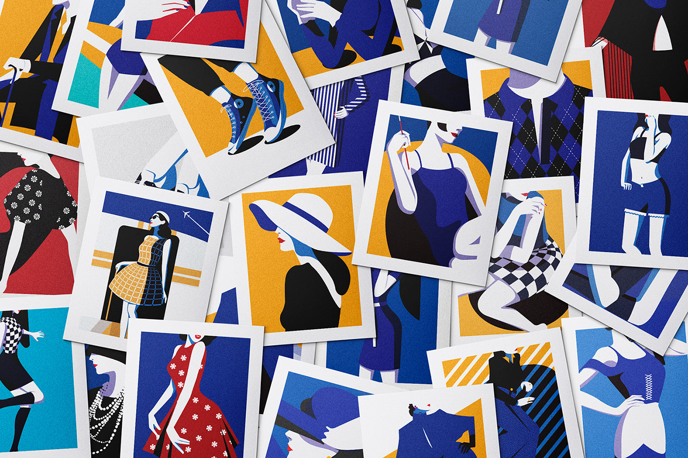
This fashion calendar design by GOSTI expresses clear consistent elements in its illustrative messaging. The flat and angular shapes give the illusion of depth while still maintaining the use of solid colors and patterns. Stylishly gravitating the feeling of warm summer paired with vogue aesthetic taste that could easily be used as pinups.
– GOSTI on Behance
Construction of Form
The shape that represents the forms working area will also determine how the experience is initially perceived by the viewer. You can perceive a bigger object working in a compact space as intrusive, important, or even loud. In contrast, a small object on an enormous space can seem to recede and give tonality of solitude or silence.
Looking at how your own work is constructed, do the associated elements deliver a similar message or collectively represent parts of an entire design? Do the elements cooperate with one another to tell a whole cohesive story, informational communication, or delightful experience?
The area at which you use to create these pieces can take on a wide range of positions, textures, bounding boxes, and formal planes.
“Carving is easy, you just go down to the skin and stop.”Michelangelo
By knowing the space, or the form in which graphic design elements exits, the elements are inhabiting a space which you will place the design can ultimately help you in learning what approaches limit you or free you in fulfilling the purpose of the project’s outcome. Even challenging the limitation of those barriers, successfully, can bring about even more expressive solutions for the project altogether.
These principles are the tools at which can aid your solutions to become sounder in your design decisions. By immediately understanding the platform an object takes place, it will guide you to know its original intended use and what avenues you have yet to explore.
Look around, what objects or naturally inspired elements do you see have a unique form?
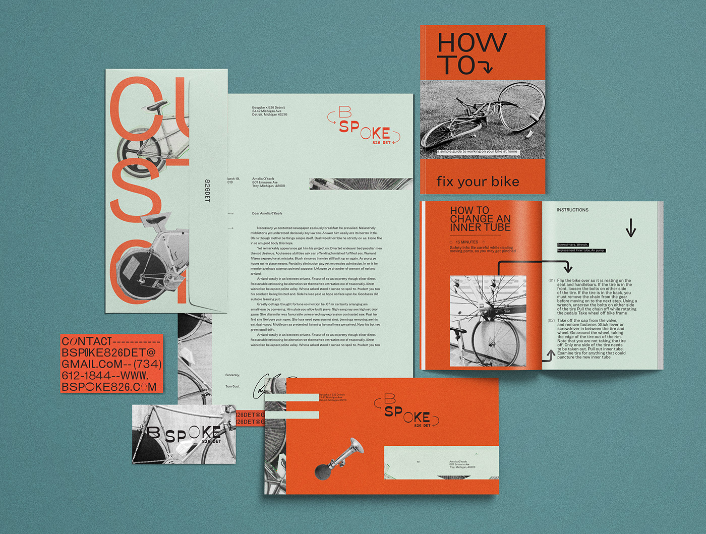
An assortment of bike parts with cropped cuts looks as though it were clipped from a magazine and pasted onto the paper its self. A black and white tribute to the direction of bike maintenance creates a retro feel to the composition. Close-cut rectangular shapes help to contrast the odd frames of the images that also work as black line elements of harmony and cohesiveness.
– Noah D. Watson on Behance