12 Graphic Design Secrets That Will Make You A Pro In No Time, is more than just about making your designs look pretty. It has rules and systems that help create order and a measurable structure. It helps to bring order out of the chaos and improve your understanding of the information you present. The design guidelines that are in place for these rules help to bring order, efficiency and shape a process to stand out in the market. Although articles based on modern software used to design these can be full of tricks and gimmicks, it’s the foundations and principles of design that will allow you to apply a standard of rules no matter the tool. But it’s a precise application of these laws that will ensure that your design decisions will stand the test of time. With the irrefutable laws, you will have a pathway and cornerstone to become a master with enough practice.
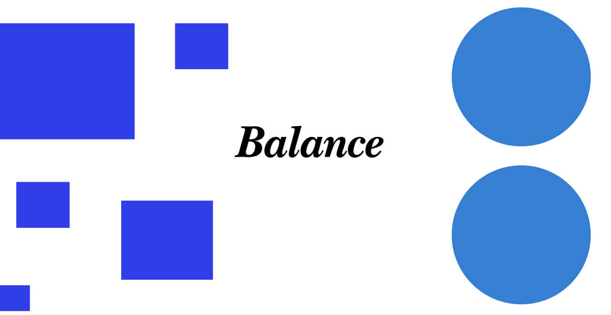
1.) Balance
Balance using elements and arranging the work in such a way that not a single design element completely overshadows the other. Balancing content and design keeps the parts working together to be as uniform as possible. Balance does not mean that all the elements must be the same but that the overall weight, or perceived weight, is taken into account.
Types of balance you can use in your designs.
They’re typically two types of balance when it comes to design. There’s symmetrical balance, and then there’s asymmetrical balance. You not limited to one or the other one, you can use them both interchangeably within the entire composition, taking full effect. Symmetrical elements can be grouped in one area but have different set images in a separate space, arranged slightly different, making the paired sets asymmetrical. If you want to know more about using space in your designs, read this article on Separating Space.
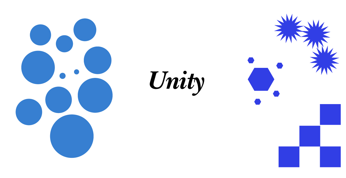
2.) Unity
Design work has a sense of unity when the parts involved in design bring communication to an obvious conclusion. It’s the bow that ties everything together on a single agreement within the design. It helps to communicate all the essential elements and delivering the message as clear as possible. Without this, the design will seem divided or unrelated to one another. It can also confuse your audience into the intended meaning behind what you’re saying with your content.
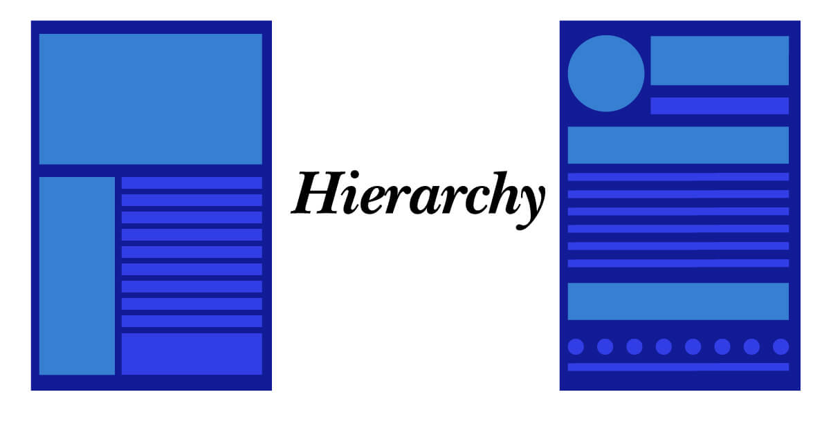
3.) Hierarchy
Hierarchy is the organization of information by adding the right amount of emphasis. Hierarchy can come in many forms of scale, color, texture, or even shape. You use these to have one element completely stand out by making it the central part of the message, although other factors may be assisting in its communication. The goal of establishing a hierarchy is to help the viewer understand the sequence at which you want them to understand and deliver information.
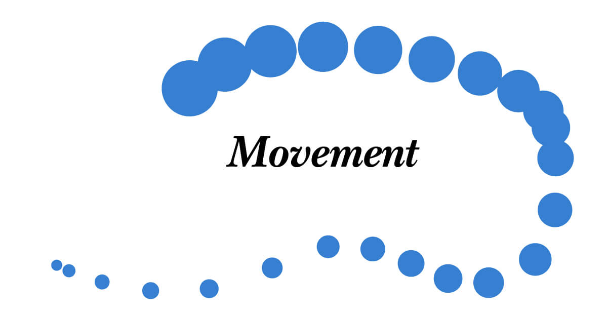
4.) Movement
Movement, also known as Flow, is how you guide the viewer’s eye along with the page’s content. Using movement, you can create dynamic forms of communication and excitement even through still images.
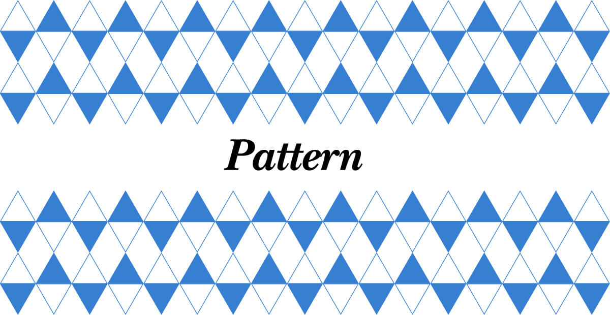
5.) Pattern
Using these secrets in graphic design communication is much more than a visual background element for interest. It adds a level of texture to an otherwise dull and boring background. These are most often used as great accents to hypnotize the viewer into an immersive experience.
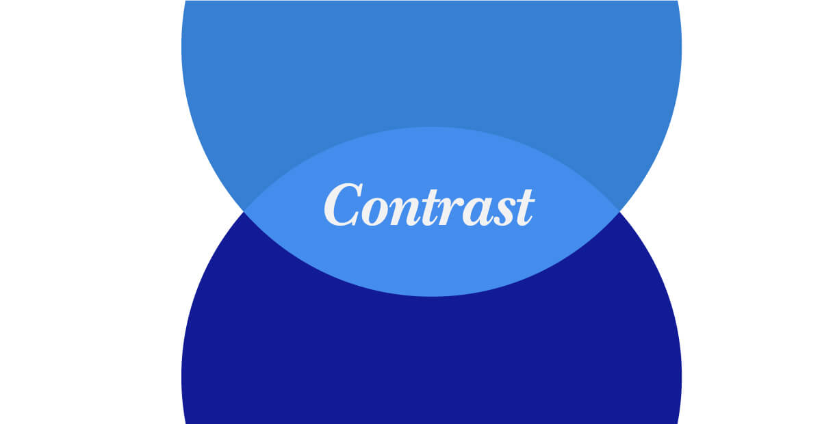
6.) Contrast
Contrast consists of two similar elements but then finding a way to take one of those two elements and make them different but still relevant. You always want to make these as harmonious as possible by interjecting a degree of difference. Don’t stray too far from the overall message and theme. Being consistent can help your elements stand out from everything else while still being exciting and fun.
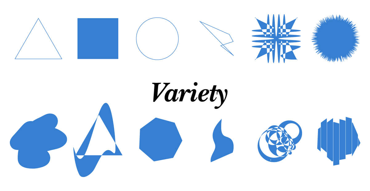
7.) Variety
Use of the same design elements, time and time again will eventually put your viewers to sleep. Changing up every once in a while can create excitement; it makes things interesting in a way you’ve never seen before. Diversifying design elements to communicate a single message can breed a whole new life into your design projects.
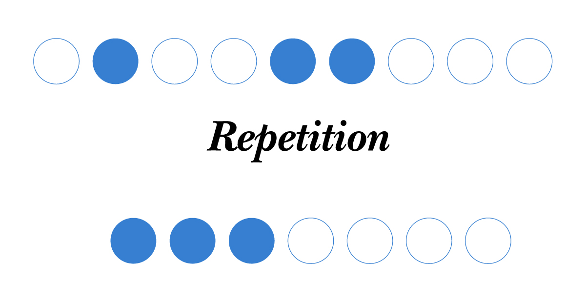
8.) Repetition
Repetition within design work is a graphic design secret that helps to create a sense of familiarity and trust. Viewers want a certain degree of predictability within their everyday experience, so the same rule applies here when using design elements, even if its a website or brochure.
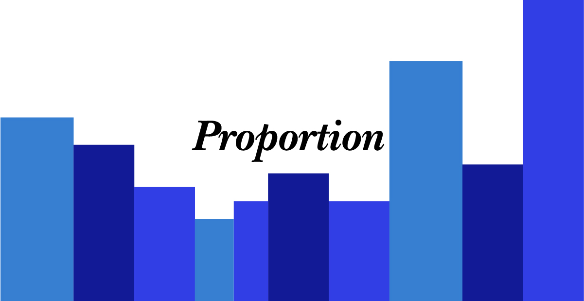
9.) Proportion
Proportion relies on the scaling of objects compared to the one next to it and relevancy of size. Typically when two objects are next to each other, having enough contrast in that scale of the objects will make one look more or less dominant. It boils down to how you prioritize elements with other aspects of balancing out the overall composition.
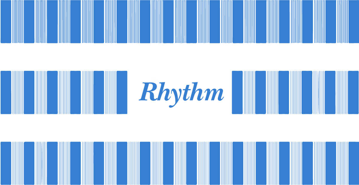
10.) Rhythm
If you look through a magazine, you’d hopefully see the pattern of how the pages are in layouts. There’s a specific system behind that layout, also known as rhythm, which brings a certain level of familiarity in expectation. Without rhythm, it’s likely to get lost because the audience wants to know the easiest way to access what they are trying to find. And fulfilling that level of expectation creates a sense of security. You can create certain levels of energy within the work using rhythm, depending on how much content is involved. Or you can design a faster cadence with fewer call-outs or visuals among the pages.
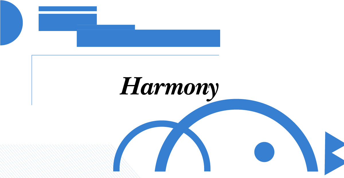
11.) Harmony
Harmony is the use of objects in your design that mirror each other even if the form of design, ie. The color, typography, image, or shapes, but there is a certain level of relationship between the elements. For example, you are using bright yellow display typography paired with a picture of a sunflower field on a bright sunny day. This application of color in an image mirrors echo the overall theme of the color palette.
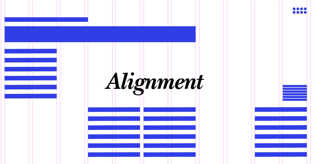
12.) Alignment
Alignment refers to how visual elements on a page communicate to one another and how they relate based on a system within compositional grid systems. If you place images on the left side of the page, or the right side of the page, or have them in rows and columns, how elements are aligned tells a lot about relatedness they have to each other. You never put your design elements just anywhere on the page deliberately know what alignment that you’re using how they play off of one another. This is one secret in graphic design that will make your graphics look sophisticated by the design choices you use in a grid system.
With these 12 Laws, you’ll be able to become more efficient at making design choices that are more effective in deliberate and the designs that you’re making. You also have resources that will work into your skill-set making you more of a professional and utilizing standardized practices that will help you articulate to your clients and your audience. Which one of these have you found was helpful? Leave your comments below.