So what is the best way to divide space?
It’s natural that we have a preference to objects that are asymmetrical in nature; we see them as being more attractive therefore we always want to spend more time with those things. The moment you put something into space it changes the way space experienced, no matter how big or small an object appears to be. So to keep visual interest within the reader you must make sure you change the way the elements interact in this space to make it interesting and dynamic as possible. Static becomes boring and you risk the chance of completely losing the interests of the reader, this is why changing the expectancy or rhythm of your design will spark a higher degree of interactivity.
There are many designers that have a wide reputation for using all kinds of chaotic elements and massive use of active space in their designs. Designers like Paula Scher and David Carson are excellent examples of designers who use space to the fullest and are easily recognizable from almost anything else out there. Aside from typographical effects artist like Michelangelo’s Sistine Chapel make great visual use of space to the point where looking at the painting itself you can’t tell what the architecture ends in the painting begins. And their many ways to separate space within design designs that hold elements are called black space and everything else that doesn’t hold an element is considered whitespace.
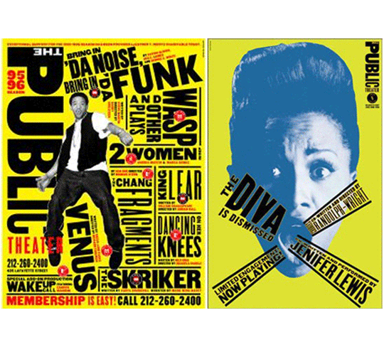
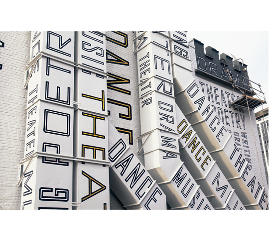
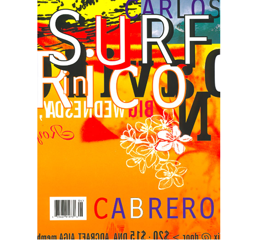
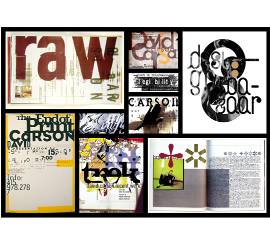
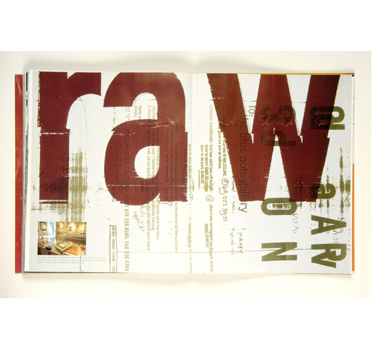 White space is necessary for the reader to know where to direct their eyes and visually flow from one piece of information to the next also notice visual flow. In most cases separating elements on the page is much more powerful than putting several things on the page once, saying one thing at a time always more effective than trying to say several things at once so be clear in communicating what you want to say visually and verbally.
Most common techniques used today to separate space are line elements and shapes color and intended whitespace many designers make the mistake of thinking every thing on the page has to be filled with some form of contents, when in fact the white space draws more attention to your elements which otherwise could not have been done without it.
The difference of relationships that you model with objects is really determined by the strategy you use. Their proximity to one another spaces between the shapes and where on the plane or page they are located all relate to the overall message of the design. You may also decide to determine the form arrangements based on a prospective element and near how far the objects are to one another, or to the viewer, based on its size. Contrasting color can also determine how you see objects in space where the color is cool or warm causes it to withdraw or advance.
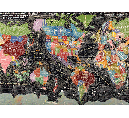 So when you align these elements together with the cluster that is close to you, to the left or the right to build the relationships the closer they are together the more related they seem. When forms meet the edge of the page or having them leave the page, they go off into the real world as if they were literally jumping off the page. This method is called bleeding and is especially useful when you want to direct the reader to another page or create a form of visual tension or even a little mysteriousness in your designs.

