The positive and negative form in a design, or the area that contains the primary focal points of a message, is a critical component to directing your designs. Negative space is the counter form of the shape that allows for natural “breathing” of the entire composition. By having more objects on a page this can be deemed as more “chaotic” than say having fewer elements that are equally or highly distributed among the form. With more elements increases noise and activity to focus on, with no one particular object dominating the attention of the viewer.

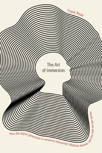
Book cover by Jason Booher
With the case of a figure-ground reversal, this design trick uses the negative or positive image to send additional messages to the brain exposing two images simultaneously. You might see the positive form first and then suddenly another shape or object takes over your initial perception causing you to have a completely different experience of the object entirely.
For example here is a game that teaches would play with children in grade school; The teacher would blindfold the student and then place an object in their hands and have the student guess what is. After a few missed guesses they would then take off the blindfold and watch in amazement as the student was completely surprised that the object they thought they felt in their hand was completely different from what they’re actually holding.
So what does this have to do with the positive and negative form? Well, this lets us know that our senses depend heavily on the way that something shaped in order for us to clearly identify it.

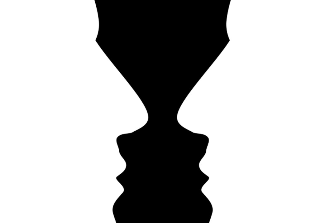
Also known as the Vace Face this popular illustration shows how our visual mind can only hold one image at a time.
One of the most powerful examples of this would be Rubens Vase (above) at which a simple shape of a vase appears to have two identical images. The positive form looks like a vase, but when you look at the negative form it looks like two faces are staring at each other. This is one of the world’s greatest optical illusions that create a figure-ground relationship in the brain causing it to naturally want to focus on the figures of objects and not pay as much attention to the background. This is why clarifying positive and negative space is so important, unless this is the result you’re trying to get.
The positive and negative spaces in the design, or the area that contains the primary focal points of a message, is a critical component to directing your designs. Negative space is the counter form of the shape that allows for natural “breathing” of the entire composition. By having more design objects on a page this can be deemed as more “chaotic” than say having fewer elements that are equally or highly distributed among the form. With more elements increases noise and activity to focus on, with no one particular object dominating the attention of the viewer. If you want to know more about how form can influence your designs I’ve also written an article you can read, The Zen Of Graphic Design Form.

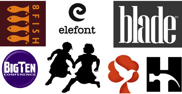
Here logos have harnessed the use of positive and negative form.
In the simplest fashion, our brains have been conditioned to relate the individual design form of an object to a predetermined emotion associated with it. It’s the contour of the shapes that are going to explain what the overall meaning is representing. So the next time you’re working with shapes try this; Look at the appearance of an object to determine its form, what is it shaped like? Rough/Smooth, Hard/Soft, Moving/Still, Exciting/Boring, and ask yourself what is the meaning that people will closely associate with that shape?
“I need no dictionary of quotations to remind me that the eyes are the windows of the soul.”Max Beerbohm

