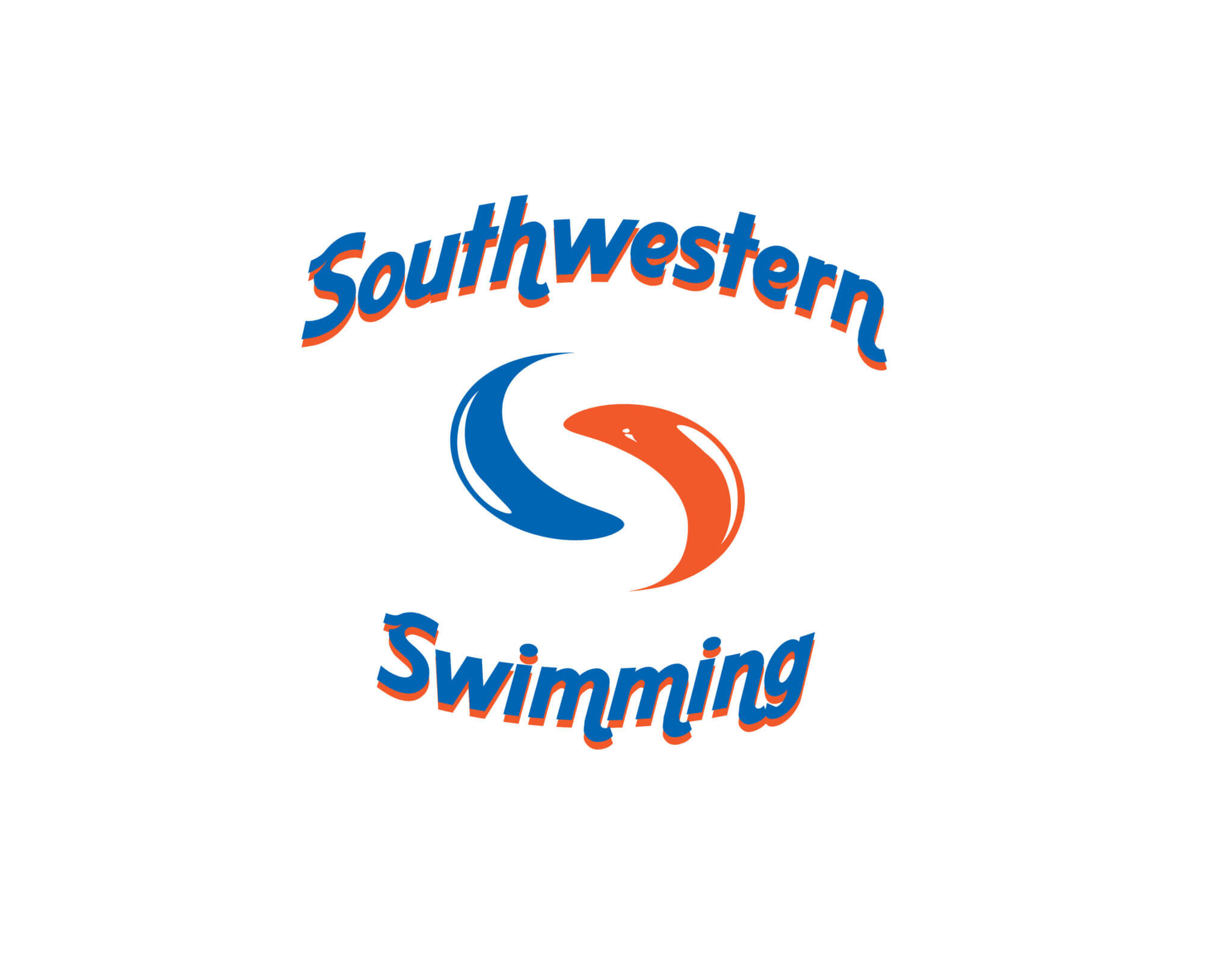
The Southwestern Swimming competitive racing team needed a logo that best represented their spirit for excellence and achievement that many passionate professionals spend their entire life developing to hopefully one day compete in the summer Olympics. Southwestern Swimming was no exception to this ideal but the needed a symbol that would live up to their courage displayed on every triumphant lap. Keeping with a fluid motion that seems to transition like the yin yang more precisely became the centerpiece for the logo mark.
By balancing the two watermark shapes created a symbolic shaped “S” in the counter space could also be recognized from an inverted position. Working under a very tight deadline to get the design done as there were nearing competitions that the team wanted to “show their stuff” as well as exemplifying spirit. Starting any endeavor is always done with a blank canvas and this is what a lot of designers work from best, but because of the quick turnaround research was completely out of the question.
Most of the conceptual sketches were actually done on the computer as soon as rough thumbnails began to take form. Themed around the tranquility of water it was easier to apply distorted forms to various shapes further examining possibilities. The blue and orange worked well together in bringing fruition to the design radiating energy as well as loyalty that seemed to follow one another like a school of Minnow. Only afterward were glossy reflections added onto the edges for that extra touch of character introduced to culminate the final solution.