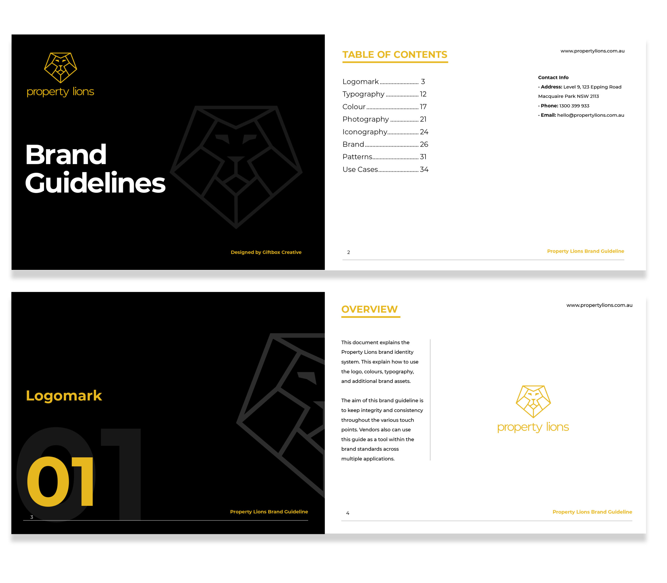
Property Lions is a real estate investment coaching brand based in Sydney, Australia. With over 20 years of experience, it was founded by William Tong and has since grown to become a respected player in the industry, despite being an underdog. Their approach is centered around providing family financial freedom to relatable customers in a transparent way, with an honest voice that helps clients feel understood and valued.
The Challenge
Property Lions faced several challenges in positioning themselves in a competitive market. They wanted a brand that stands out, a client base with specific needs, and a refreshed name that is more memorable.
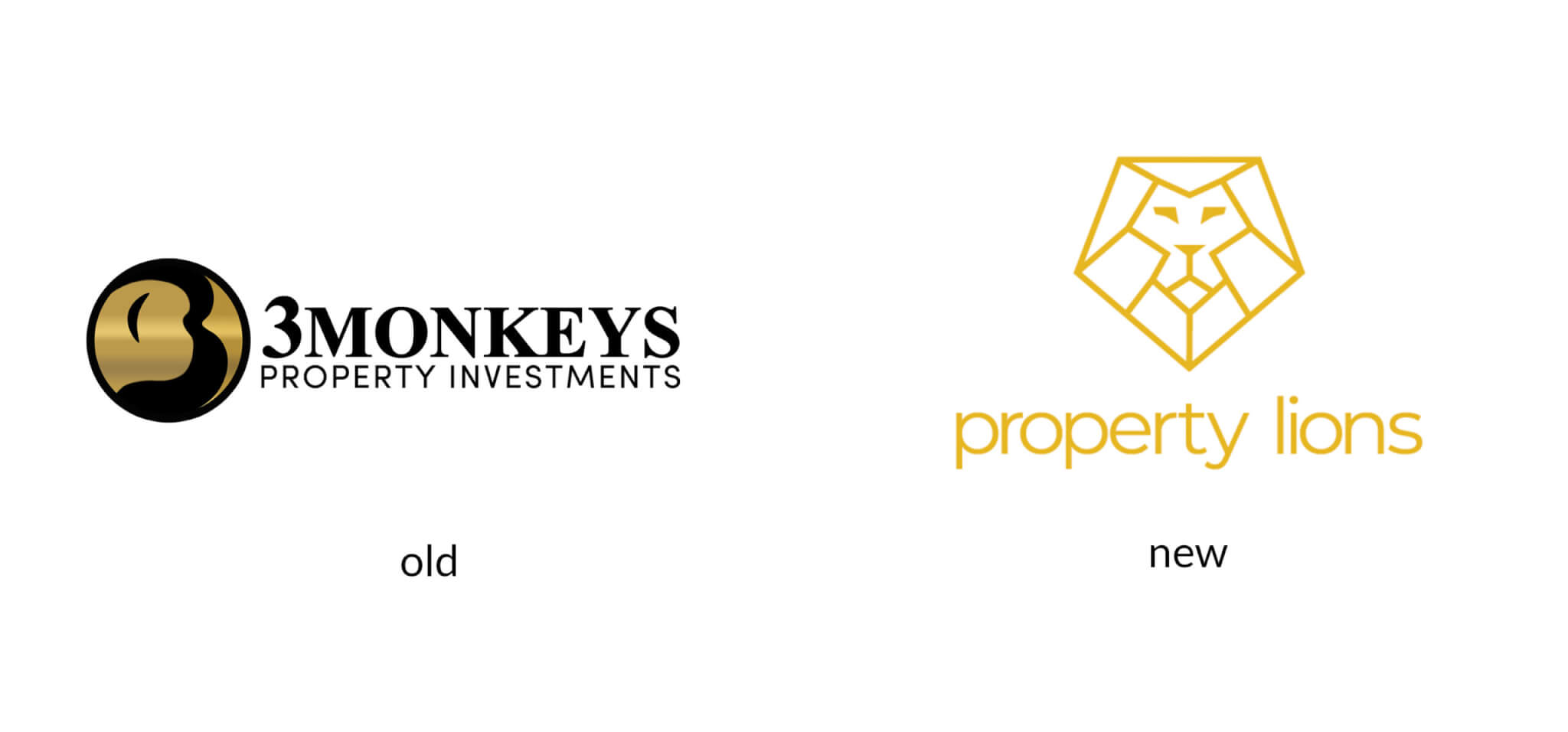
Additionally, they needed a new logo mark that communicates strength and reflects their focus on family-oriented, middle-aged, business men. They approached a vendor with a clear expectation for a brand strategy, logo design, brand assets, and a plan for their brand moving forward.
Style Scape
The Solution
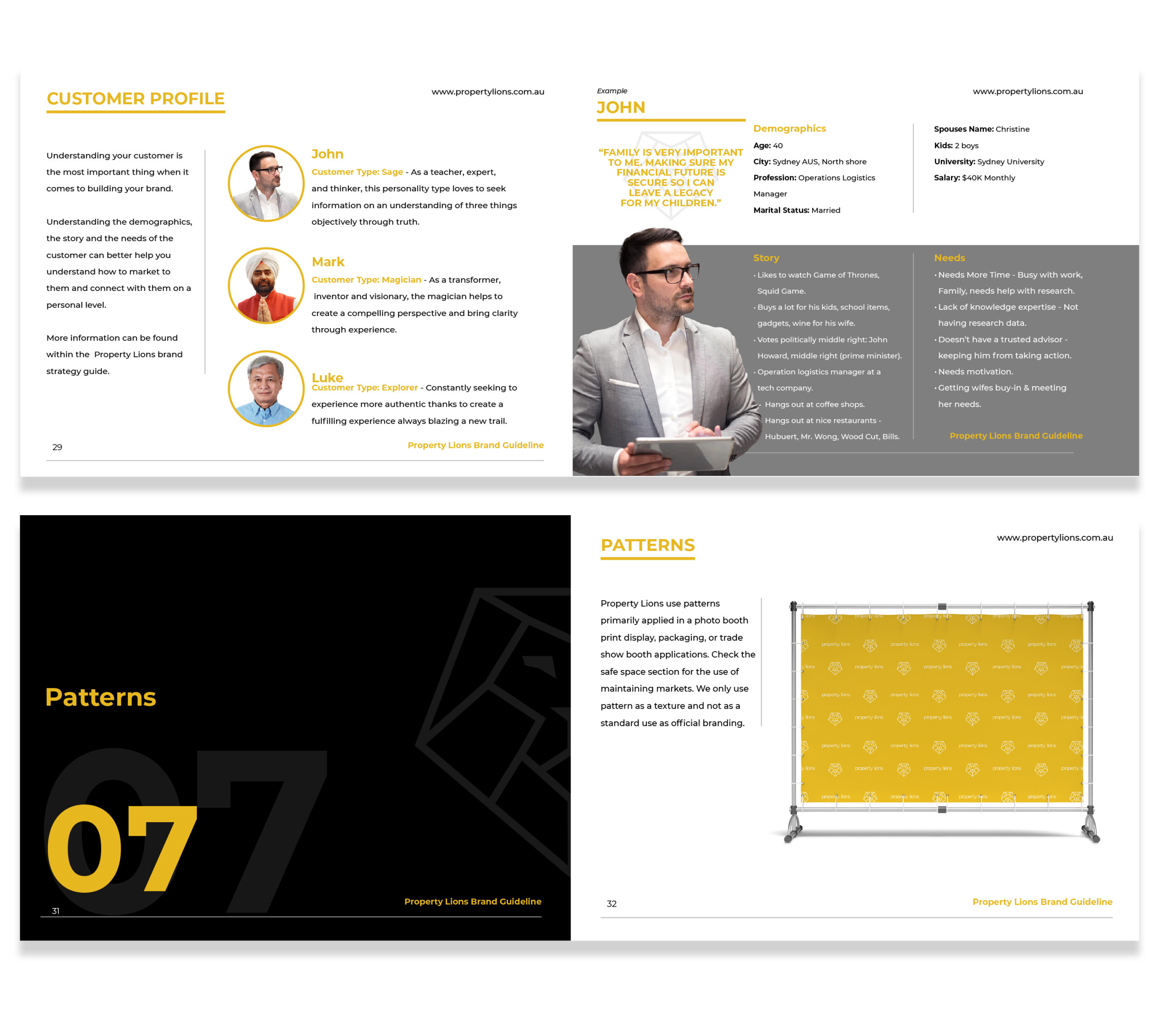
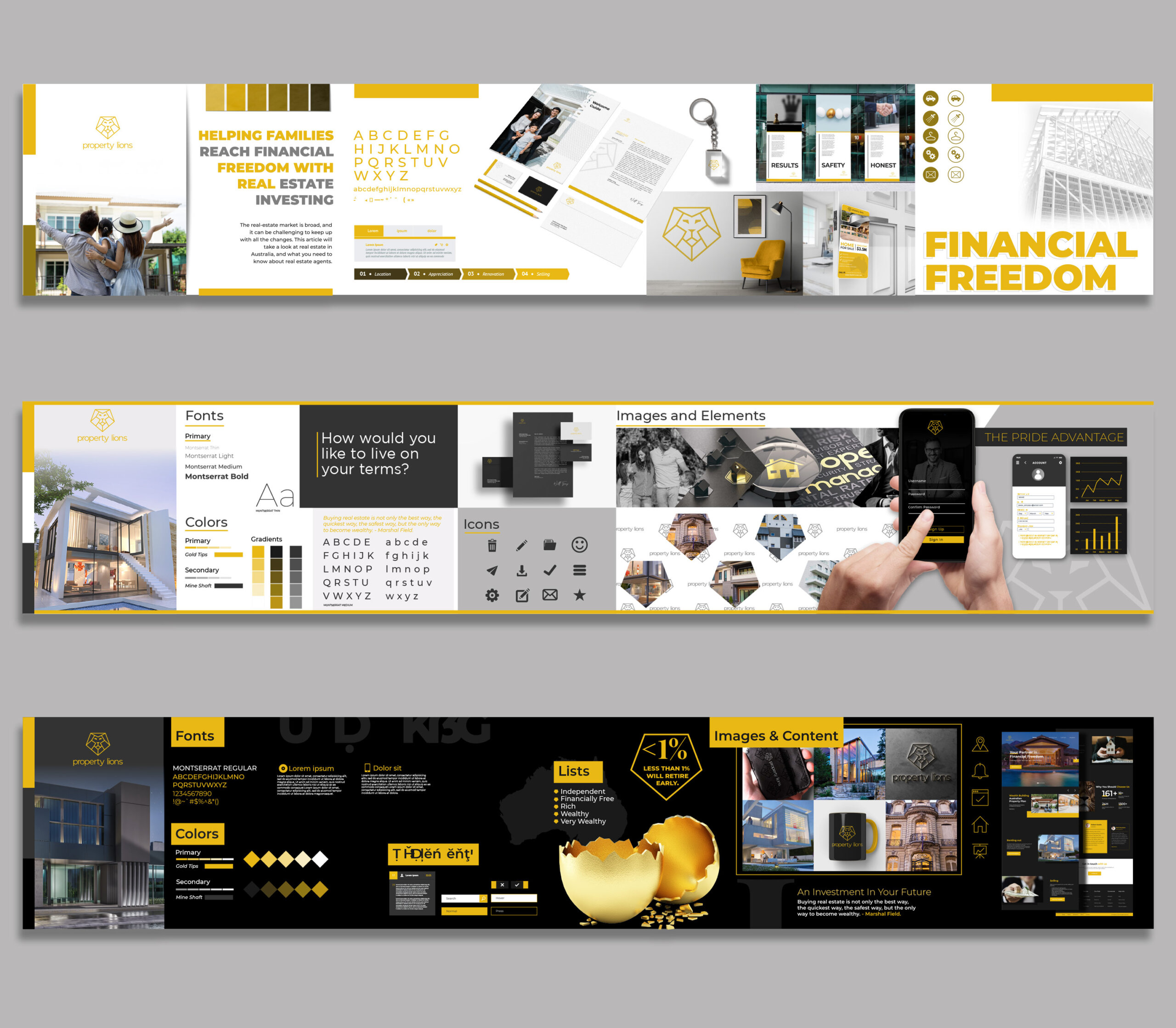
The challenge presented by Property Lions required an approach that thought outside of the box. A brand strategy was developed that uncovered three customer profiles and aligned business goals with the brand statement. Extensive research was conducted to define the elements of the brand and assess competitors such as Century 21, Cardone Capital, and RE/Max. The final solution involved creating a solid logo mark that stood out from the crowded lion-based icons in the market.
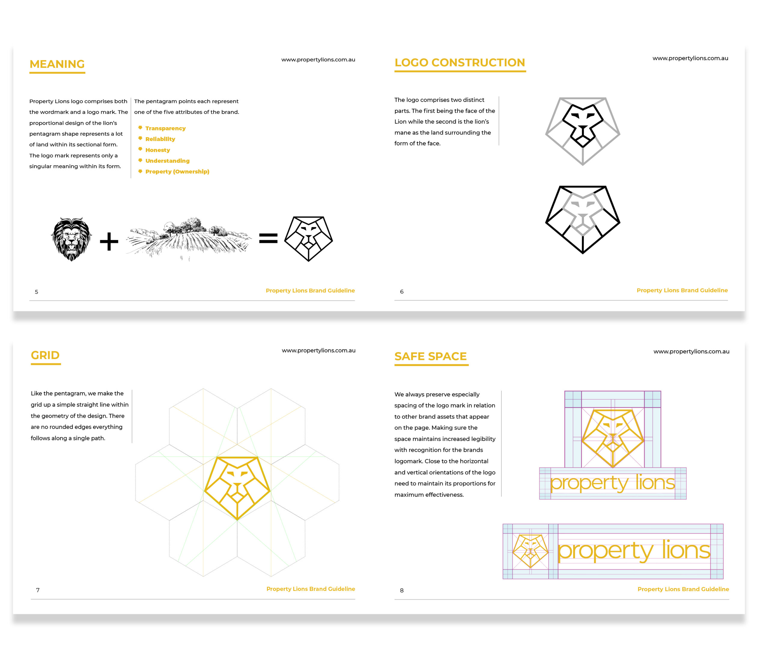
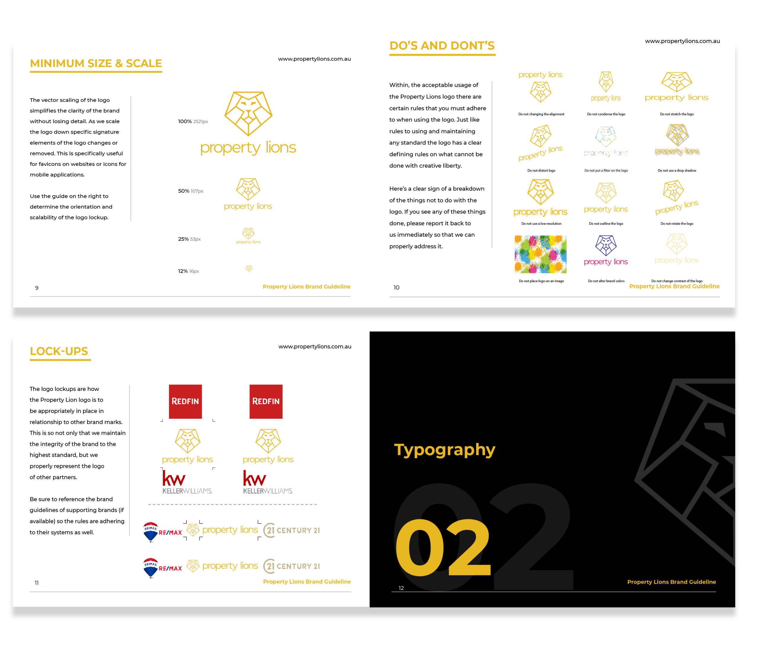
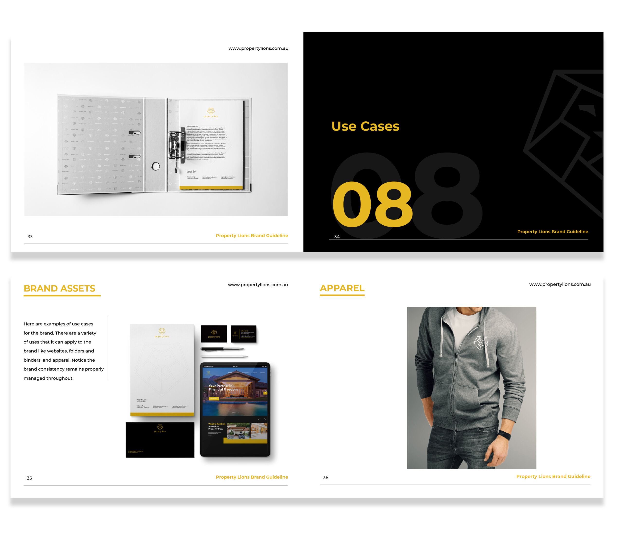
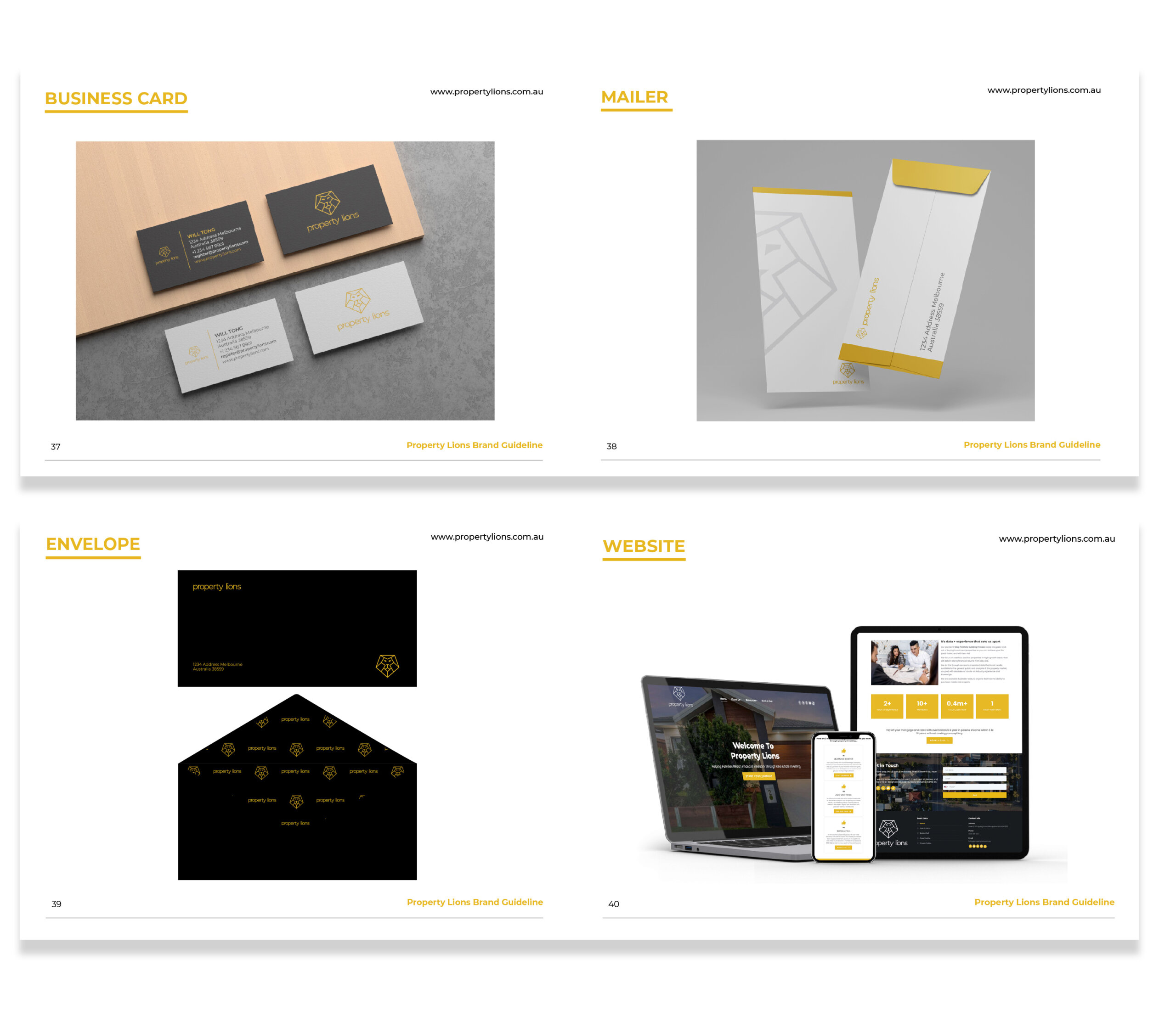
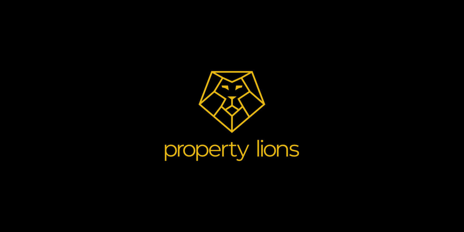
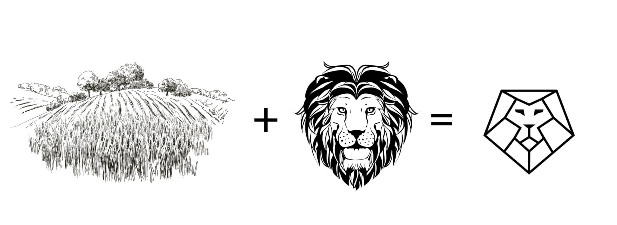
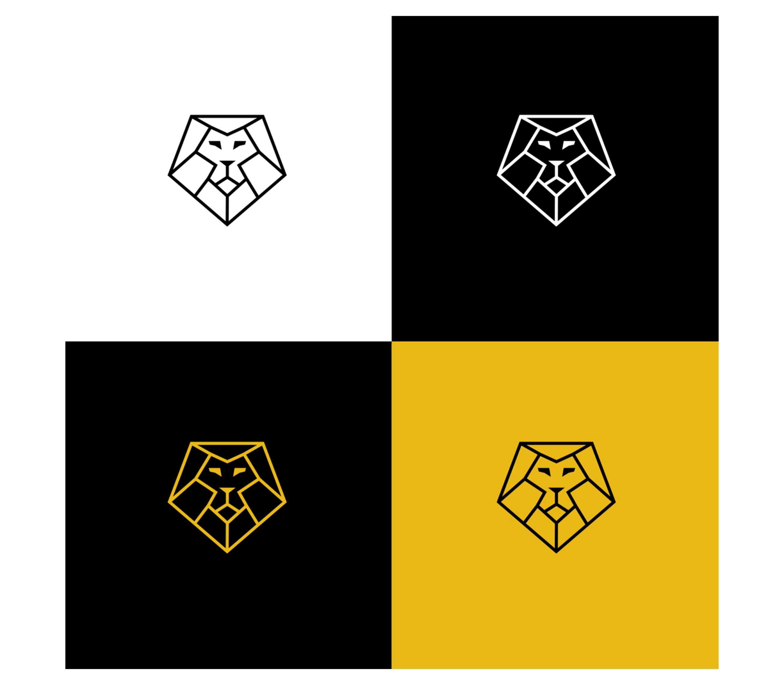
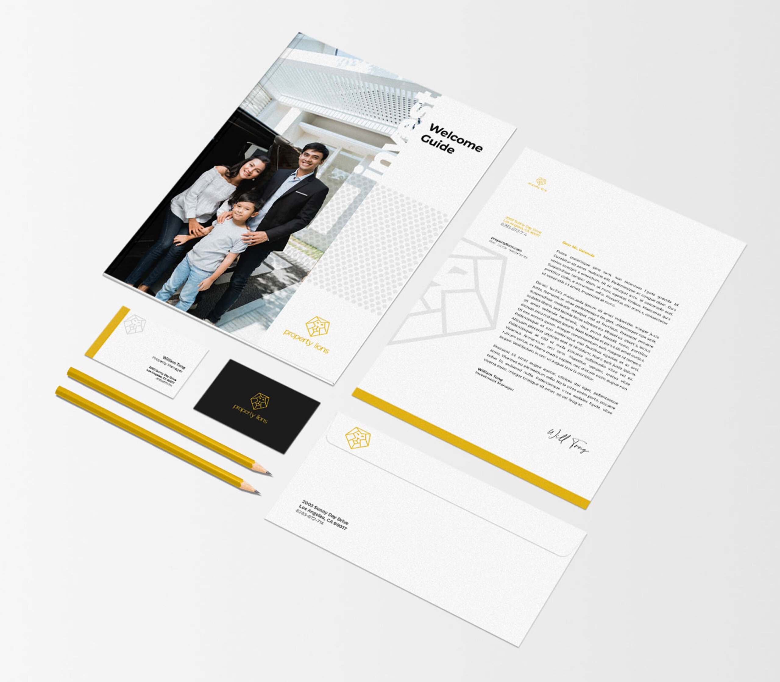
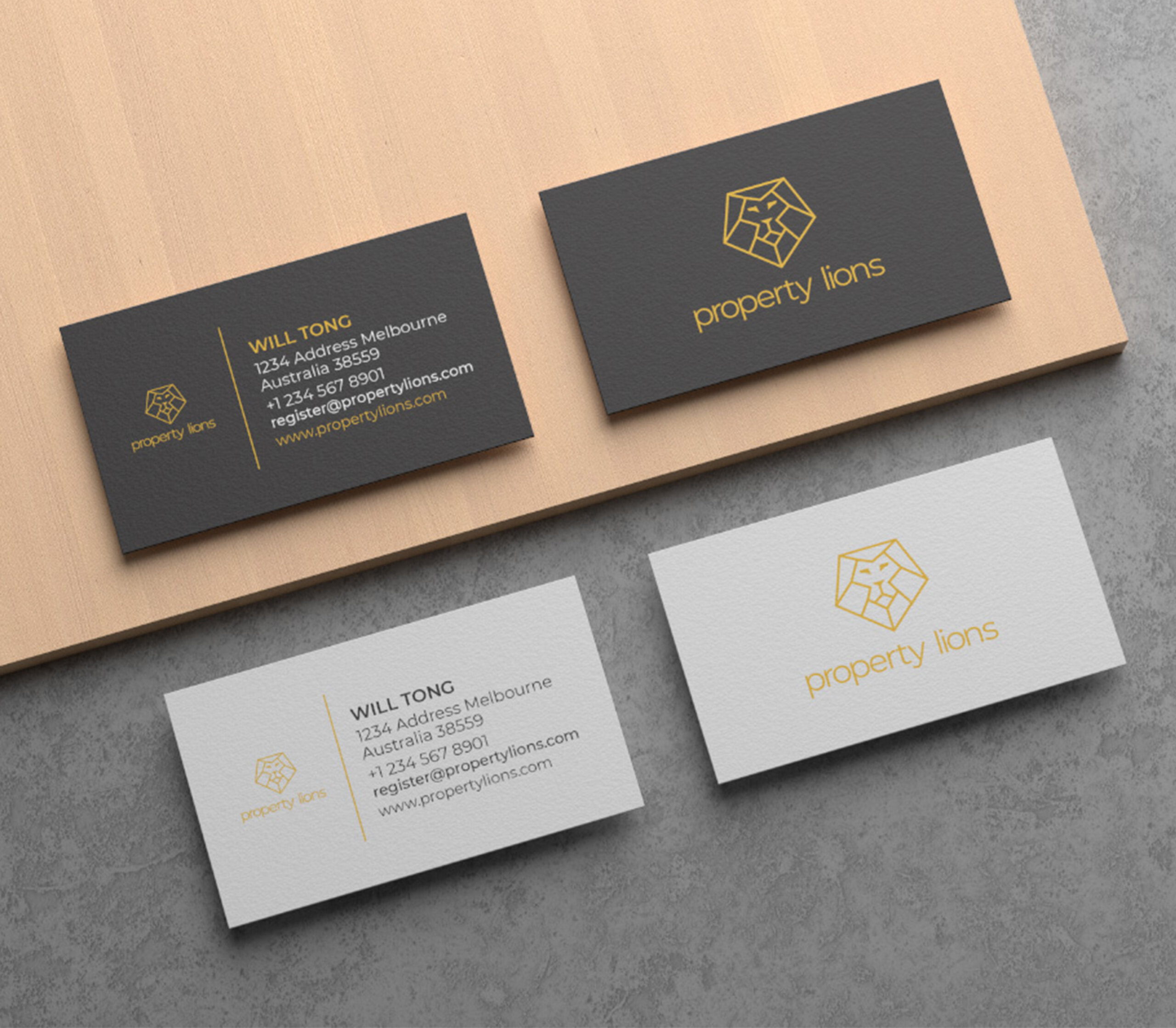
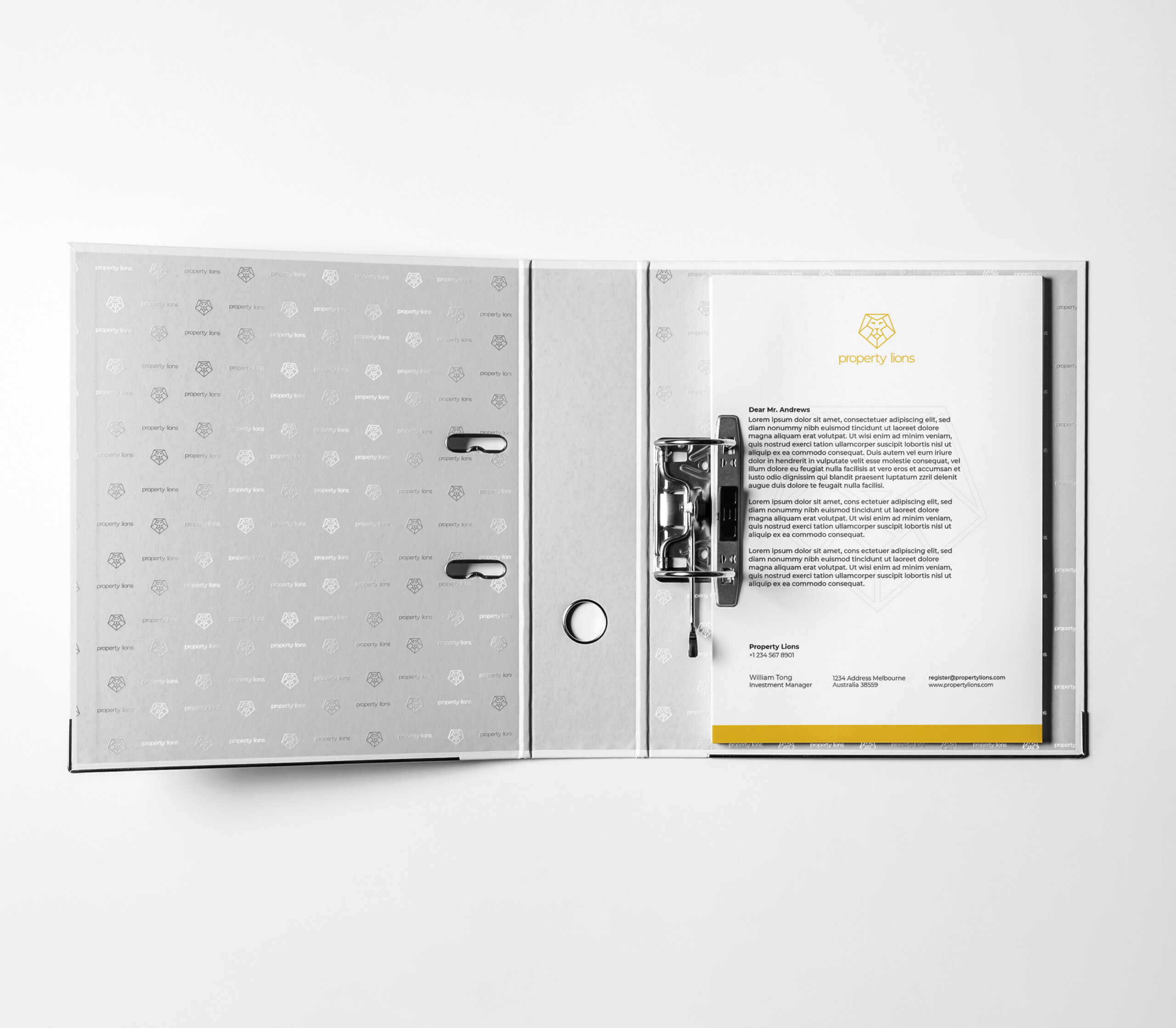
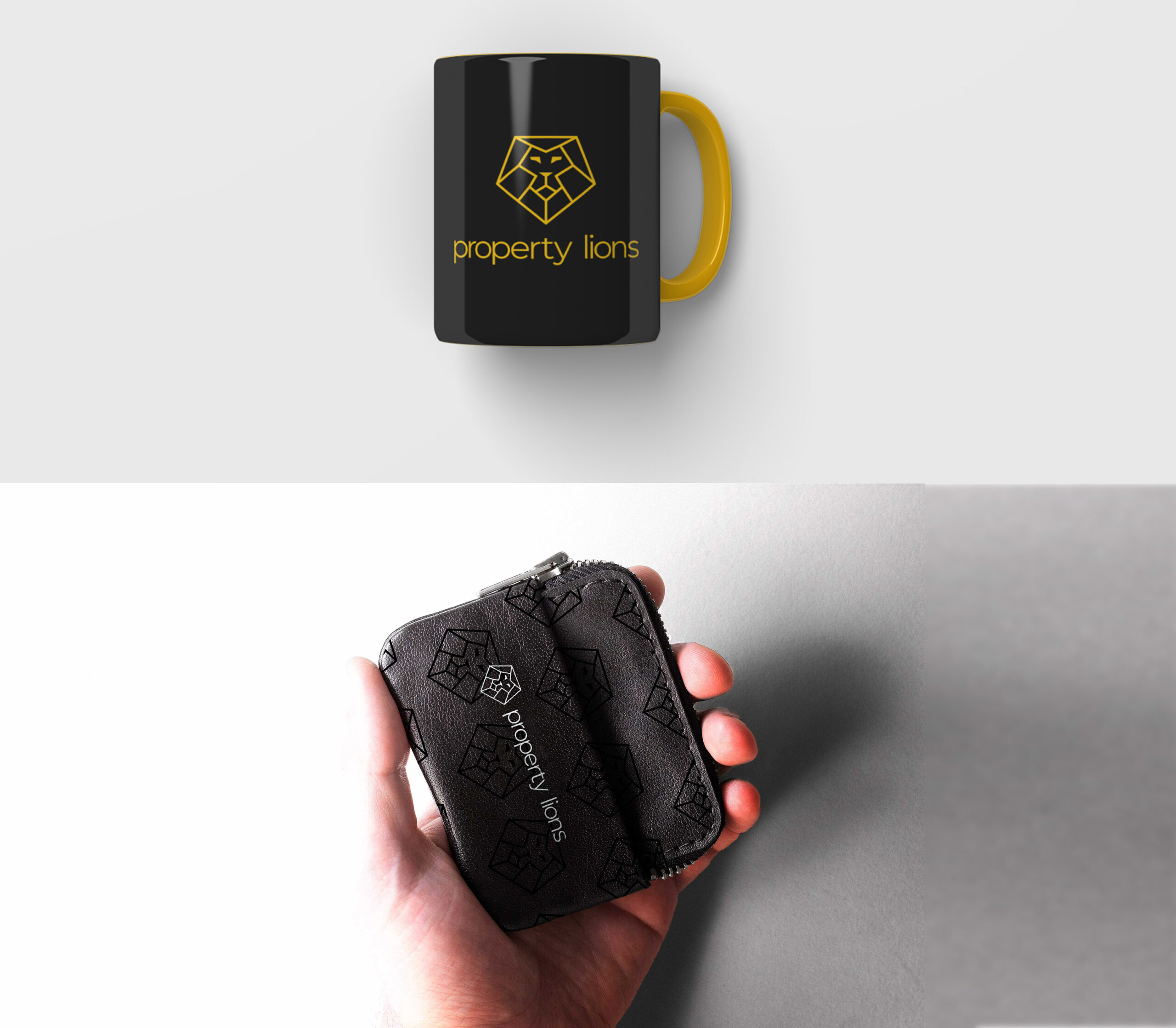
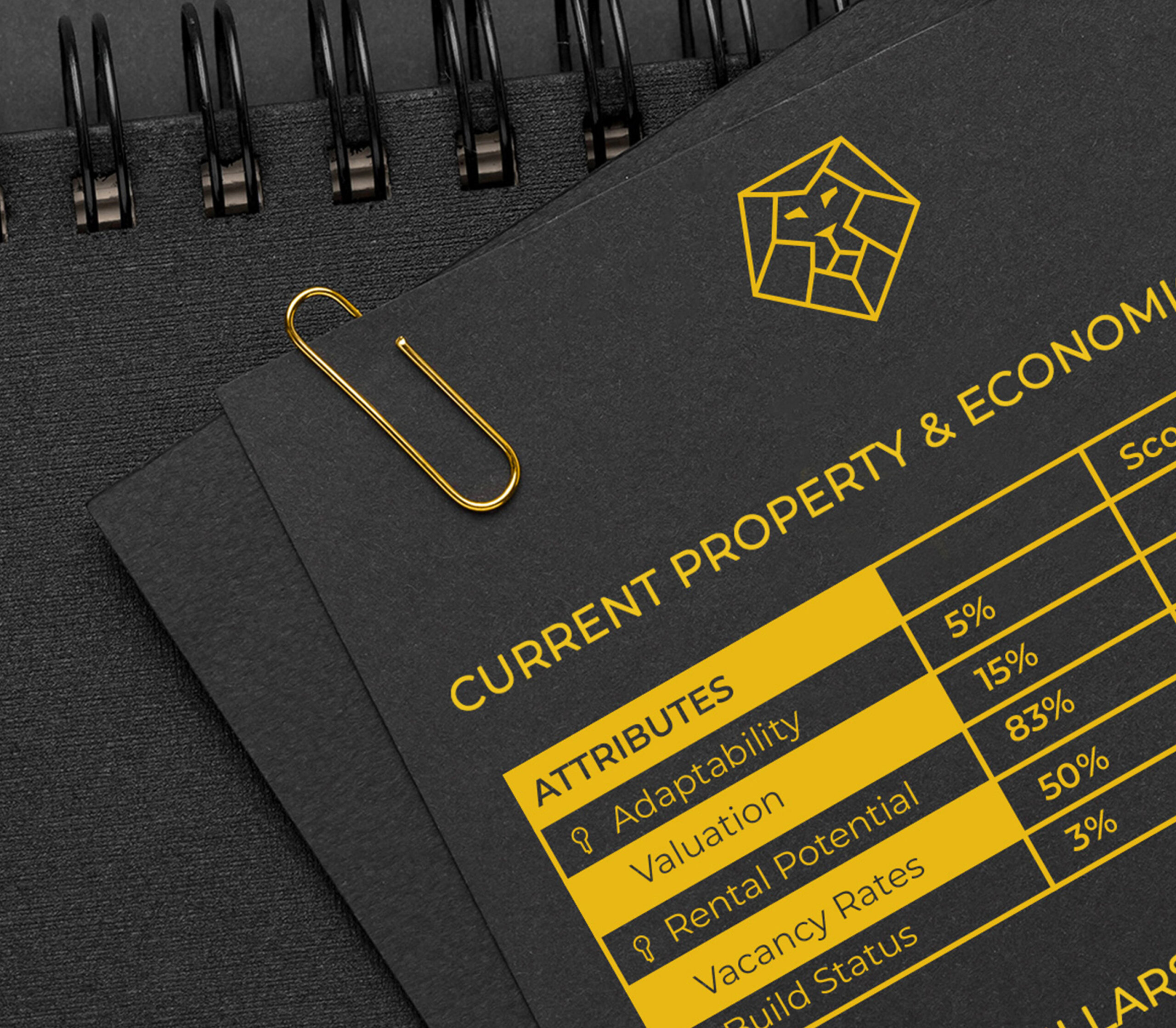
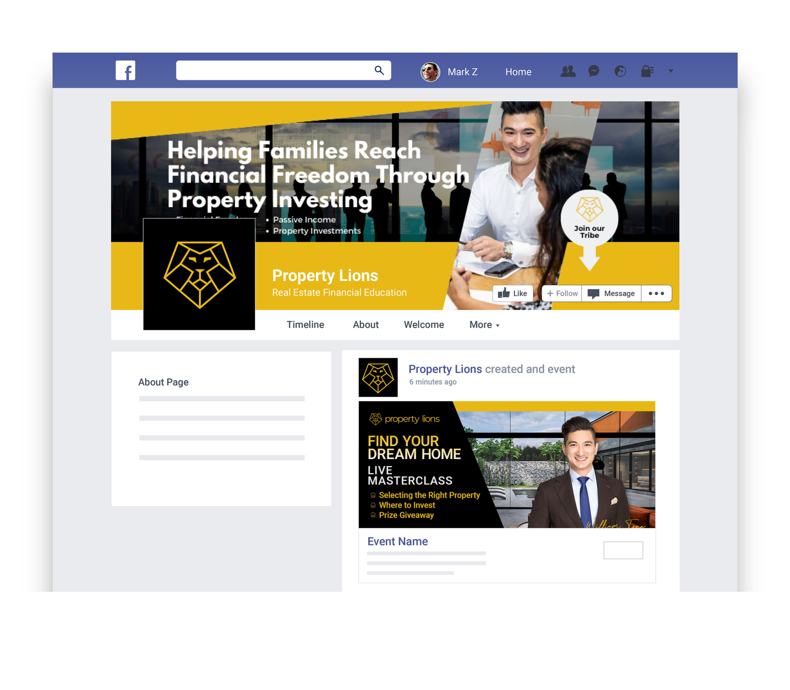
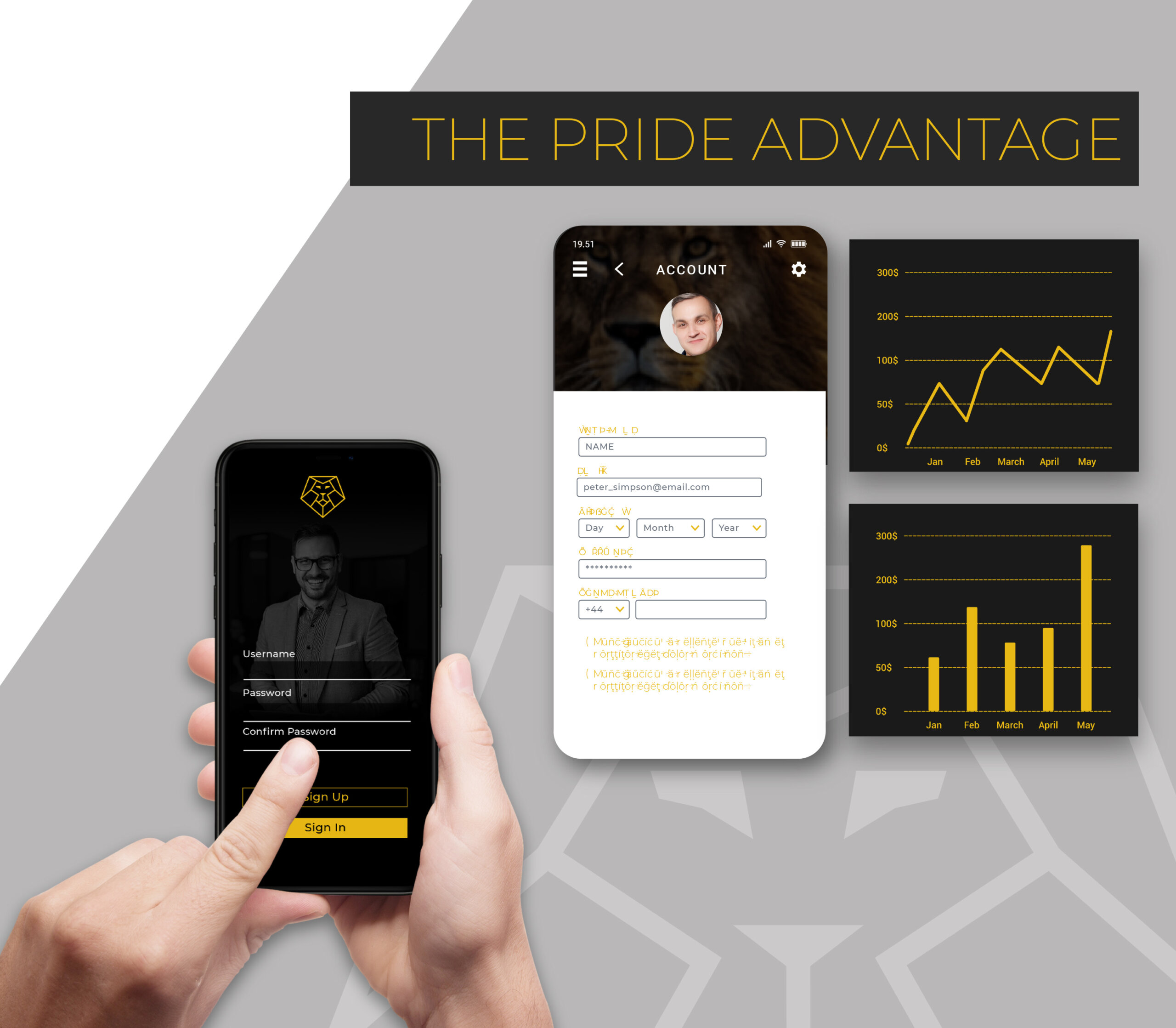
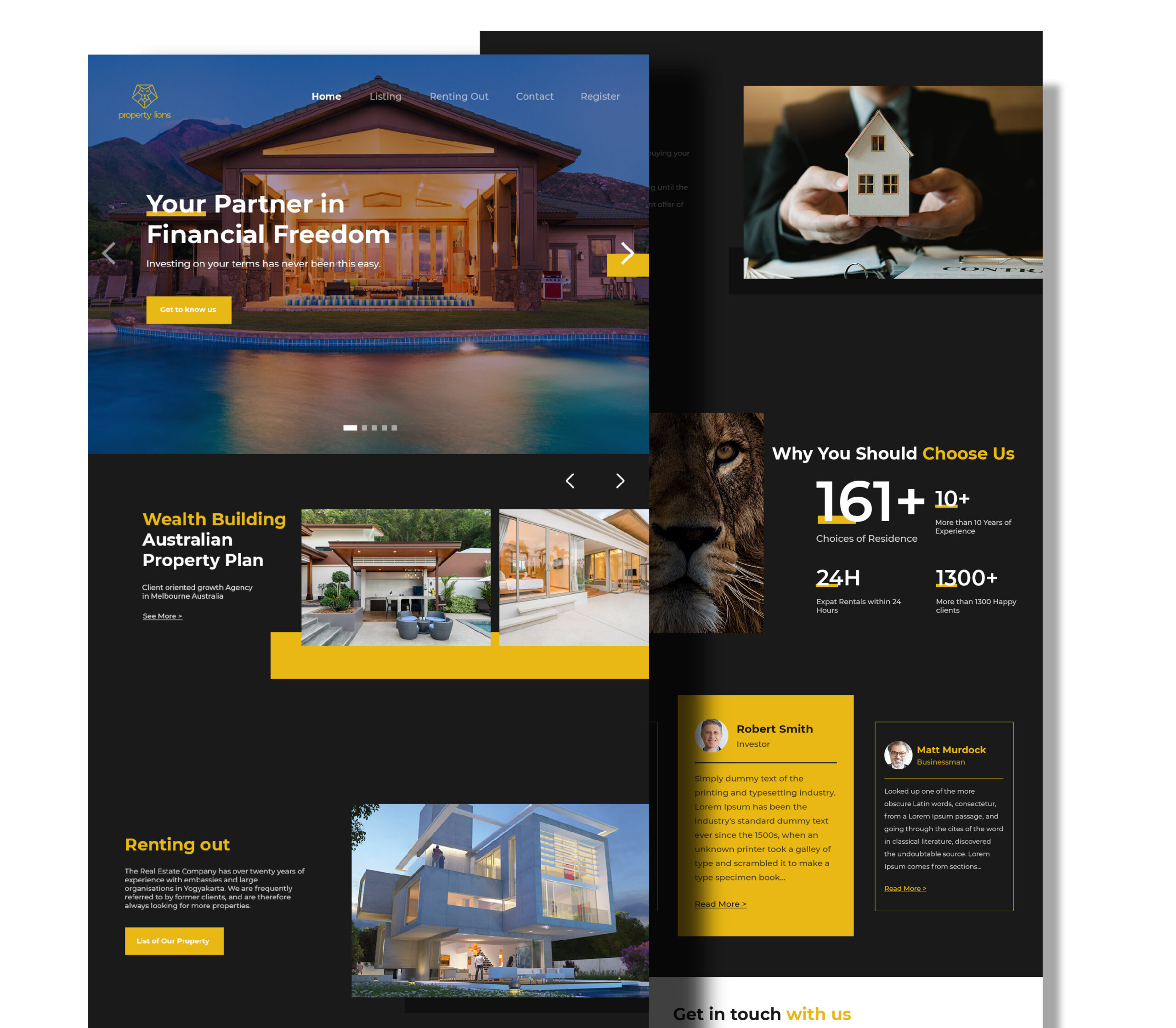
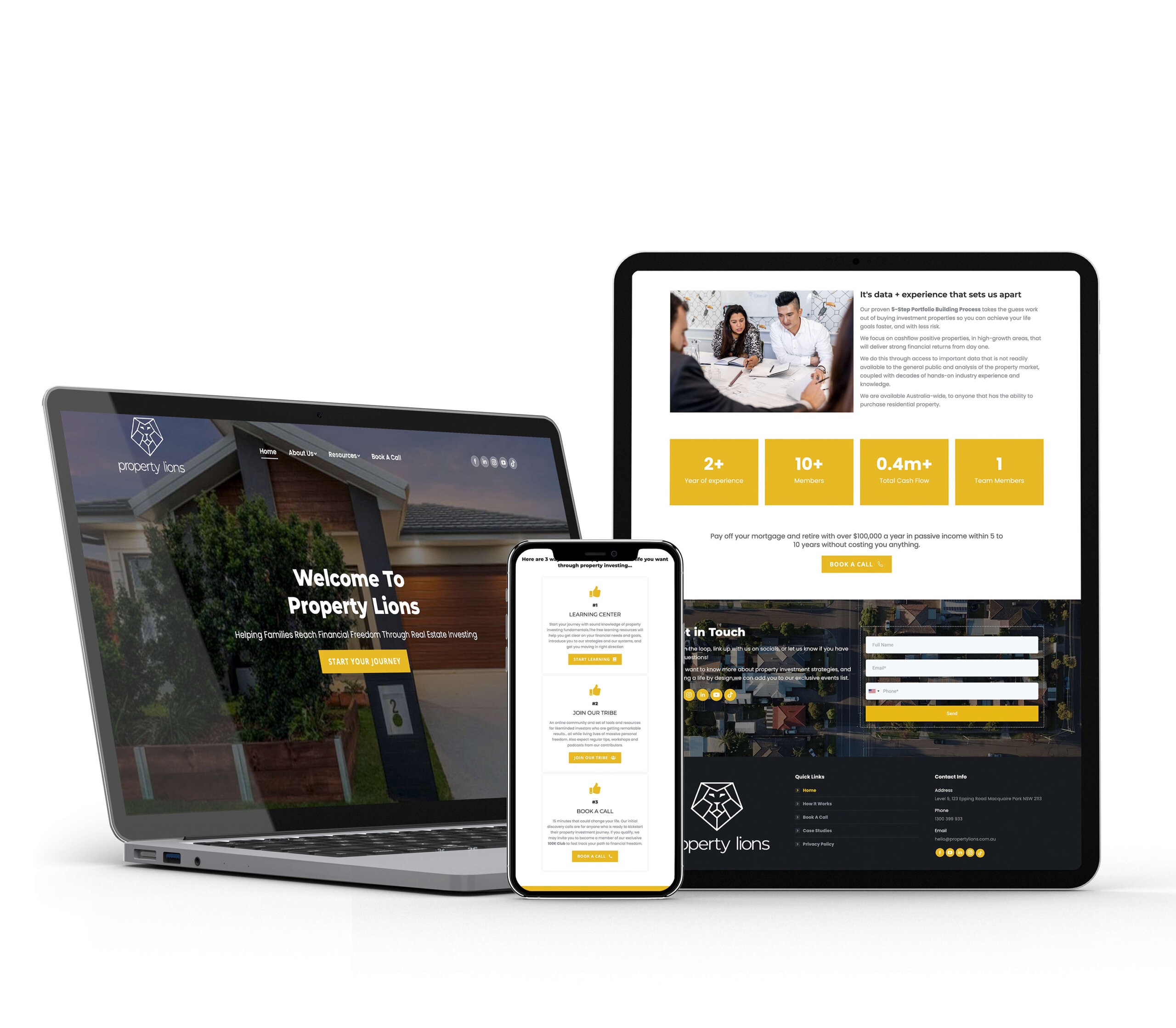
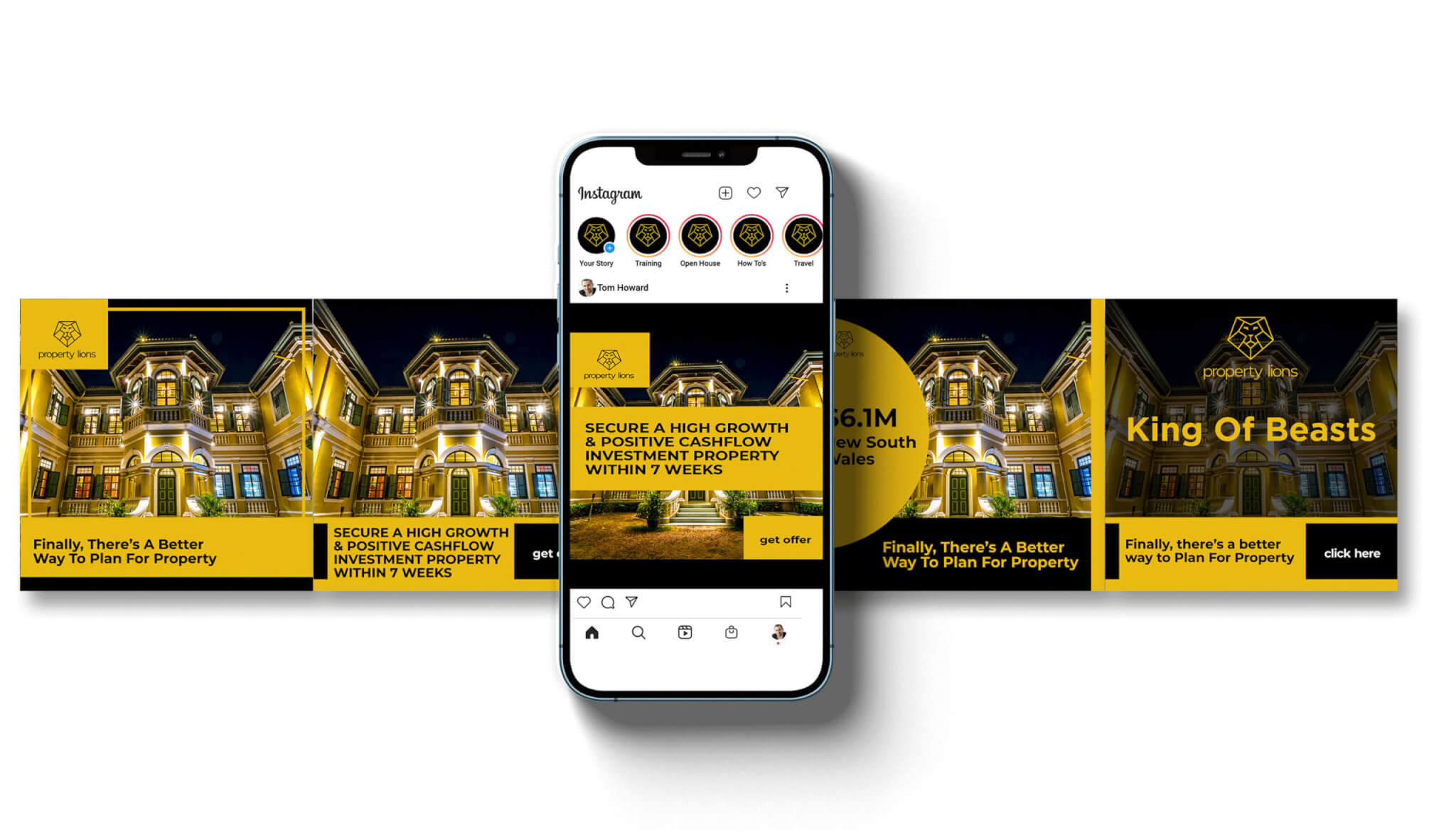
Using the lion symbol in combination with a plot of land, a pentagon geometric shape was used to enclose the logo. The result was a set of brand assets, including a brand guide book, social media post templates, custom icon set, and assorted variations of the logo mark for print and web. The logo mark itself featured strong geometric strokes that were even in weight across the logo mark, with the lion’s mane creating space that represented plots of land. The eyes were designed with a bevel that courses downward, ensuring recognizability at a distance.
Results
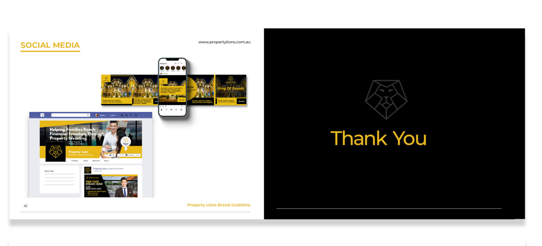
Property Lions immediately saw the benefits of the work done on their brand. The new logo design and refreshed name led to brand recall from their new client base, increasing brand recognition and trust. Internally, investor trust increased due to a clear vision, while content outreach increased across Facebook and Instagram. Overall, the new brand assets and strategy have helped Property Lions stand out in a competitive market and position themselves as a leading real estate investment coaching brand in Sydney, Australia.

“I had the pleasure of working with Kendol Mason on our brand refresh project, and I must say that I was thoroughly impressed with his work.
Kendol came in with a fresh perspective and an open mind, willing to listen to our needs and goals as a business. He conducted thorough research on our industry and competitors and was able to provide us with a comprehensive brand strategy that aligned perfectly with our business objectives.
Kendol’s ability to think outside the box was evident in the logo design he created for us. It was unique and distinct, setting us apart from the crowded real estate industry, and it perfectly communicated the strength and reliability we wanted our brand to convey.
Overall, I would highly recommend Kendol Mason to anyone looking for a creative and adaptive brand designer who can deliver great results. He truly is a talented and professional designer who goes above and beyond to ensure his clients’ success.”
William Tong,
Managing Director, Property Lions
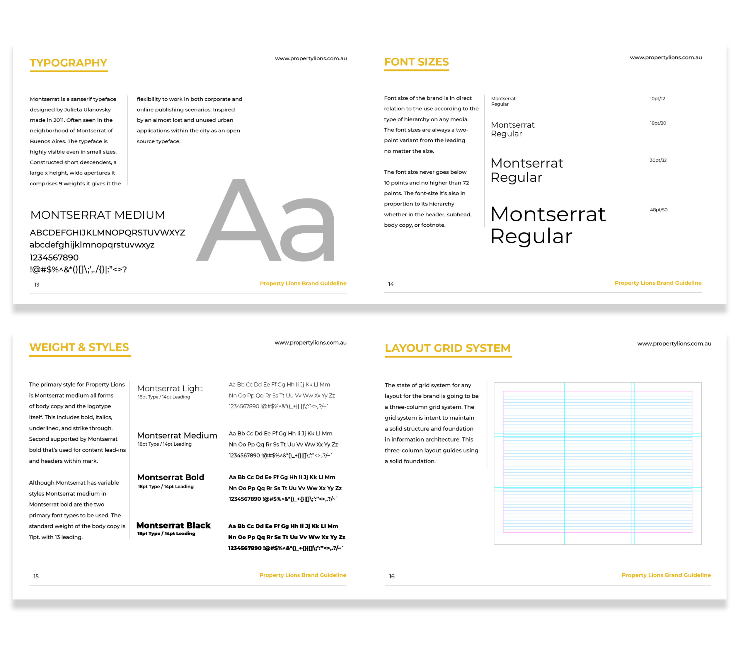
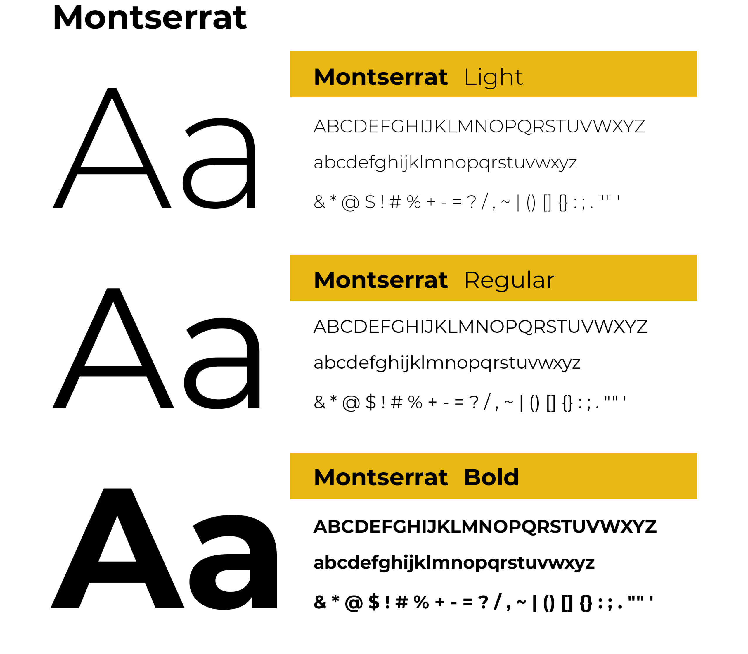
Typography

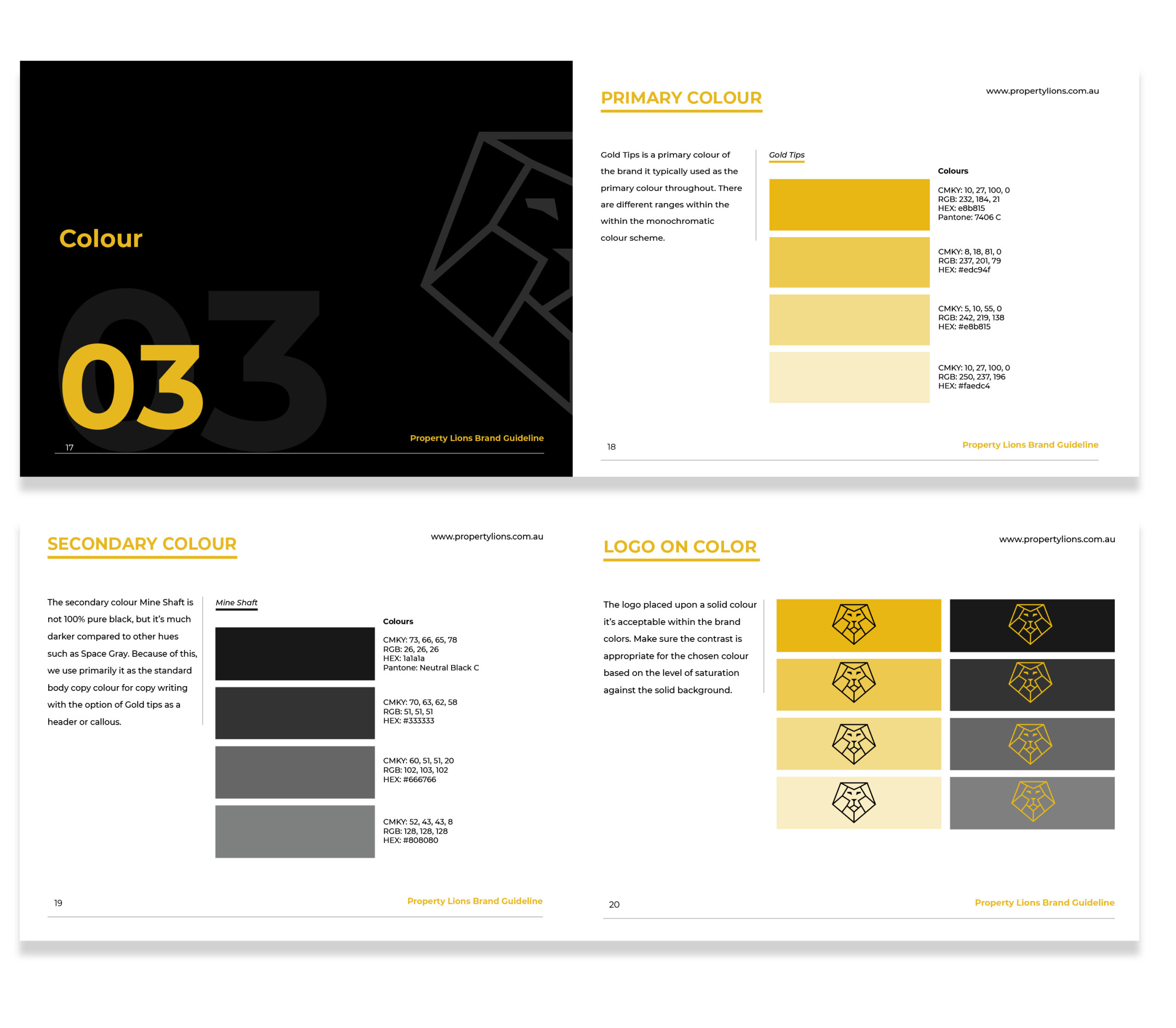
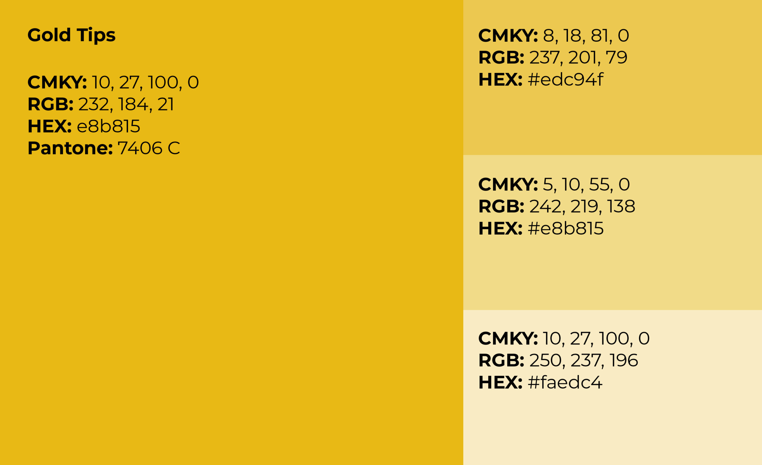
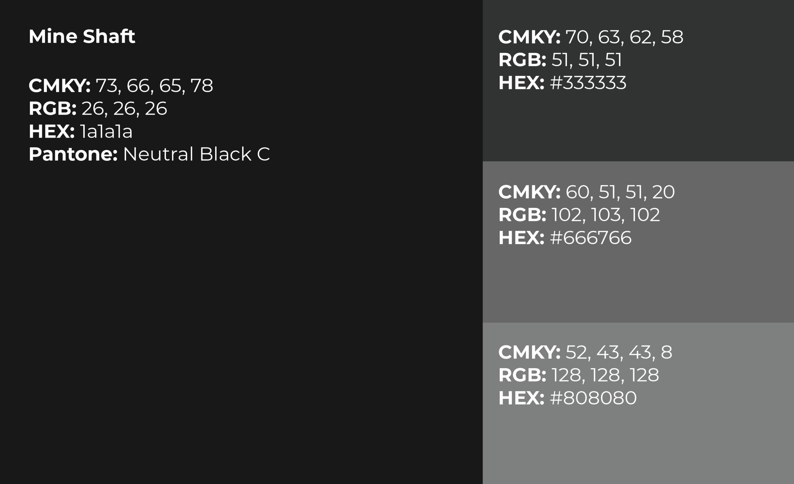
Color
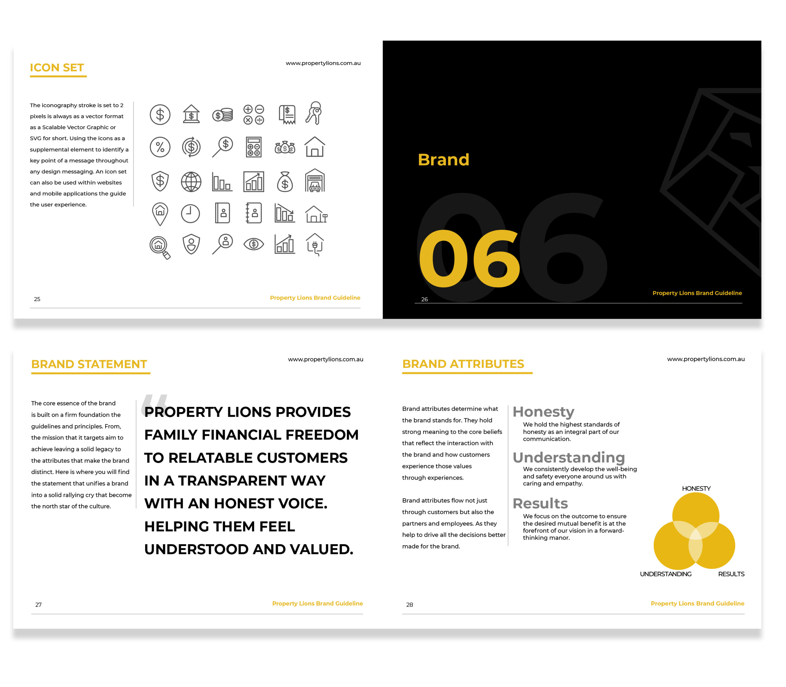
Iconography
Brand Assets
Digital Applications
Brand Guideline
