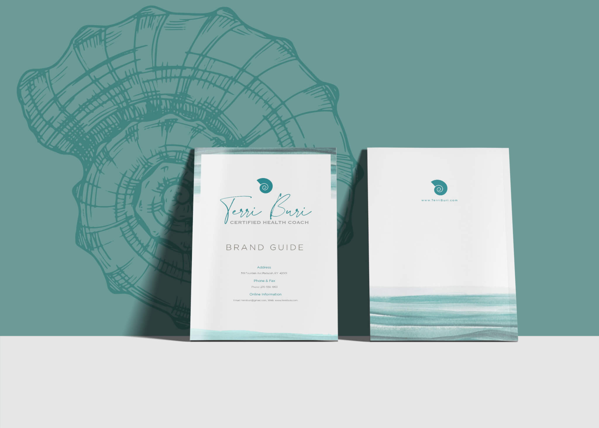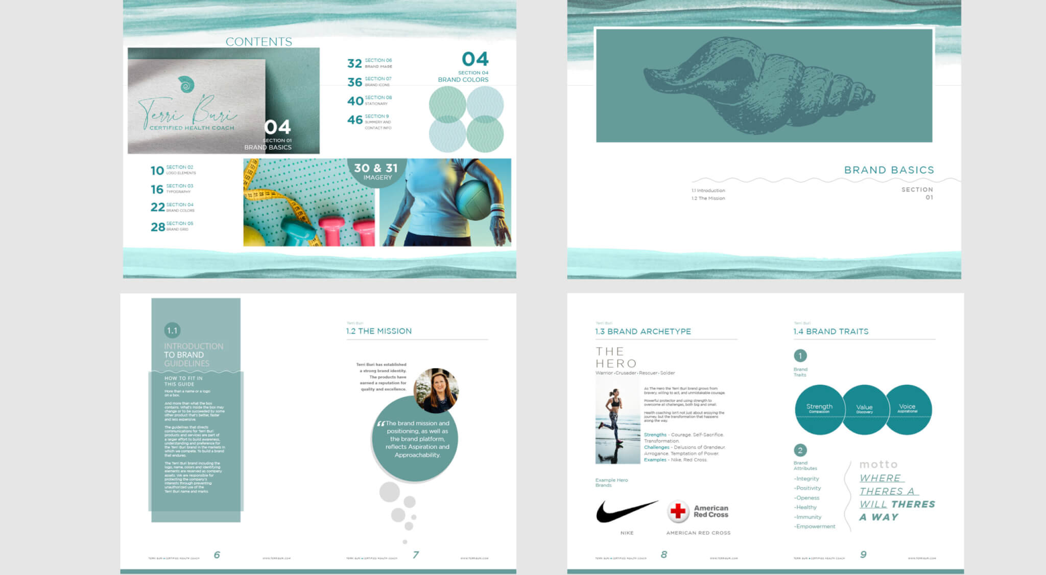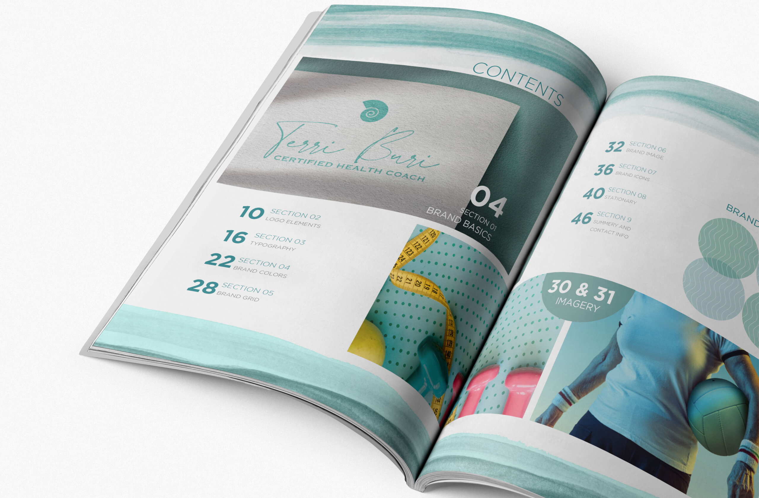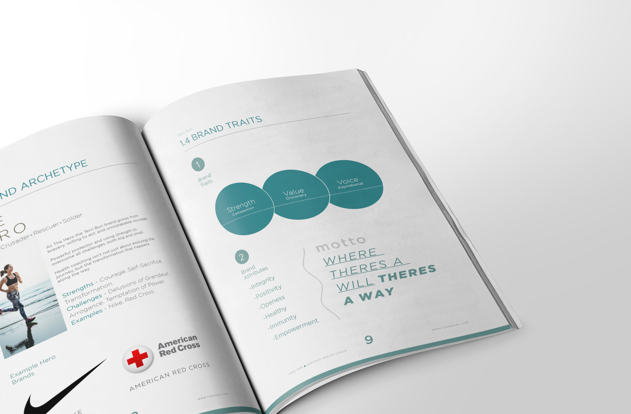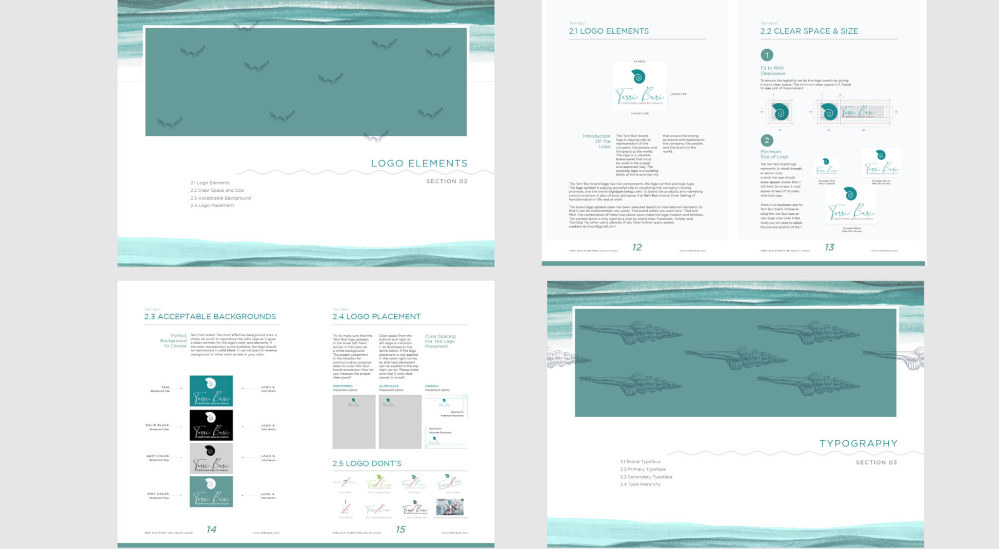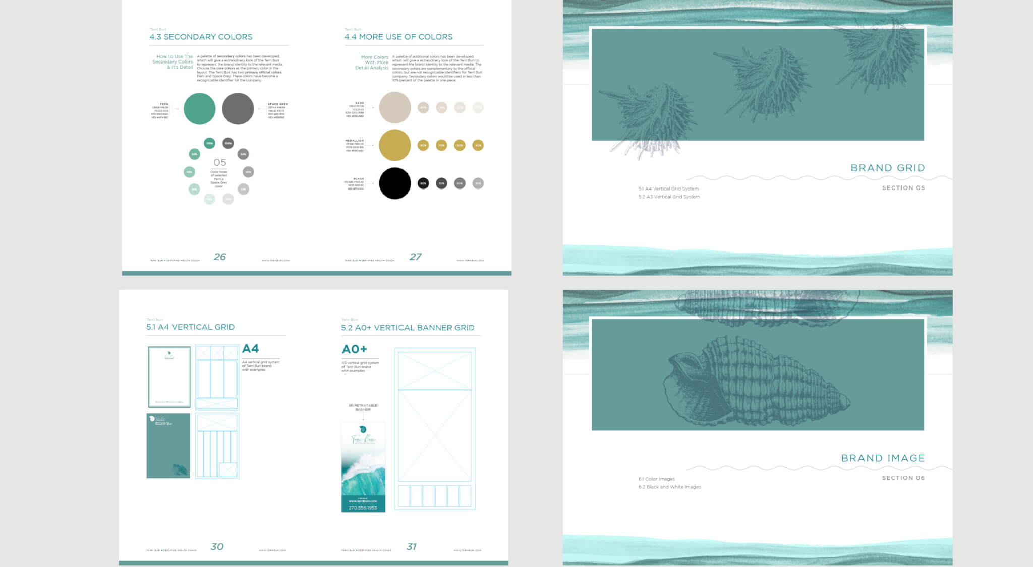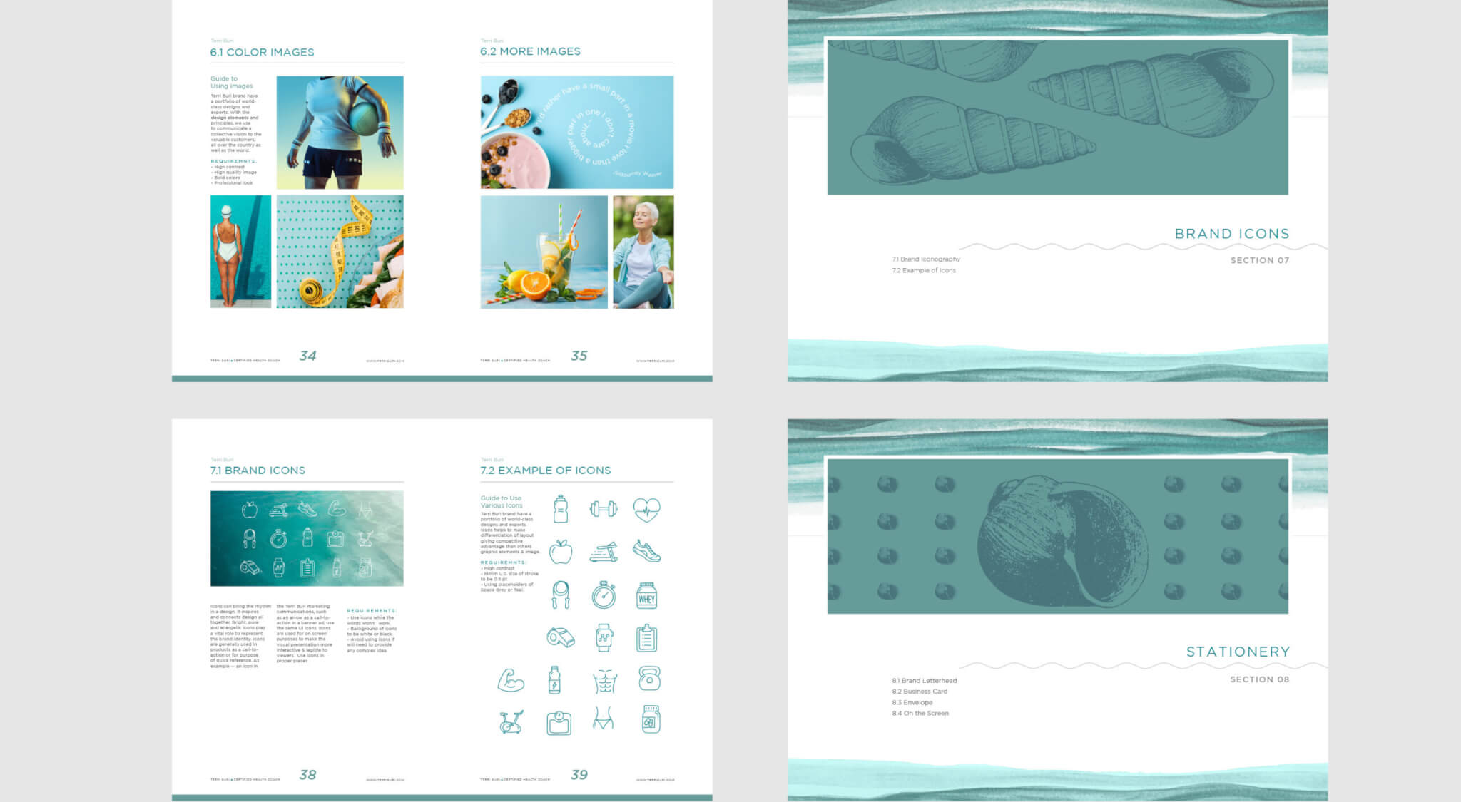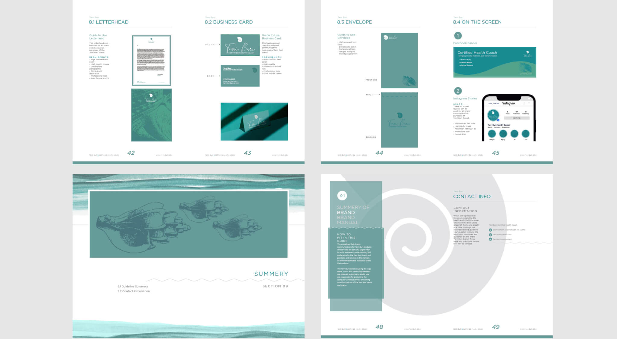
Focusing on the health and well-being through proper nutrition and the development of the body, mind, and spirit. Our body comprises 80% water and what we put into it should be pure. That’s the approach that we took while developing this brand identity for Terry Buri certified health coach.
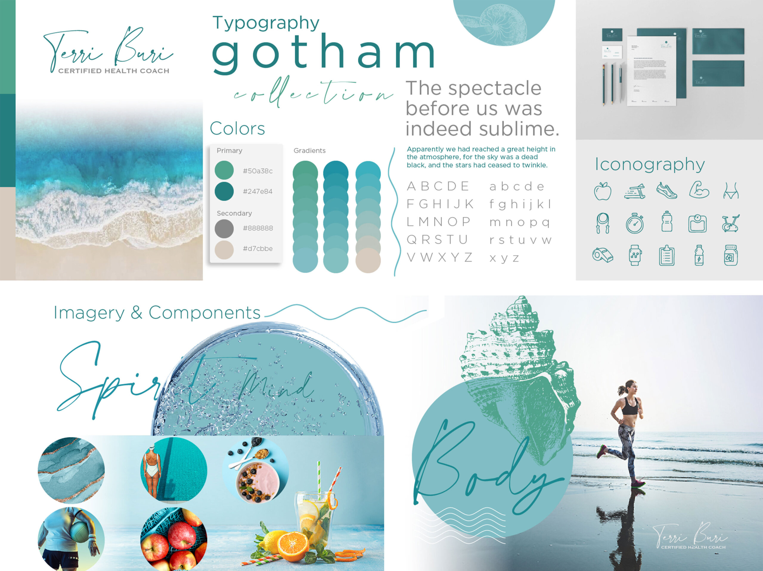
Style Scape
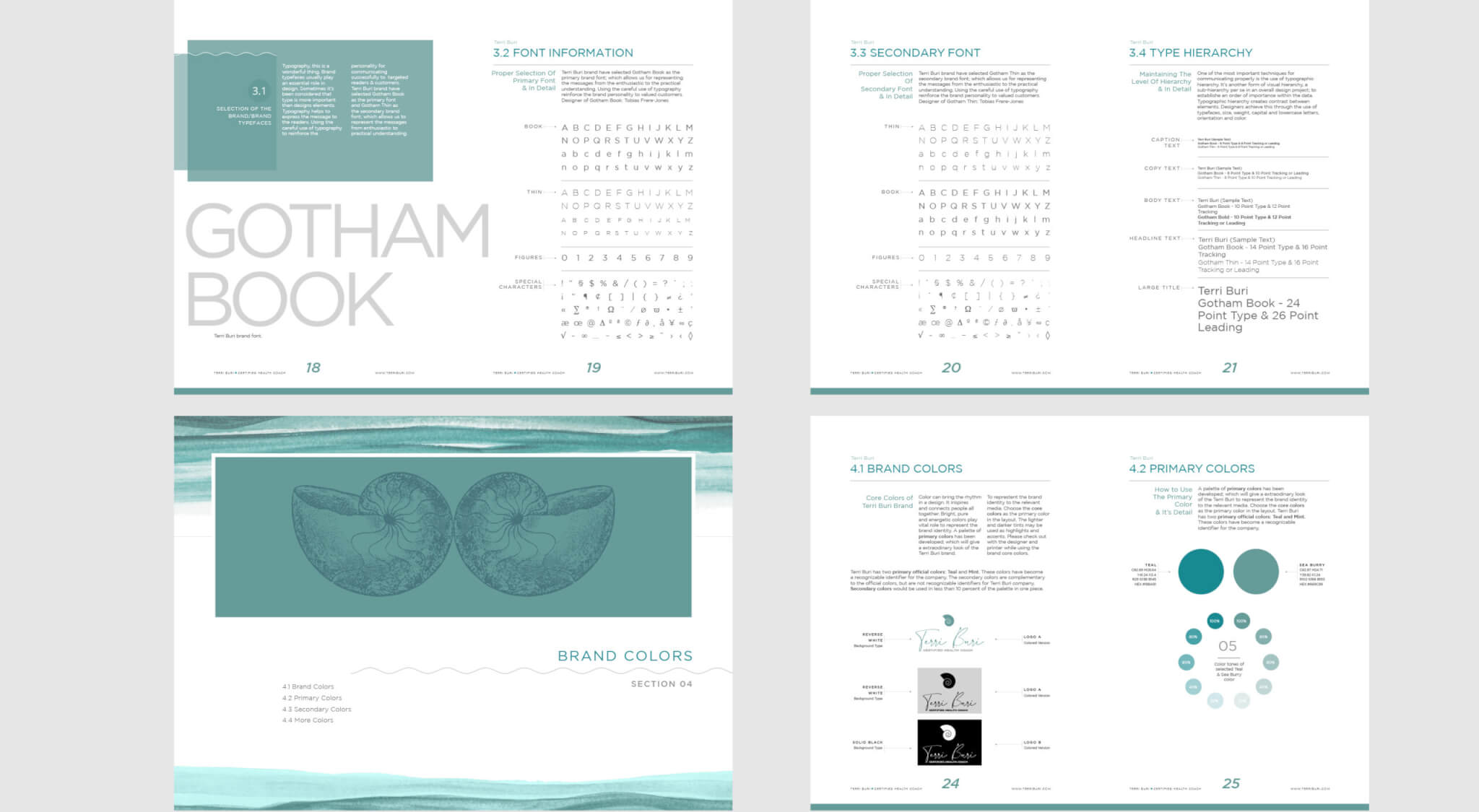
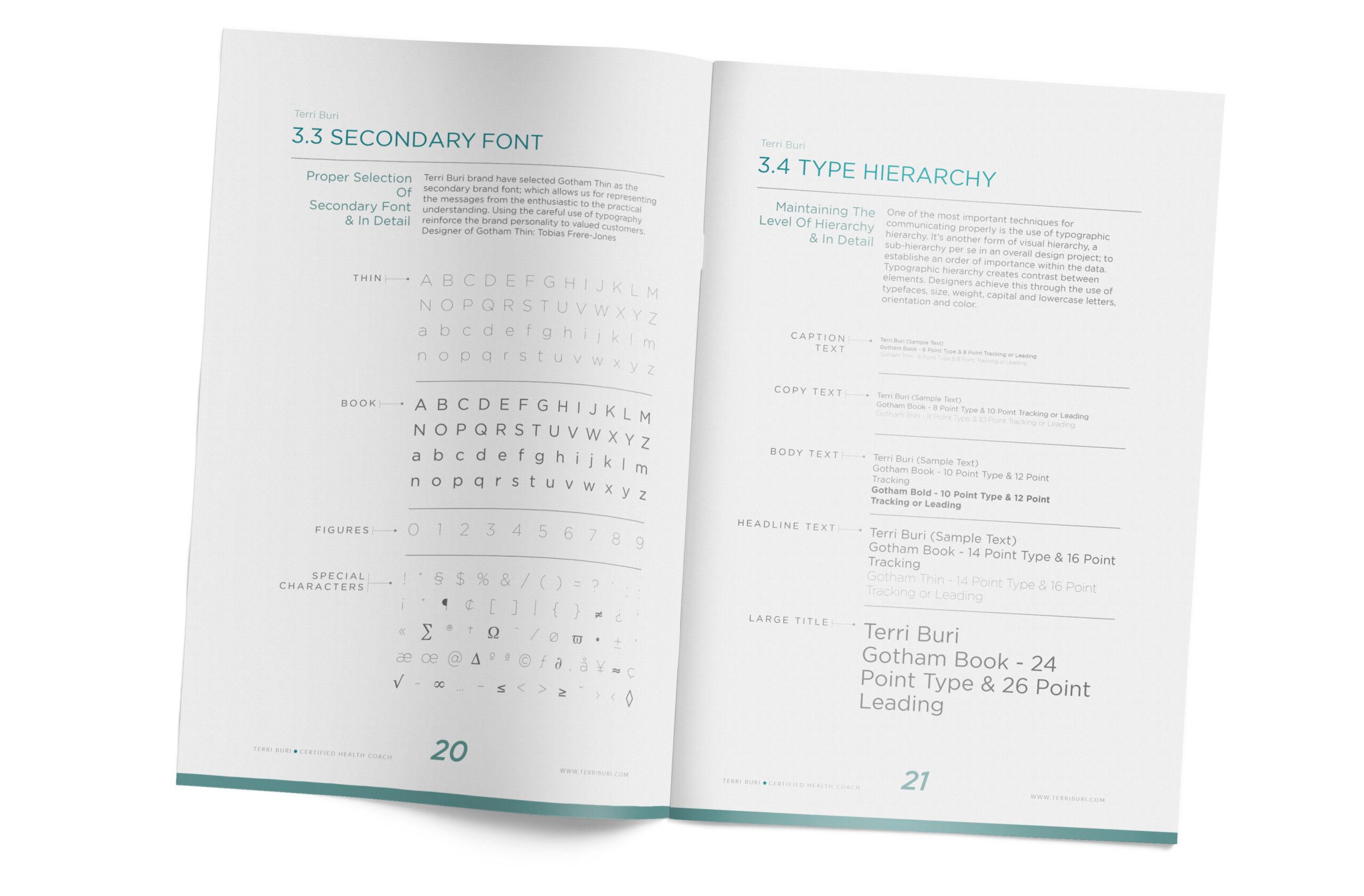
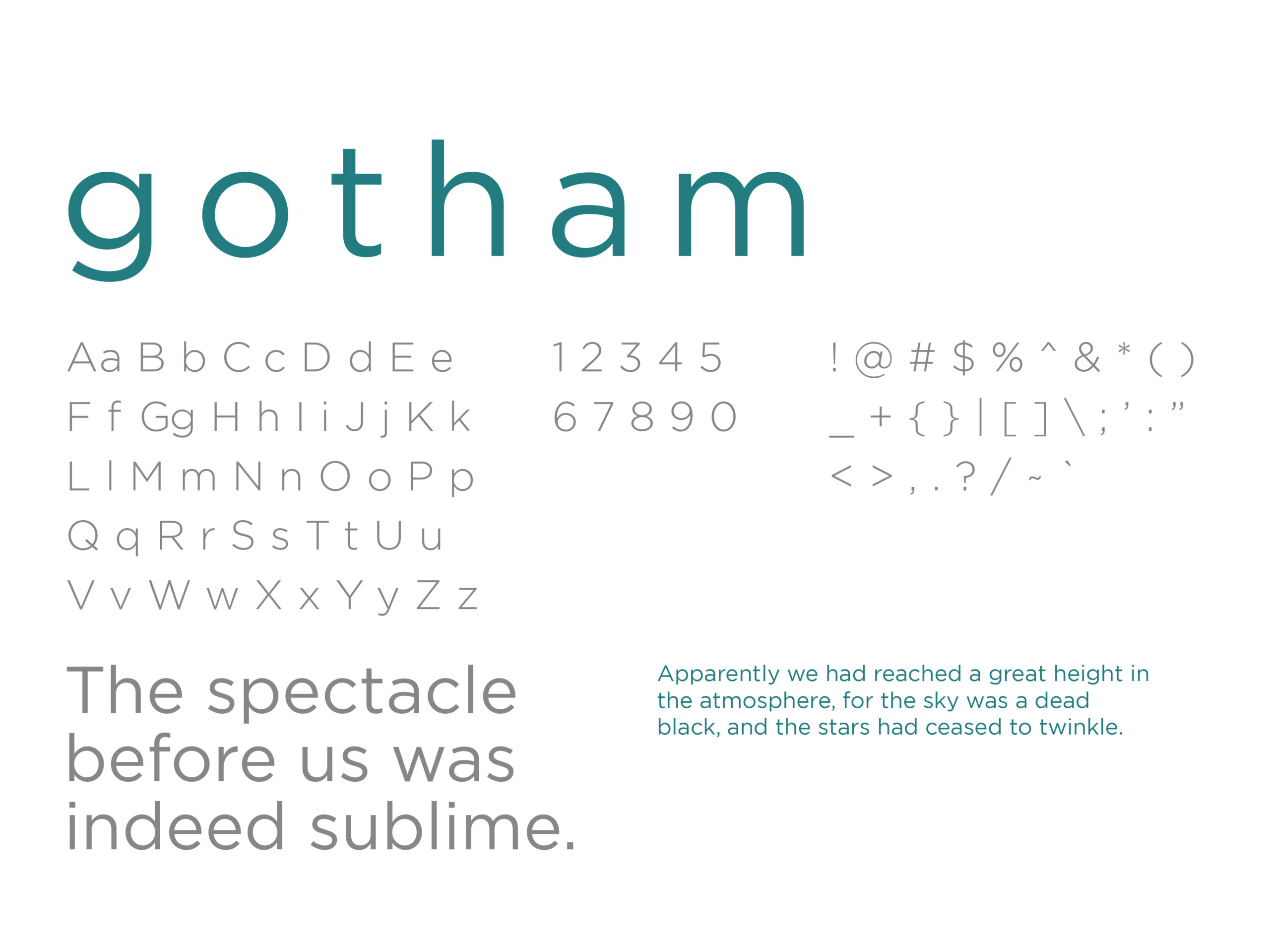
Typography
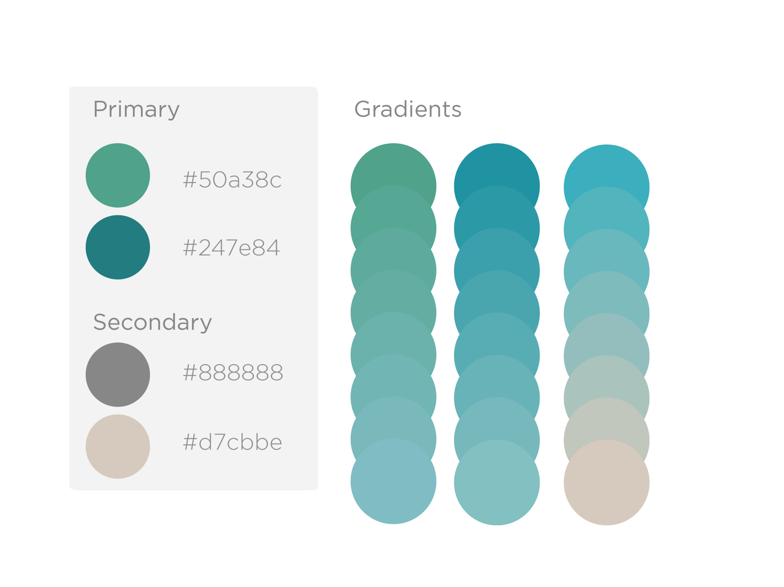
Color
Pattern
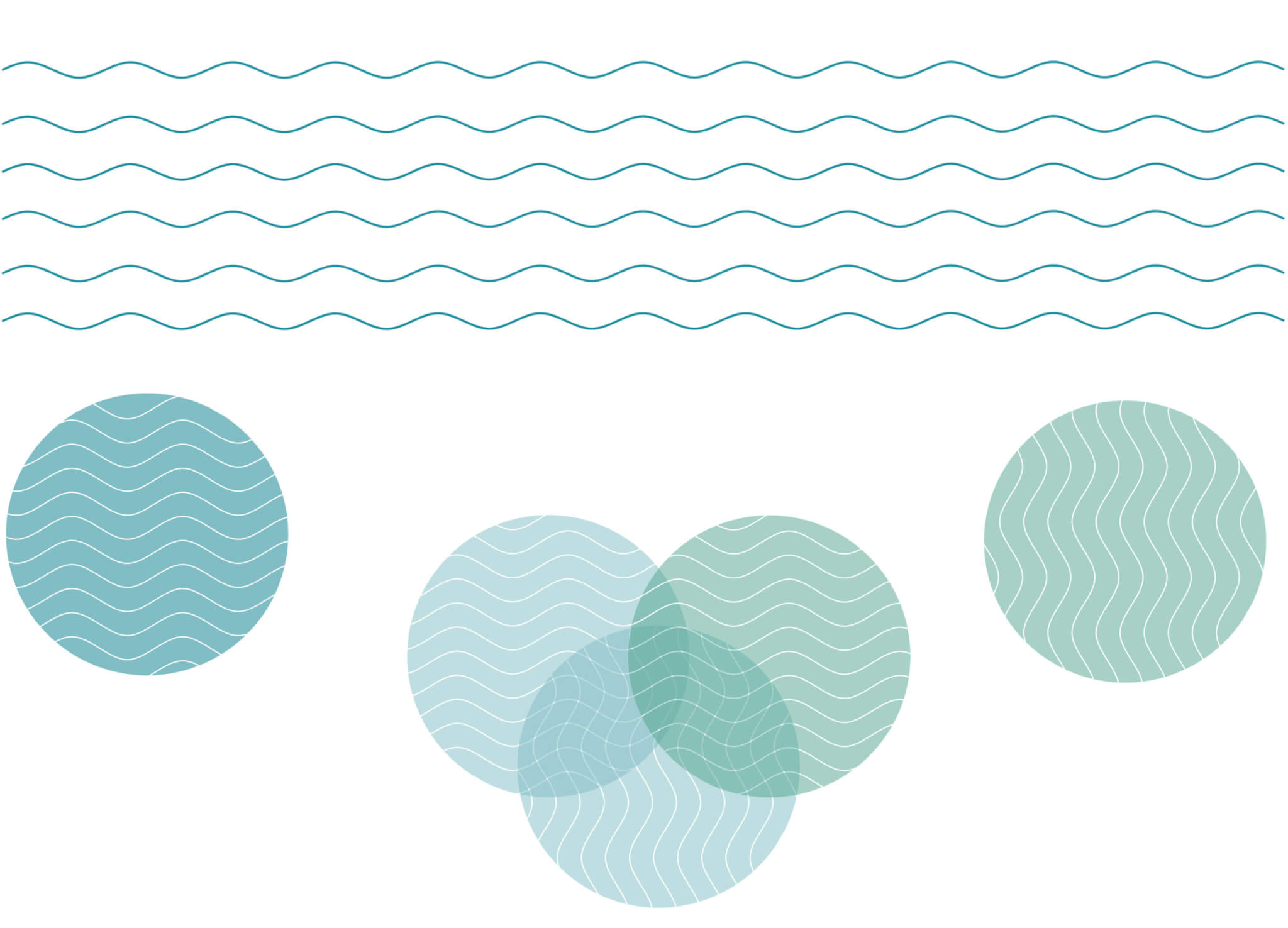
Taking care of your mental and physical health over time, we learn to invest in and being much more aware of what we’re putting not just on our bodies, but in it. Terri Buri is a certified health coach, focusing on optimizing to help through a proper diet and adopt healthy habits through simple steps.
This isn’t the type of nutritional system where you “lose 50 lb in just two weeks.” You develop healthy habits that play a game over the long term. With practical approaches to optimal health and a sustainable support system from a variety of backgrounds, it’s what makes this brand effective in the marketplace.
Aimed at women 40 and over who have tried just about everything but want a guided personal transformation. Supporting clients on their journey is one of the most impactful things that could be done in the health coach industry. We created a brand identity system, positioning, color system, marketing campaign that revitalizes a positive outlook and living out the best version of one’s life.
Kendol collaborated closely with Terry on several calls to flesh out any details along the way. The brand identity strengthened around focusing on what nature naturally provides. The fact that our bodies are 60% water, so growing and maintaining a stronger foundation using the grains and minerals from the earth should be from a source that’s already within us.
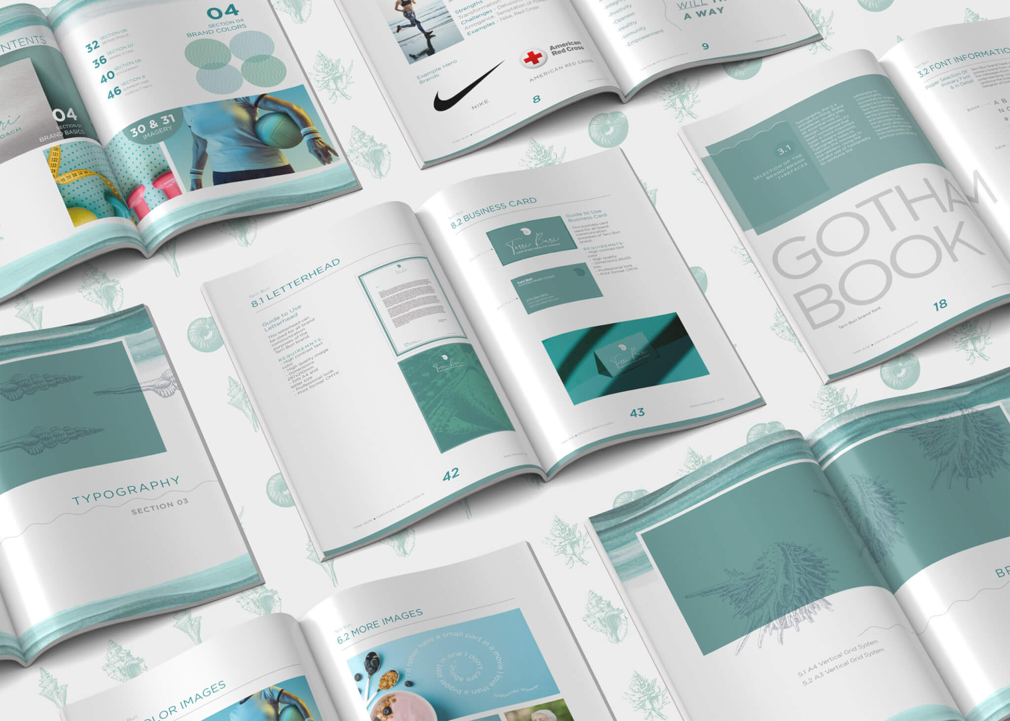
Brand Assets
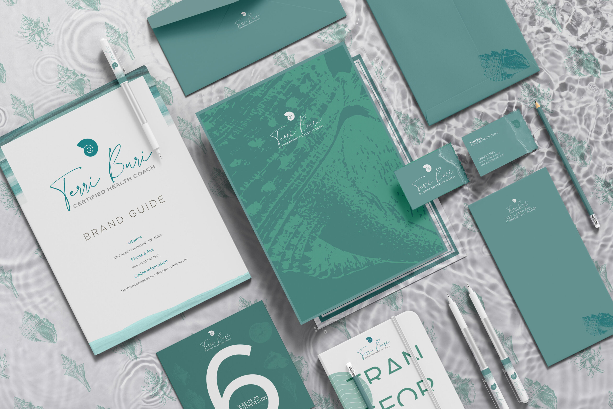
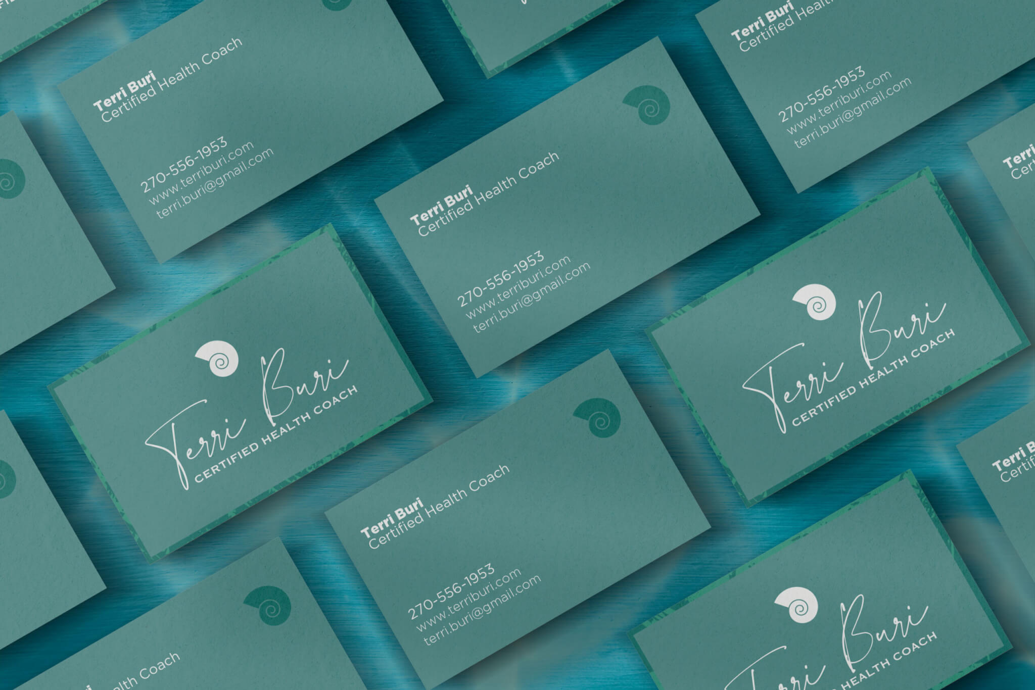
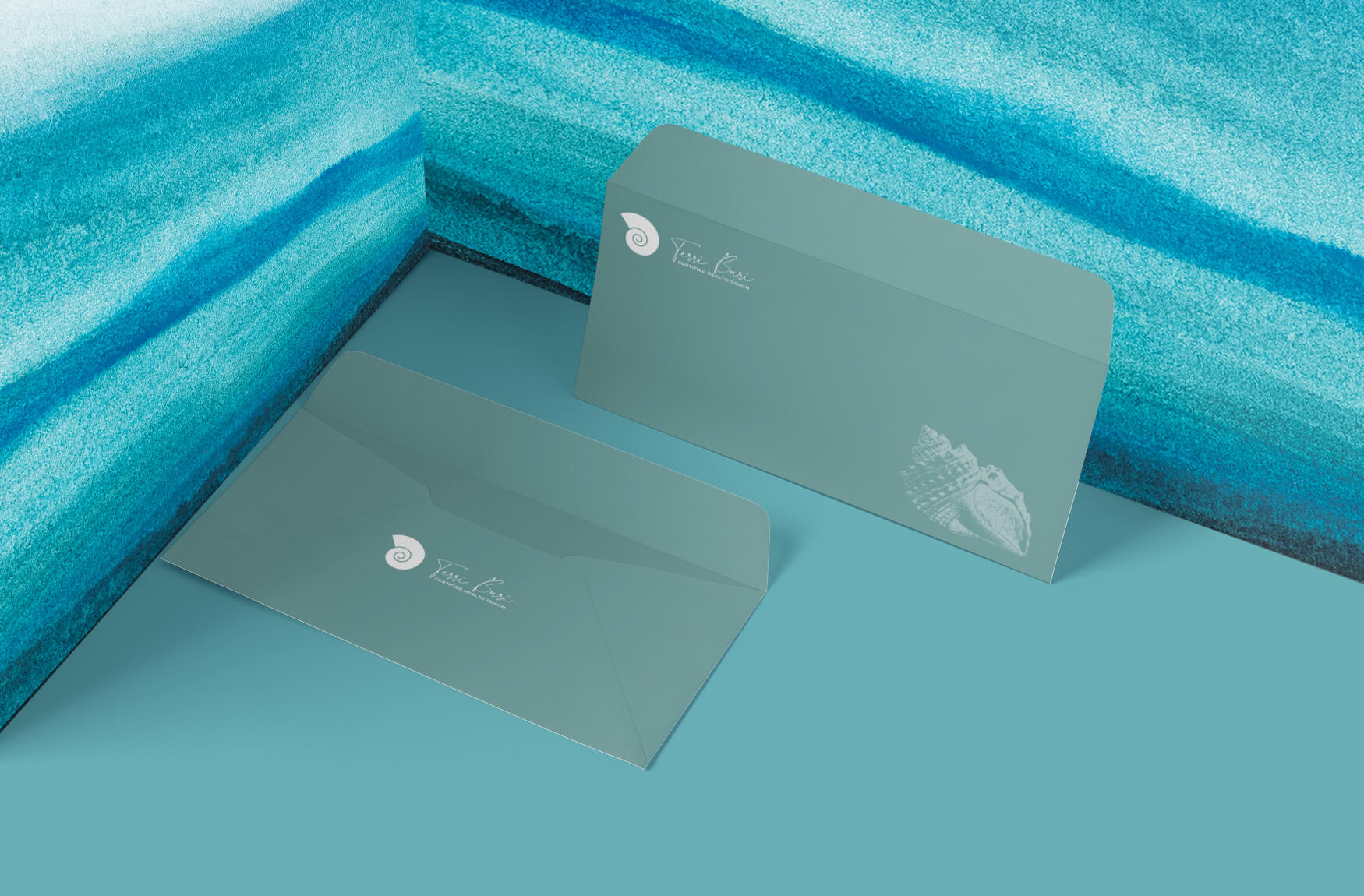
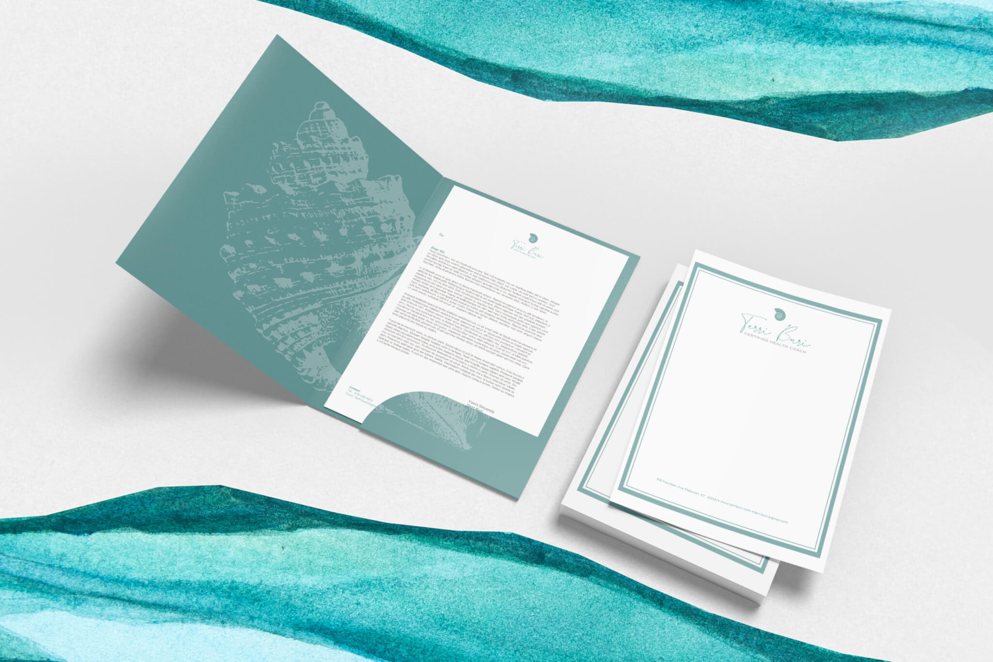
We got down the core essence of the visual tone by doing brand exercises and creating an archetype is a great direction for getting her values in alignment. The Hero seems to be just the right archetype that aligns with the values of the brand. It’s just as fitting with larger well-known brands like Johnson & Johnson or the American Red Cross, both of which focusing on personal health efforts.
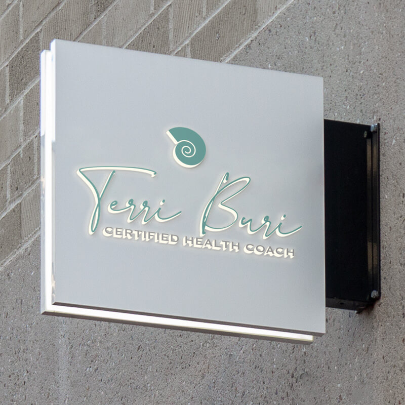
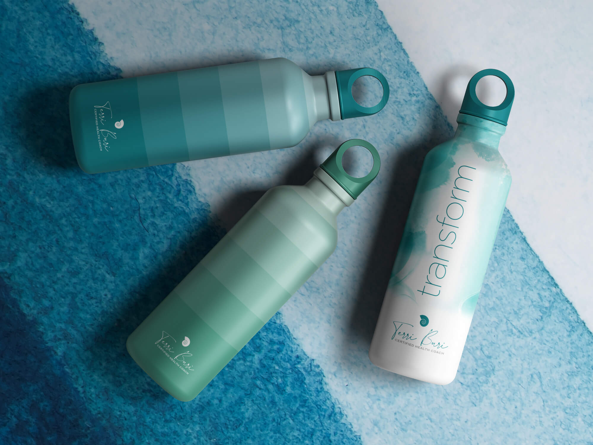
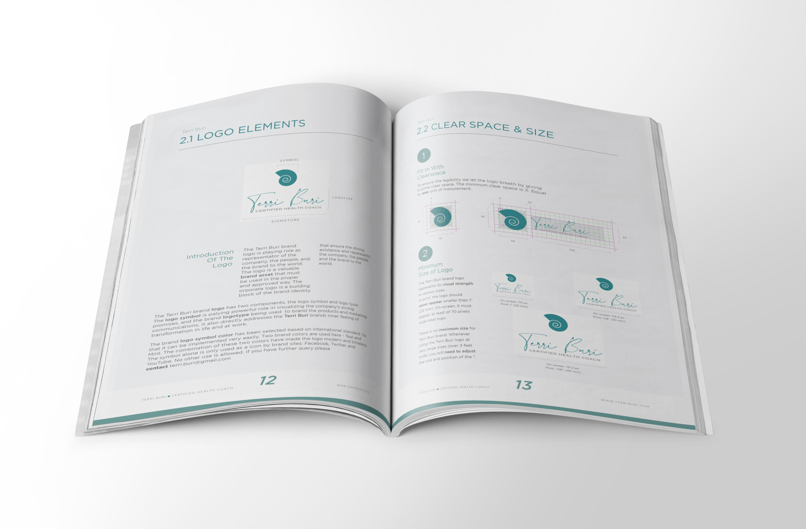
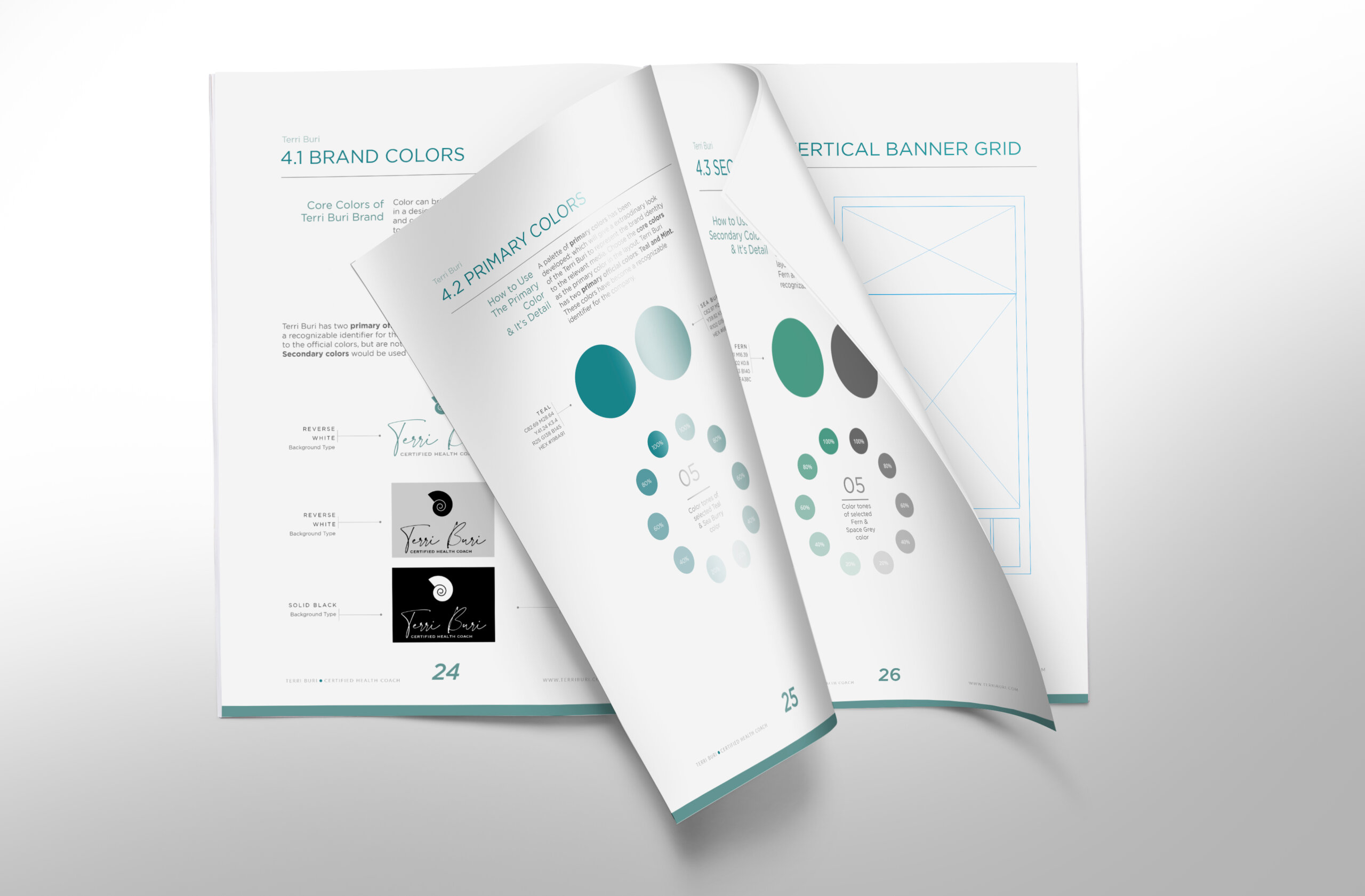
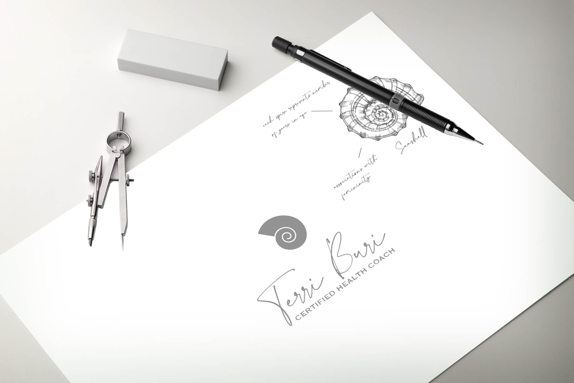
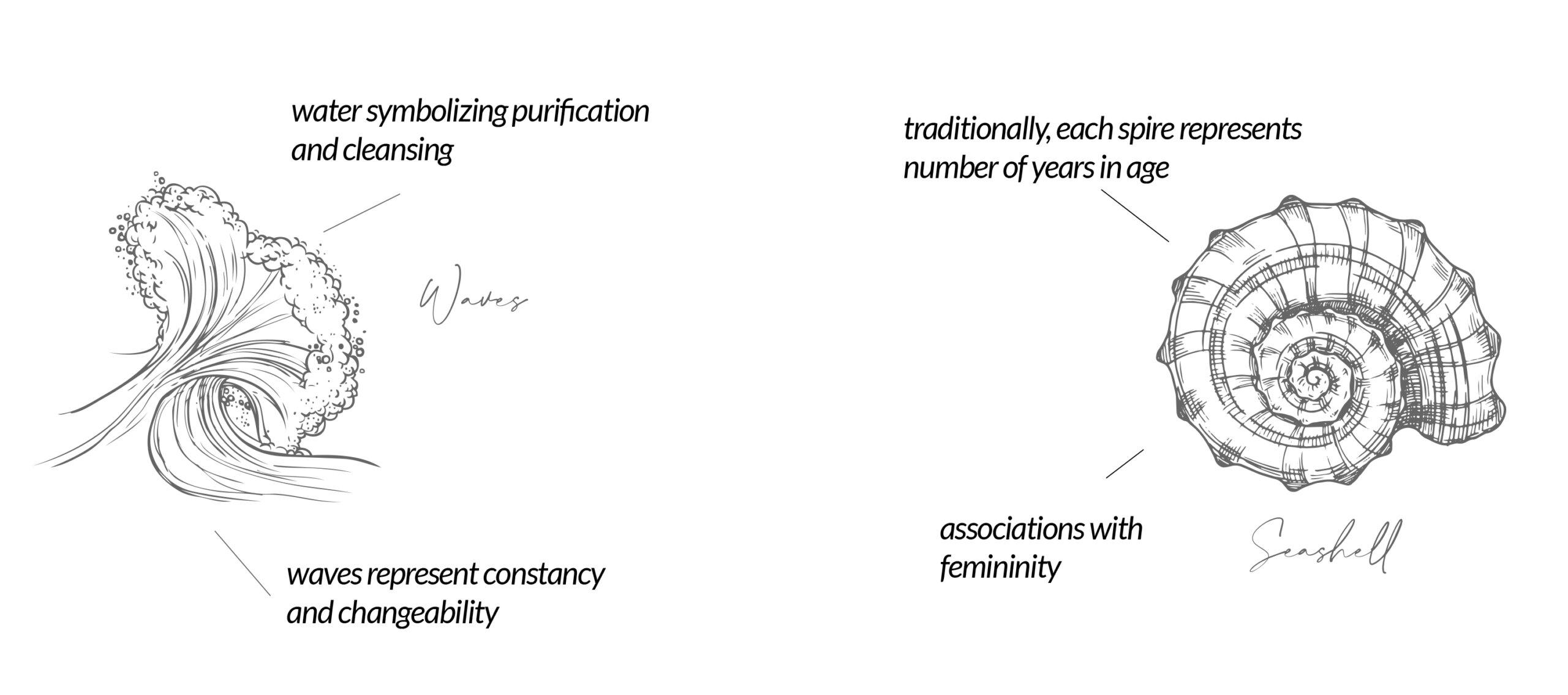
Mint green refreshes the senses refreshing nature along with shades of Teal, capture the smell of the seaside. The brand is always in motion with a delightful personality that relishes the journey. Helping Terry to develop the personalized logomark through the seashell with strong ties to fertility anatomy, oceanic fossils spiral down with all organic matter that measure on natural life cycles.
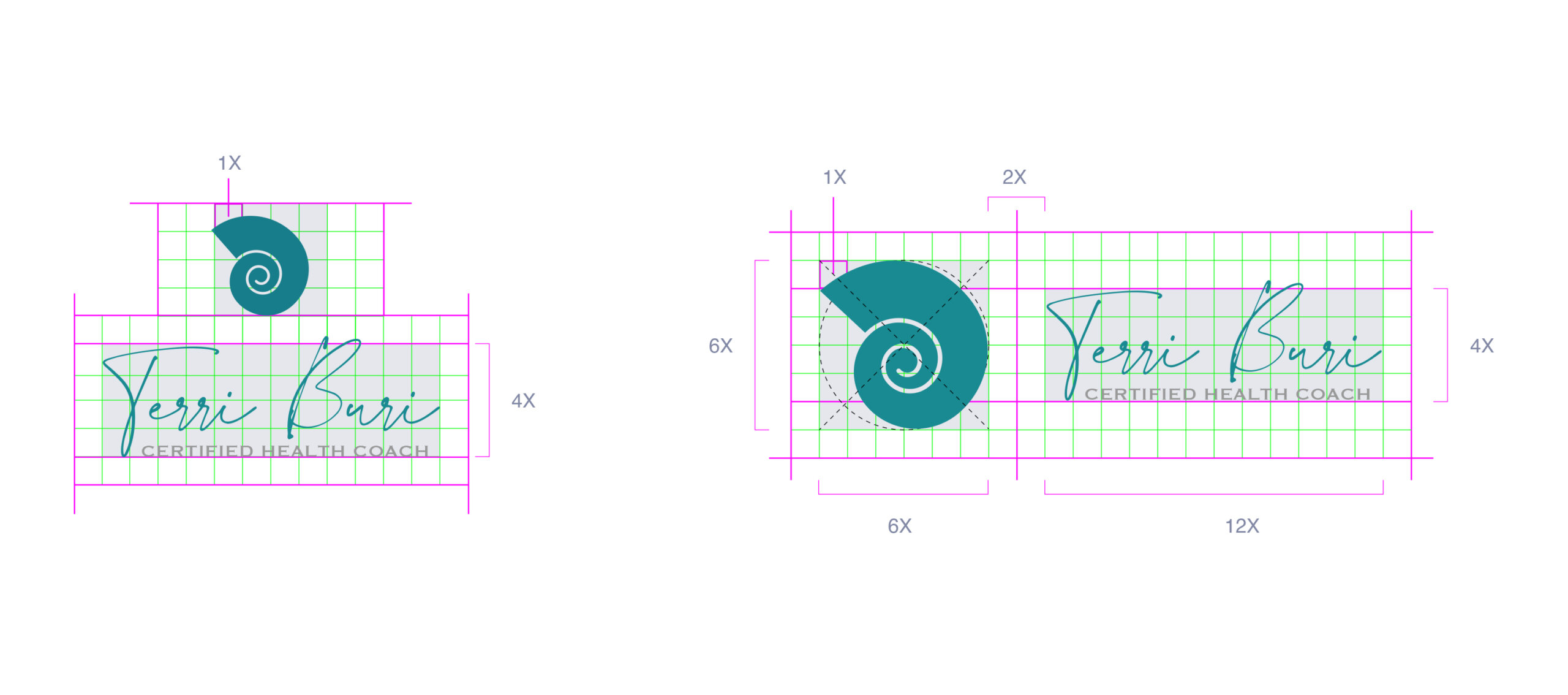
Terri Burri wordmark opens with a script is wide crossing uppercase “T” that mirrors the open-angle of the seashell at an obtuse 135 degrees.
The brand takes a fun approach with a lively personality that encourages living your best life. The heavy influence of nature.
