The Challenge
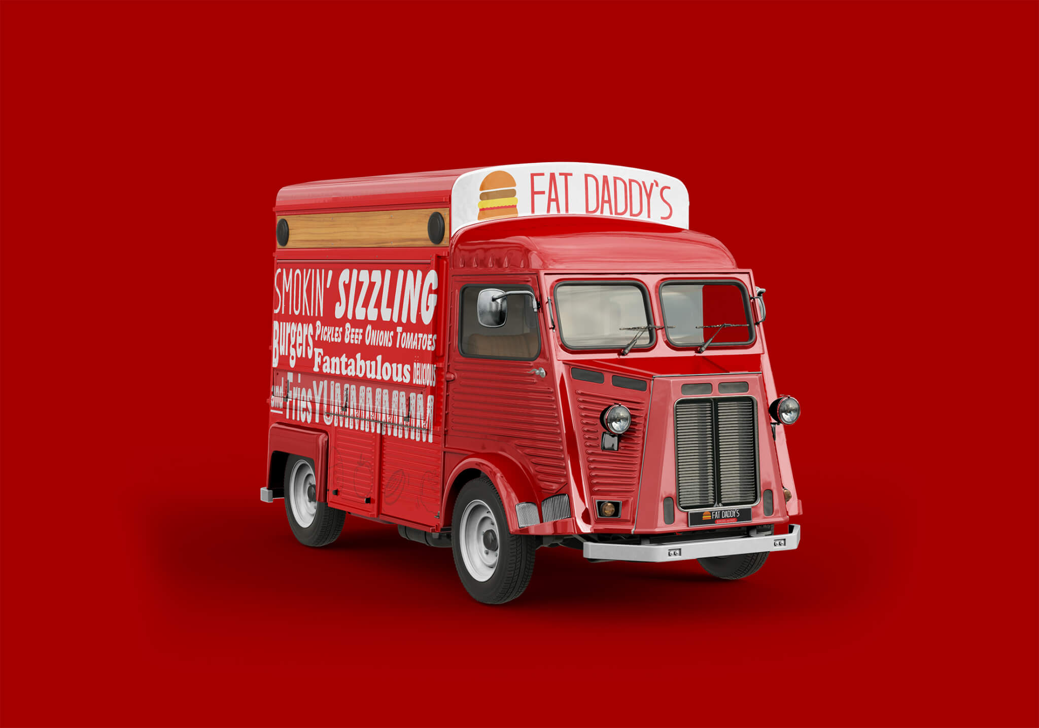
Fat Daddy’s is an American food truck. Featuring their popular juice burgers. And all beef patty that is thinly seared top with onions, tomatoes, lettuce, and a special sauce.
The founder Rashid Riley approached Giftbox Creative to help him build a solid logo design. Being that the brand is new and knowing that it has an uphill climb, he wanted to focus on Simplicity and clarity. This would be partially responsible help in the marketing efforts and a familiar approach in building recognition in Belleville, Illinois.
Fat Daddy’s goal is to align with a new audience for its food options which also involves creating appetizers, snacks and desserts while still being known primarily as an American dine out option. Gift box creative was asked to design and original logo mark, colors, typography, and assets.
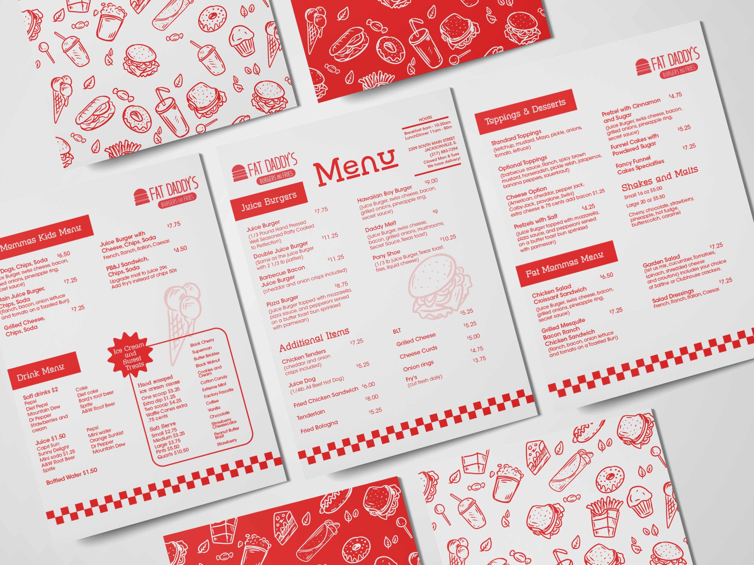
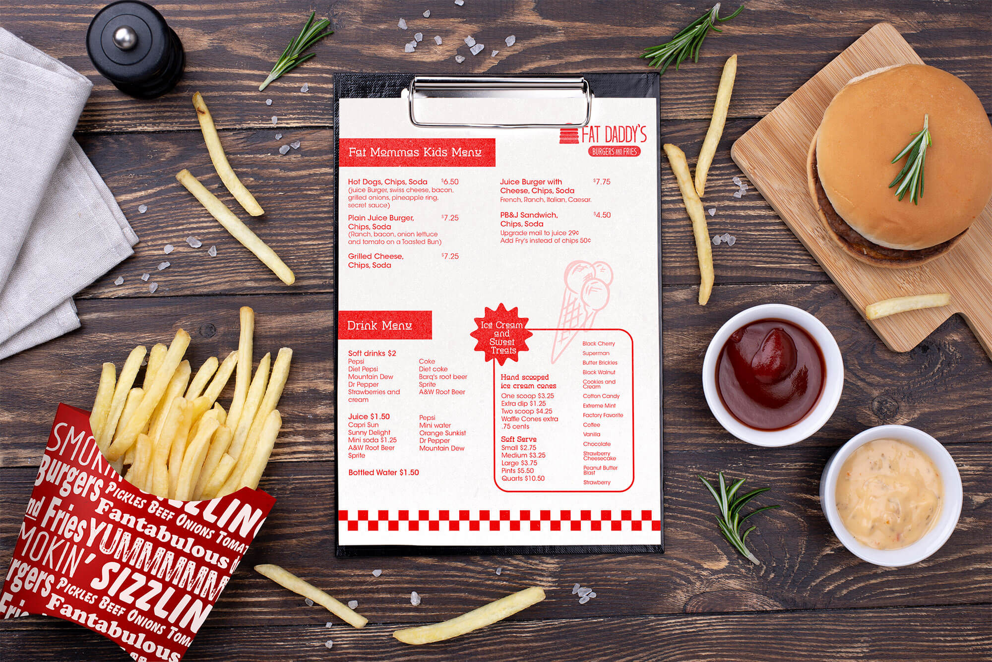
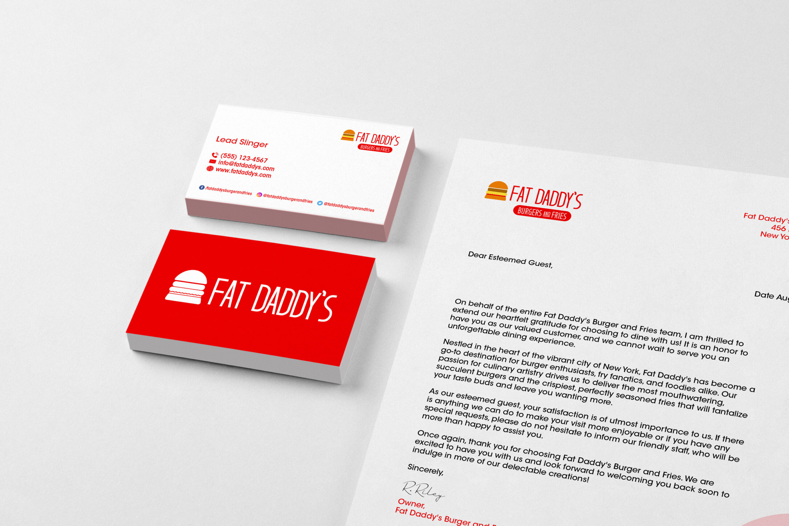
Options for packaging design, stationary, and social media assets have also been explored. This will help create cohesiveness and a robust but familiar option to build a strong position in the market. They needed to stand apart from other options in the area that were primarily Mexican and Spanish food.
The design decisions chosen to position Fat Daddy’s as a delightful choice for enjoyable quality, while making it easy to recognize and it already competitive market.
Solution
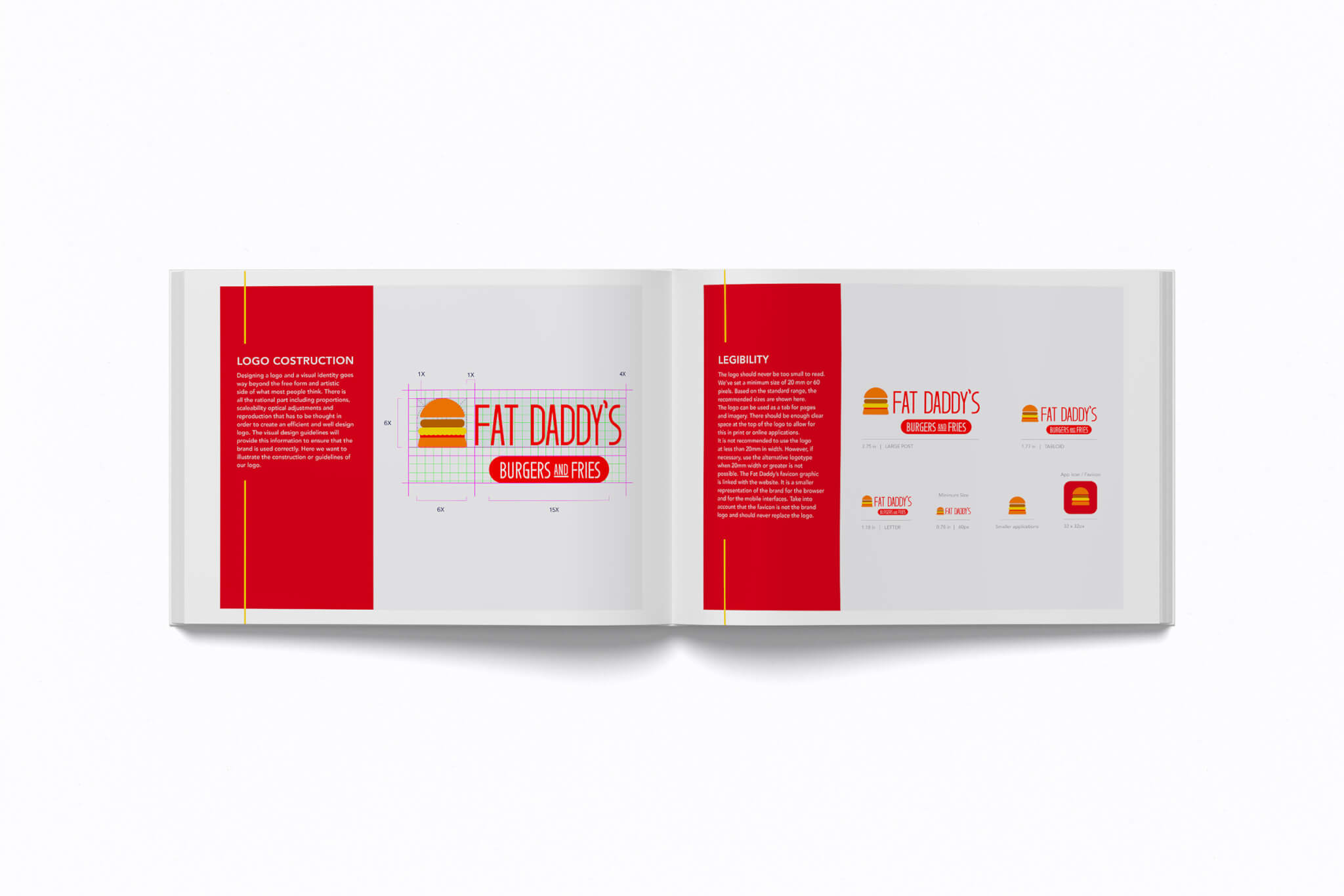
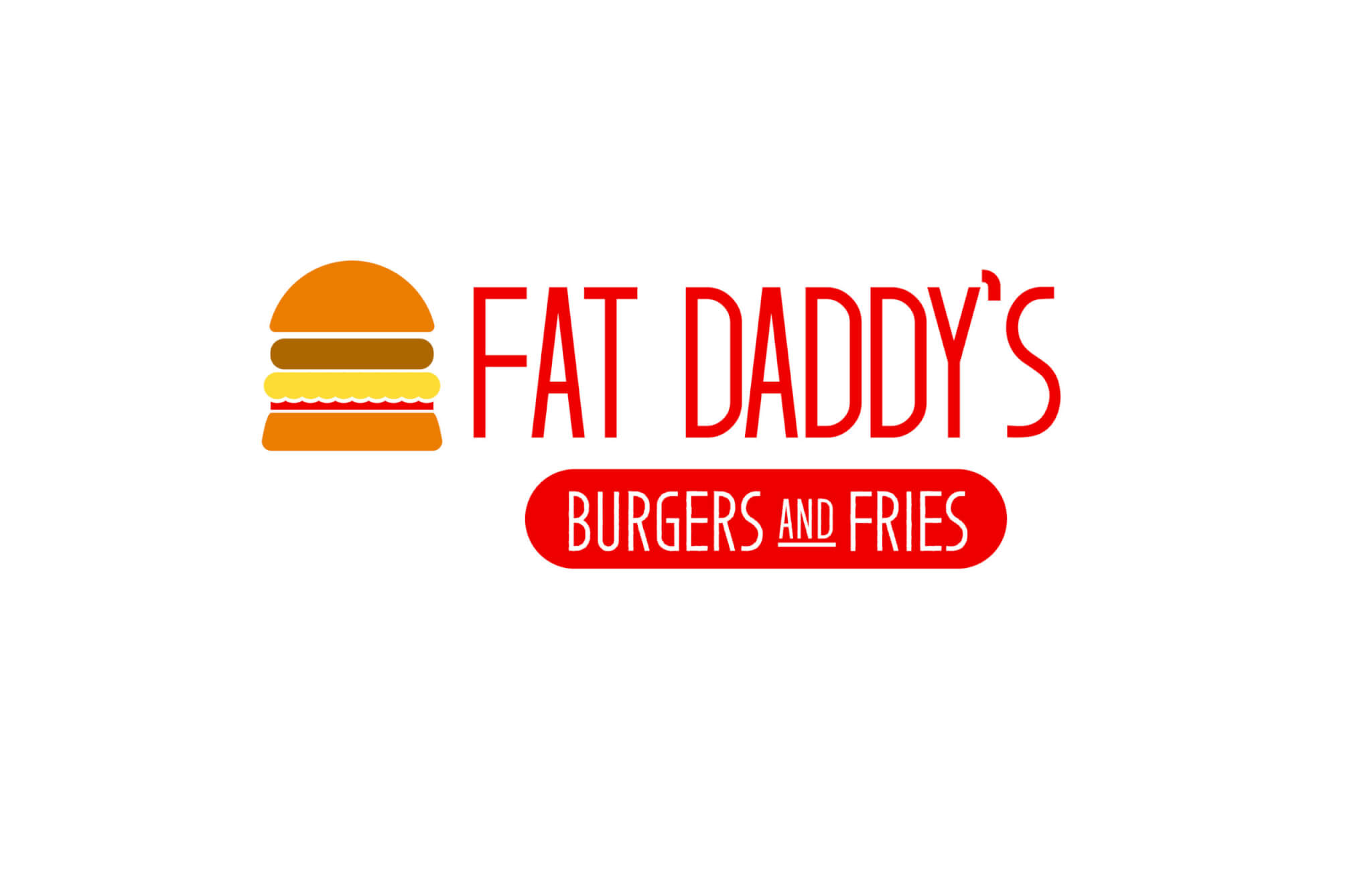
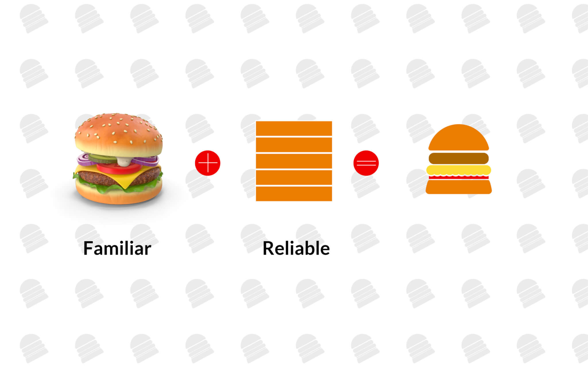
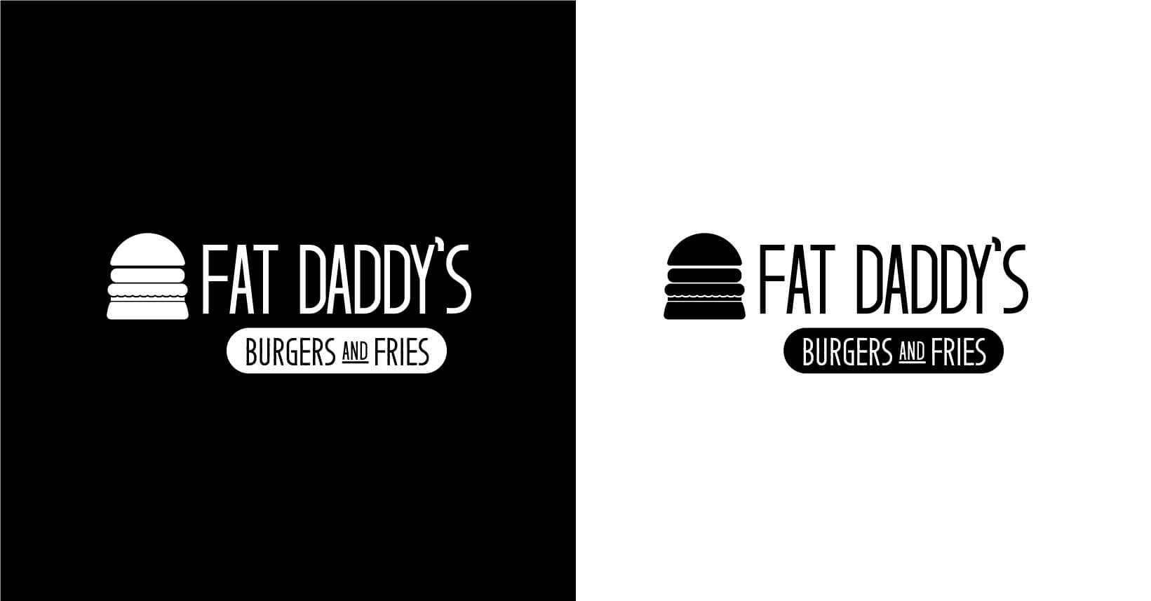
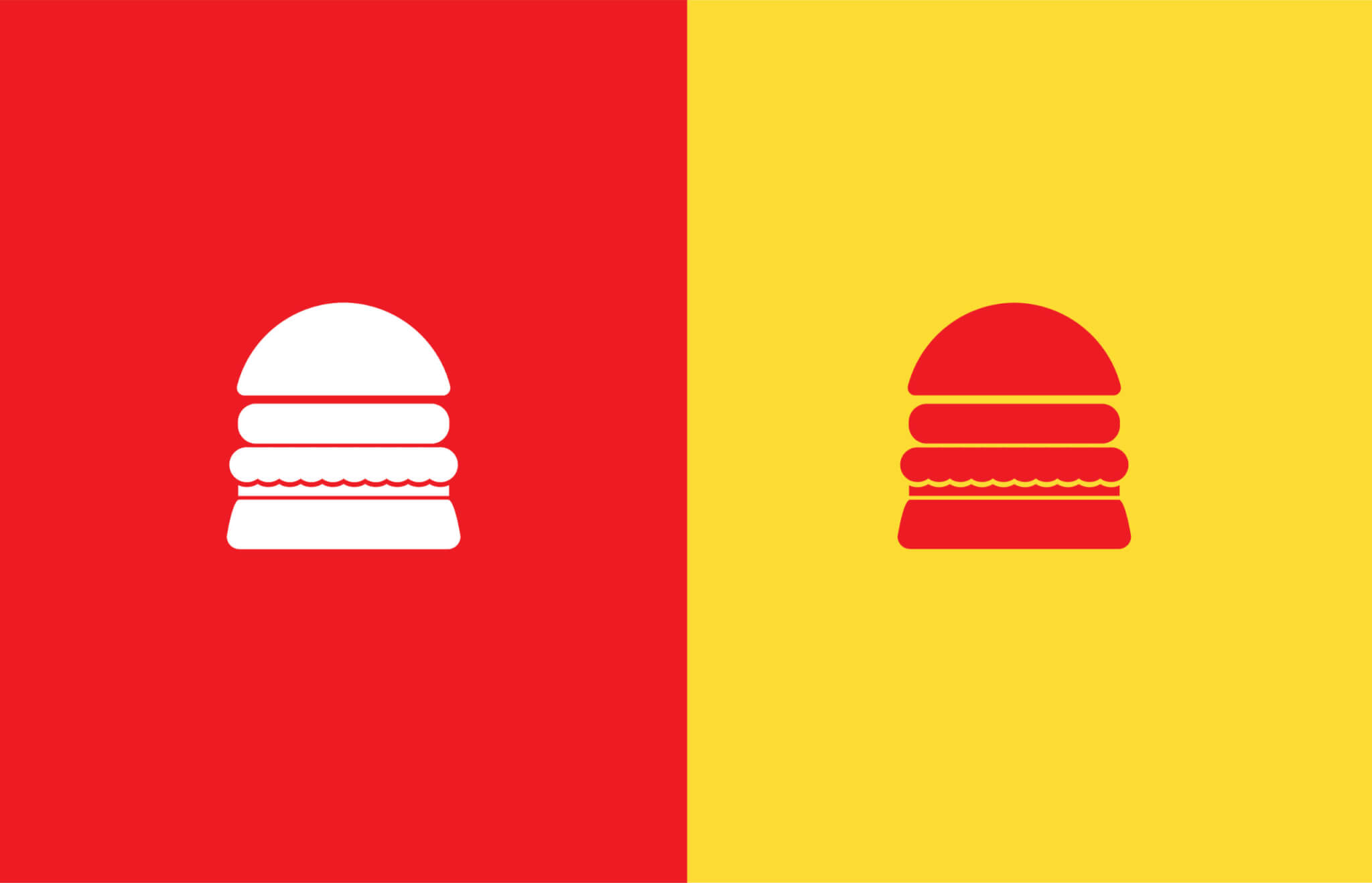
The logotype features a word mark and a geometric burger the company was founded in 2021 and the logo references an orderly stacked Juice burger. We drew out and sketched a different concept and making sure the thought and the shapes were similarly aligned in form. We also explored different options including a circular stamp. Designed to signify Fat Daddy’s communal approach come it also embraces approachability and it’s midwest heritage.
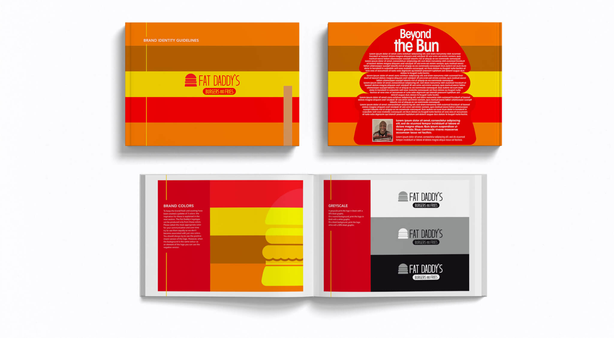
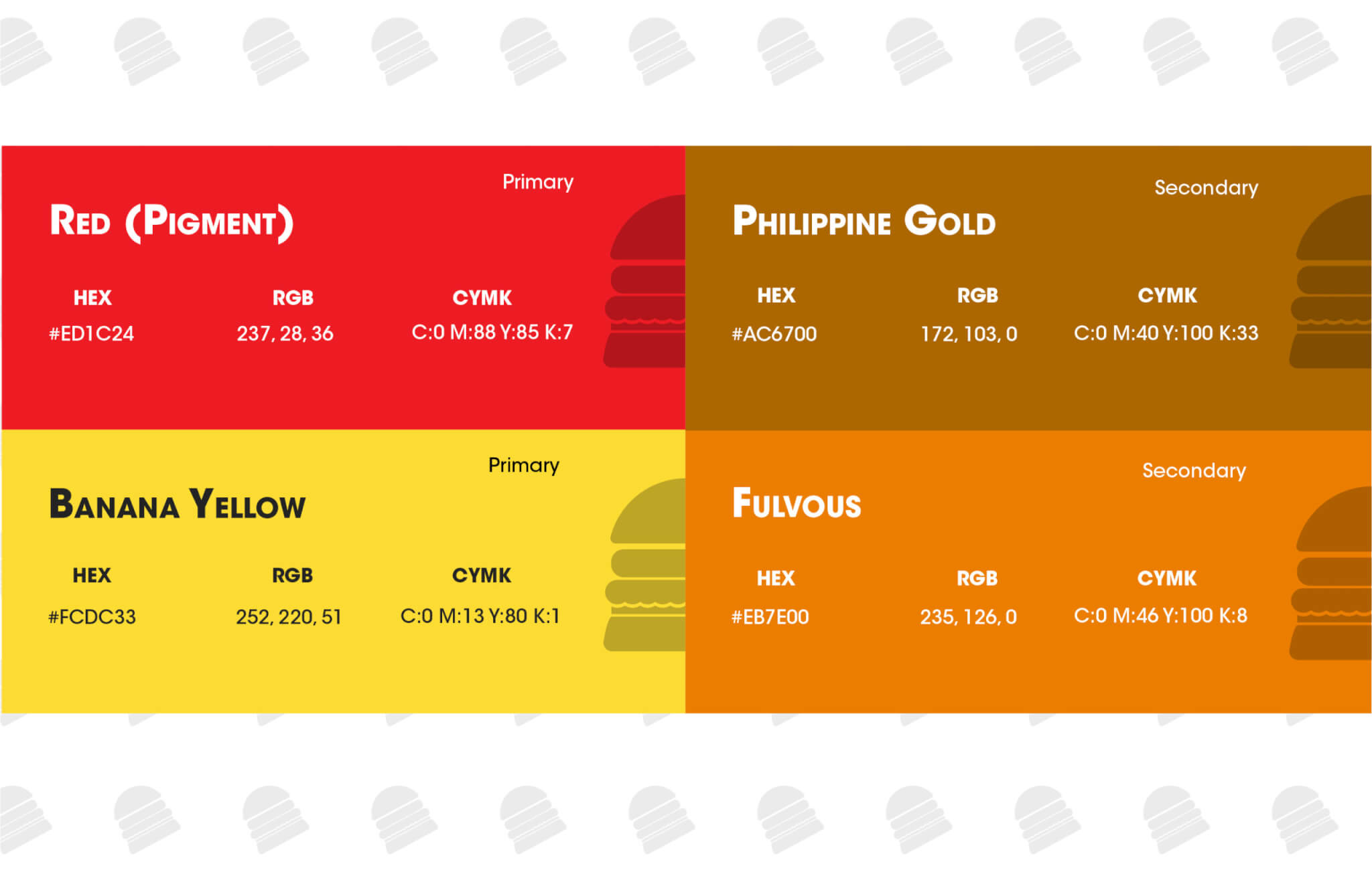
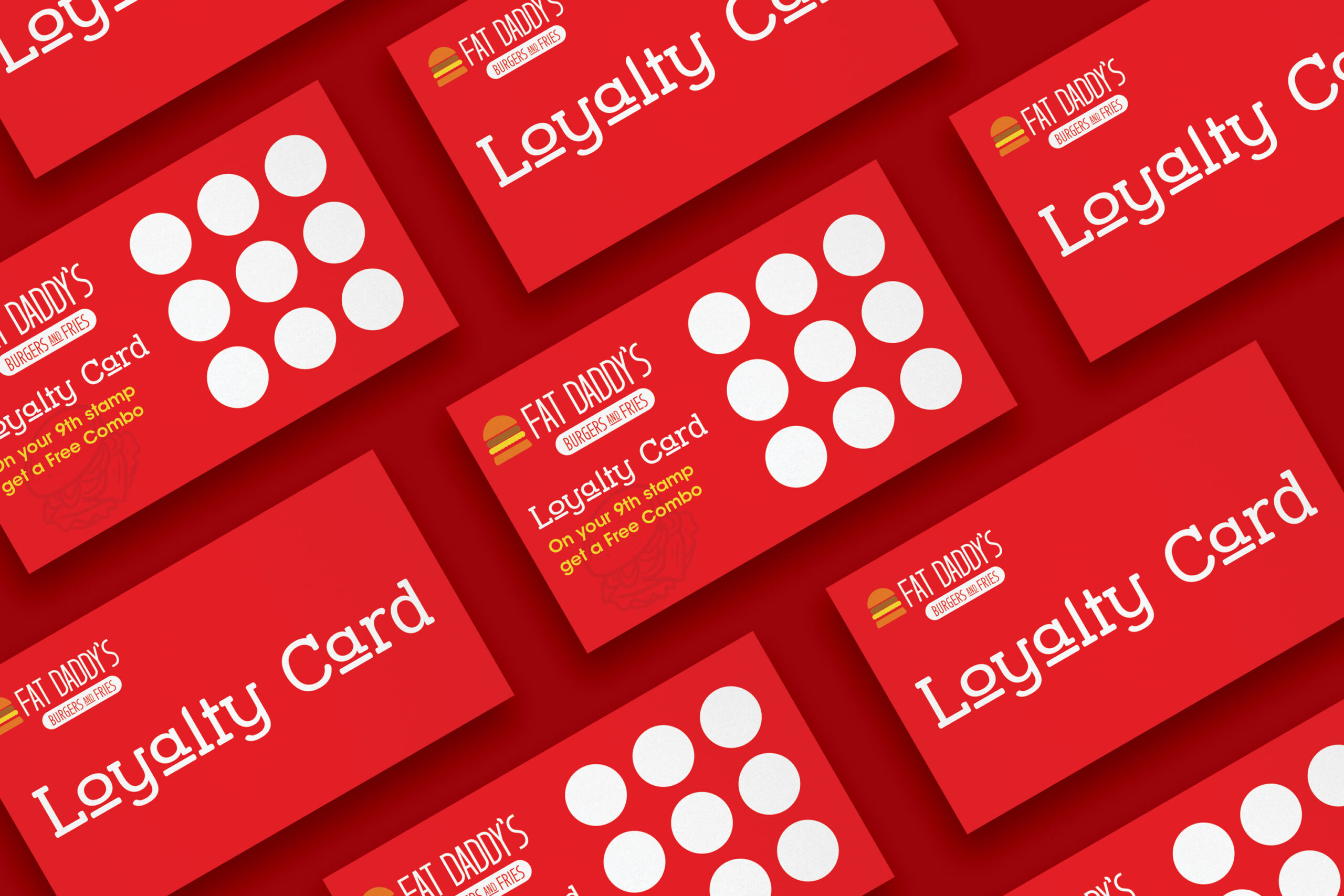
We focused on a reliable color palette using pigment red, banana yellow, as the primary color palette; supported by Philippine gold, and frivolous (Orange) as complementary color. The color also presents itself throughout the marketing assets while featuring a silhouette of the juice burger logo mark. Although red is still the most dominant player went hungry it leaves irresistible choice to be desired.
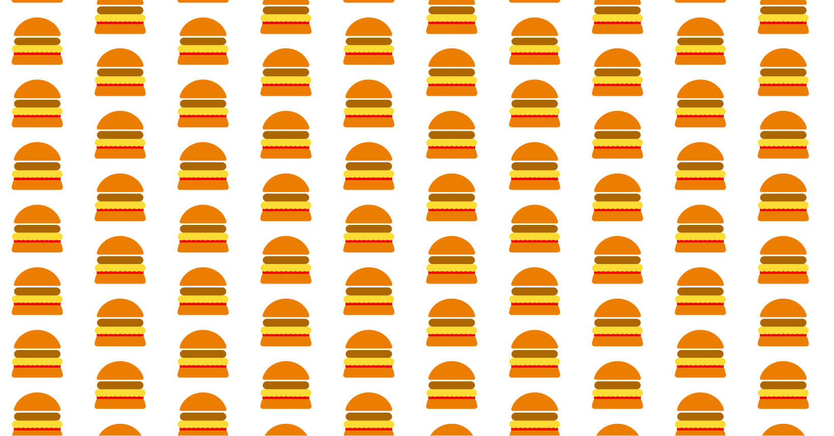
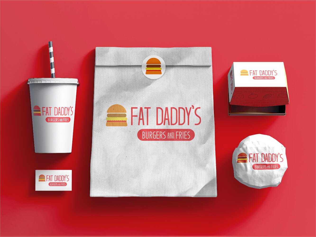
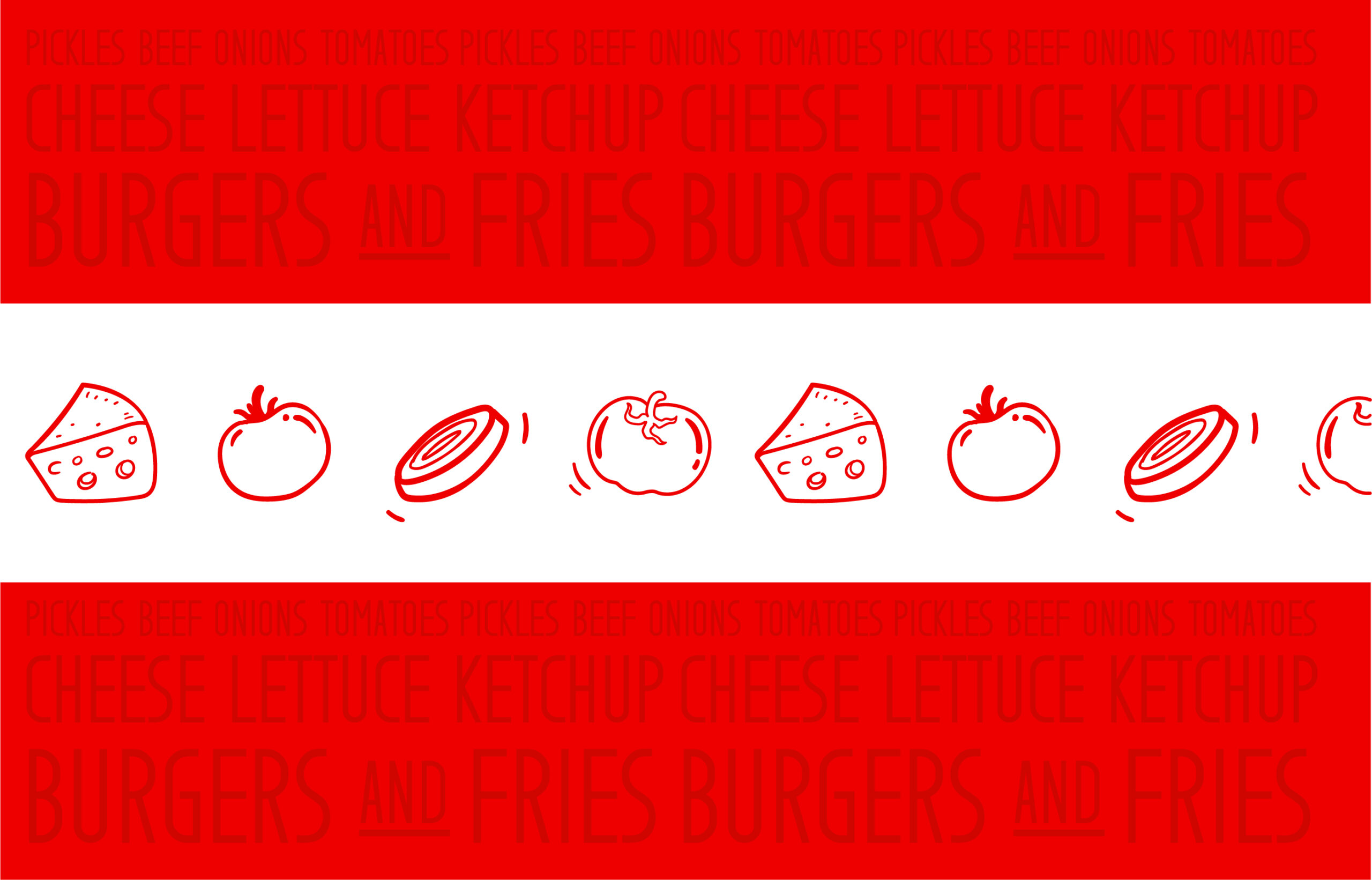
The packaging features an illustration of tomatoes, onions, and cheese, giving it a natural fresh and delightful texture as delicious as it is to bite into. The same designs system flows throughout other parts of packaging with a balance of warm hot buns and meat paired with fresh veggies.
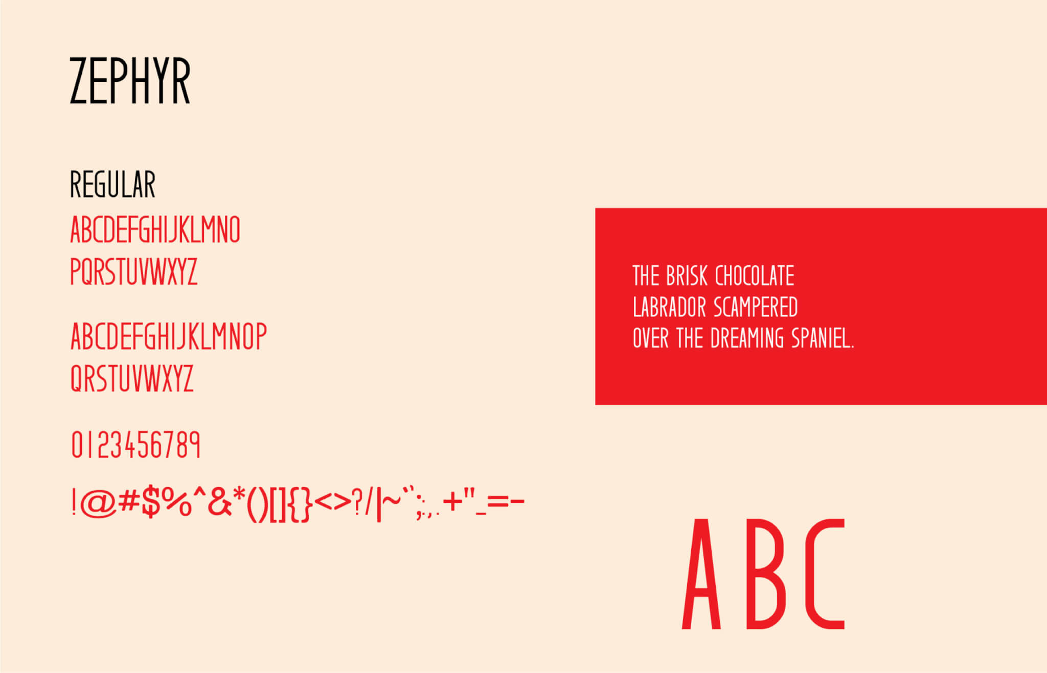
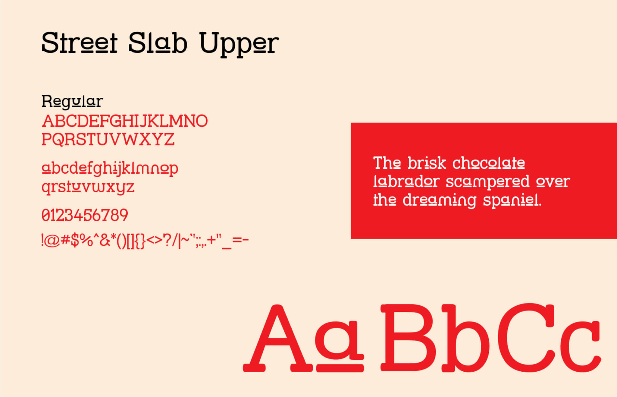
Typography
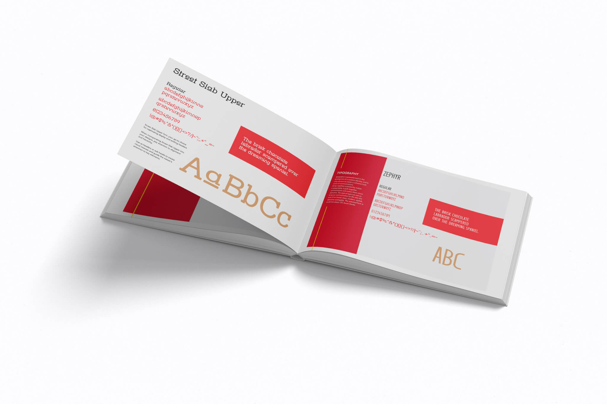
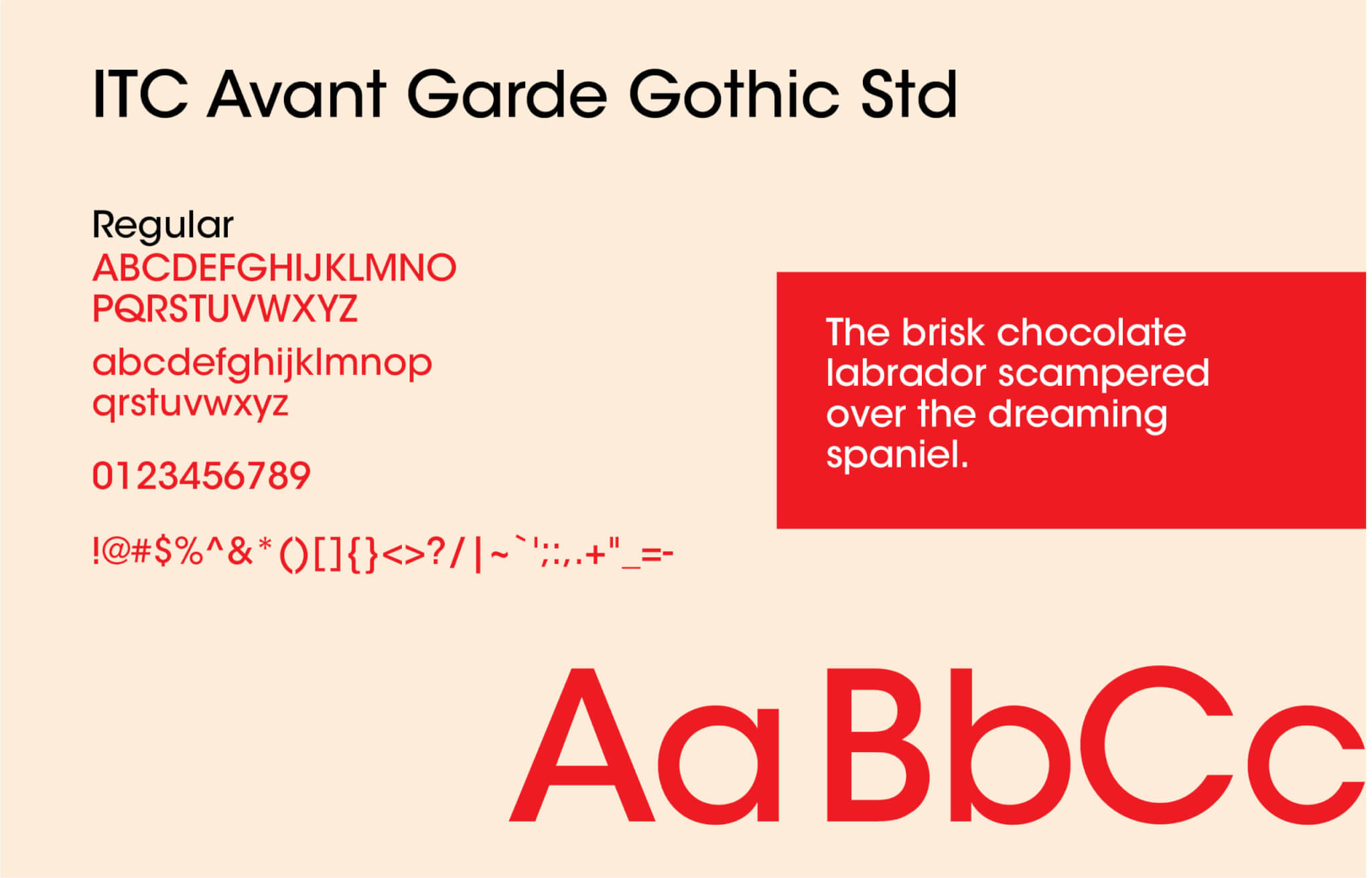
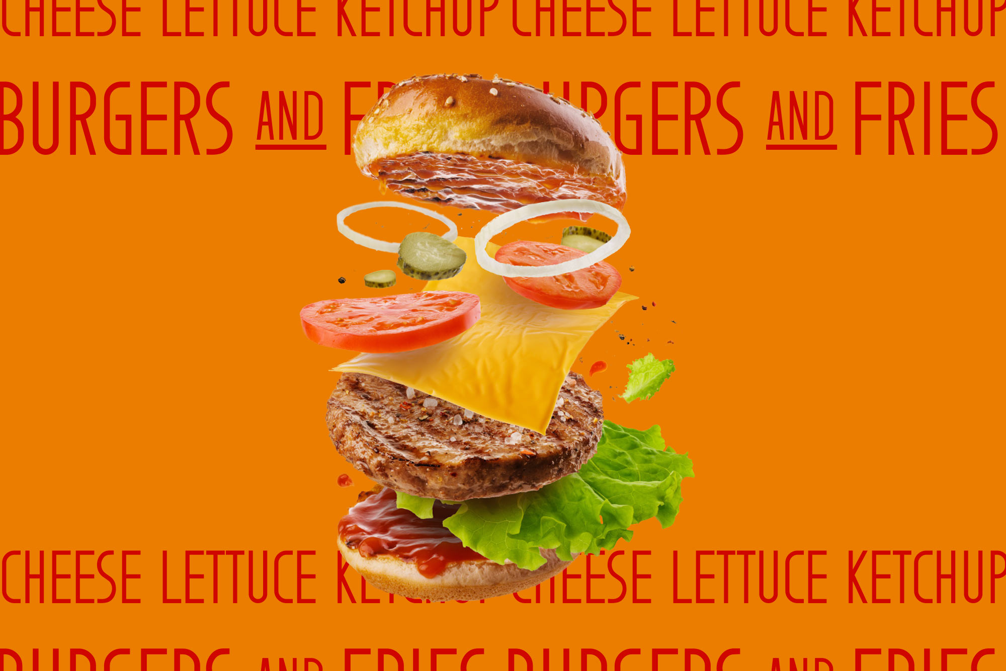
The primary typeface used is Street Slab Upper for headlines. The body copy uses ITC Avant Garde Gothic Std. The use of the copy and the writing delivers a punchy cost to the variety of ingredients and feeling. Exploring various thought uses for the copy as display pattern texture just as varied as the options from the menu.
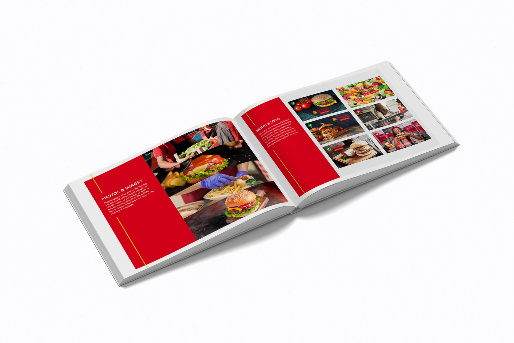
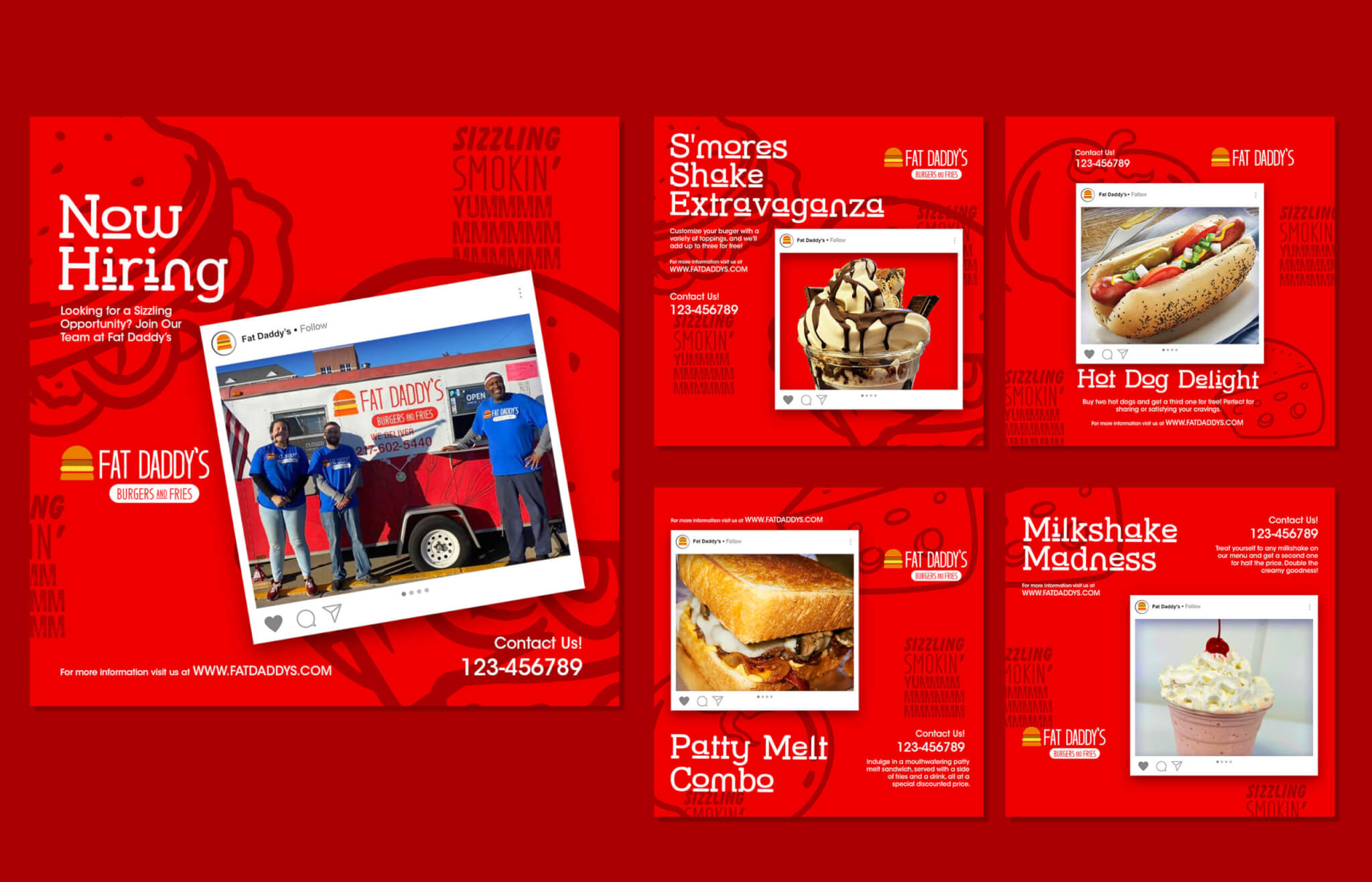
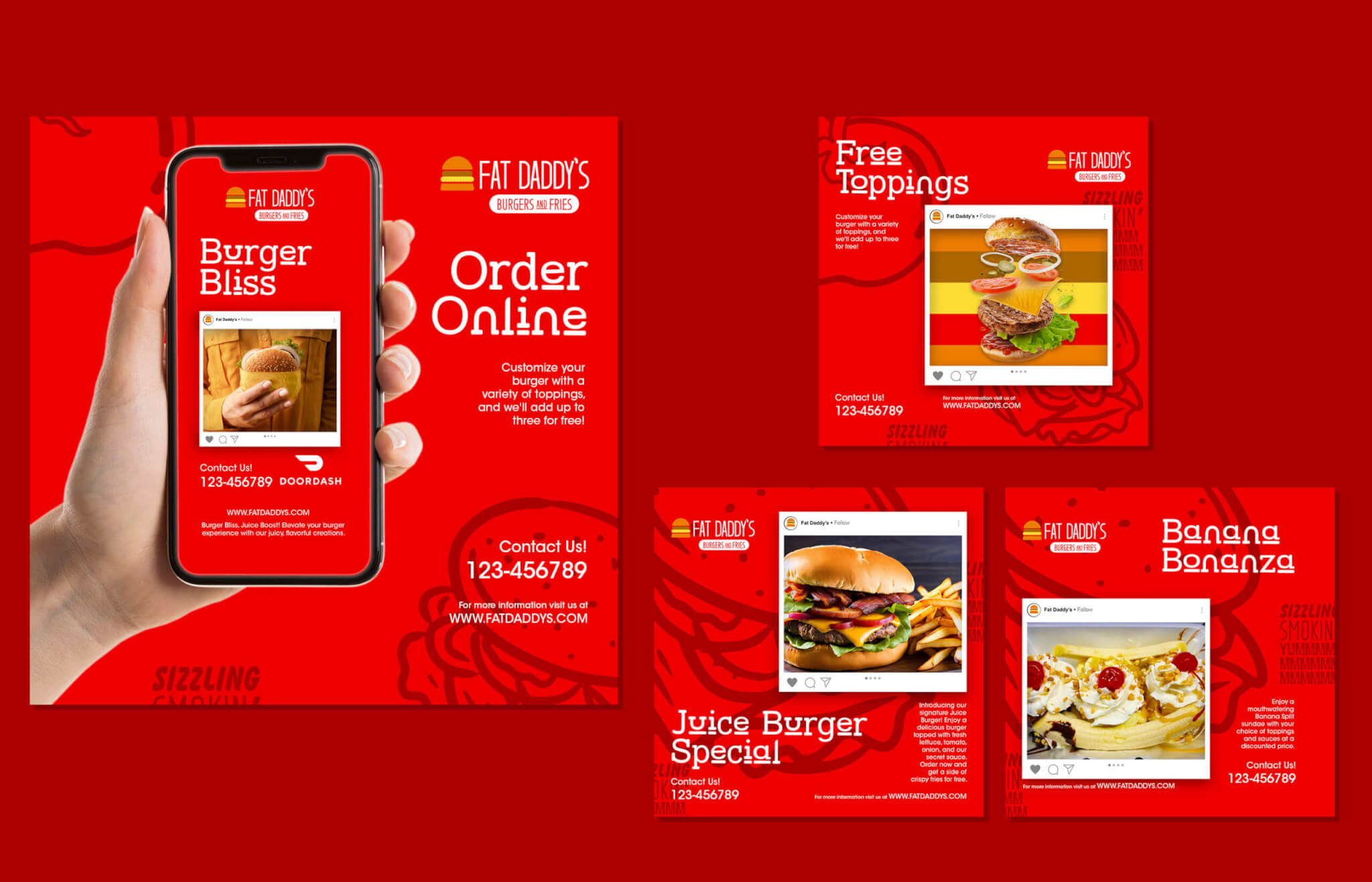
Photography played an important role in the brand leveraging existing and new photos taken by the staff. This creates a personal approach close shot of desserts, milkshakes, and burger options. Because of the natural photos taken this makes it seem natural and relatable to the fans in which it targets.
This makes it easy to create new perspectives on the meals and frequent updates as new menu options become available.
Giftbox created a strong logo for Fat Daddy’s that lays foodies raving about the positive experience made by hand by homegrown cook that’s crafted with love with a flavorful and appreciated approach.
The original concept when he realized that there wasn’t as many American options in his area.
Marketing Resources
Social Media
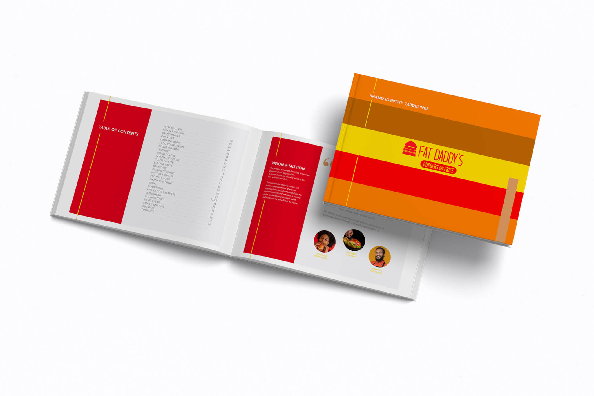
Brand Guideline
