Founded in 2012, Cloud Virtual Servers is a data storage company by DMD Data Systems, now Volta Inc., and The Kentucky Center for Rural Development. Giftbox Creative was approached to design a new logo for their brand, along with marketing collateral that would include a brochure, brand identity, and landing page design.
This was clear that this project would be forward-thinking in its approach. It is diving into the world of cloud-based storage as a niche industry as a challenge for CRD because localizing it as a service when they don’t have a firm identity was both the challenge and the opportunity.
Making it affordable for larger companies and easy to work with people who are also may not be as tech-savvy. Michael Cornett, Director of Marketing and PR at The Center for Rural Development, was looking for something that would be pervasive in its approach and iconic through the service which the product provides.
Although, far too many tech companies would play on a direct correspondence on technology with symbolic elements of micro and macro equipment.
This is the apparent theme that was surfacing through the design research process. Either it ridged the logo with jagged edges, displayed a literal icon of the product, or used ethereal typography akin to something you’d see in an episode of Star Wars.
There was an approach that came to mind that has been around in the technology space that could be an asset, a horizontal stroke similar to the one used for IBM by Paul Rand in 1972.


The industry has recognized this as the poster child design element for tech. As simple as it may be, just having a stroke with no ties to the messaging or the name would need a lot more to pull this off convincingly.
Notably, having it function as a logotype that could be for multiple purposes as a form of an asset just as much as it would be a part of the complete brand system.
The logotype uses a rounded approach to the anatomy in all lowercase to make it more approachable to companies in smaller markets, which conveys a relatedness and care.
After researching other tech space players and examining other brands such as IBM, who rule technology, patterns emerged.
During the process of examining several other players in the same space and the overall direction that brands use to communicate technology.
The use of a line was the most obvious. The identity combined with a well-rounded typeface resembling the lightness of a real-life cloud.
The line was then aligned to float above the letter as a symbol of a cloud-based service covering its customers.
And because this element choice is so versatile, we can use this in many applications and tools for implementing it in a diverse range of communication assets from the simple to the complex.
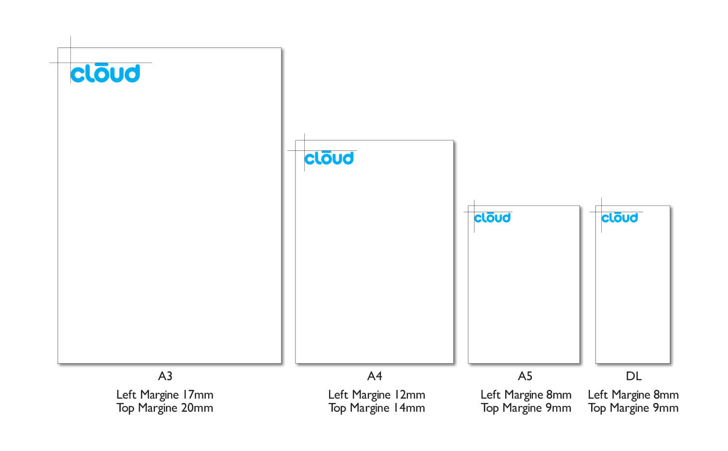
The brand identity complete with acceptable usage rules, logo geometry, typography usage, and lifestyle mockups to make sure that the identity stays intact no matter who applies the logotype and in what context they will always have consistent flexibility.
What’s great about this application, being straightforward and having a visual play with tech and environment, is that it thinks in terms of what’s coming in a timeless sense without being trendy.


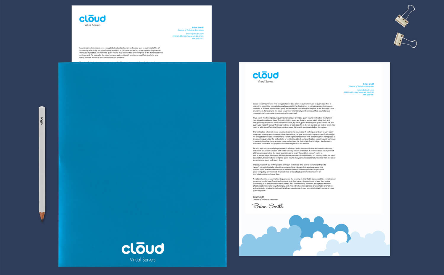
Over a month and a half long project the logo scope mockups range from vehicle wraps, pens, brochures, digital media applications, signage, and trade show booths.
What’s even more impressive is that the logo & brochure project captured First Place in the 2012 Kentucky Association of Government Communicators Award of Excellence — garnering attention and recognition for the company.


