So Ceramic Technics out of Cumming Georgia, sells tile. Nice tile. The kind architects and builders put in fancy buildings. Problem was their brand didn’t match how good their stuff actually is. They needed to look like they know what they’re doing. Smart, reliable, clean. No cheesy tile-industry nonsense.
Design Challenge
Their old look was forgettable. Blended right in. In a market full of competitors that’s death. Nobody looked at it and thought “these people are the real deal.” So the job was simple to say, hard to do, make the logo feel precise and modern, and make it work everywhere. Signs. Print. Website. Product sheets. All of it.
Solution
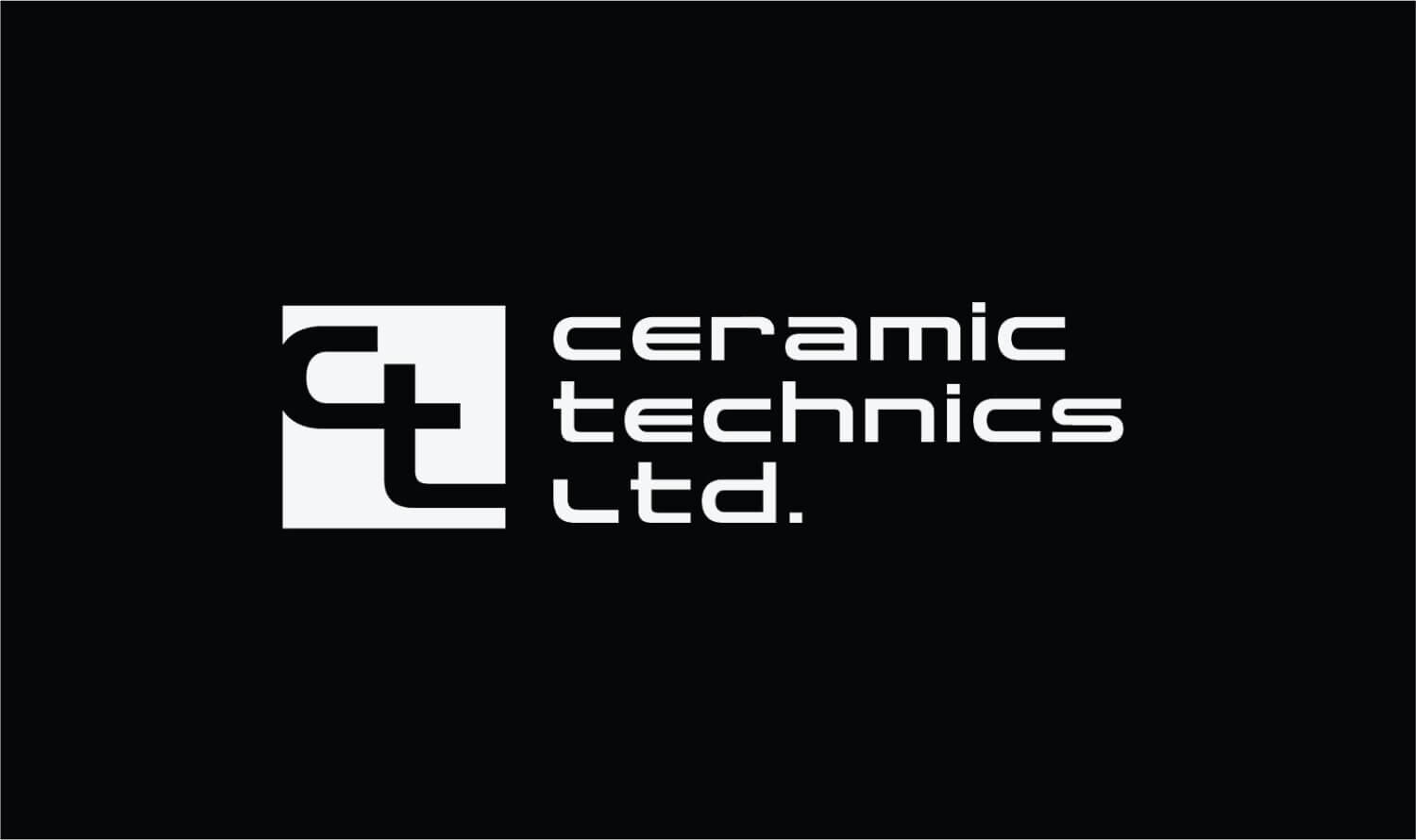
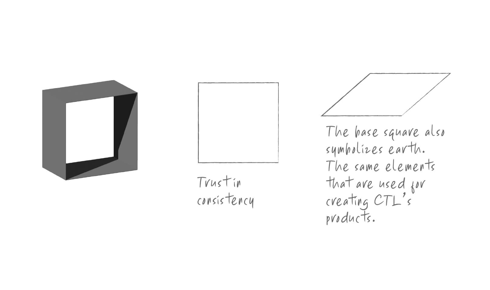
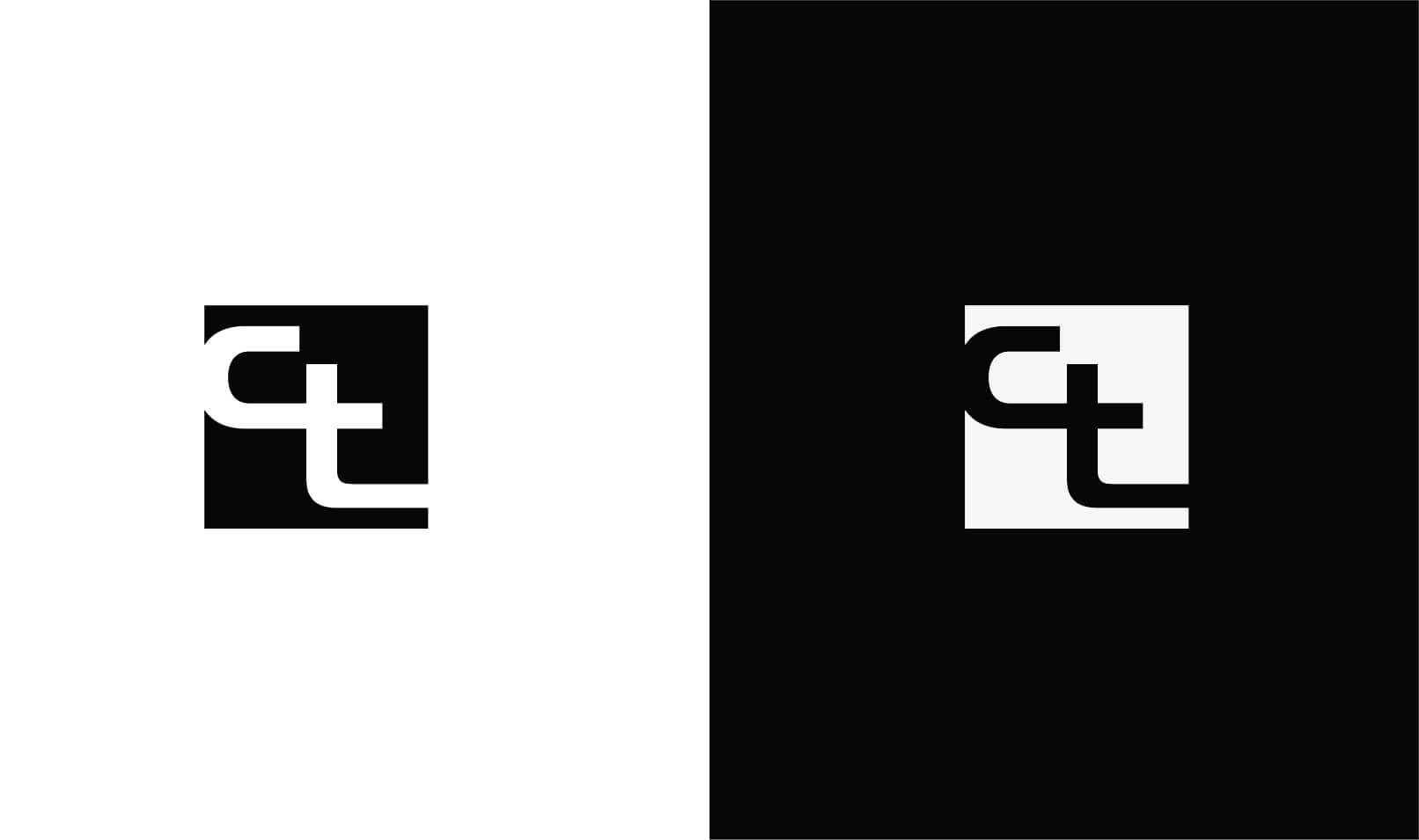
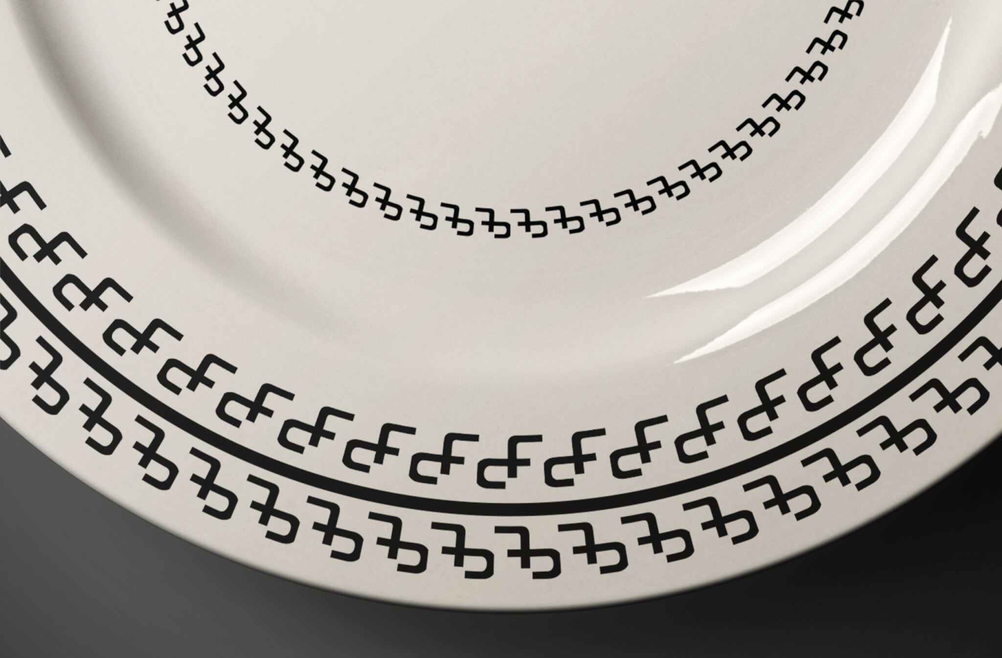
We built a monogram outta the C, T and the L. But I didn’t wanna just draw a tile, that’s lazy. Instead the mark hints at pieces locking together. Structure. Precision. It stands alone or sits next to the name, either way it works.
The name itself uses a clean simple font. Nothing fancy. Just clear and professional. Laid it out sideways so it feels steady and lets the icon do the heavy lifting.
End result feels built, not decorated. Which is the whole point.
Color
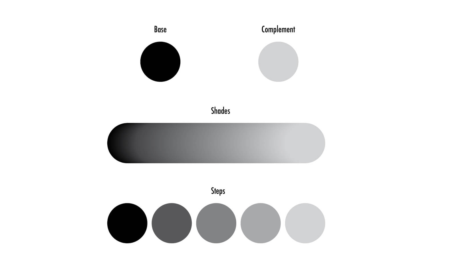
Kept it boring on purpose. Black for authority. White for clarity. Gray for the in-between stuff. That’s it.
Here’s why… the tile already has all the color. So the brand steps back and lets the product be the star. You don’t put a loud frame around a good painting.
Fonts
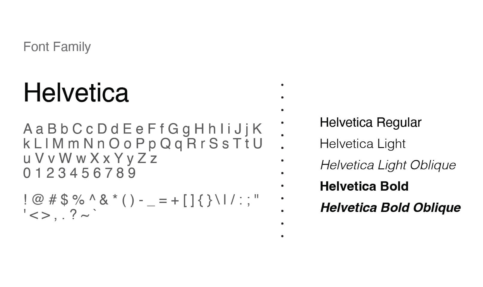
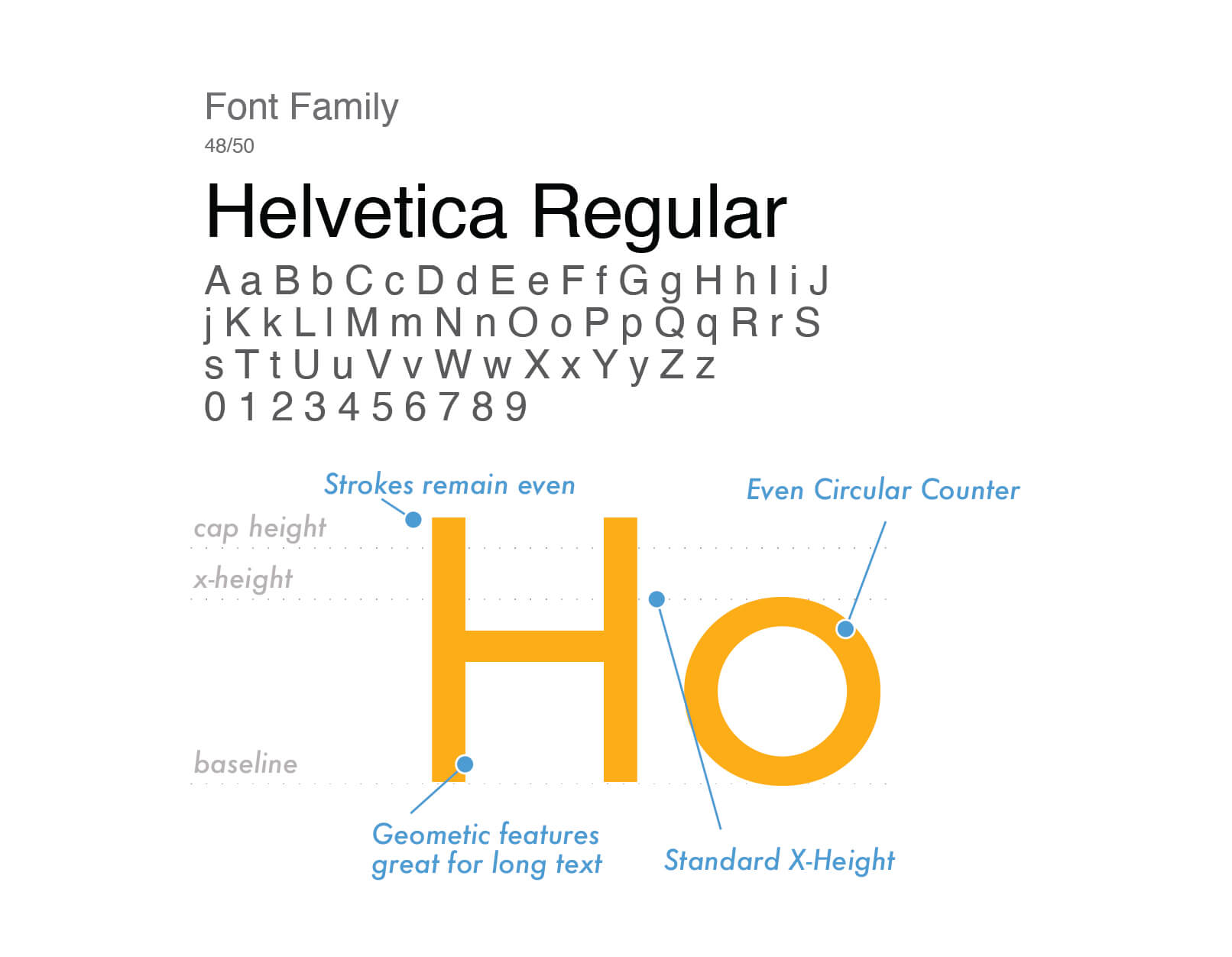
Helvetica does the main work. Reads great big or small. Works on a giant sign or tiny spec sheet.
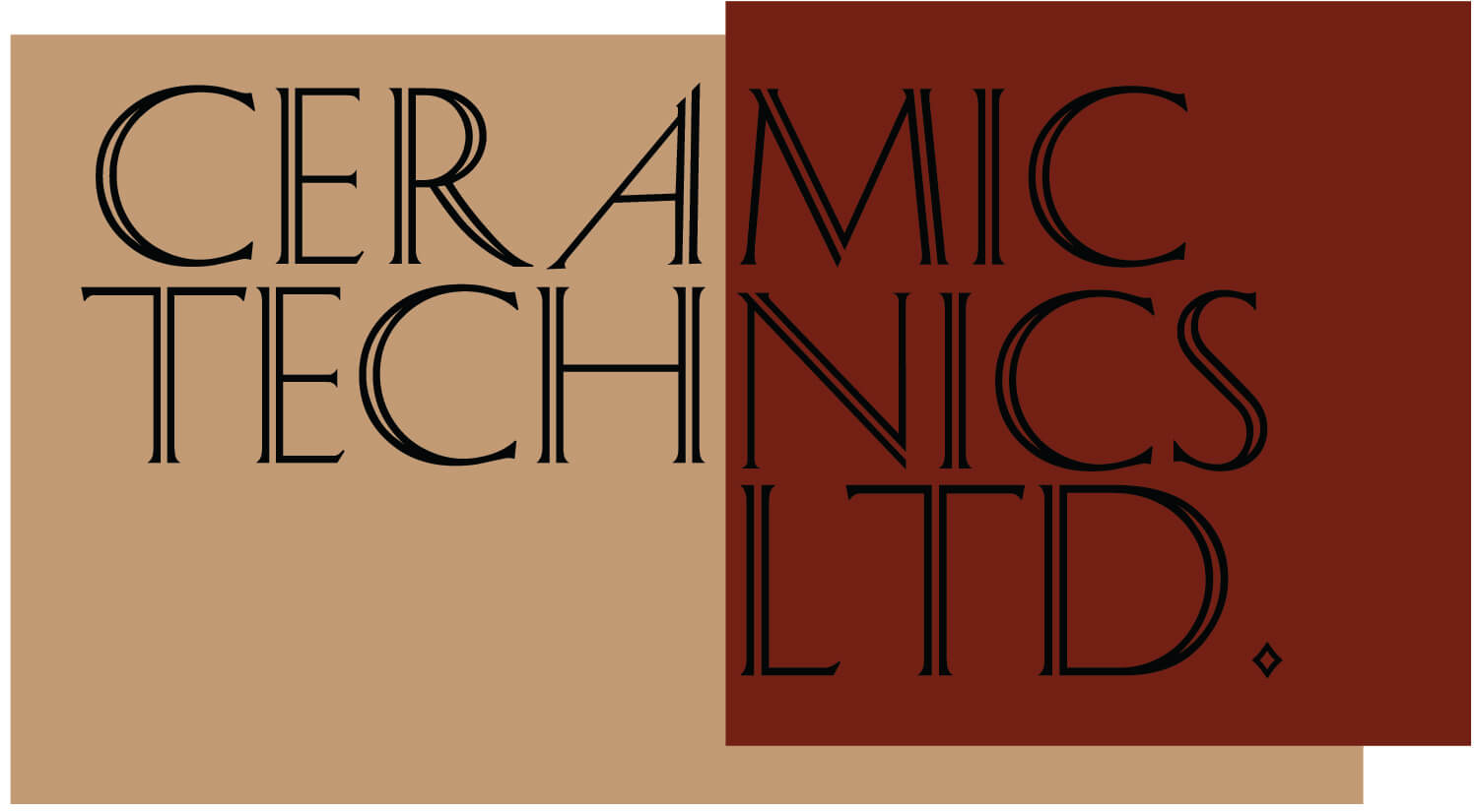
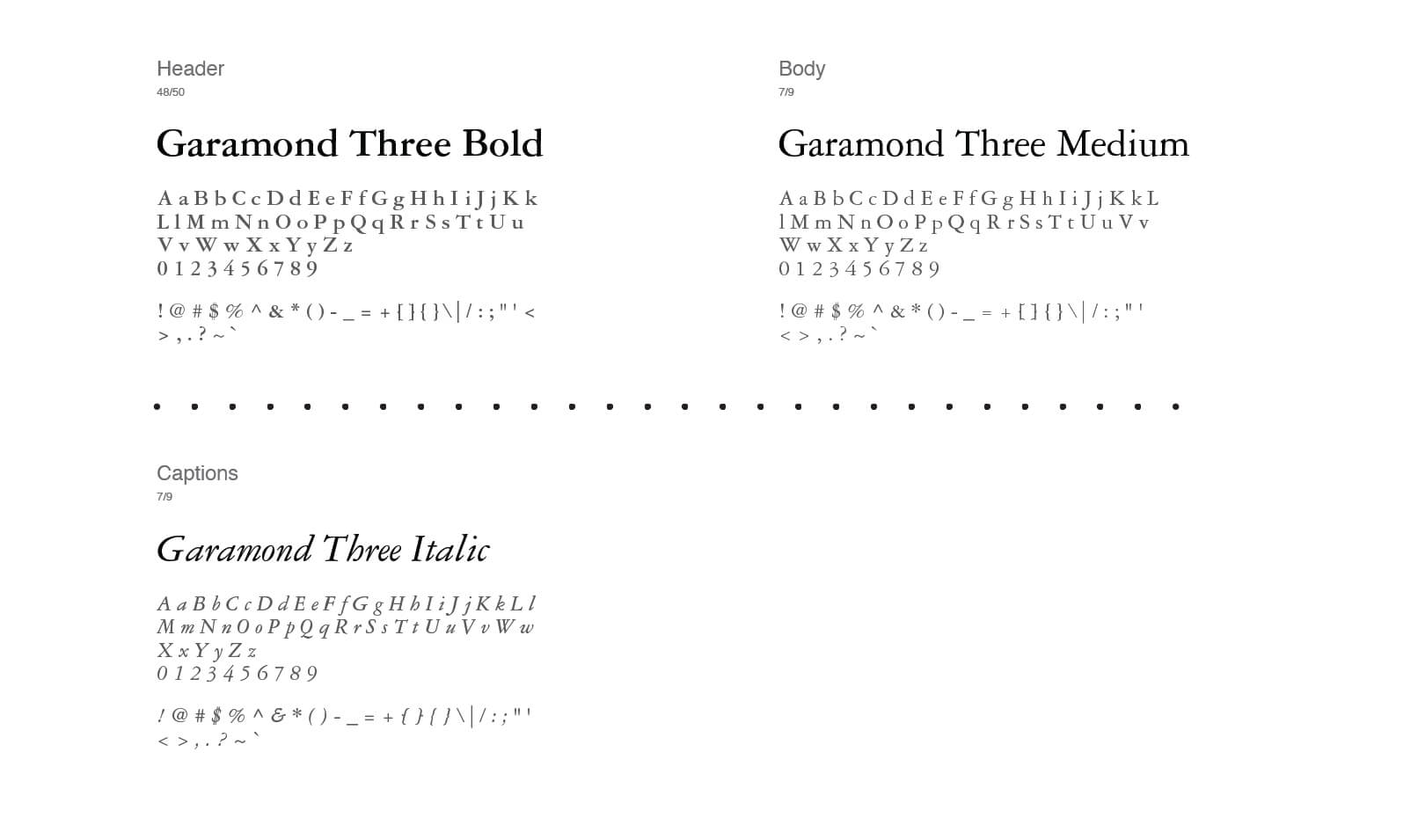
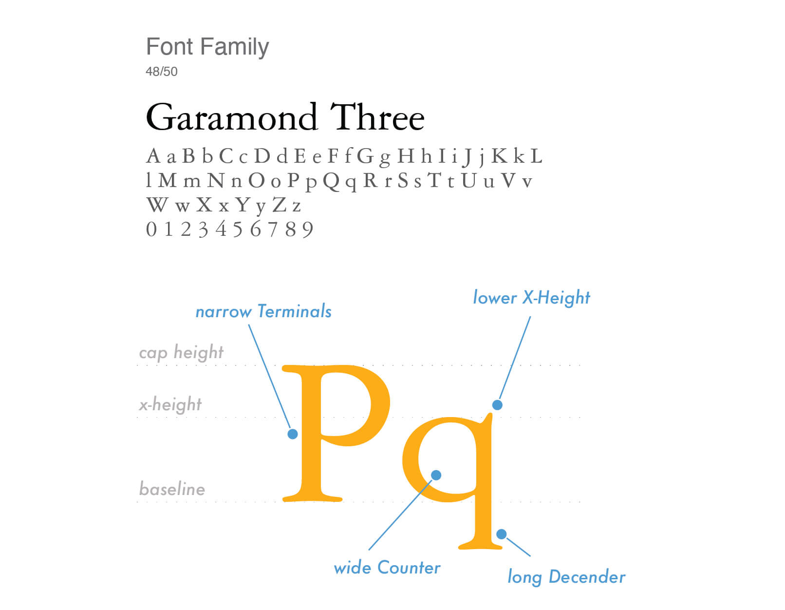
Then Garamond for the softer editorial stuff, adds a little warmth so it’s not too cold and robotic. Two fonts, clear jobs, done.
The type isn’t decoration, it’s part of the brand. Same spacing, same alignment, same rhythm everywhere. Brochures, catalogs, website all feel like family. Makes it easier to read and it feels mostly organized.
Primary Typeface:
Secondary Typeface:
Brand Systems
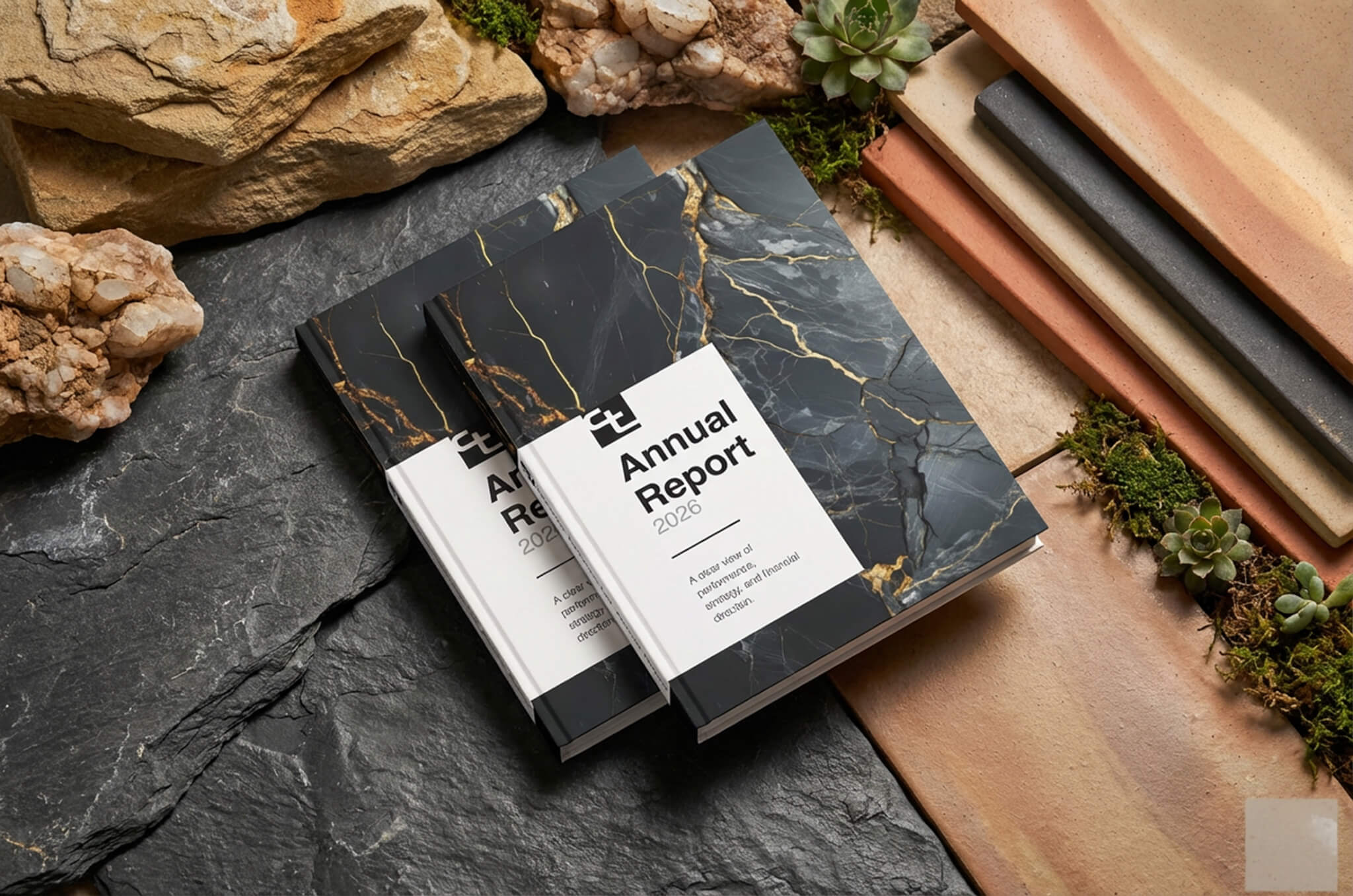
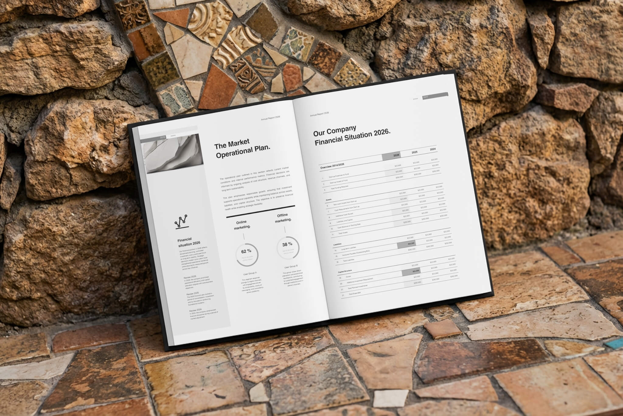
Print & Visual Branding: The look carries into everything. Business cards, catalogs, packaging, spec books. Lotta whitespace, the monogram used with discipline, good photos of the material.
No tricks. No effects. Just clean composition and a tight grid. Everything connects but still fits whatever size it needs to.
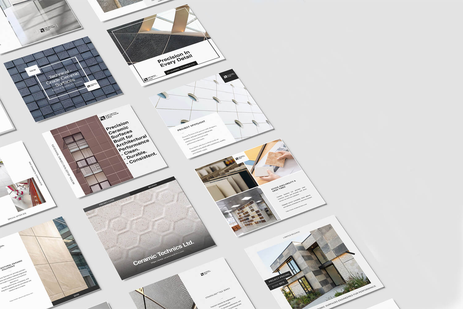
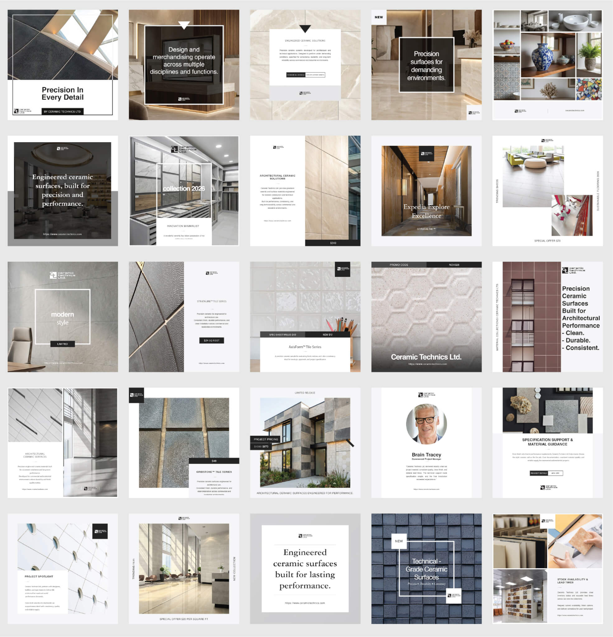
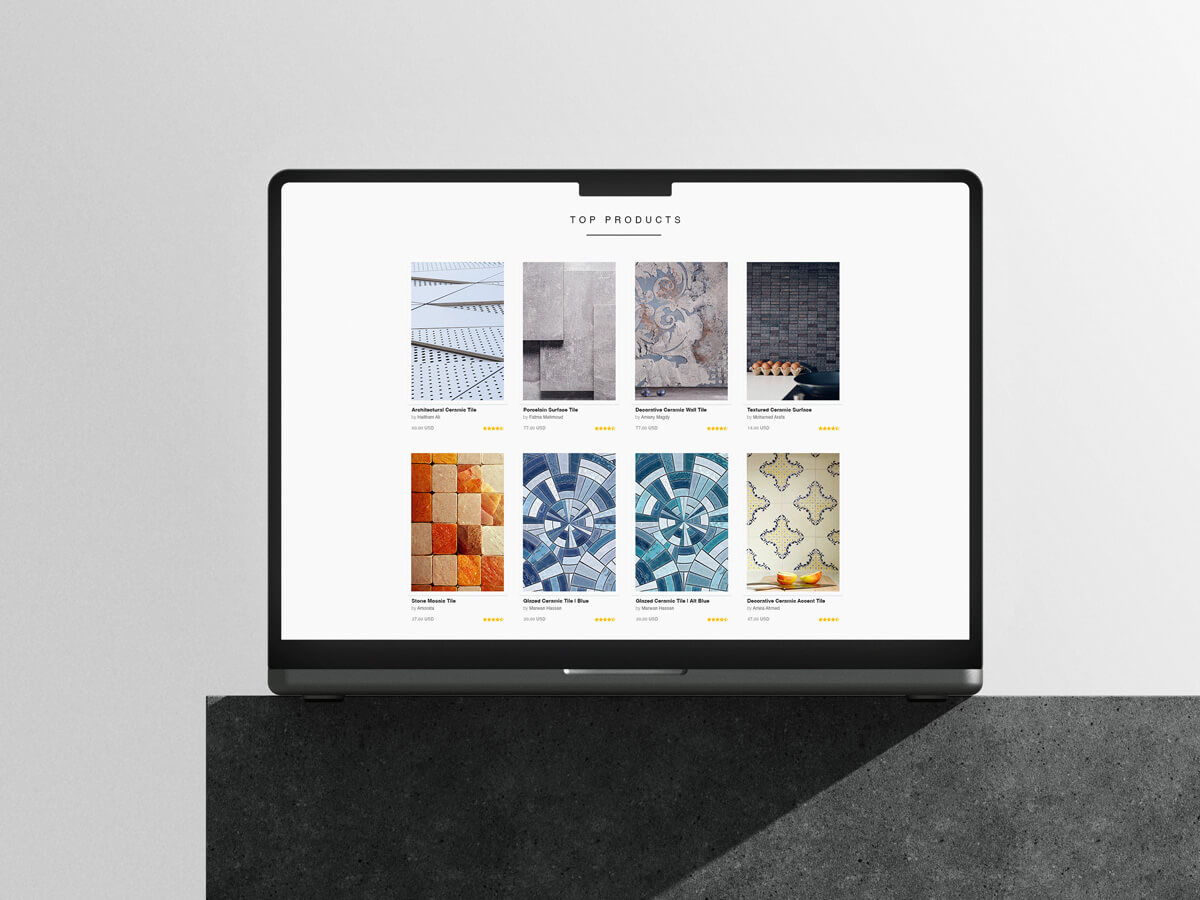
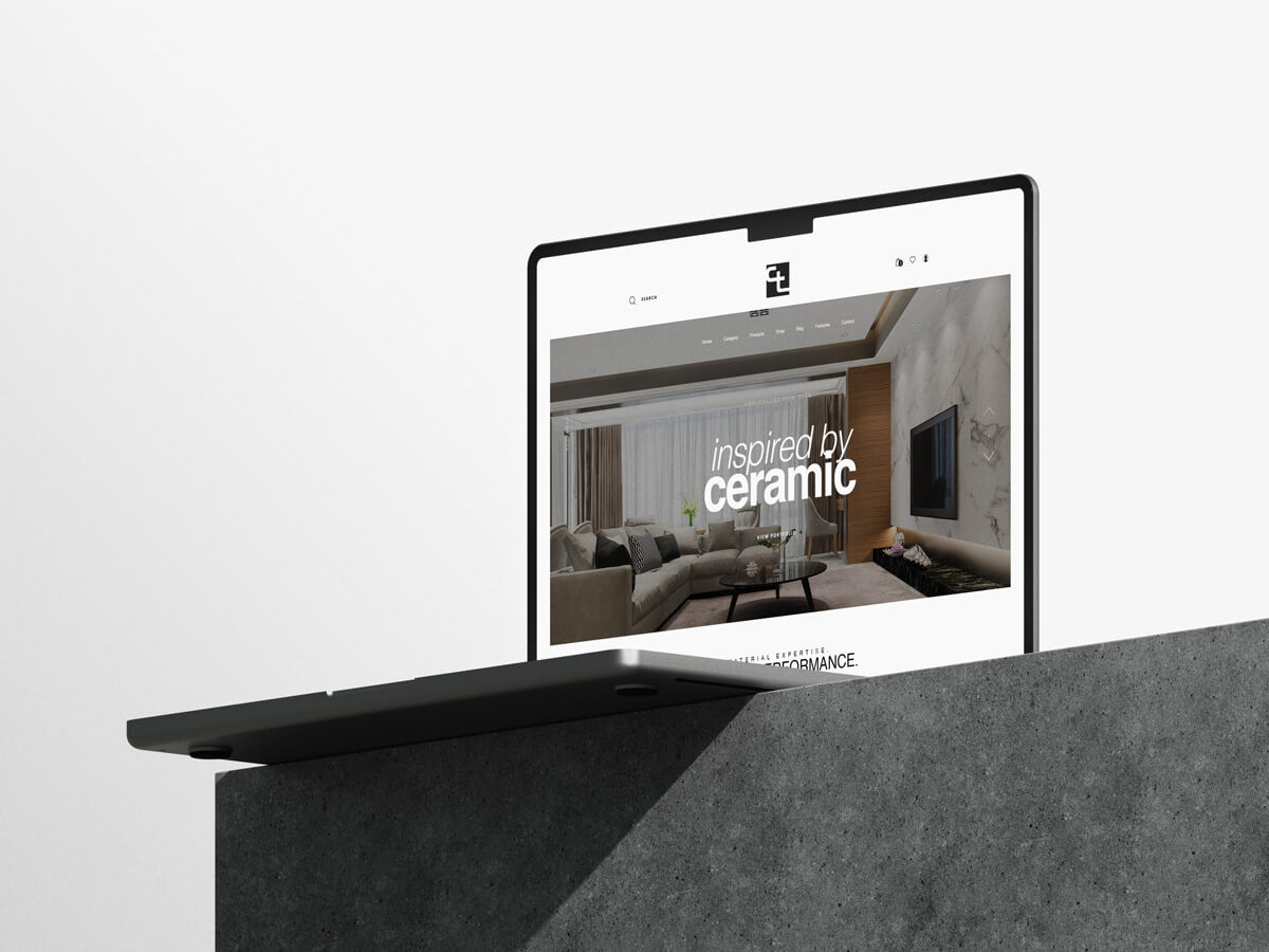
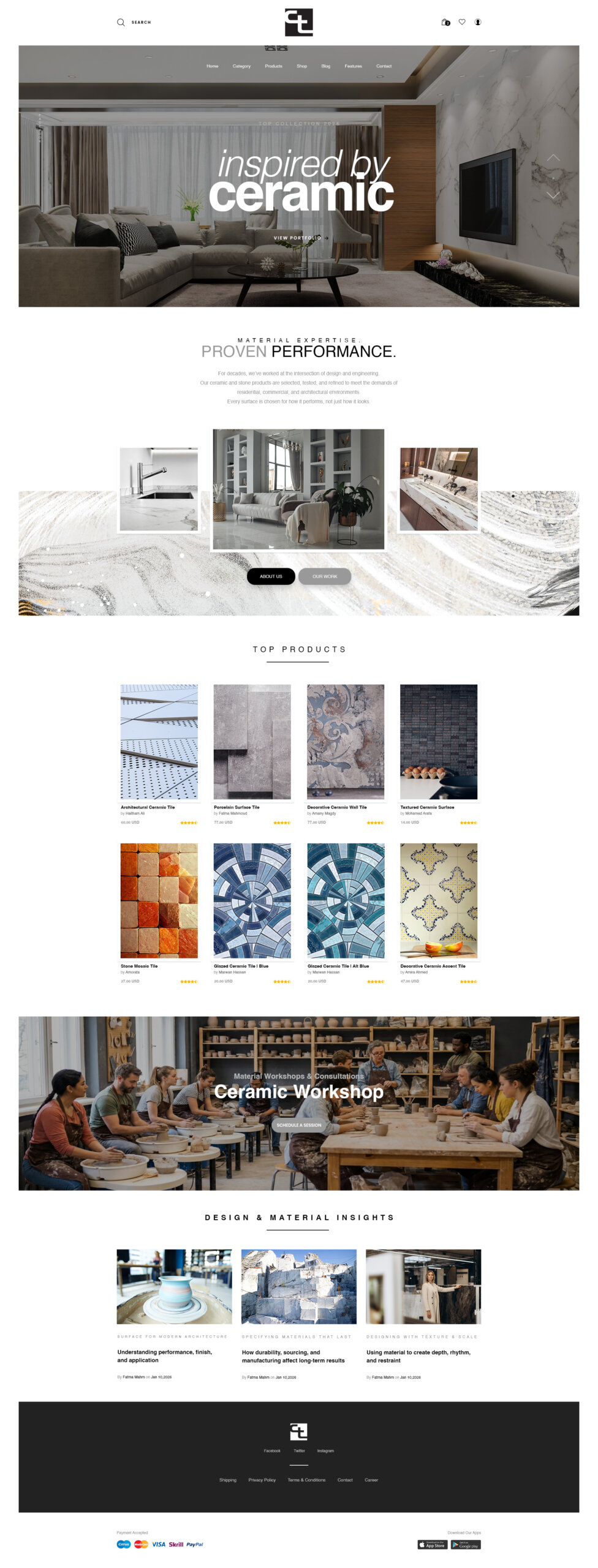
Digital & Social Visual Branding: Online it’s the same story. Big photos of the material. Clean type. Simple to move around. Feels like walking through the actual showroom.
On social we lead with real installs and architecture, not sales graphics. So the feed works two ways — inspiration and a product catalog at the same time. Looks the same on your laptop or your phone.
Results: Now Ceramic Technics looks like what they are. Precise. Dependable. Design focused. The system stretches across print, digital, signage, whatever comes next and stays recognizable the whole time.
And by stripping out the junk, the product finally gets to be the hero. That’s the win.
Digital & Social Media Visual Branding