Healing Through Mindful Movement
MindfullyFit helps people move better and feel stronger without pain. I focus on gentle movement that supports your spine, balance, and long-term health. This is not about pushing harder. It’s about moving with care, control, and purpose.
Mindful Movement for Long-Term Health
MindfullyFit is a movement studio built around healing. I work with people who deal with back pain, stiffness, and spinal stability issues. Every session is designed to help your body feel safe while building strength. Movement is slow, intentional, and supportive. The goal is simple. Help you move with confidence again.
The Problem
Why the Brand Needed to Change
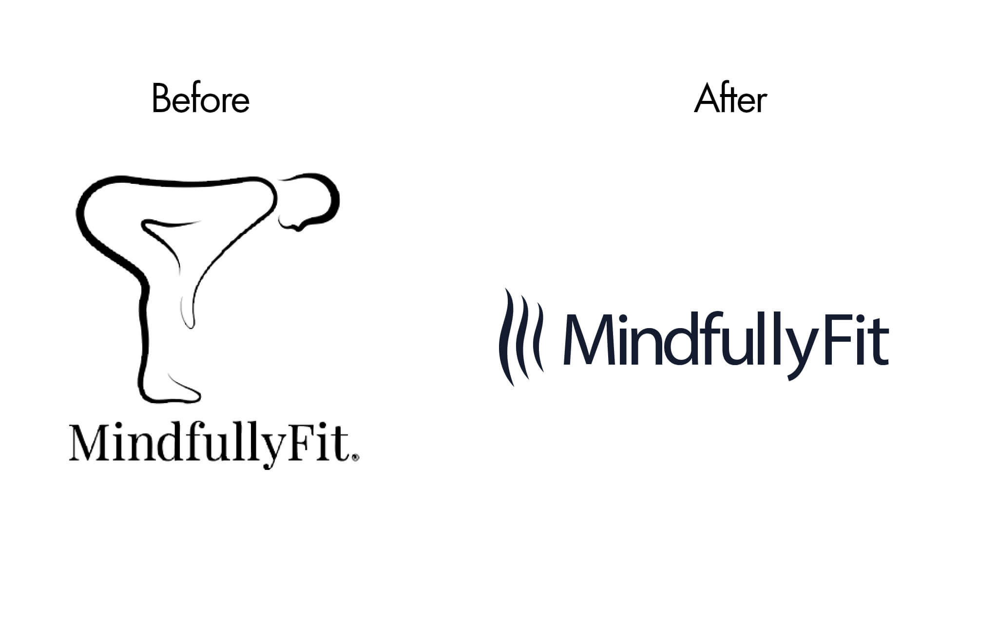
The old brand did not clearly explain what MindfullyFit does.
– The logo was hard to read at small sizes.
– The symbol caused confusion.
– And the message did not match the healing work happening in the studio.
Online, this made it harder for people to understand the services or feel connected.
The Strategy
Designing a Brand Around Healing
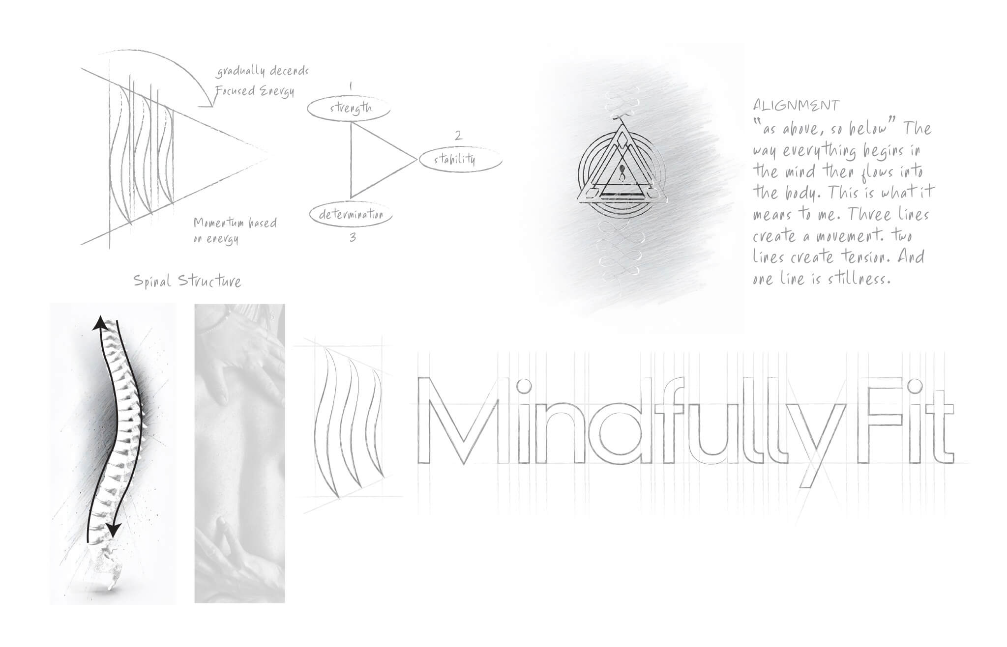
We started by looking deeper at the purpose of the studio. MindfullyFit is not just about dance. It is about longevity, spinal health, and mindful movement. Research and exploration showed that movement, flow, and support were the core ideas. The spine became the foundation for the new visual system.
The strategy begins around understanding what the primary challenge is around the brand from an observational standpoint. This can be challenging depending on all the available information on the brand’s current state and unknown challenges that don’t show up on the surface. In this case, it’s the communication of the brand’s logo in a way that still keeps the core messaging intact while creating a flexible approach in the mark. This is the observable problem. Plus, the opportunity of removing any ambiguity (confusion) in how the logo mark can be understood through the wrong interpretation.
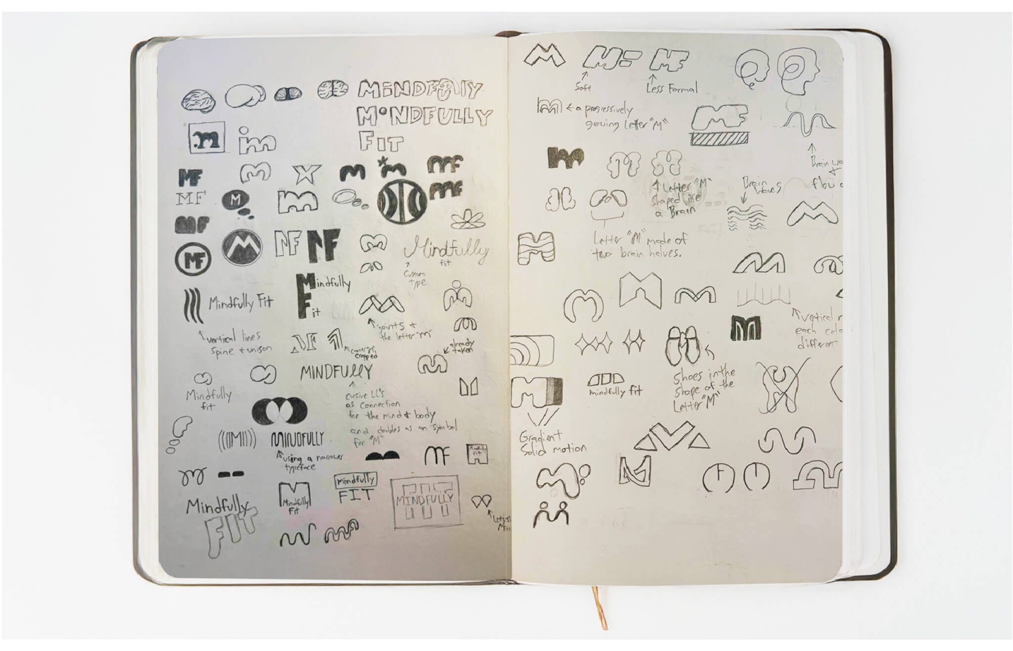
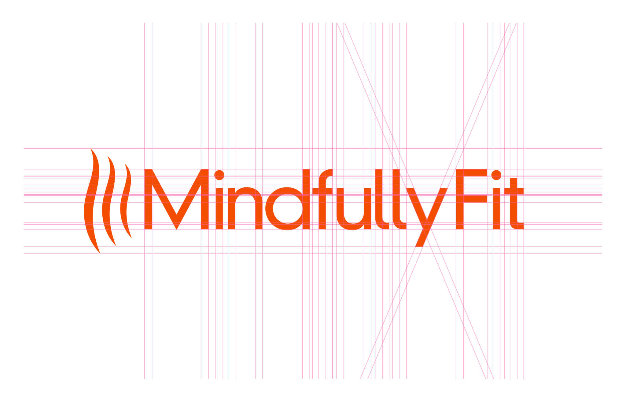
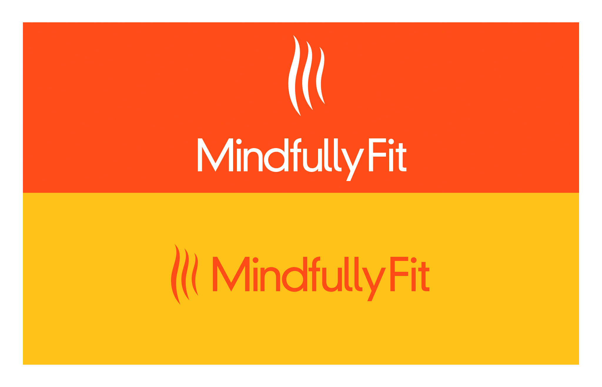
Logo Design
A Logo That Represents Movement and Support
The logo takes on 3 primary functions:
(1) The visual interpretation of the spinal structure.
(2) The focus on value adaptation in Strength, Stability, and Determination. These support the healing and restoration of the human body as a whole, not just the spine.
(3) The flow of progress. Not a hurried change, but the gradual growth of a natural process.
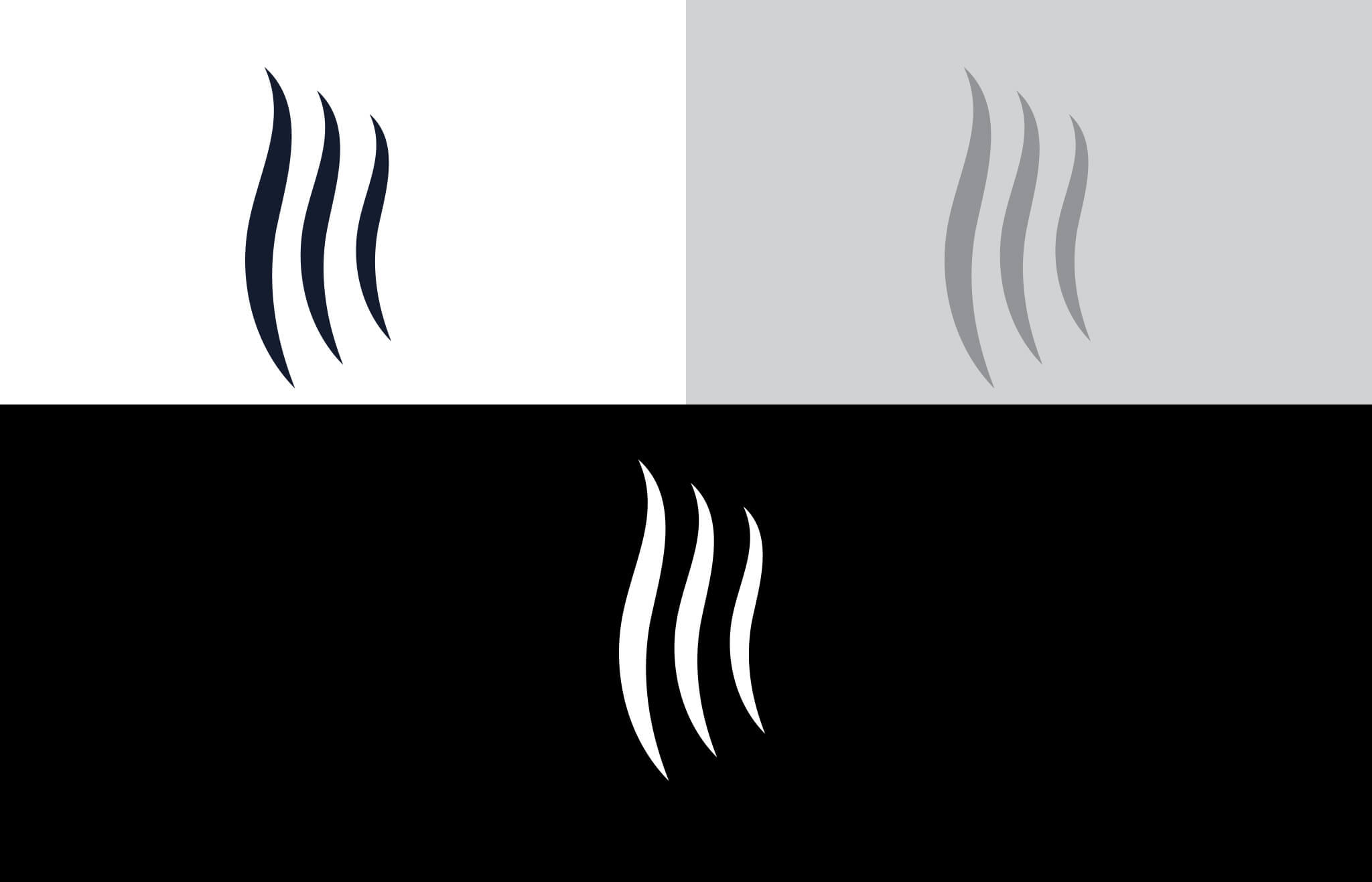
The complete mark comes together as a monogram (single letter M) from three disconnected but aligned strokes. This makes for a more abstract, but solid recall compared to the previous design.
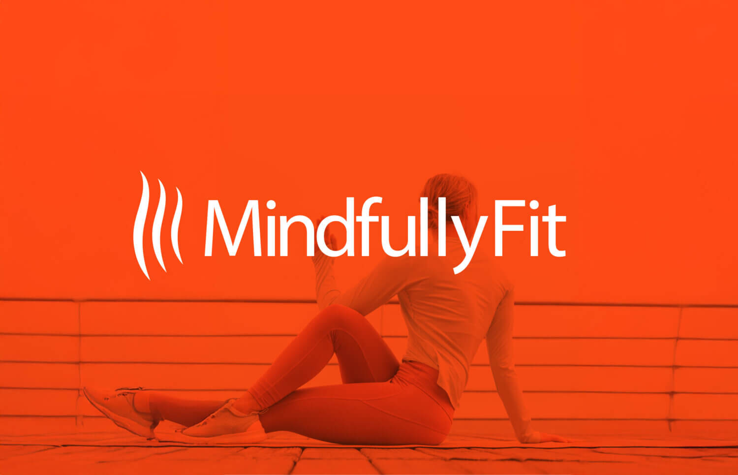
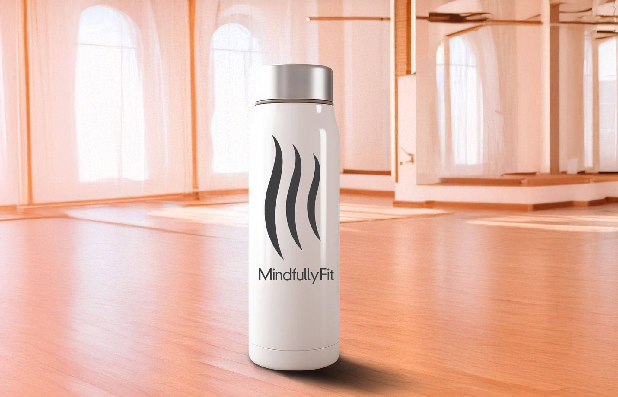
The new MindfullyFit logo is clean and flexible. The flowing lines are inspired by the spine and natural motion. The symbol works across all sizes and platforms.
– Digital screens.
– Print materials.
– Studio products.
It now clearly communicates strength through care.
Color Palette
Warm Colors That Support Energy and Calm
The color palette was refined, not replaced. Warm tones create energy without feeling loud or aggressive. The colors move from deep to bright. This mirrors the journey from tension to release. From effort to ease. The palette stays consistent across print and digital use.
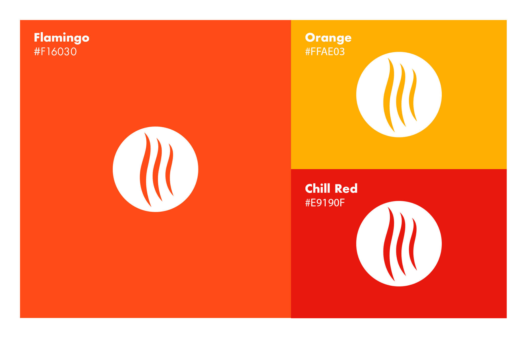
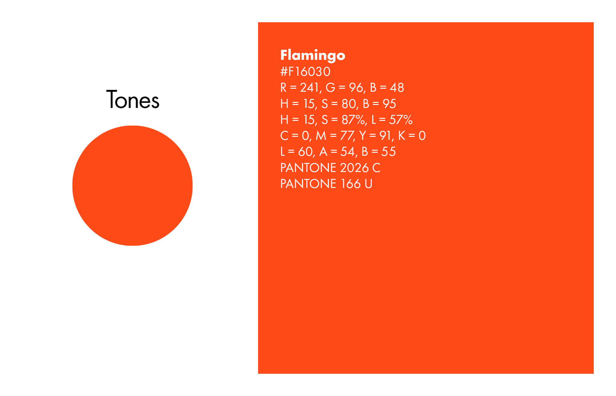
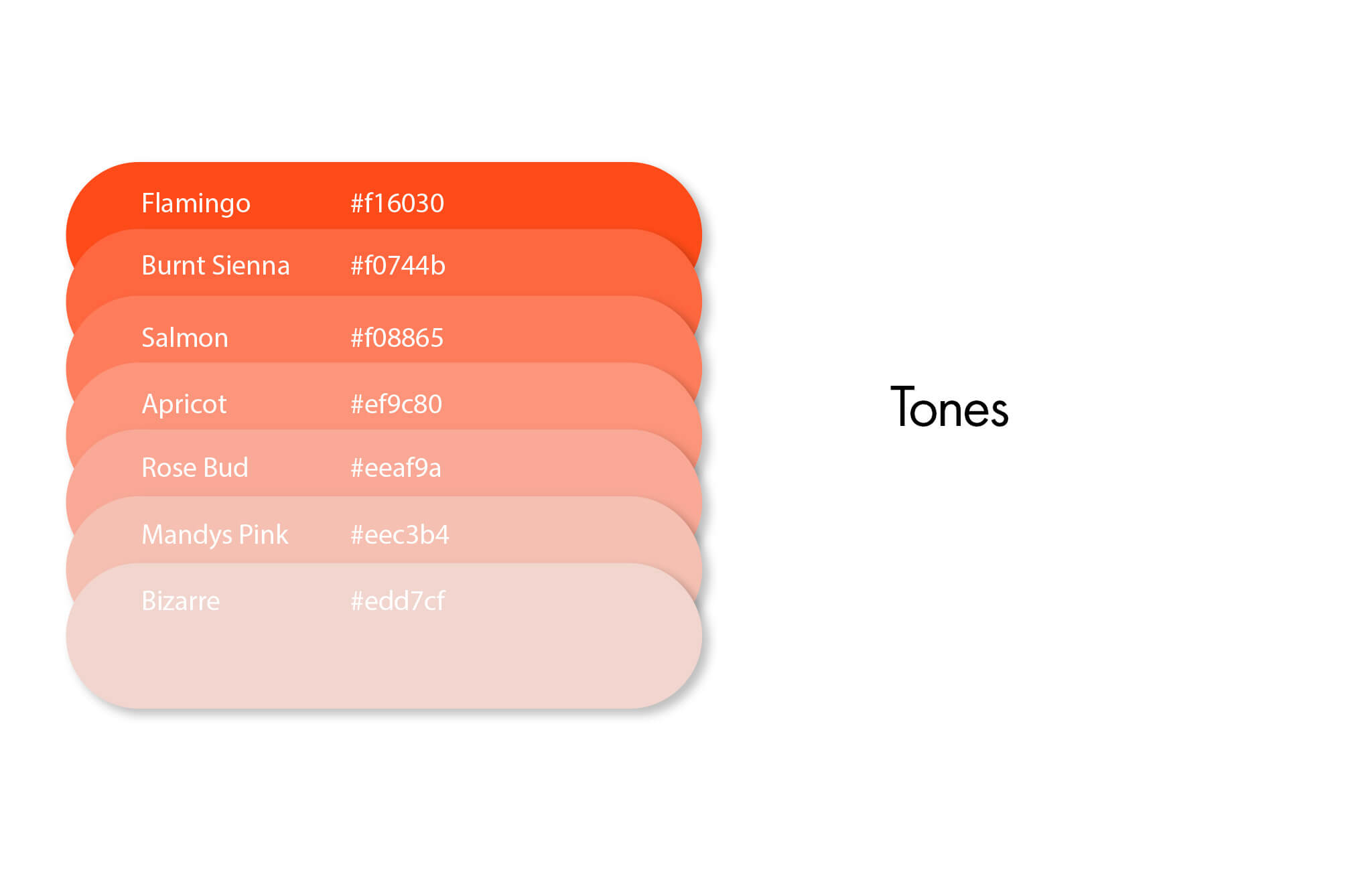
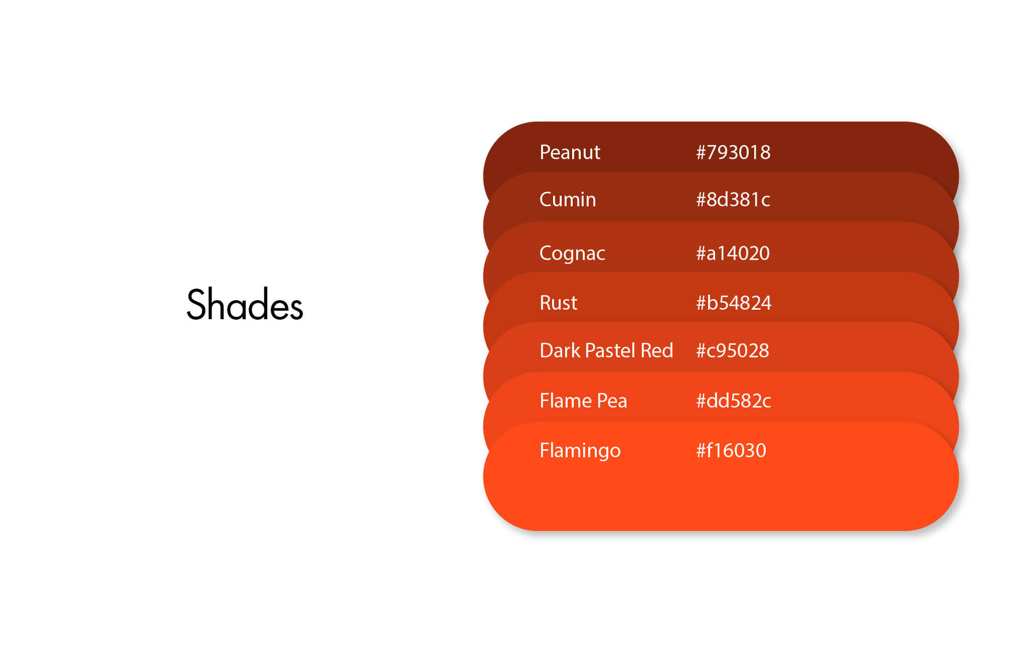
Tones & Shades
Color tones are used for darker backgrounds, particularly type. This makes it easy to read while using contrast in certain paragraph use cases. Shades make for best use on lighter backgrounds (as you would expect from something like black ink on white paper), whether on a website or printed page. Not all colors need to be used; however, these give the maximum flexibility in many cases, including texture flexibility, not limited to primary Flamingo.
Typography
Clear Fonts for Easy Reading
The old type system was difficult to read online. The new fonts are modern, simple, and clean. They work well on phones, tablets, and desktops. They help visitors read faster and understand more. Clear type supports clear communication.
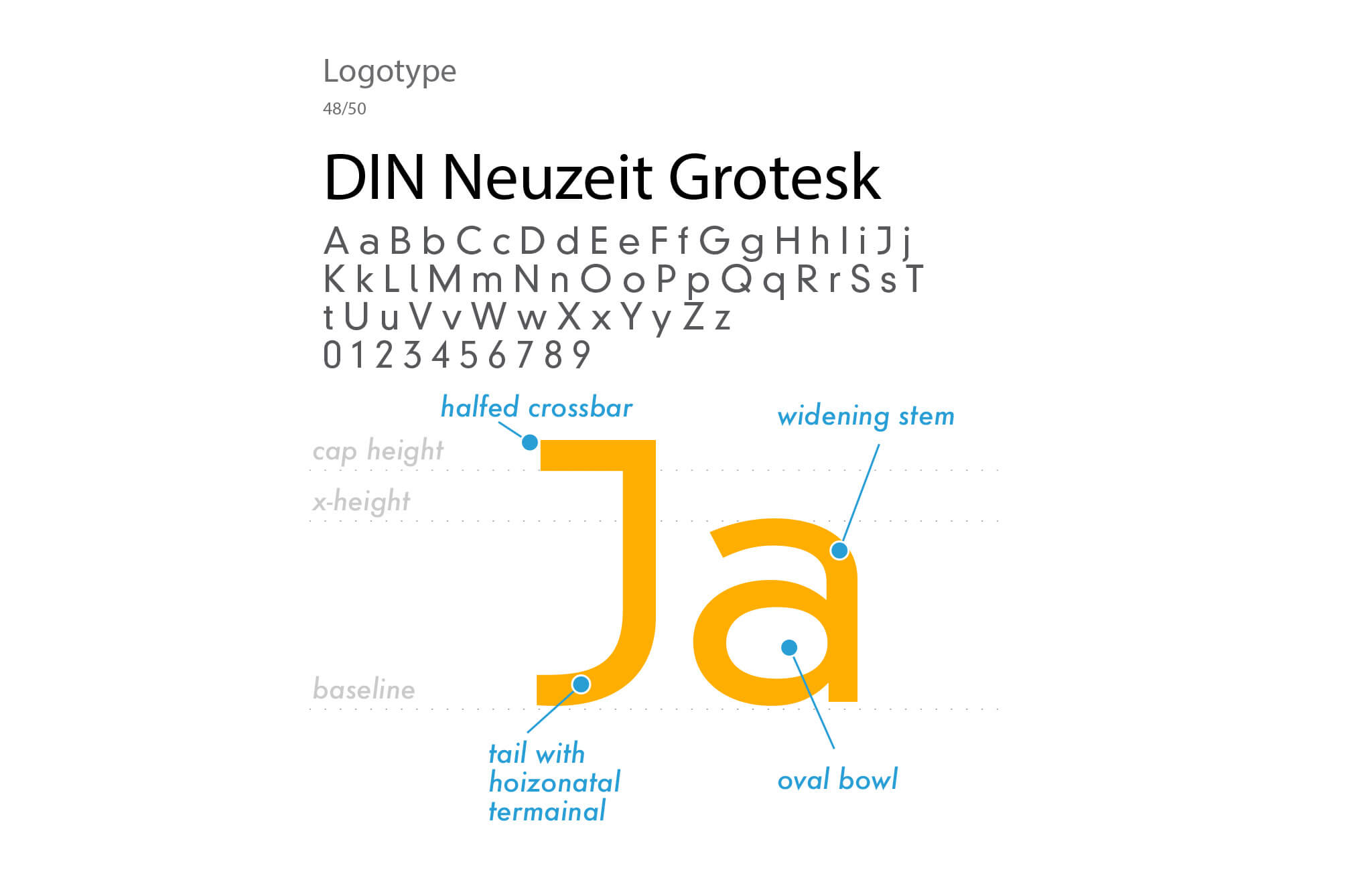
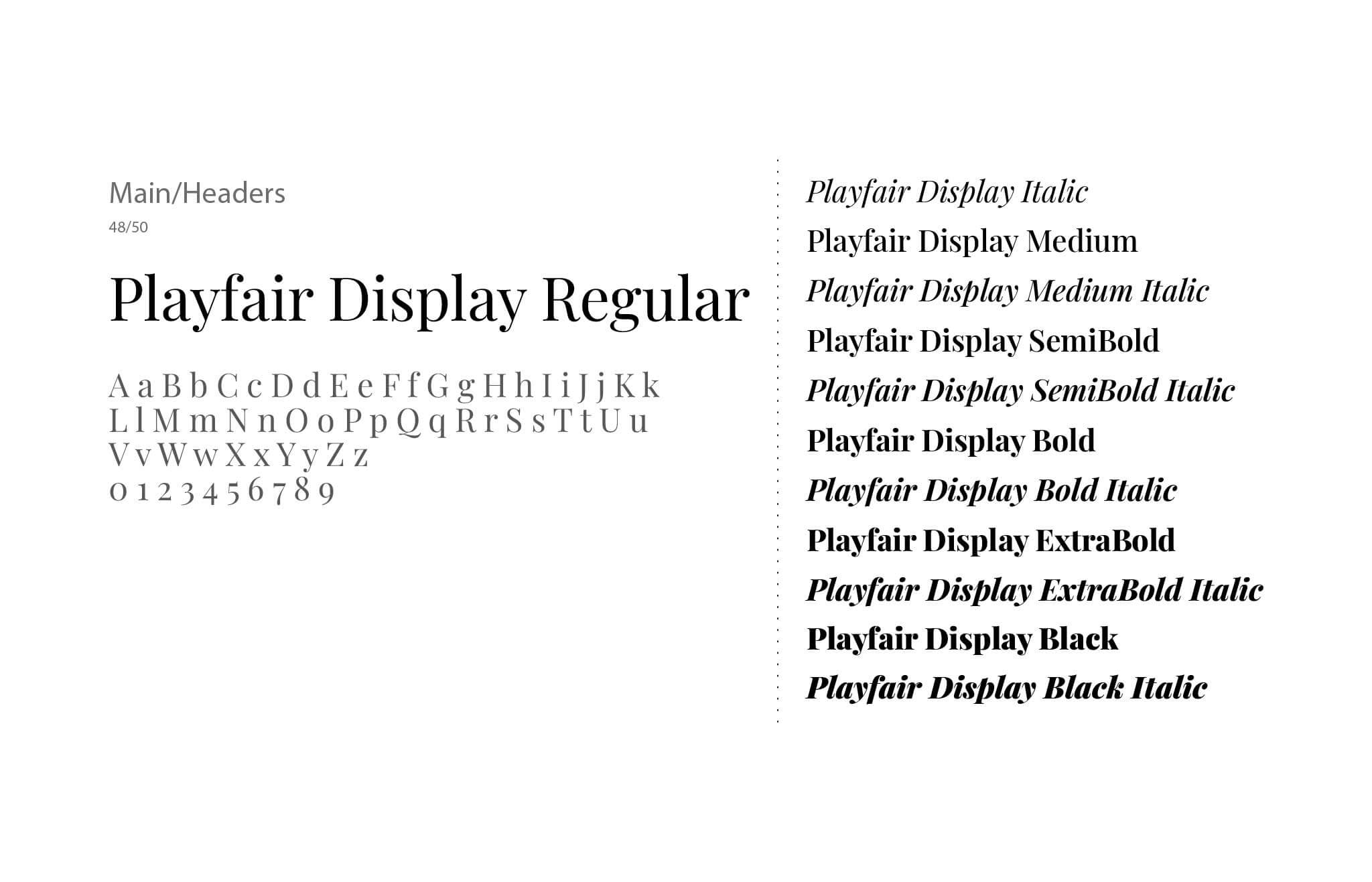
Header Typeface & Font: Playfair Display
Playfair Display — The sleekness of the type and design makes the headers readable for the selection of type in this category. There’s contrast in the characters, which makes for an elegant and natural way of reading information.
The thick and thin structure mirrors parts of the human anatomy, like type anatomy, that works as a whole. With proper letter spacing, it makes the flow from one word to the next best for readability.
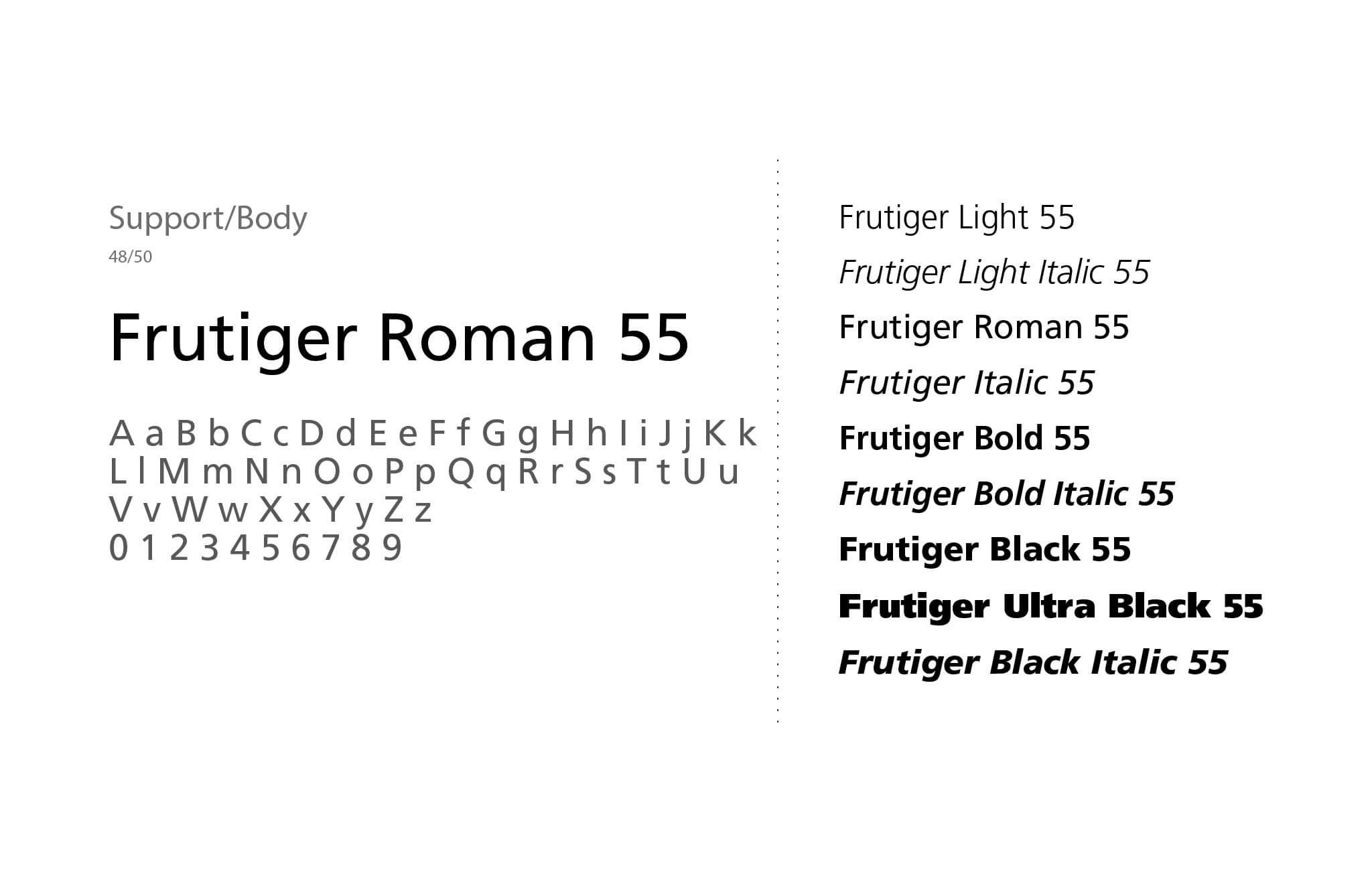
Body Typeface & Font: Frutiger
Frutiger — With its modern shapes and rounded forms, even though this was intended for use in airport signage, it still works as the perfect body copy for content to fill pages. Frutiger Roman 55 functions best as a neutral direction and the primary use for the family, followed by Frutiger CE 55 Roman Bold for subheads.
Type System Implementation
The pairing of these typefaces creates a sophisticated system that:
- Maintains clarity across all publishing formats
- Provides ample variation for creating clear hierarchies
- Balances modern and traditional publishing aesthetics
- Ensures consistent brand recognition through distinctive letterforms
Accommodates both display and body copy needs effectively
Print Visual Branding
The refreshed brand extends beyond the website. It appears on studio items, printed materials, and merchandise. Each piece feels connected and intentional. Nothing feels random or mismatched. This builds trust and familiarity over time.
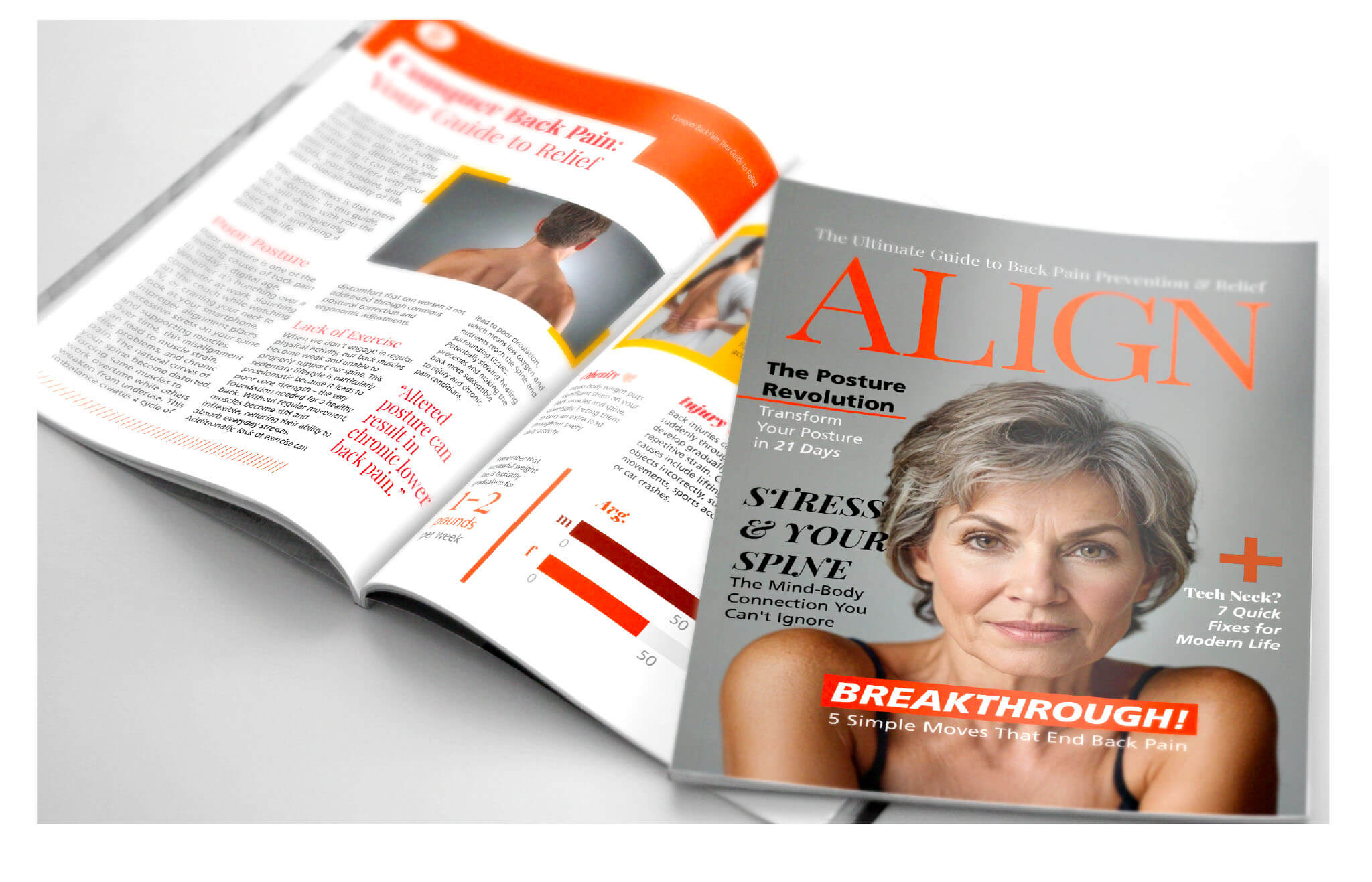
Going beyond the aesthetics and details of the logo, it’s only as useful as the application of the brand’s assets. With the studio also being used for dance as a form of healing, there are different angles that were considered to include in the direction. I chose to keep it narrow and practical for what’s most likely to be used in healing and restoration for the audience.
One consideration is a publication that talks about hot topics surrounding issues that come with dealing with the skeletal structure. This works perfectly as a lead magnet.

Digital Visual Branding & Social Media
A Website Designed for Clarity and Trust
The website experience is calm and easy to use. Visitors quickly understand what MindfullyFit offers. The layout supports education, exploration, and connection. Nothing feels rushed or overwhelming. The site helps turn visitors into confident clients. Parts of the existing website were updated to support a more cohesive brand and content system to aid in the understanding of physical therapy. Posts are made to be directly useful, helping prevent premature aging and optimize health.


Social Media Branding
Staying Connected Outside the Studio
Social content keeps MindfullyFit present between sessions. Visuals stay consistent across posts and platforms. Each piece reinforces mindful movement and healing. The brand feels familiar wherever it shows up.
A Brand Built Around Care
Every part of the brand was designed with intention. From movement to visuals. From message to experience, because nothing is forced. Everything supports healing through mindful motion.
