
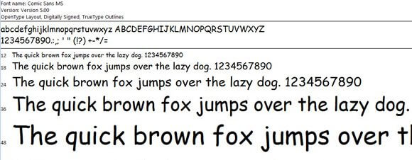
Oh Comic Sans, with its wonderful curves and bulgy appearance that has swept the world over has crept its way into our font library to stay. Although is being in some cases described as a casual script it was designed by Vincent Connare for Microsoft in 1994 yet for some reason people, specifically graphic designers, mock or even loathe the very name of it. But despite all of this, it has gained great momentum in the font of choice in many respects for invitations, stationary, and even logos (yeah I know please don’t ask). So given the public acceptance of this phenomenon it begs the question,
Can we really trust Comic Sans?
It was initially designed to be used in speech bubbles for comic book art!

Its true, comic sans was meant as an option for comic book artists to use in programs such as Microsoft word to give comic book writers an option for writing copy.
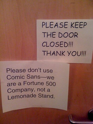
Public Acceptance

Comic Sans has taken on a style of its own with incorporation into the mainstream with Company logos, mailers, Branding, and not surprisingly, stationary design.
Comic Sans is Fun!

It’s fun and Jabby! Comic Sans was never meant to be taken seriously, and that’s just the beauty of it. You can revel in the polite fondness of it while not getting bogged down in something incredibly serious like the majority of fonts that are available in your library. It’s actually a much needed comic relief from the mundane letter forms providing that punchline within the typographic sphere.
Approachable Typography

Its uniqueness sets it apart as a font that for some reason has become appealing to people that want something fun to stand out. I’m not advocating people are deliberately choosing comic sans but they seem to automatically register it with something approachable and not so damn serious, but that’s the point.
It has typographical essence
Vincent Connare spent time designing this Typeface, and if you know anything about designing fonts, it’s not exactly a walk in the park. Just like any other Typeface there are multiple considerations to go through like weight variations, counters, x-height, kerning contrast, and a lot more.
Given the reasons listed would you think that Comic Sans is a reasonable part of your design arsenal? It is a trust worthy and reliable typography family that has earned its place with in society? Let us know.
Share this Post