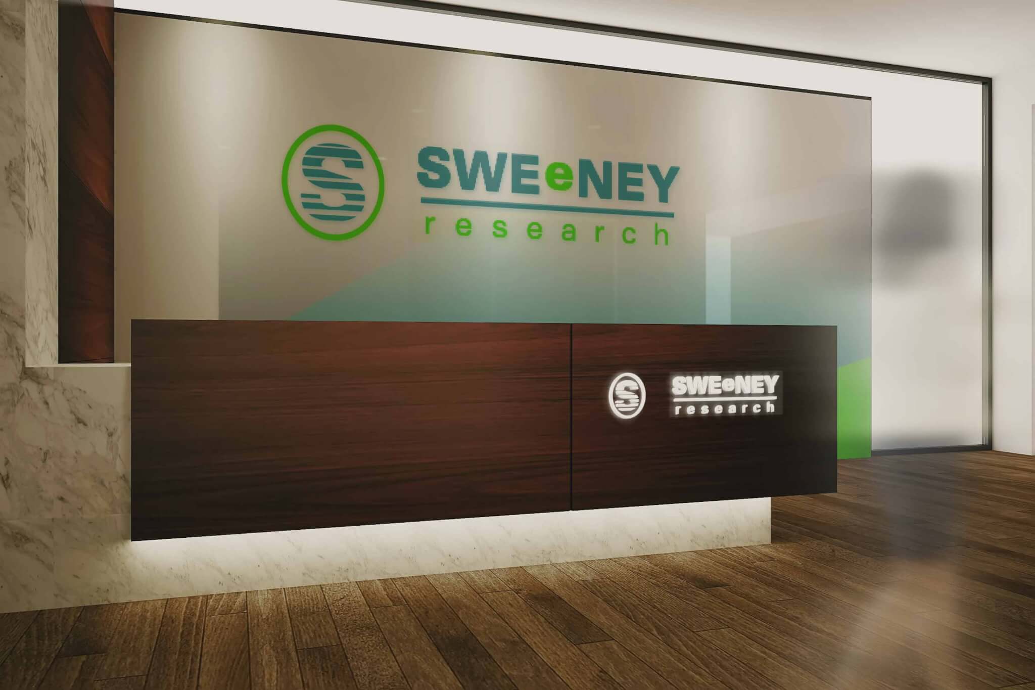
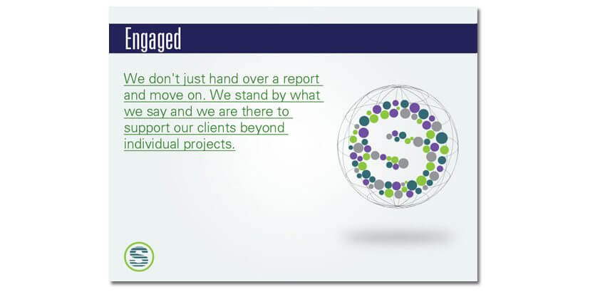
Sweeney Research is a full service research agency and highly acclaimed marketing firm based out of Australia who wanted to redesign their logo. The company has been in business for over 40 years so it was important to have a design that resembled progression with a modern feel. At the heart of the logo icon lays ripples of progression ever expanding like water, strong enough to break through rock yet always flowing and never growing stale. In center is also the mirage of an “S” a reflection of the Sweeney initial representing a transparency of trust between you and all customers coming together as a global force. The lime green lowercase “e” in the center of the logo type is a model of focus and intent striving on a single goal.
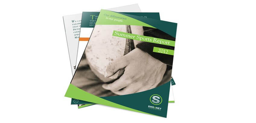
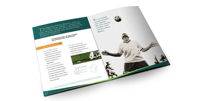
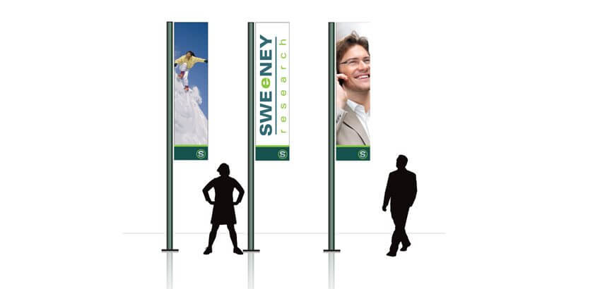
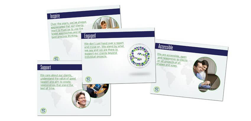
We kept the Sweeney green intact throughout the whole campaign reflecting the color scheme of the brands integrity. This gave the whole campaign a natural feel that wasn’t too cool in its approach and complemented it with a deep sea blue. The gradual progression of lines in the “e” indicates the company’s continual growth throughout the market place progressing like ripples in a pond. Additional pieces included Outdoor Signage, Brochure Design, Logo Design, Power Point Slides, Business Card Design, Letter Head Design, and Envelope Design