Introduction
Here’s a wild stat. Consistent brand presentation across all platforms can increase revenue by up to 33%. That’s not a small bump. That’s a third more money — just from being consistent.
I think about that a lot when I see small businesses with a sleek Instagram page but a logo that looks like it was made in 2003. Or a killer website paired with a Word doc invoice that doesn’t match anything. You know what I’m talking about.
The problem isn’t that people don’t care about their brand. It’s that most people think branding means having a nice logo. It doesn’t. Not even close.
A brand identity system is the full picture. It’s everything that makes your brand look, sound, and feel the same — no matter where someone finds you. And once you understand it? Everything about your marketing gets easier.
Let me walk you through it.
What Is a Brand Identity System? (The Real Definition)
A brand identity system is not just your logo.
It’s the full set of pieces that work together to make your brand feel like one thing. Think of it like a puzzle. Your logo is one piece. Your colors are another. Your fonts, your photos, your words — they’re all pieces too.
When all the pieces fit together, people trust you more. They recognize you faster. They feel like they know you.
Here’s the simplest way I can put it:
“Your brand identity system is every visual and verbal tool you use to show up consistently.”
That includes what your brand looks like and what it sounds like.
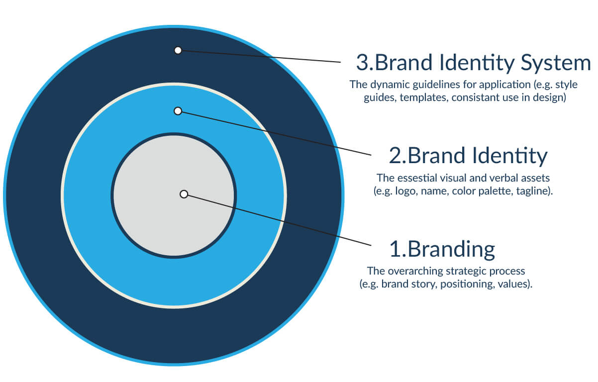
A lot of people mix up three things. Let me clear that up fast.
| Term | What It Means |
|---|---|
| Branding | The overall strategy and feeling of your brand |
| Brand Identity | The visual and verbal elements of your brand |
| Brand Identity System | All those elements organized and working together |
Branding is the big idea. Brand identity is the stuff you can see and hear. The system is how all that stuff is organized so it stays consistent.
The Core Elements of a Brand Identity System
Okay, let’s get into the pieces. Every strong brand identity system has these building blocks.
1. Your Logo System
This isn’t just one logo. It’s a family of logos.
You have your main logo. But you also need:
- A horizontal version (for email signatures and headers)
- A stacked version (for square spaces like profile photos)
- An icon or symbol (just the mark, no words — for favicons and small spaces)
Why does this matter? Because a logo that only works in one size or layout will break your brand the second you try to use it somewhere new.
2. Your Color Palette
Your colors do a lot of heavy lifting. They create mood. They build recognition. And they show up everywhere.
A solid color palette includes:
- 1–2 primary colors (your main brand colors)
- 2–3 secondary colors (for accents and variety)
- Neutral colors (whites, grays, blacks for backgrounds and text)
Pro tip: Every color in your palette needs to be accessible. That means enough contrast between text and background so people can actually read it.
3. Your Typography
Fonts carry personality. A luxury brand uses different fonts than a playful kids’ app. And you should use your fonts intentionally.
Your type system needs at least three levels:
- Headline font (the big, attention-grabbing text)
- Body font (the readable everyday text)
- Accent font (optional — for pull quotes or special callouts)
Stick to 2–3 fonts max. More than that and things start to feel messy.
4. Your Imagery Style
Think about how Apple uses photos. Clean. Minimal. Real people. No clutter. You can always tell an Apple photo from someone else’s.
That’s intentional. And you need that too.
Your imagery style covers:
- Photography (bright and airy? Dark and moody? Candid or posed?)
- Illustrations (flat, hand-drawn, 3D?)
- Icons (outlined, filled, rounded or sharp?)
When all your visuals feel like they come from the same world, your brand feels polished. When they don’t — it looks scattered.
5. Your Brand Voice
This is the one people forget. Your brand has a voice. It’s how you write. How you talk to people.
Are you casual and funny like Wendy’s Twitter? Or warm and expert like a trusted doctor? Or bold and direct like Nike?
Your voice shows up in:
- Your website copy
- Your social media captions
- Your emails
- Even your error messages
The words you use are part of your brand just as much as your colors are.
Brand Identity System vs. Brand Guidelines: What’s the Difference?
People use these two terms like they mean the same thing. They don’t.
Here’s the easy way to think about it:
- Your brand identity system = the actual stuff (the logo files, the colors, the fonts)
- Your brand guidelines = the rulebook that tells people how to use that stuff
Think of it like a kitchen. Your brand identity system is the ingredients and tools. Your brand guidelines are the recipe.
You need both. The best brand assets in the world won’t help you if nobody knows how to use them right.
A good brand guideline document covers things like:
- How much space to put around your logo (called a “clear space” rule)
- Which color combinations are allowed — and which are not
- What font sizes to use for headlines vs. body text
- The right tone to use when writing for the brand
Why Your Business Needs a Brand Identity System
I get it. When you’re just starting out, building a full brand system feels like overkill. You just want to make sales.
But here’s what happens without one.
You hire a designer for a flyer. They use different fonts than your website. You post on social media and it looks nothing like your email newsletter. Your business cards don’t match your packaging. Every piece of your brand is telling a different story.
Customers notice. Even if they can’t name what feels off — they feel it.
Here’s what a strong brand identity system actually gives you:
1. Faster recognition. People need to see a brand around 5–7 times before they remember it. If your brand looks different every time, those exposures don’t stack up. Consistency is what builds memory.
2. More trust. A polished, consistent brand signals professionalism. It says: we have our stuff together. And people buy from brands they trust.
3. Way less work. Once your system is built, your team doesn’t have to make design decisions from scratch every time. The system does that for them.
4. Stronger brand equity. Brand equity is just how much your brand is worth beyond your actual product. Think about why people pay more for Nike sneakers than a no-name brand. That’s brand equity. And your identity system is what builds it.
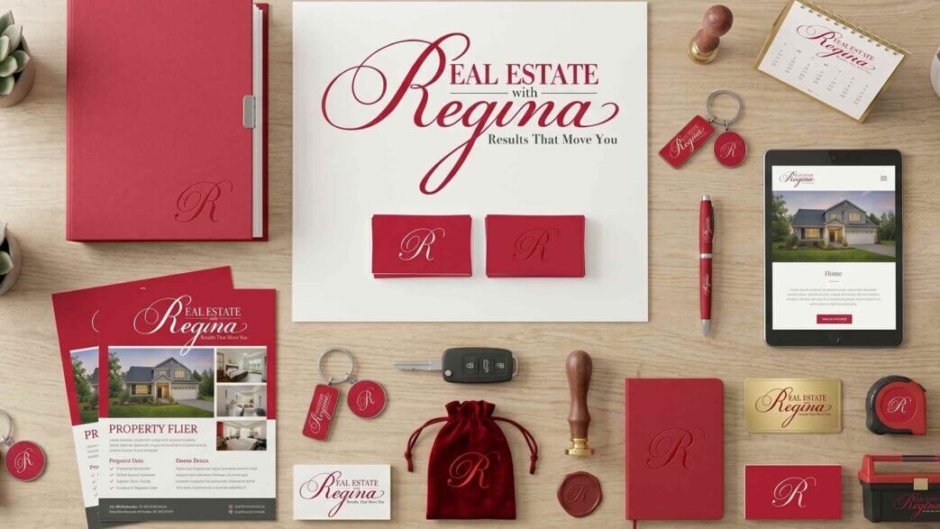
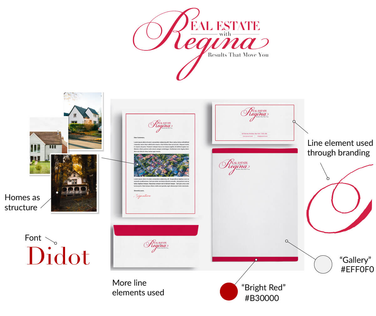
Brand Identity System Examples: Brands That Get It Right
Let’s look at some real examples. Because this stuff makes way more sense when you can see it.
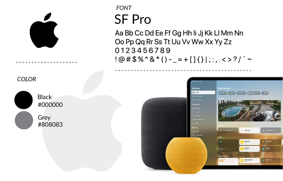
Apple
Apple is probably the most studied brand system in the world. And for good reason.
Everything is minimal. White space. Clean sans-serif fonts. Real product photos with soft shadows. No clutter. No noise.
What makes it a system is that you could cover the logo on any Apple ad and still know it’s Apple. The visual style is that consistent.
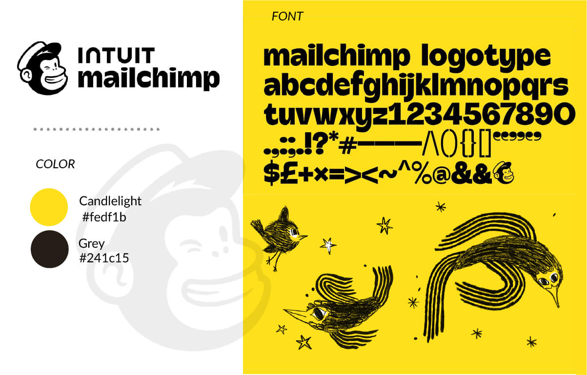
Mailchimp
Mailchimp is the opposite of Apple in a lot of ways — and that’s the point.
They use bold yellows. Quirky hand-drawn illustrations. A mascot named Freddie. Their voice is witty and a little weird.
But it’s all intentional. The illustrations, the colors, the voice — they all feel like the same brand. That’s the system working.
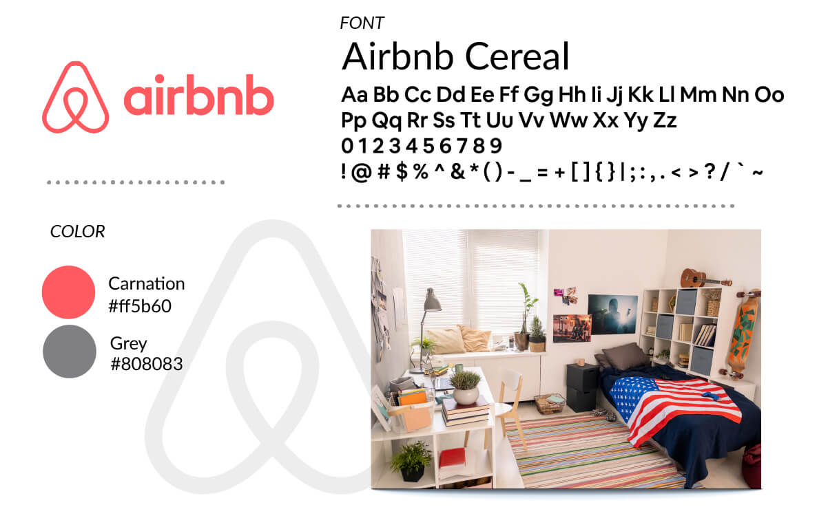
Airbnb
Airbnb built their whole visual identity around the idea of belonging. Their “Bélo” logo is designed to look like a head, a heart, a location pin, and the letter A all at once.
Their photography is warm. Real homes. Real people. Never too polished or staged.
Their voice is inviting and human. Words like “belong anywhere” match the visuals perfectly.
The verbal and visual identity tell the same story. That’s a brand identity system firing on all cylinders.
How to Build a Brand Identity System Step by Step (lite version)
Alright. Here’s where we get practical.
You don’t need to hire a big agency to build a solid brand identity system. You just need to do the steps in the right order.
Step 1: Define Your Brand Strategy
Before you design anything, you need to know who you are.
Answer these questions in writing:
- What does your brand do?
- Who is your customer? (Get specific. Not “women 25–45.” Think: “busy moms who run side businesses and value their time.”)
- What makes you different from everyone else?
- What words do you want people to use to describe your brand?
- What are your brand values?
This step is not optional. If you skip it, everything you design will be based on guessing. And it’ll show.
Step 2: Develop Your Verbal Identity
Your verbal identity is your brand’s voice on paper.
This includes:
- Your brand name (does it still fit where you’re going?)
- Your tagline (optional, but powerful if it’s good)
- Your brand voice (casual? authoritative? warm? bold?)
- Your key messages (what do you want people to know about you?)
Write a quick voice guide. List 3 words that describe how your brand talks. Then list 3 words it never sounds like. That contrast is clarifying.
For example:
- ✅ Warm, direct, no-nonsense
- ❌ Corporate, stiff, jargon-heavy
Step 3: Design Your Visual Identity
Now you design. In this order:
- Logo — primary mark, horizontal version, icon version
- Color palette — primary, secondary, and neutrals (with hex codes)
- Typography — headline font, body font, with size hierarchy
- Imagery style — define the look and feel with a mood board
Don’t skip the mood board. Collecting 10–15 images that feel like your brand will save you and any designer you work with a ton of back-and-forth.
Step 4: Build Your Supporting Assets
Once the core is done, you create the toolkit:
- Social media templates (posts, stories, covers)
- Email newsletter template
- Presentation / slide deck template
- Business card design
- Invoice or proposal template
These are where your brand actually lives day to day. Build them once. Use them forever.
Step 5: Document Everything
This is the step most people skip. Don’t.
Create a brand guideline document — even a simple one in Canva, Figma, or Notion — that covers:
- Logo usage rules (what to do and what NOT to do)
- Your color palette with hex, RGB, and CMYK codes
- Font names, sizes, and hierarchy
- Imagery style guidelines
- Voice and tone examples
If someone can’t use your brand correctly without asking you every five minutes, your guidelines aren’t clear enough.
Step 6: Roll It Out
Now you update everything:
- Website
- Social media profiles and highlights
- Email signature
- Any physical materials (packaging, signage, cards)
Set a date and launch it all at once if you can. A consistent rollout feels like a brand refresh moment. That’s good energy.
Tools to Create and Manage Your Brand Identity System
| Category | Tool | Best For |
|---|---|---|
| Design | Figma | Building and organizing your visual identity (free plan available) |
| Design | Canva Pro | Easier entry point, great for templates |
| Design | Adobe Illustrator | Professional logo and asset creation |
| Brand Mgmt | Frontify | Storing and sharing brand assets with a team |
| Brand Mgmt | Brandfolder | Managing brand files at scale |
| Guidelines | Zeroheight | Publishing polished brand guideline docs |
| Guidelines | Notion | Simple, free option for small teams |
If you’re just starting out, Canva Pro + Notion is honestly all you need. Canva to build your assets. Notion to document your rules.
If you’re growing a team or working with outside agencies, look into Frontify or Brandfolder. They make it easy for everyone to grab the right file without emailing you.
You don’t need fancy tools to get started. But here are the ones worth knowing.
Common Brand Identity System Mistakes to Avoid
I’ve seen these over and over. Let’s save you the pain.
🚫 Mistake 1: Thinking your logo IS your brand identity.
Your logo is one ingredient. Without the other pieces, it’s just a picture.
🚫 Mistake 2: Using too many fonts and colors.
More is not more here. More is mess. Stick to 2–3 fonts and a tight color palette. When everything is fighting for attention, nothing wins.
🚫 Mistake 3: Having visuals but no verbal identity.
You can have the most beautiful brand in the world. But if your captions sound robotic and your emails read like a terms-of-service document — the illusion breaks.
🚫 Mistake 4: Building the system and never enforcing it.
I’ve seen brands spend thousands on a beautiful brand guide that nobody follows. The guideline is only as good as the habit of using it.
🚫 Mistake 5: Ignoring accessibility.
At least 1 in 12 men has some form of color blindness. If your brand colors don’t have enough contrast, a chunk of your audience can’t read your content. Use a contrast checker. It takes two minutes.
Conclusion
A brand identity system is not a “nice to have.” It’s the foundation everything else is built on.
We covered a lot. You now know the difference between a logo and a full identity system. You know the six core elements — logo, color, type, imagery, icons, and voice. You know how to build it step by step. And you know the mistakes that will waste your time and money if you don’t avoid them.
The brands people remember aren’t just pretty. They’re consistent. Every touchpoint — every post, every email, every product photo — is telling the same story.
Here’s something I want you to think about: if a stranger looked at your Instagram page, your website, and your email newsletter side by side right now — would they know it was all the same brand?
You don’t need fancy tools to get started. But here are the ones worth knowing.